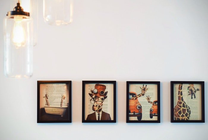
If you’re looking to take your product photography skills to the next level, then you need to check out our latest blog post on product photography props. In this post, we’ll show you ten different props that you can use to improve your styling and backgrounds. We’ll also provide some tips on how to use these props effectively.
Understand the Brand: Product Photography Props
Before you start planning or photographing a product, you need to understand the brand. What is it about the brand that the images need to convey?
Figuring this out should start with a conversation with the client, and perhaps a creative brief. A creative brief is a document filled out by the client. It answers questions aimed to help a photographer or designer understand the desired end result.
Clients can find it difficult to describe what they’re looking for. They may give you descriptive words like “fun” and “bold”, which are vague and can mean something completely different to you than it does to them.
The more information you have to begin with, the greater the likelihood that you’ll deliver something they will be happy with.
Questions in the creative brief should include:
- How would you like to be perceived?
- Who is your audience?
- Who is your primary competition?
- What are some words that describe your brand?
- How will the images be used?
Also, a great approach to understanding what the client is looking for is a mood board. This is a board created on an app like Pinterest or Mood Board. You and the client can pin sample images that align with their brand in terms of color, mood, and aesthetic etc.
Not only can you ensure you’re both on the same page, it’s a great communication tool. Visuals are the best way to communicate ideas you need to express visually.
Research the Target Market
Before you shoot, you need to know the brand’s ideal customer. Does it appeal to millennial women, or a mixed demographic in an older age range? Is it a luxury product, or is it budget-friendly? Understanding who your audience is will help you deliver the right message
Businesses don’t have the resources to reach everyone with a product message. Identifying a target market allows them to focus on those who are most likely to purchase the product. This results in reaching customers with the highest profit potential.
Keep in mind that the purchaser of the product may not actually be the end user. For example, some goods are bought for men by women. Therefore, the target audience in that case is female, rather than male, which affects how the product should be presented.
Plan the Product Shoot
Rummaging around and pulling things together for photo styling is a fun and creative process that can lead to interesting results, but when doing client work, you should do as much planning upfront as possible.
This means figuring out what product photography props you’ll use, the overall desired aesthetic, and other important logistics on shoot day.
You need to have an overarching story to tell about the brand or the product.
Write down everything you need to remember for your photo shoot. Not only the props you’ll need, but also the answers to the points discussed in this article. Yes, as a photographer, it’s your job to be creative, but it’s also your job to deliver images that will effectively convey certain messages about a brand.
This will not always line up with the creative vision you might have for a product.
Before your shoot, I also recommend doing a lighting test. This is where you determine what kind of light you will use, how you will position it and what your camera settings need to be. This is a necessity for artificial light, especially if the client is attending the shoot.
You don’t want a client or creative director tapping their toes while you’re fiddling with your light source. It might make you seem like you don’t know what you’re doing.
I do a lighting test before every single one of my shoots, and make sure my equipment is in working order. It will save you a lot of time, and help you go into a shooting feeling and looking confident.

What Is the Color Scheme?
A big part of the overall aesthetic and conveying a certain message is the color scheme.
Start with the overall mood. Are you looking for light and airy? Then maybe lots of pastels and white will work. Or are you wanting to create a bold statement? The maybe bright colors in the props with a background in the mid-tones, like grey or light blue.
The client may already use a certain color palette throughout the brand. If this is the case, then you need to stick to those colors, or colors that will complement them.
Be Cohesive
Every element of your image needs to make sense within the context of your story, and to work together in a cohesive way.
All the objects that are being photographed need to fit with each other logically and also work in terms of color, height, shape etc.
For example, if you’re photographing a body wash with a woodsy scent, you can shoot it on a wooden background with some pine cones or twigs and leaves as props. These elements would work together and give the customer a visual message about the fragrance of the product, which may be a key selling point.
Sourcing Product Photography Props
Product photography props are so important because they bring context to an item. They show the product’s intended use, highlight key features, or provide other import visual messages about the product.
For example, in the image below is a bowl of amaranth, a main ingredient in a baby food product for a campaign I shot. In addition to wanting images of the product itself, the client also wanted images highlighting some of the main ingredients.
Photographing a lone bowl of amaranth wouldn’t make sense, so we shot it with some baby toys. This gave it context, especially next to the actual product images on their website.
Also, olive oil was another ingredient. To highlight the shine in the oil as well as the surface texture of the amaranth, I used side backlighting, which does this more effectively than side lighting. It also gave a light and airy feel to the image, which is what the client was looking for.
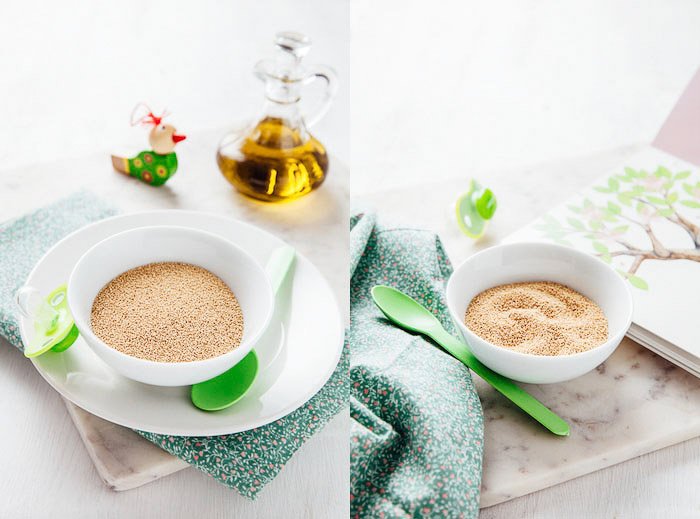
When choosing props, consider their color, shape, and size. The props should be neutral or in the brand colors. The baby food brand’s colors were green and white, so I used these colors in all my photographs. You can see that in the case of the book, I opened it up to a page where it had an illustration of a tree with green leaves.
This is the kind of attention to detail product photography demands.
Be sure to avoid any props with logos, or Photoshop them out! Remember what you are advertising. Props should not cause confusion about what is for sale.
Be Aware of Scale
Scale is extremely important in any kind of still life or product photography. Objects have a tendency to look much larger to the camera. Scale is choosing objects that work with each other and the product in terms of how big they appear next to one another, and to the camera.
If they are too big, or look too big, they will dwarf the product and will detract the eye, and therefore the attention, away from the product. Most likely, any props you use should be on the small side.
Use the Right Background
The background you choose is just as important as the props. It should work with the product and carry the same aesthetic and message. For example, if your product is something rustic or handmade, a wooden background may do very nicely.
If you’re creating lifestyle shots, you might use colored poster board or craft paper, wood panels, pieces of marble, fabric, or even wallpaper.
Simple backgrounds often work best. Something with a neutral color and perhaps a bit of texture is ideal. A concrete effect background looks great with modern and streamlined products. Plain white is good for e-commerce types of shots, but for lifestyle images, a white background with some texture will look more interesting.
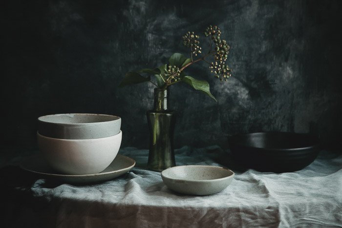
The image below shows a line of stoneware dishes sold in a variety of blues, greens, and neutral colors. I shot the items with a small branch of leaves to add a bit of texture as well as natural element–without being too distracting.
The background I used was painted with colors found in the products. The texture of the background as well as the tablecloth added interest but didn’t detract from the dishes. Overall, the image has a moody feel that fits with the heavy ceramics.
Showcase the Product
Remember that the whole point is to showcase the product. It can be easy to get carried away with props and the other elements that go into creating a pleasing image. But these should always support the product, not take over the shot or become the focal point.
You can showcase a product in several ways. For a unique perspective, you can hang products if it works aesthetically to style them that way, or place your product in different settings such as outdoors. You can also show people using the product.
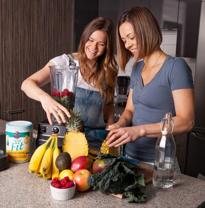
In the image below, the superfoods product shows people using the product. The picture gives a potential buyer a clear idea of how to use the product. Showcasing it alongside a lot of fruits and vegetables puts the idea of health in the viewer’s mind, and the produce also adds color and interest to the image.
This makes the image more dynamic than a simple product shot on a white background.
Think of where your product is used the most when you’re looking for a location for the shoot, or thinking of the environment you wish to create. For instance, spa and bath products are used in the bathroom, so a marble or tile background would create that connection between the product and a natural setting for its use.
Also note that when consumers browse online, they will take a closer look at a detail that looks different or interesting. Be sure to highlight any unique features in a way that doesn’t feel too forced.
Composition and Creating Balance
The most difficult aspect of styling product photography is creating balance while showcasing the product. You should consider props and other elements, even color, supporting elements that do not detract from the product itself.
In addition to taking care that your props don’t overshadow the product, make sure that you communicate the size of your product. One of the biggest frustrations consumers have about purchasing online is that the product doesn’t look like the picture, or the amount of the product is less than they expected.
When it comes to composition, certain compositional tools can help you place your products. The Rule-of-Thirds for example, states that the human eye is naturally drawn to the area that is about two-thirds up from the bottom of the photograph.
Imagine the photo you are taking broken down into thirds horizontally and also vertically. The image has nine sections–three sections across and three sections down.
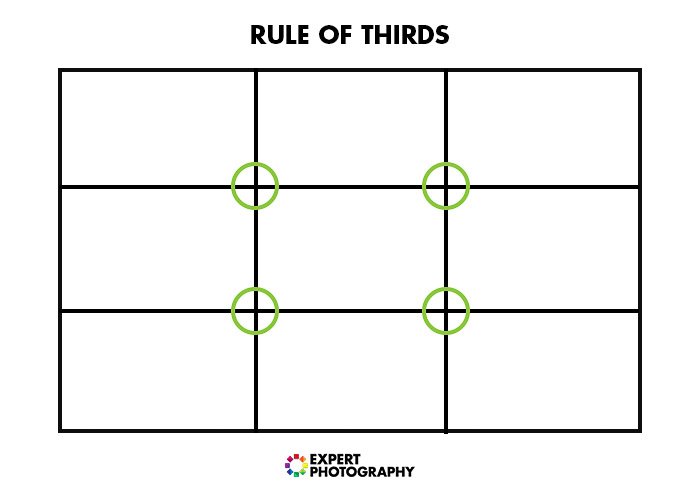
You will notice that there are four places where the lines of the grid cross. These four intersections are the areas in the photograph that a viewer is most drawn to naturally. We tend to look at one of these intersecting points first, instead of the center of an image.
The theory is that if you use the Rule-of-Thirds, your photo will be more interesting and correctly balanced. To make use of this compositional tool, you should place your subjects or points of interest in these key areas.
However, rules are made to be broken. None of this means you can’t compose an image that works outside of these parameters. It’s simply a guideline to help you place your objects or point of interest in a way that is naturally appealing.
Another easy compositional tip is to place the products or other important elements along diagonal lines. Diagonal lines are a simple and dynamic way to bring life and energy into a composition.
Diagonals act as leading lines to draw the viewer’s eye into the picture. They create a path for the viewer to follow through the photograph, leading them to the subject. Diagonal lines can also suggest perspective and give the image more depth.
There are many ways to implement diagonal lines. For example, from top to bottom or off center within the frame.
Our eyes naturally move through an image by moving from left to right. A diagonal line originating in the bottom left and moving up and then right takes the viewer through the image in a natural way. Try positioning your product and props in this way.
If you’re using post-processing software like Lightroom, you can find compositional overlay tools that you can place over your image as a guide while composing your shots.
Conclusion
Ultimately, what you’re doing with product photography is selling a lifestyle. Your images should be aspirational and create a desire in the customer to own the product. If you’ve done that, then you’ve done your job!
Why not keep improving by checking out our still life photography tips or food photography ideas!