Color in photography is a powerful tool to control the mood and grab the viewer’s attention.
Orange and blue make the most common color combination in photography. Do you know why? It’s all about color theory.
This article will look at when and how to use orange and blue to improve your photos.
Orange and Blue Color Theory 101
Color theory is a set of practical guidelines on the visual effects of color combinations. It explains things like:
- How to mix colors;
- Why certain colors are pleasing in an aesthetic way;
- How to find pairings most suitable for your particular goal.
Color theory is a visual design element that we can use to create interest in our image. It uses the color wheel to represent the relationships between colors.
The color wheel shows how colors are organised by hues. And it provides the most common types of color pairings.
These are analogous colors, complementary colors and monochromatic colors.
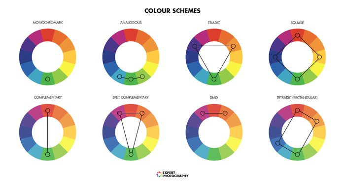
Complementary Colors
These are opposite each other on the color wheel. The three traditional sets of complementary colors are:
- Red and green;
- Yellow and purple;
- Orange and blue.
They come from the model where the primary colors are red, yellow and blue.
Color theory states that the bigger the difference between two colors, the higher the level of contrast.
When two complementary colors are next to each other, they produce the highest contrast level.
Analogous and Monochromatic Colors
Complementary colors are powerful and intense. Nowhere is this more obvious than when comparing them with other color schemes.
Analogous color schemes use colors that are next to each other on the color wheel. They harmonise well with one another.
Analogous colors are perfect for discreet and unobtrusive photos. If you need an image with a smooth and calm look, use analogous colors.
Monochromatic colors are derived from a single base hue and extended using shades, tones and tints. (en.wikipedia.org)
It helps the viewer to make sense of an image quicker. Your brain can understand the overall mood in a split second.
Monochromatic color schemes are perfect for images where you don’t want one element to stand out.
Why Use Orange and Blue in Photography?
Using contrasting colors is an easy way to make your image stand out. This works with different color pairings. But for some reason, the combination of orange and blue is the most notable one.
This color scheme is also known as ‘orange and teal’ or ‘amber and teal’ between filmmakers.
There are many reasons for using it. Let’s take a look at them one by one.
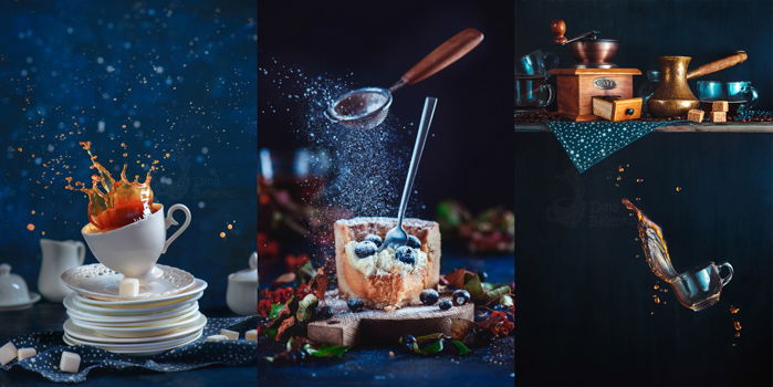
Orange and Blue Have the Highest Contrast
On the color wheel, orange and blue are opposite each other. The contrast between their exposures is higher than any of the other complementary color combinations.
Set your color wheel to grayscale. See how orange and blue transform into shades of grey with the most recognisable contrast.
This helps our brain to recognise objects with the smallest effort. Our minds love simplicity.
Blue and Orange Emphasise Each Other
Blue and orange are dominant colors, even if used in a monochromatic color scheme. But include both in the same image, and you’ll maximise the power of this combination.
The cold of the blue tones emphasises the warmth of the orange ones. And vice versa.
Besides, fiery orange and cool blue are associated with opposing concepts. Unlike other pairs of complementary colors.
They represent warmth and cold, earth and sky, land and sea, fire and ice. This extends to more abstract concepts, as well, such as passion and indifference.
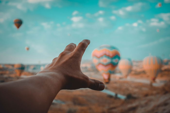
Blue and Orange Tones are Close to Ambient Light
Natural light ranges from cool blue to warm orange, depending on the light source. Warm orange light against a blue sky is the definition of the golden hour.
The orange and blue duet appears a lot in nature even if you might not be aware of it. But once you start thinking about it, it’s everywhere!
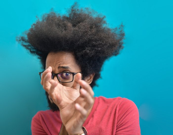
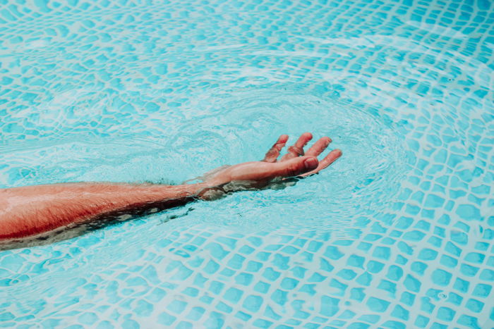
Use Blue and Orange to Make Skin Tones Stand Out
Pushing blues into the shadows will make skin tones stand out from the rest of the image.
You can turn up the shadows to the cyan end and the highlights to the orange. Voila!
You can separate your model from the background in a visual way, and the image is easy to understand.
How to Use Orange and Blue in Photography
Orange and blue are excellent when used on purpose. If it’s applied automatically, without thought, it becomes a disaster. You don’t want your photo to look like a frame from Transformers 2.
In fact, there’s a strong parallel between photography and movies. Some filmmakers use orange and blue to distinguish day and night, interiors and exteriors, and reflect different moods.
Other color everything in orange and blue because it looks cool. You want to be like Wes Anderson. Not Michael Bay.
So, how can we do it?
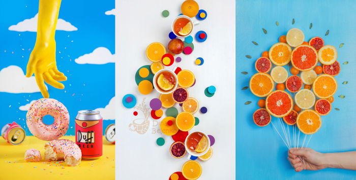
Experiment With Color Blocking
The best way to get a sense of color is to experiment with bold colors and geometric shapes.
Pick a background, orange or blue. Pick some objects of a contrasting color. And try to arrange them in a minimalist composition.
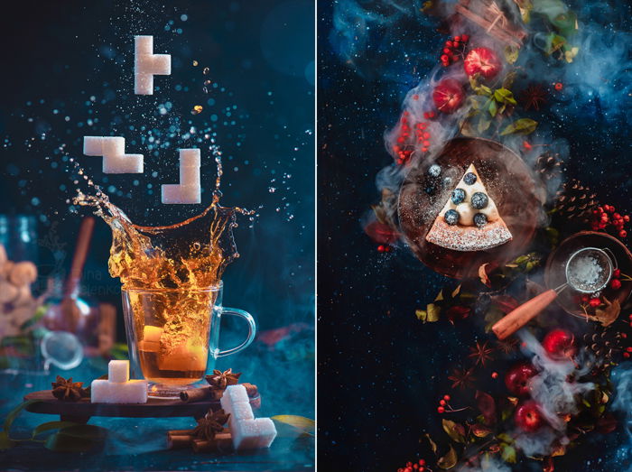
It could be a balance between two bright tones or a single pop of color. An orange on a blue plate. A blue napkin with apricots.
A redhead against the blue sky. A man in a broad-brimmed blue hat. Start simple, keep geometric forms in mind and see where it will lead you.
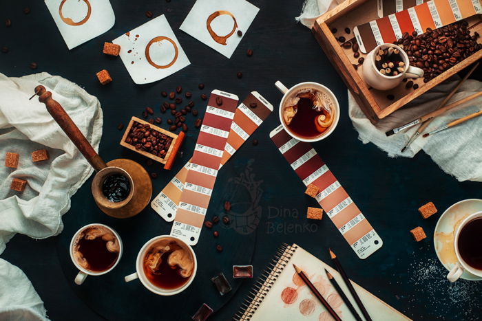
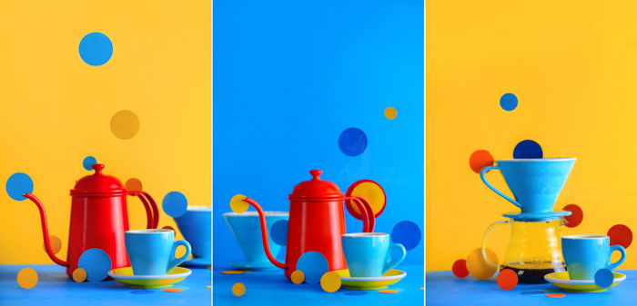
For this series, I used brightly colored props. I looked at the tone of the teapot and cups. Then I decided to make them pop against a complementary colored background.
To add some variety to my palette, I cut out a couple of red paper circles and scattered them through the scene.
The result is a simple eye-catching image.
Use Orange and Blue for a Natural Look
You may want your photo to have a more balanced, natural look. But at the same time to save the appeal of the high color contrast.
In that case, you can look for objects with natural bright colors. Designers often complain that orange and blue images look the same.
Granted, movie posters with orange people against abstract blue backgrounds are to blame. But we can do better than that!
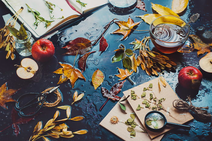
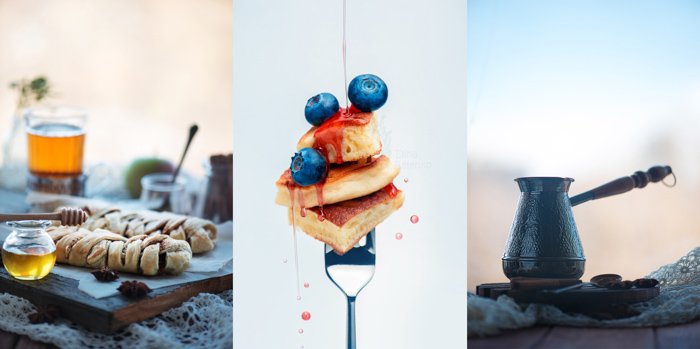
Look for blue and orange details. Food photography is a good option here, like maple syrup drizzled over blueberry pancakes.
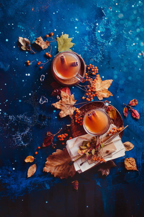
Use Orange and Blue for Your Point of Interest
Make sure the dominant detail is the one you wish to emphasise most. The first step is to pick the color of an object and the color of the background.
Choose a bright, saturated object which stands out. Then match it with the contrasting background.
For example, look for a blue surface and make an orange object your main hero.
My favourite model here is tea. It has this warm glowing look that makes me smile every time I see it. Pair it with autumn leaves or cookies, and you get a gorgeous picture.
The background could be a sky-blue paper or a dark-blue wood. The important thing here is to match the saturation.
If your blue is washed-out, your orange should be rather pale too. And match a vibrant shade of blue with a vibrant shade of orange.
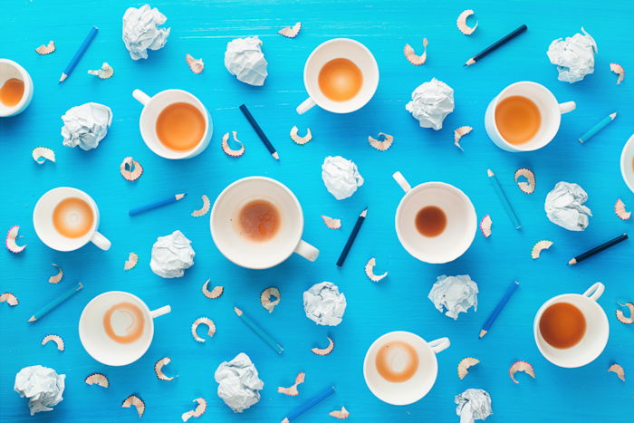
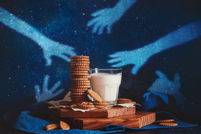
Use Contrast to Highlight the Details
You don’t have to use orange and blue for the entire surface of your image. You can keep the background neutral and use spots of color to create the contrast.
Keep your composition in warm tones and add some bright blue details. These tiny details will make your image come to life.
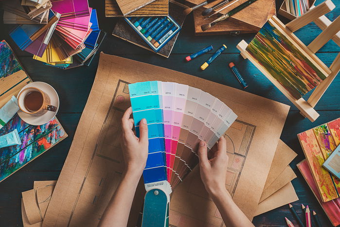
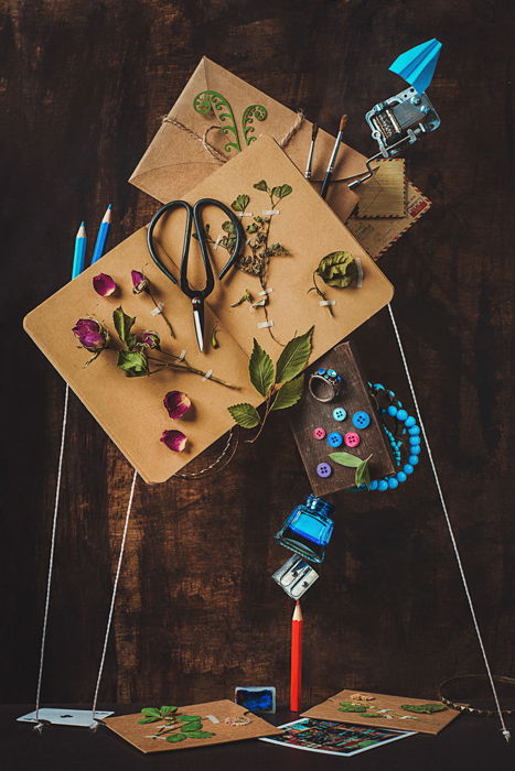
 My favourite example is this ‘Draw Your Home’ series I made.
I created a still life photo using craft paper with a flat layout as a background. I used warm colors for most of the props: papers, hands, wooden boxes.
Pops of blues (pencils, tiles, swatches) added a much-needed contrast. They also provided color balance.
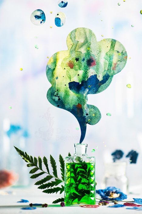
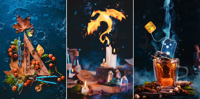
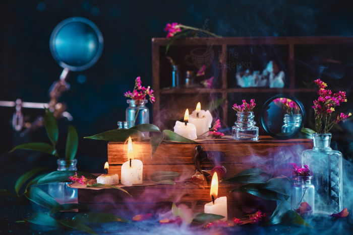
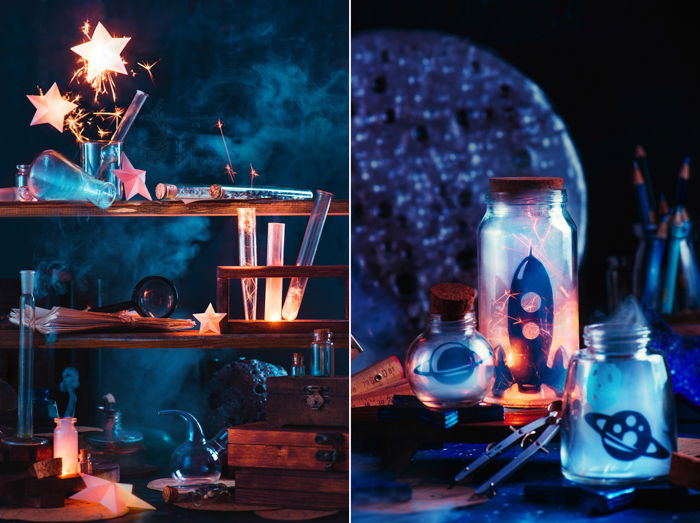
Another way is to shoot the orange and blue duet against a dark background. This way, they can work together on equal terms. You don’t have to overdo it, though.
Try orange tea with bluish steam. This still lies in amber and teal spectrum. But looks non-processed and natural.
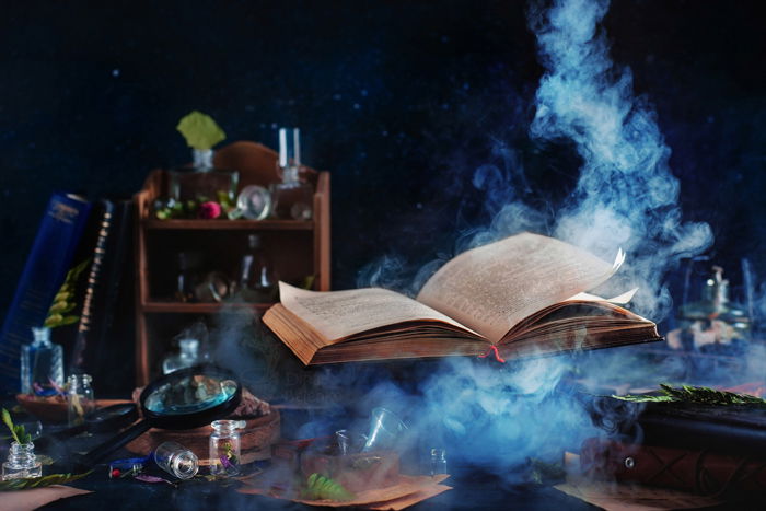
 My favourite example here is candlelight and smoke. The warm orange of a candle fire and cold misty blue of rising smoke create a natural contrast.
And it makes your picture fascinating to look at.
This doesn’t work only with candles. Sparklers and fairy lights look interesting even by themselves. But pair them with spots of blue, and the entire image looks magical!
Avoid Using the Brightest Shades of Orange and Blue
You don’t have to work with the brightest shades of orange and blue to create visual contrast.
 You’ve decided you’re going to use orange as your background color. This may seem a little intense.
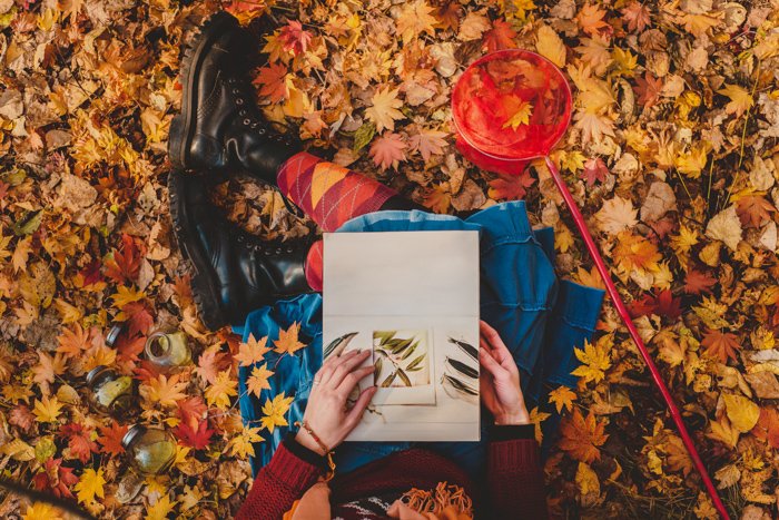
But wooden backgrounds also lie on the orange spectrum. So does craft paper. Or autumn leaves.
Notes and Keepsakes is one of my favourite photos. I used a wooden background and a couple of craft paper notebooks to set the warm and cosy mood.
The rest of the little props are sky blue. Natural wooden shades can be a great replacement for vibrant orange.
It still contrasts with darker shades of blue but has a more tamed and well-balanced feeling.
Add Some Variety to Your Palette by Using Other Colors
Don’t limit your palette to these two colors. You can base color contrast on orange and blue. But add objects of other hues to provide variety.
In food photography, you can add accessories which bring out the color of your main dish using contrast.
But minor details like scattered berries or herbs can differ from your main palette. And the green of the herbs can bring out a very subtle contrast of pastel shades of orange and blue.
Other types of color contrast can play the lead in your experiments too. Red and green is another common combination. So is purple and yellow.
I like to diverge from the straight line between two complementary colors. This means pairing light blue not with orange, but with pink.
There are many hues and tints that you can use within the wheel to personalise your color choice.
Conclusion
Color theory is complicated and versatile. There are no fixed rules to go by.
Basic facts about color can provide insight into your choice of palette. But the actual guidelines are much more nuanced. Feel free to experiment and discover your own unique color palettes!
Looking for more tips? Check out our new post about color saturation next!