Typography photography is an excellent way to add meaning and layers in your imagery. It can be used to add meaning, emphasize a point, or simply to make your photos more interesting. Here are eight great tips for using text or typography in your photography.
The Benefits of Typography Photography: Why Add Text in the First Place?
The way typography works in your image strongly depends on the reason you added it in the first place.
Do you want to say something and make your message as loud and clear as it can be? Or do you want to create a small Easter egg for especially keen spectators to notice and enjoy?
I believe that there are two main ways to use text in photography:
- as an artistic detail, which adds to the atmosphere,
- as a message, and a leading hero of an image.
Artistic detail is important to your story but doesn’t take up the entire image.
It could be a handwritten text in an open notebook, a memo left on a monitor, or a title on a book cover.
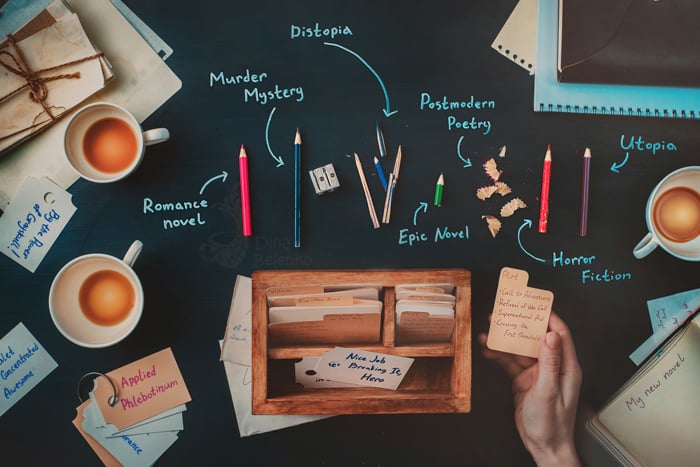
In this image, I used crumpled paper balls to indicate the messiness of a real workplace. And I wrote some literary tropes and elements of a classic Hero’s Journey on stickers and pieces of paper.
I don’t expect my viewer to read these notes closely. If they do though, they will find something believable and authentic.
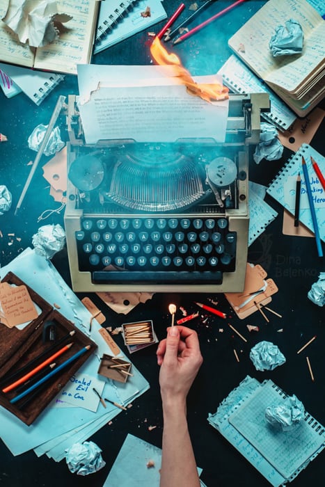
Here text works mostly as a nice atmospheric touch
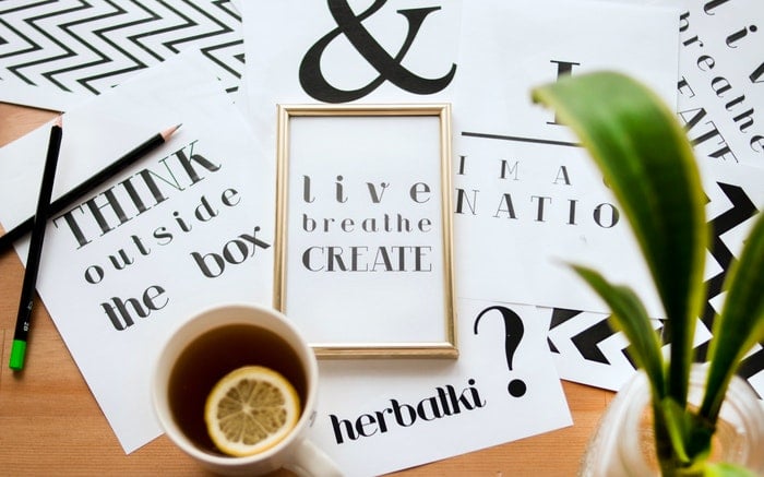
If the text is a hero of your image, there’s no way to ignore it. In the image below, the text is the main reason the photo was created in the first place.
It takes up most of the space and practically is the model whose portrait you’re trying to create.
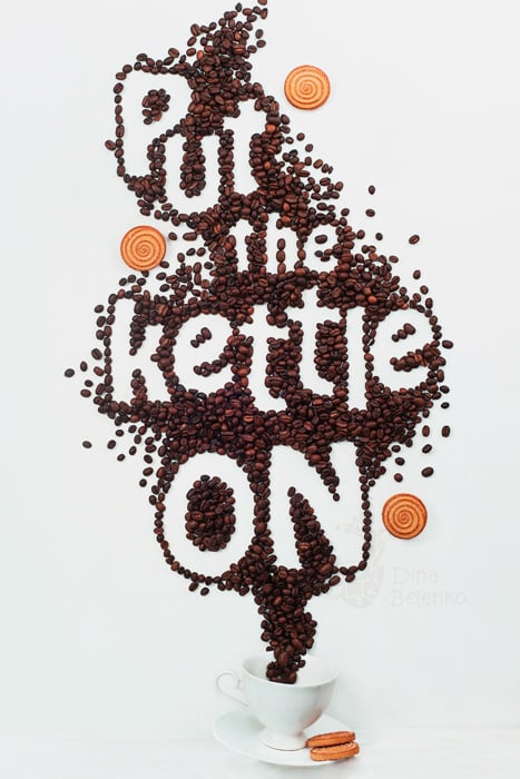
Text is definitely the lead actor in this image
There can be some middle ground cases too. But most of the time it depends only on how much time you want a viewer to spend on the text.
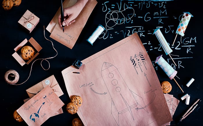
In this image, the text doesn’t take up much space, but still plays an important role in the narrative
Make Details Accurate to Add Realism to Your Images
Sometimes viewers don’t even notice your carefully written book titles or scattered artist’s notes.
But for every viewer who doesn’t pay attention to details, there’s ten who will point out that your book titles are out of place or your witch’s spell is gibberish.
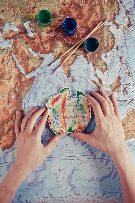
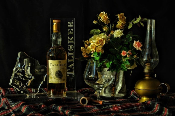
I don’t expect the viewer to actually read the toponyms of this island, but if they do, they won’t find random nonsense
I often see this in images by Russian photographers who are trying to shoot something meaningful but rely on vintage props to carry their story, not on a well-thought idea.
They use newspapers with modern titles or a pile of old letters with names and addresses that don’t make sense in this time period.
Things like that are not easily noticeable, but they create the feeling that something is off. So be careful not to put irrelevant text in the frame.
Create Props You Can Reuse
If the recurring theme in your photos is writing, fill a couple of pages with notes on story structure or working on a character.
I shoot a lot of magical scenes, so I have a text I put on every scroll that is slightly out of focus but still could be readable. It’s a quote on the safety of conducting magic experiments, so it works in every scenario.
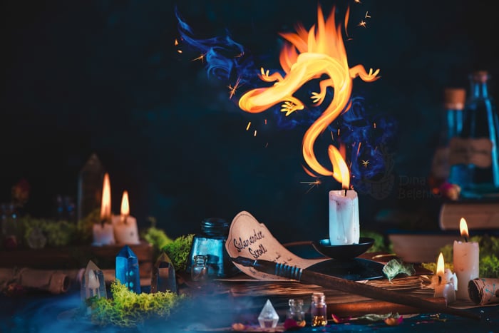
The title Salamander Scroll is clearly readable, but the text below is hidden behind a pen. Where you to read it, it would still make sense though.
Include Typography That Matches the Theme of Your Shoot
The easiest way to include typography in your photos is using traditional tools like pencils, pens, ink or paint. It works especially well with text as a detail.
Add stickers, a memo note or a tag with a meaningful inscription onto your main subject. It could be an address on an envelope, a title of a book, a scroll with the first words of a spell or a quick note on scrap paper.
For example, I made some travel stickers for one of my shots in the Endless Book series. I needed them to indicate that this is not just a suitcase, but a space traveller’s suitcase.
Each sticker has an astronomy theme, like Wormhole Travel or Moon Travel Int.
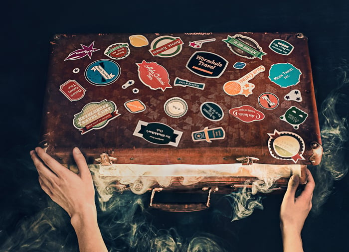
I printed these stickers in the nearest print shop. It was cheap and quick.
You can also create your own book titles. Print book covers if you’re going for a more professional and tidy look. Or simply wrap your book in colored paper and write a title by hand.
If handwriting is not your forte, use your favourite text editor like Word or Pages and print it out.
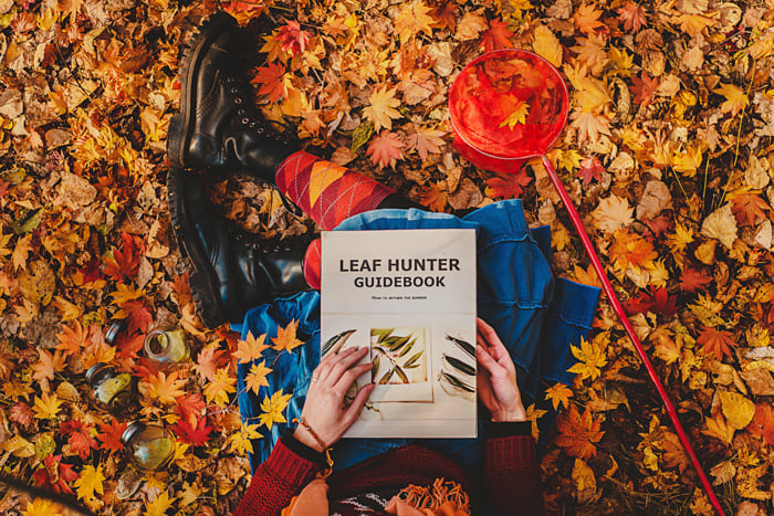
Working with a model was actually harder than designing a book cover
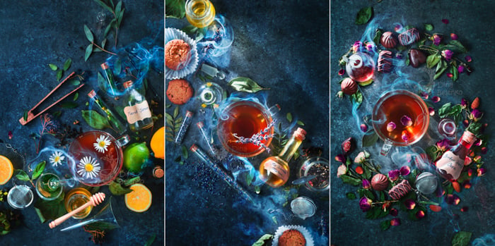
My favorite example is writing labels for magical potions. I thought about potions I personally may need, invented names for them, like No Worries Mixture and Broken Heart Cure.
Then I picked out the elements that could be ingredients of those potions. Or at least connected with them thematically.
After that, I cut out craft paper labels and simply wrote down the potion’s names with a pen. It’s an easy setup for creative photography you can recreate at home.
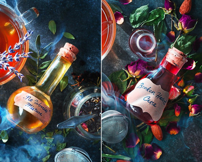
The labels I made for potions in Enchanted Tea series
Mix Chalkboard Writing With Real Objects
Chalkboard in still life photography is invaluable. The combination of a flat drawing and real objects can transform ordinary objects into something exciting with a couple of chalk lines.
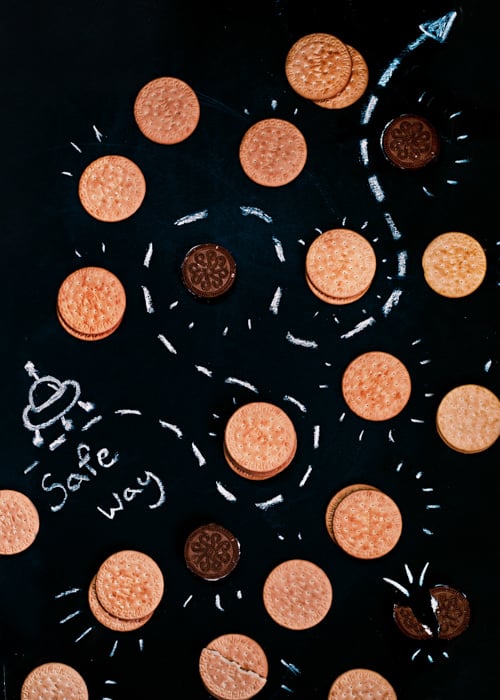
Chalk is also useful as a typography tool. Indicate a safe way to travel through an asteroid belt of cookies. Wish someone Merry Christmas. Or explain which tool does what in your character’s workplace.
You can arrange a flat lay of a recipe and note down all the ingredients as well as describe the cooking process.
Or maybe wish someone good morning with a served breakfast and a chalk inscription.
This is how a drawing incorporating chalk looks like…
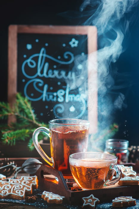
…and this is lettering on a chalkboard adding background detail to this Christmas photo.
Keep the Chalk Piece Wet
I prefer chalk markers because they provide a thinner and more accurate line. If you only have regular chalk, keep it wet. Drawing with wet chalk is much easier.
The lines will look a bit faded at first, but let them dry.
Create Typography Out of Everyday Objects
Finding objects that correspond to letters can be difficult, but it’s always fun. The letter O is the easiest and the most obvious one. Represent it with a donut, an orange, a vinyl record or a tennis ball.
Other letters are much more fun! Bend an old-fashioned ruler two times to get N. Take a spiral of lemon peel for S.
And make a lowercase a with a coffee cup stain paired with a Pocky chocolate stick.
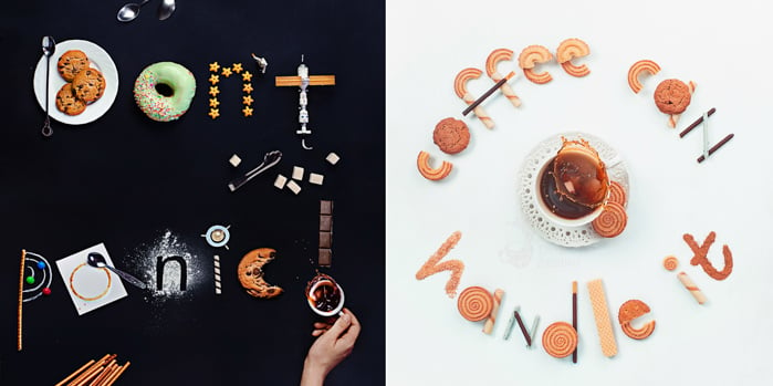
Bonus points for finding objects that belong to the theme of your photoshoot. It would look strange if you make letters simultaneously out of food and, say, carpenter’s tools.
Pick your theme first and look for letter-like objects inside it. For example, you can make the words Drink me from potions, little bottles, keys and other references to Alice in Wonderland.
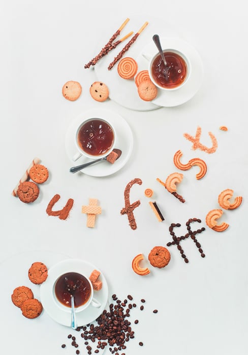
You can often modify your objects so that they better match the letters. You can cut your cookies in half, combine them with waffles and use chocolate sauce to draw additional lines.
Form Letters With Negative Space
If you have a lot of tiny objects, try using negative space to form your letters. You need to mark the edges of the letters first.
Draw them on your background with a piece of chalk or a pencil making thick lines that are easy to erase.
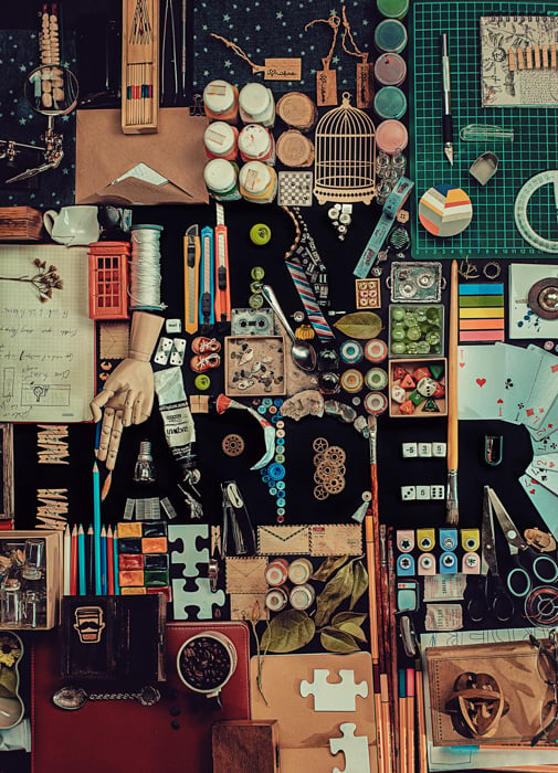
After that, you can start to lay out the items around the template. To make Try Harder I gathered all the props related to artistic work I was able to find: colored pencils, sketchbooks, brushes, paints, fabrics for patchwork and stamps for scrapbooking.
You can use a variety of objects for a picture like that. Say, get some nuts, bolts, and screws from the garage. Or disassemble the flower bouquet and use the buds, stems, and petals.
Or maybe you have an abundant collection of threads, coils, and buttons?
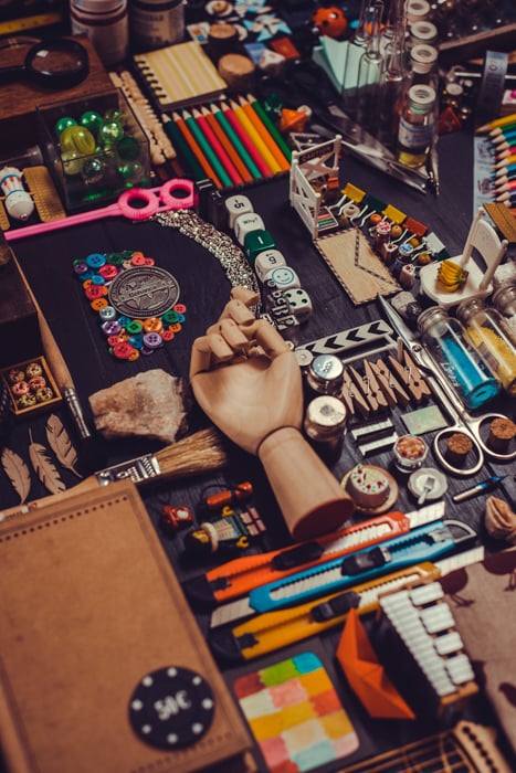
Place your objects on the edges of the letters, forming an outline. It would be great if you can find items that mimic the shape of letters. For example, curved tubes of paint for the arc in the R or half a leaf for the hole in the D.
After you complete the basic outline, fill the remaining space with smaller objects. Large parts of the background will be visible only under the letters.
Erase letter markings and take a shot!
Use a Paper Template to Create Letters
This way is great for people like me, who don’t have beautiful handwriting and would rather work with an existing type. Choose typeface with bold, easily recognisable letters. Avoid thin serifs and subtle lines.
Print the text you want to use and cut it from a sheet of paper with a layout knife. Here’s your template!
Now you need something free-flowing and powder-like. Flour, sugar, sprinkles, confetti, cocoa powder, spices, tiny petals, sand, rice, tea leaves, little buttons, anything you can scatter.
Fill the inner counter of your letters and carefully remove the template with tweezers. Add additional items of your typography flat lay and take a shot!
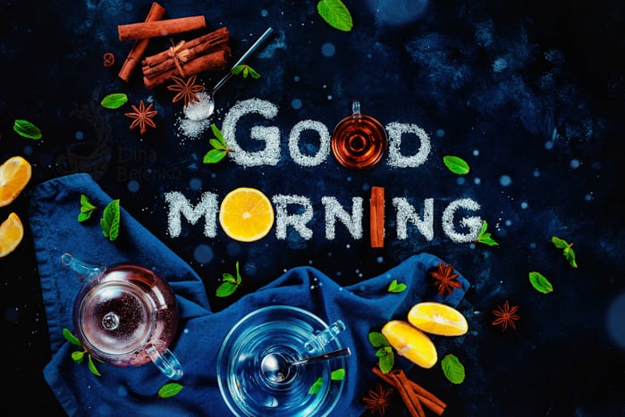
Sugar is perfect for typography photos
Or you can save the paper letters and scatter powder around them. That way the inner contour of the letters would be empty, like in the picture below.
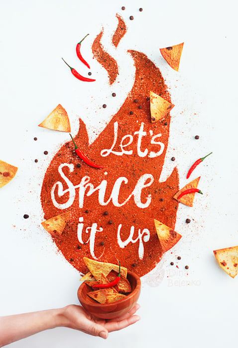
You can cut out a template for the powder too, like the flame in this image.
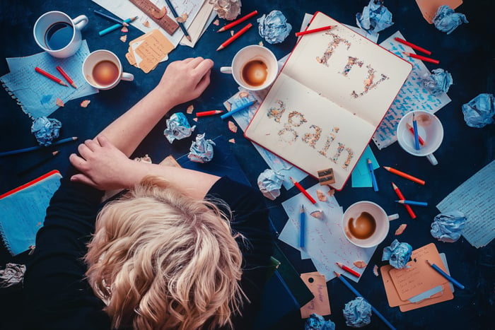
You can even use pencil sharpenings.
I love this trick because of its versatility. You can use a lot of materials to make letters. That’s suitable not only for food typography but for a variety of still life photoshoot experiments.
See, for example, how it works with soil in this gardening themed still life.
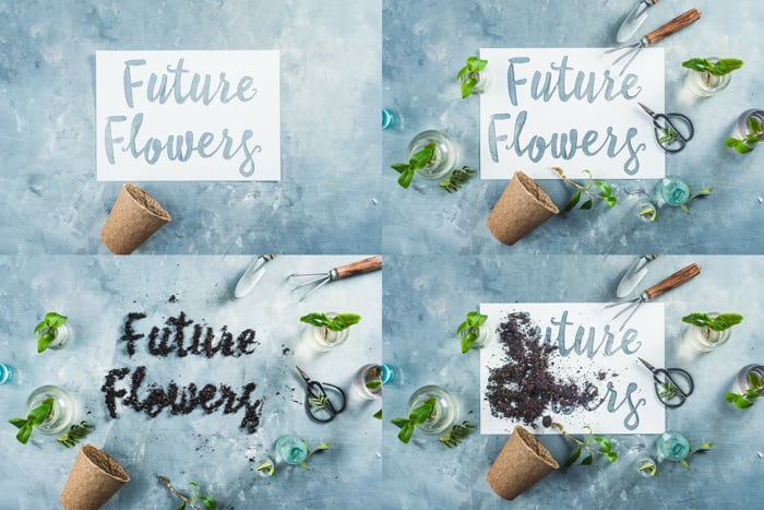
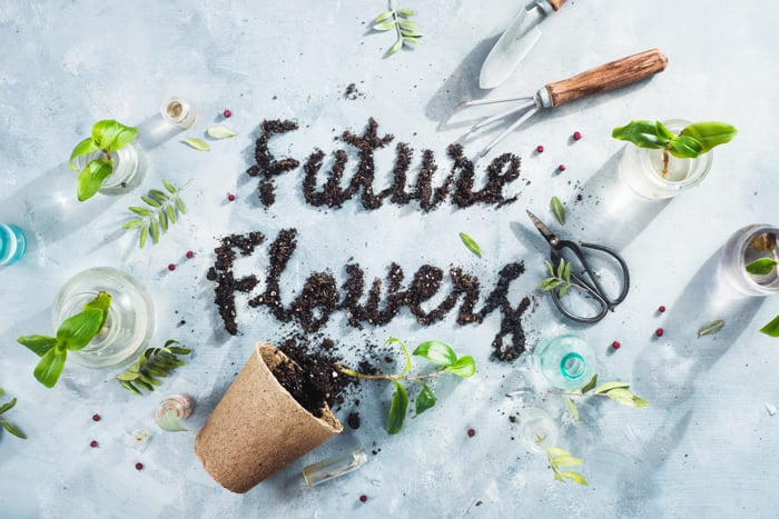
The best thing about using templates is the opportunity to work with liquids. Attach your template to a background with double-sided tape to prevent it from curling because of moisture. Fill it with honey, jam, syrup, sauce, chocolate or ketchup using a small syringe or a hard brush.
Surface tension and the edges of the template will hold the liquid in place and prevent it from spilling.
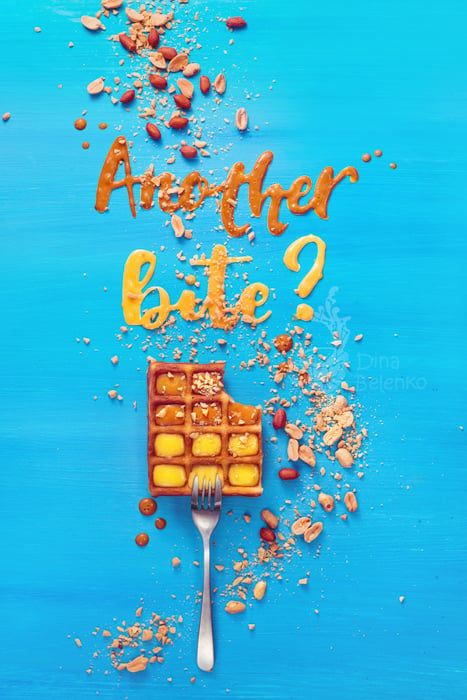
Typography experiments with peanut and caramel syrups
Create Typography With Baked Goods for Creative Food Photography
If you feel like making letters is a lot of work, well, you’re right. But cutters and molds can make it a lot easier. Let’s look at what they can do.
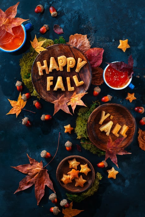
Alphabetical cookie cutters can be a blessing when you want to try your hand at food typography. First of all, use them to bake cookies or gingerbread.
Plan what you want to say and cut several versions of each letter in case something goes wrong.
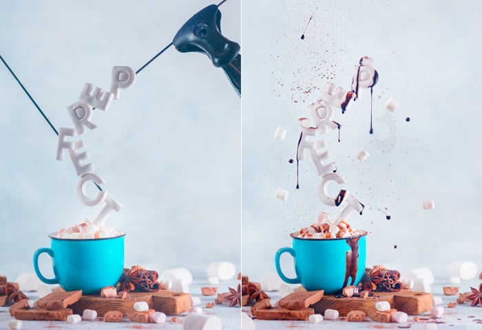
Second, use them for cutting letters out of other soft materials. Marshmallows are a perfect example. Drop marshmallow letters in cocoa creating a message in a cup.
Or combine them with levitation and drops of chocolate. Think of other foods soft enough to be cut by cookie cutters and feel free to experiment.
Marshmallow typography in one GIF
Last but not least, use cookie cutters to make decorative pie crust. Before you put the final layer of dough on your pie and leave it in the oven, add dough letters as you usually do with decorations like stripes or leaves.
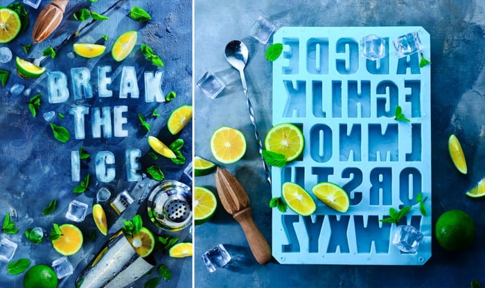
There’s also a lot of alphabet silicone molds. Use them to make letters out of ice, chocolate, caramel or even ice-cream.
Most typography photos are flat lay images. But molds provide volume, so you have more room to experiment.
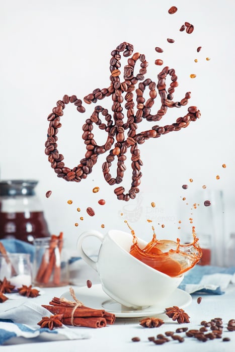
Let your photos literally say something. Experiment with templates, cutters, and molds to find your own way in real typography photography.
