Color correction is a crucial part of photo editing. Sometimes, the colors produced by are camera are not entirely accurate. Photographers must use digital editing software to make adjustments for an accurate representation.
Today, we will guide you through a color correction in Lightroom. Luckily, this program has numerous ways to give us control over the colors in our images. We will take you through a few of these methods so you can choose the one best for you.
Color correction is important in photography as we want to show colors accurately. Each camera sensor will read light and color in different ways. We can use digital editing software to fine-tune these colors to be as accurate as possible. We can also use these processes to enhance the colors.
Using a color card is crucial in fashion, editorial, and product photography. This card has accurately printed colors that will help digital editing software achieve the right colors. Professionals’ use of a color card shows that they understand how hard it can be to achieve accurate colors.
Most of us will be shooting with auto color temperature on. This means your camera will read the room’s ambiance to try and offset the cool or warm tones depending on the lighting environment.
If we step into a room with a deliberate color cast (red lights, rooms affected by screens, etc.), our camera will try to counteract this. Color correction will allow you to bring back the original color cast.
Color correction is also important to more casual genres of photography, as it allows us to get the most out of our photographs. It allows us to push each color to have more luscious greens and deeper blues. This means it’s important to learn if you want your photos to look as beautiful as possible.
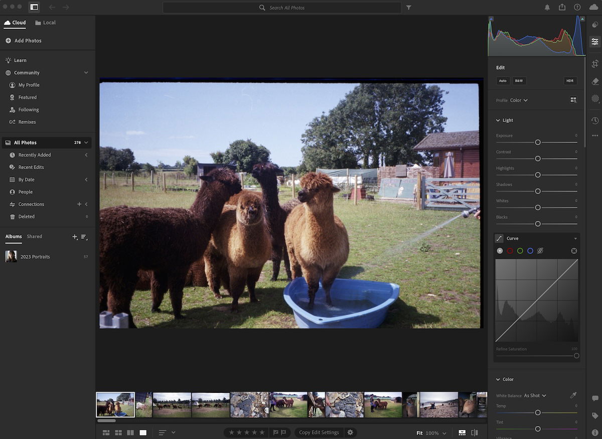
Adobe Lightroom now comes in two different versions: Lightroom and Lightroom Classic. Both versions have many of the same functions; what differs are the approaches to editing processes.
Lightroom favors a post-processing workflow that utilizes the cloud. This allows you to work from the same set of images on any device you want. This version also prioritizes simplicity and ease of use through a stripped-back interface. This may be easier for beginners to work through.
Lightroom Classic has an interface with which any photographer who has used the past versions of Lightroom would be familiar. It provides a wide range of features, some of which you may never need to use. You will find more in-depth controls and attention to detail in Lightroom Classic.
Both Lightroom versions produce the same results as the algorithms for adjustments are the same. So, it will come down to personal preference or whether you need to use a very specific process. This article will outline differences in the processes we touch on in either Lightroom version.
Let’s now explore a few methods that Lightroom provides to color correct our photographs. Each method will have a specific effect on the colors, so make sure you understand each approach.
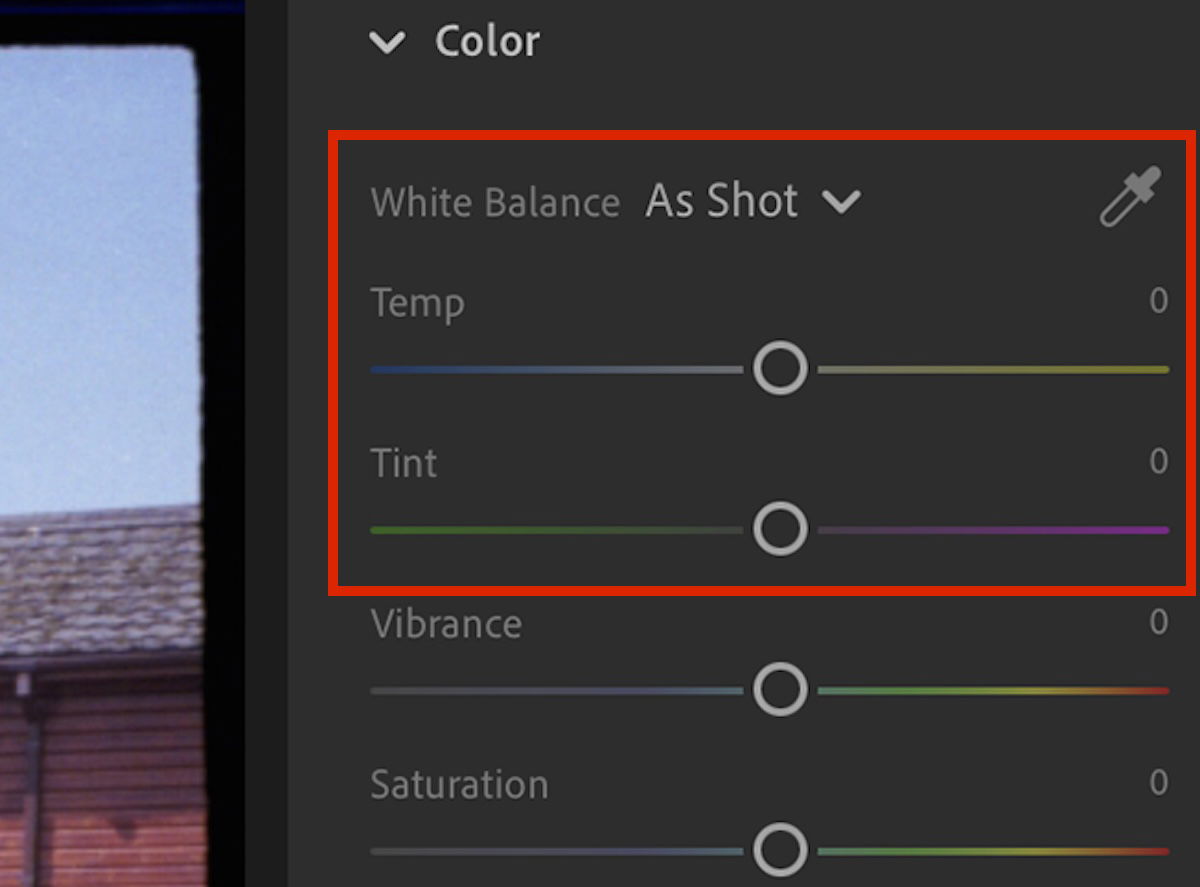
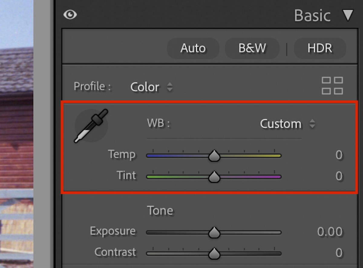
The very first set of adjustment sliders you come across in the Lightroom Classic ‘Develop’ panel are Temp and Tint. These are the easiest and simplest ways to color correct the temperature and tint of your photograph. You will find these sliders in the ‘Color’ section in Lightroom’s ‘Edit’ panel.
The temperature controls how warm or cold the image is. It does this by making the image more yellow or blue. This slider is ideal for making summer images feel warmer or conveying true cold winter mornings. These sliders are also useful for counteracting images that are too warm or too cold.
The tint controls are more suited for color correction. This slider controls the balance of green and magenta in your photograph. This is the most common color axis that can help a photograph that looks off.
A photo that is too green can look sickly, and a photo that is too magenta can emphasize red faces. This slider lets you quickly and easily adjust unwanted color casts in your photographs.
You can use the Dropper to select a neutral grey color. This will automatically fix the color cast. You have to be sure it is perfect neutral grey. This can be found on Color Cards.
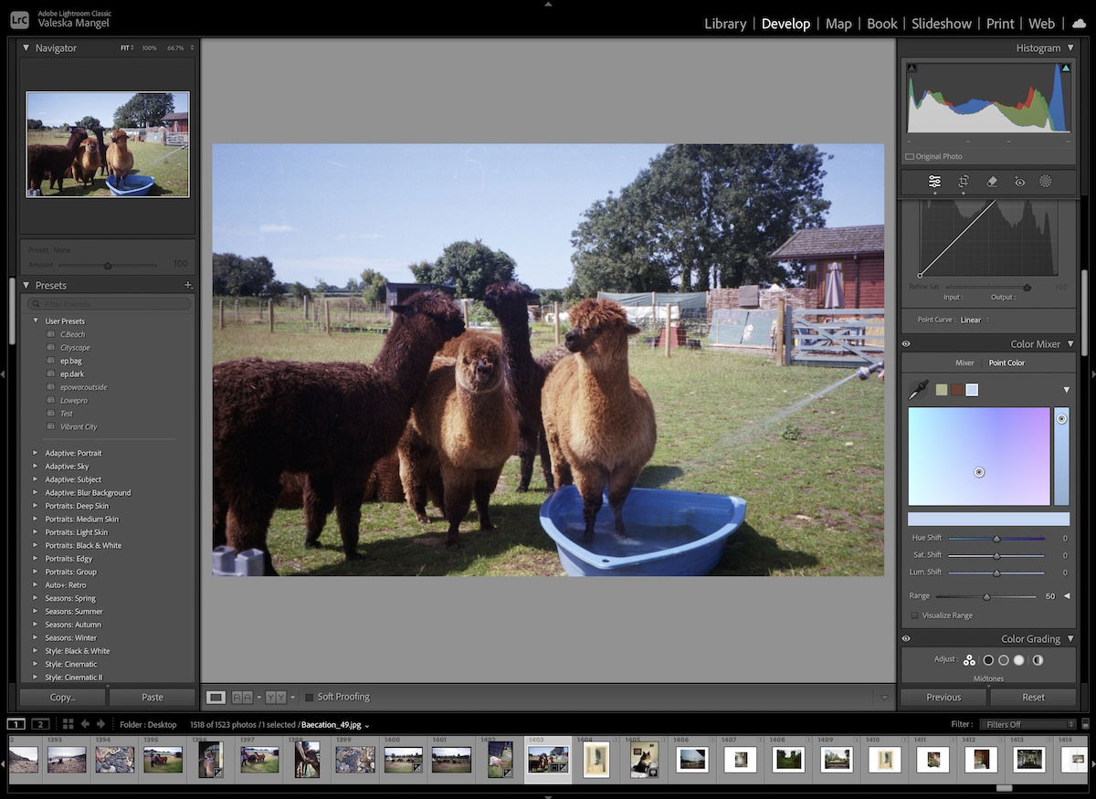
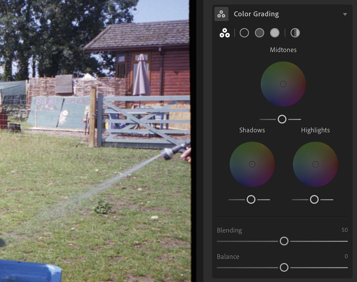
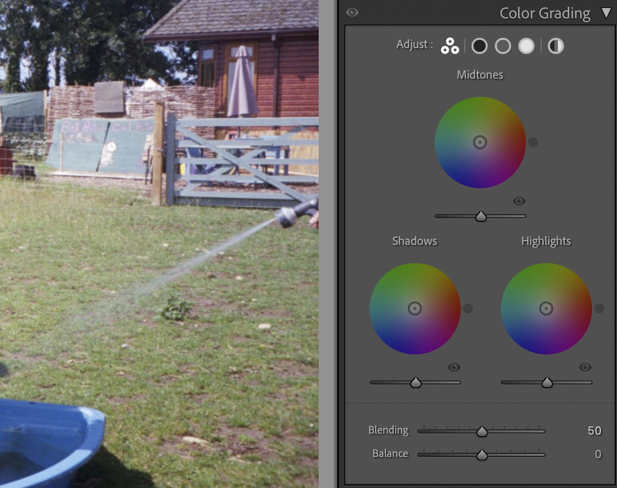
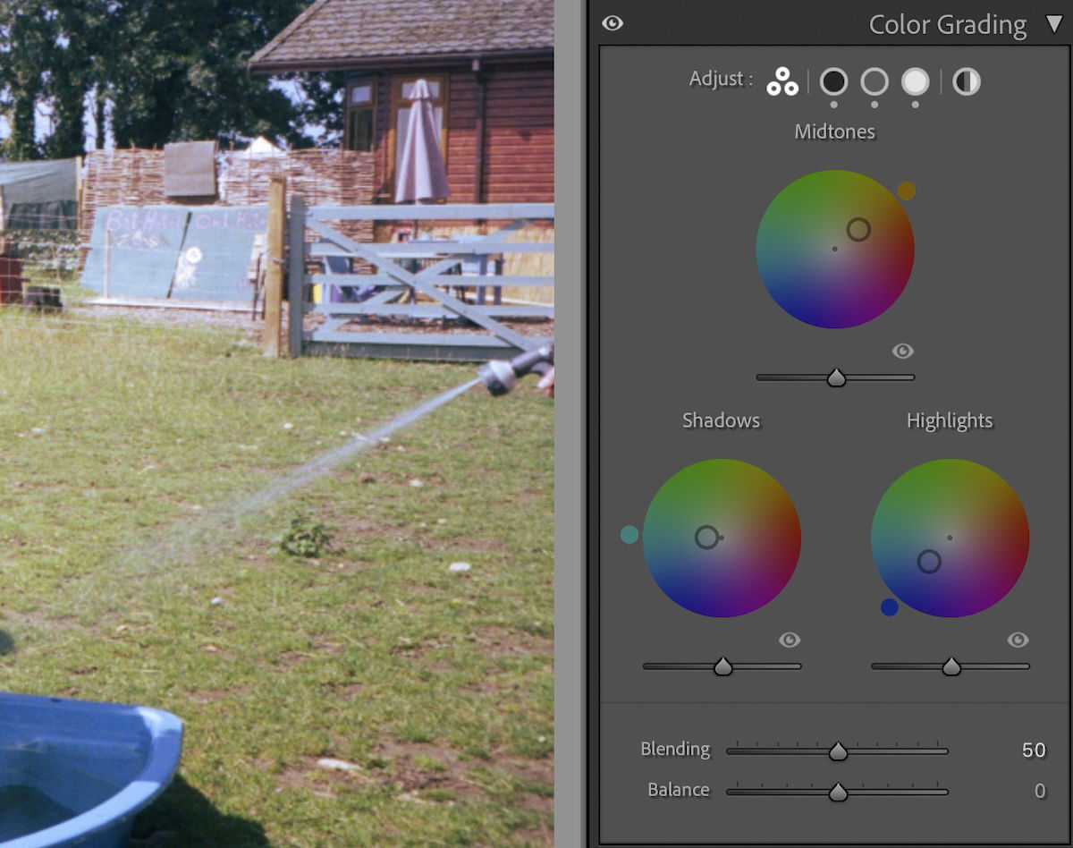
Color Grading is the most extensive and accurate form of color correction in Lightroom. Although both versions provide the same adjustment, the Lightroom interface is slightly stripped back.
You will see three color wheels. Each represents a different section of the photograph: the shadows, midtones, and highlights. You can click the circle icons along the top to get a focused view of each wheel. You can also choose to adjust the color wheel globally.
Each color wheel has a central point you can adjust. You move this point toward the color you want to add to your photo or the different tonal sections. The further you move the point from the center, the more intense the color cast.
You will notice a small grey circle around the outside of the color wheel. You can use this to fine-tune your selection. It will adjust the color selection without adjusting the intensity. Holding the shift button while moving the central point allows you to adjust the intensity without changing the color.
Each color wheel also has a Luminance slider below it. This will adjust the brightness of that particular color wheel adjustments. Below, you will also notice two sliders: Blending and Balance.
Blending will determine how much each tint overlaps between the different tonal sections. The Balance slider will determine how far these overlaps extend into each tonal range.
Adjusting the Color Grading section for color correction can be tricky for a beginner. It would help if you made each adjustment in small increments unless you are making big changes to the colors in your photo.
This is a crucial adjustment that lets you fine-tune your colors and helps you enhance them. If you remember the grass being greener or the sunset being more purple, you can make these adjustments here.
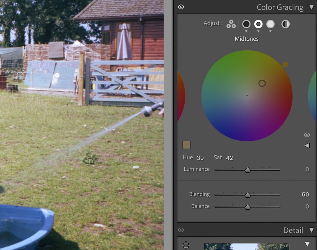
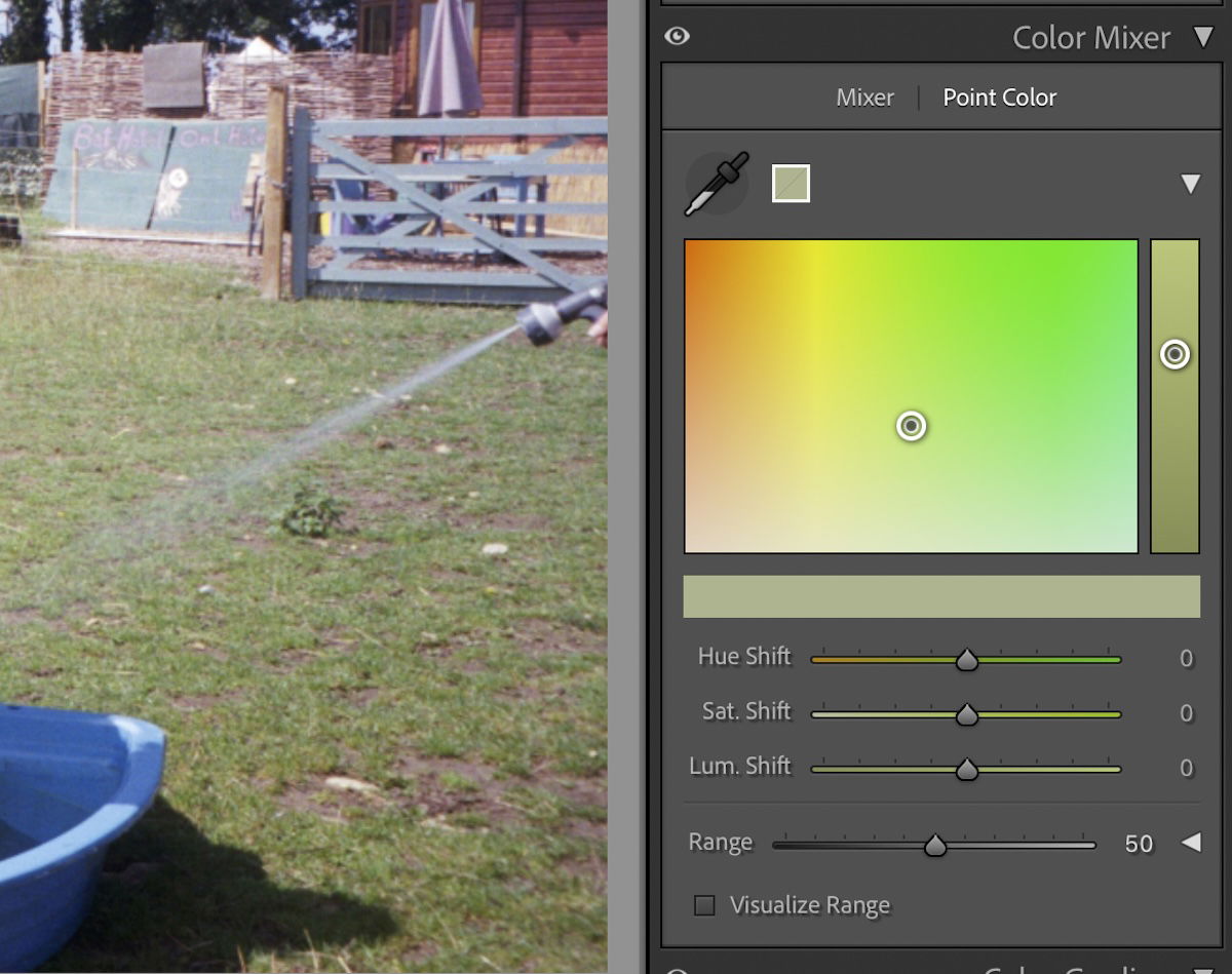
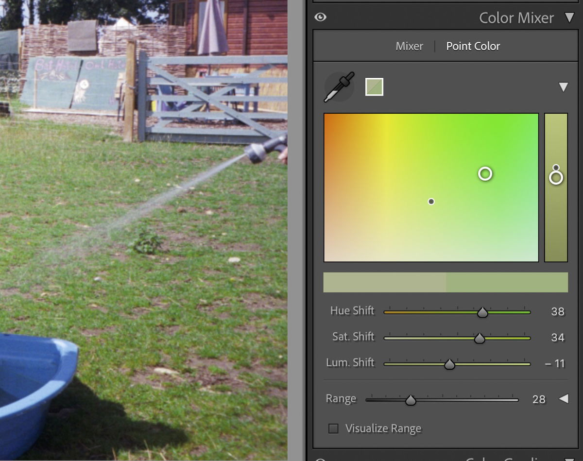
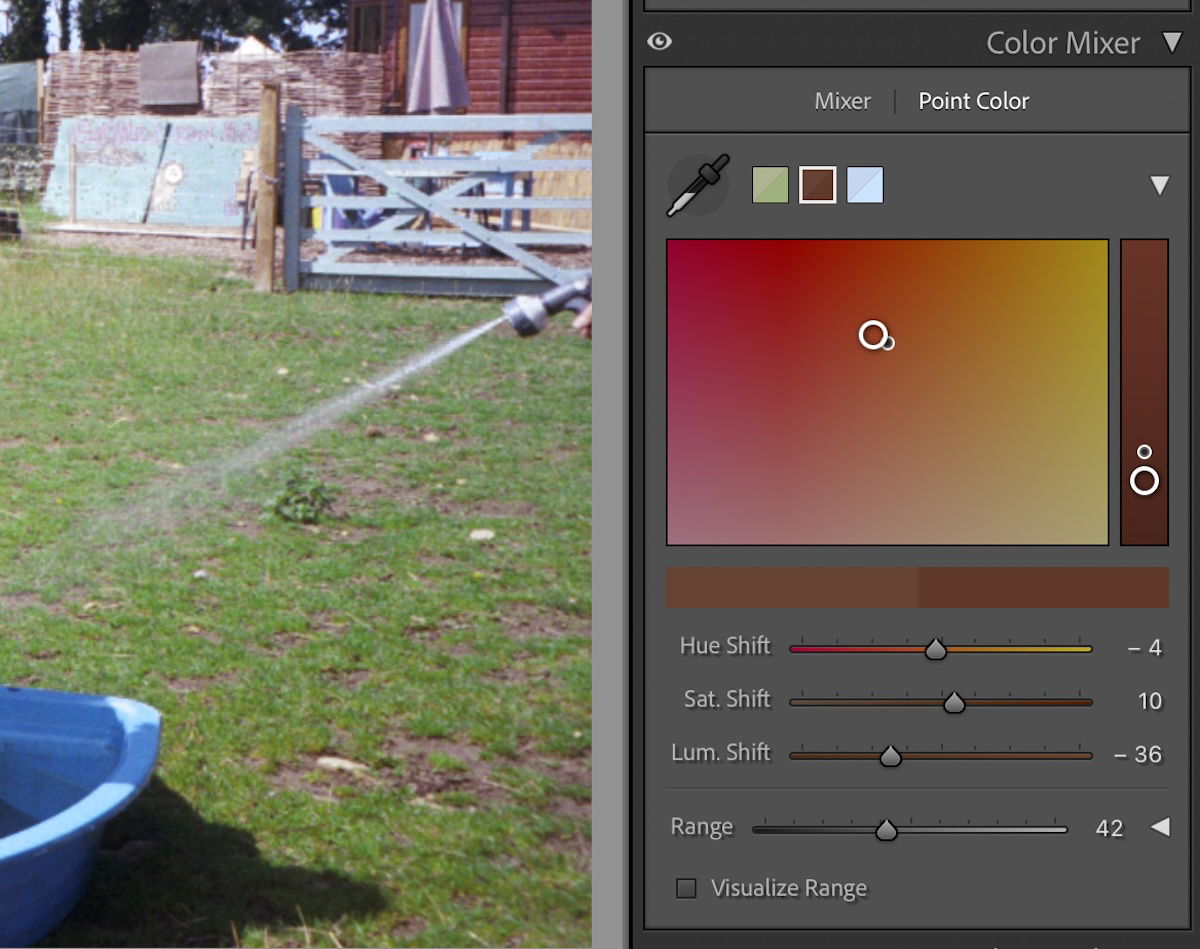
If you want to adjust one particular color or tone, you should use Point Color. This adjustment is in its own section in Lightroom and under the ‘Color Mixer’ section in Lightroom Classic.
Point Color uses a Dropper to click directly onto your photograph to choose the color you want to edit. Once you have clicked on your photo, Lightroom will determine this pixel value and give you several adjustments to fine-tune this color.
The Point Color interface provides a drop-down section that visualizes your selected values’ color spectrum. You are able to move this point about to adjust the color.
As you move this around, you will notice all the adjustment sliders below moving. Vice versa, if you move the sliders around you will see the point on the spectrum move.
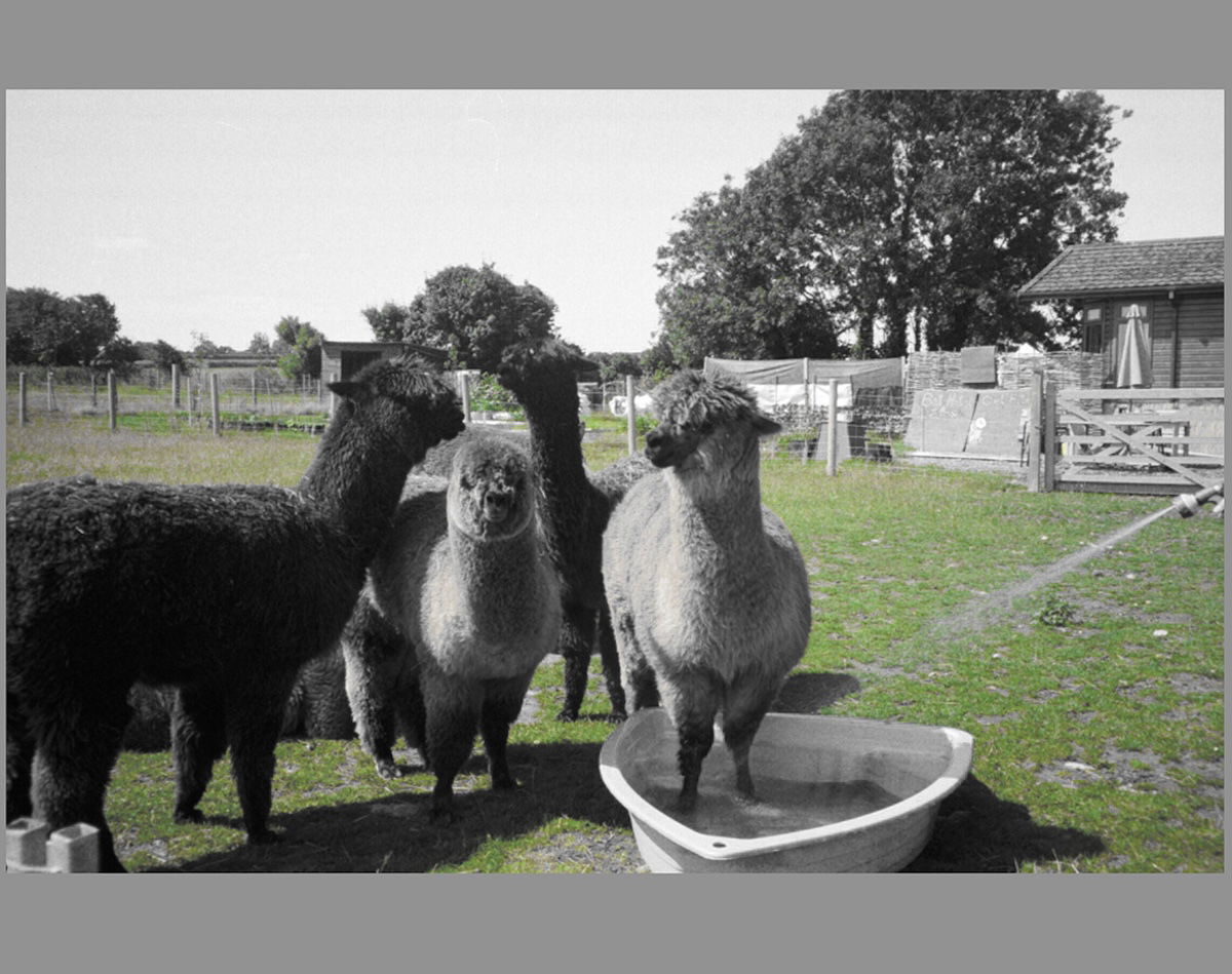
The Range adjustment here is important. It will ensure your targeted selection does not spill into other colors. There is even a Visualize Range button, which will produce an overlay on your photograph.
This overlay will make every color that isn’t affected in black and white. You will see your color and the areas it affects with this setting.
Below the drop-down spectrum, you will notice a bar of color. As you adjust the color, the right half of the bar will change. This shows your previous shade and your current shade. Seeing how far you have strayed from the original color is helpful.
Point Color is the best option if you do not like a certain color in the image but want to keep all the others the same. Lightroom provides an easy way to edit the color without being overly destructive.
This is brilliant for specific levels of color correction, as you can always get the Dropper and work on a separate color. Lightroom will then store the different colors as blocks next to the Dropper. This means you are always able to return to edit each color adjustment.

Color correcting in Lightroom is straightforward. This is great because color correction can be confusing. Getting the overall colors you want can be hard, but Lightroom provides a few avenues to help you change this.
In this article, we discussed overall adjustments with the Temperature, Tint, and Color Grading systems. The Color Grading system can also be divided into different tonal ranges. The Point Color adjustment then lets us adjust specific colors in the frame. So, these tools will help you gain complete control over your colors.


![P08 [Lead Gen] Product Sidebar_v2_date_20230223](https://expertphotography.b-cdn.net/wp-content/uploads/2023/02/P08-Lead-Gen-Product-Sidebar_v2_date_20230223-300x295.jpg)
![P08 [Lead Gen] Sidebar Banner 2_date_20230223](https://expertphotography.b-cdn.net/wp-content/uploads/2023/02/P08-Lead-Gen-Sidebar-Banner-2_date_20230223-300x245.png)
![P08 [Lead Gen] Sidebar Banner 3_date_20230223](https://expertphotography.b-cdn.net/wp-content/uploads/2023/02/P08-Lead-Gen-Sidebar-Banner-3_date_20230223-300x245.png)