Have you ever noticed an orange or blue tint in your photos? The colors make skin look jaundiced or deathly. What should be white in your photo takes on an unusual color. If so, your color temperature, or white balance, needs adjusting.
In this article, we will define color temperature and show you how to adjust it in Lightroom.
What is Color Temperature?
Color temperature is the relative warmth or coolness of light. Every light, from the sun to your computer screen, has a unique color. The color of the light tints all the colors in the scene, including skin tones. Some lights make the colors cooler. Others make the scene look warmer.
The human eye is good at adjusting to different types of light. We often do not even notice that it has a color. Our eyes see something as white, even if the lights tint the white surface. But our cameras record the color. They ‘see’ the yellow of candles or the blue of a flash.
If you have taken a photo that looks orange or blue, the temperature needs adjusting. In photography, we often interchange the terms color temperature and white balance. Our goal is to adjust the colors so that the whites are not tinted. To do this, we adjust the colors around a neutral shade of grey. We will show you how to correct this in your camera and during editing.
Color Temperature Chart
We measure color temperature in Kelvin. This is a scientific scale, like Celsius, that describes the warmth or coolness of light. On a color temperature scale, the lowest numbers are the warmest. The higher numbers are cooler. Daylight is around 5,500 – 6,500K. Shade is often cooler, and sunset warmer.
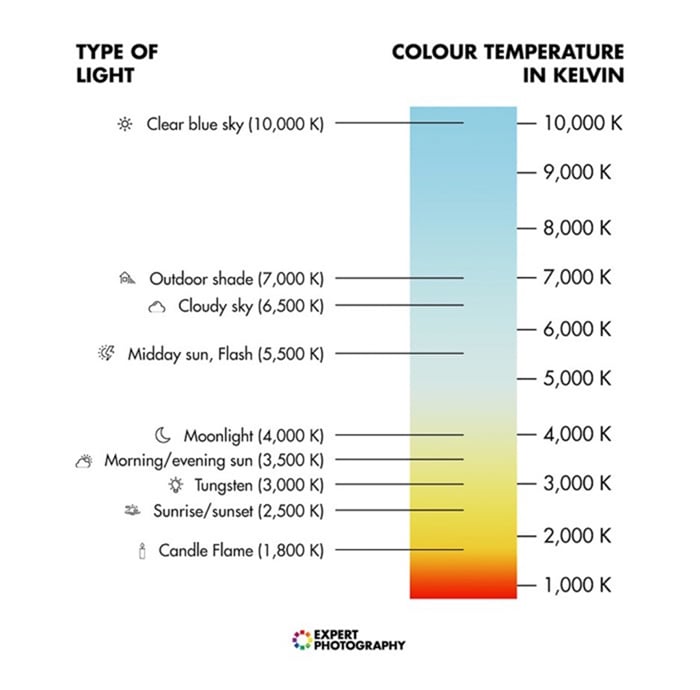
Color temperature scale showing the Kelvin temperatures of many light sources.
We counter the tints by adjusting in the opposite direction. We know a cloudy sky will have a cool color temperature. To make the scene look more natural, we add warmer tones. We can do this either when we take the photo or in post-processing.
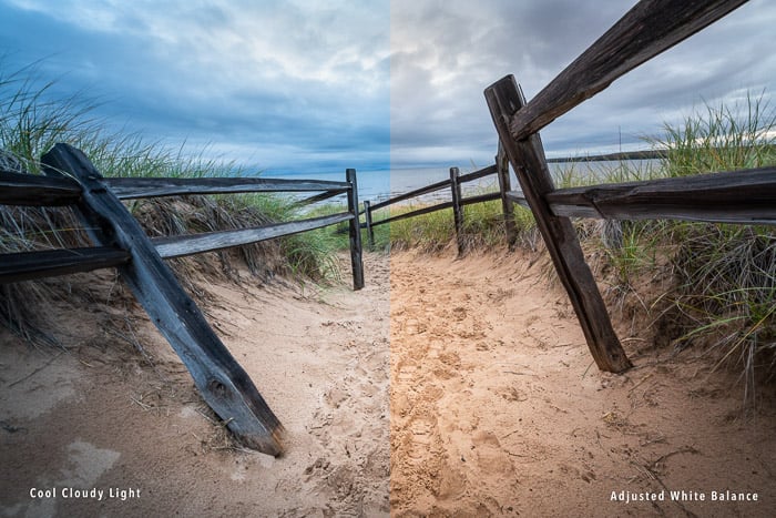
Comparison showing cool, cloudy light (left) and warmer color correction (right).
Choosing a White Balance
There is no ‘best’ color temperature in photography. In product and portrait photography, matching exact colors is often important. We tend choose color temperatures that match how we remember the scene. But we can also capture the feel of a scene. A summer day feels warmer than a cool winter morning. Color temperature is a personal preference. Some photographers favour cooler or warmer tones as part of their editing style.
Most cameras, including some smartphone apps, have color temperature presets. The most common are Tungsten, Fluorescent, Daylight, Cloudy, Shade, and Flash. Professional models also allow you to set a specific temperature. The preset adjusts for the color cast by the light source.
These settings are great if you know what type of light is in the scene. But if the lighting is complex or uncertain, it is best to use Auto White Balance.
Auto mode analyses the scene looking for a neutral grey. This is a shade without color. It will use this shade to select appropriate white balance settings. This can be fooled, or there may not be a neutral shade in the scene. But you can also adjust color temperatures later.
Most editing programs let you adjust the tones in your photos. You will have the most flexibility if you shoot in raw. In Lightroom Classic, white balance is in Develop Module under the Basic panel. By default, Lightroom will use the temperature selected by your camera. It will label it ‘As Shot.’
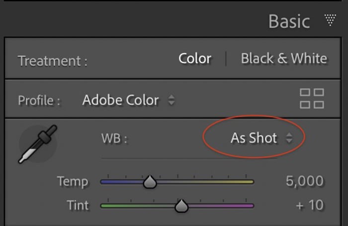
Lightroom Classic screenshot showing temperature adjustments. Click the drop-down menu to see presets
Open the drop-down menu by clicking ‘As Shot’ to see white balance presets. These change the colors in your photo. For instance, Tungsten light bulbs give off a warm glow. To counter this, Lightroom sets a cooler temperature. This looks blue in comparison.
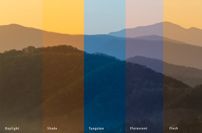
Presets adjust for color casts expected from selected light sources
You can also use sliders to adjust the colors. In Lightroom, move the slider to the right for a warmer color temperature. Move it to the left for a cooler feel. The tint slider lets you adjust the greens and magentas. Often cool temperatures favour greens. Add Magenta to warmer temperatures.
Lightroom also has an eyedropper tool. Select the eyedropper and hover over the colors in your image to find a neutral grey. A color panel appears to show you the range of colors around the selected pixels. Click to adjust the WB.
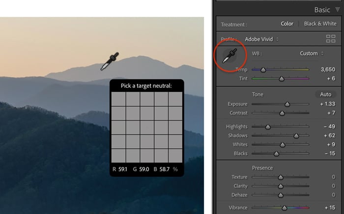
Lightroom screenshot showing the location of the eyedropper tool (right). When the eyedropper hovers over an image, a color panel appears (left)
Conclusion
Color temperature is a measurement of the warmth or coolness of light. The temperature of the light affects all colors in the scene. You can adjust the color temperature in your camera or during post-processing. The goal is to use a color temperature that appears neutral without cast a blue or orange tint over your images.
Read our Photography Unlocked ebook for even more tips and tricks to make your photos stand out from the crowd.