When we take a photo with our cameras, we turn a 3D image into 2D. That can cause problems when you’re trying to display depth.
It has advantages and disadvantages, depending on what you’re trying to convey in your photo. But ultimately, it holds you back when trying to add depth to a photo.
You may have read many of my tutorials on composition. If so, you’ll know by now that you can easily add depth by implementing some of these techniques. We’re going to look at them now.
How to Add Depth to a Photo
1. Use the Rule of Thirds Composition Technique
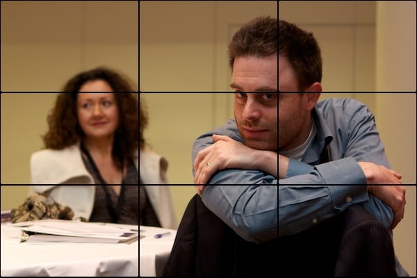
The most important thing to do is ensure you have a foreground and a background. A great way to do this is to include the rule of thirds.
This rule basically dictates that photos should be split into nine equal sections, divided by two equally spaced horizontal lines and two equally spaced vertical lines. The important features within the frame should intersect with these lines at some point.
If you place the foreground to the right of the image, space is left for the background on the left, creating a clear sense of depth. You can read more about how to use the rule of thirds here.

2. Use a Frame within a Frame
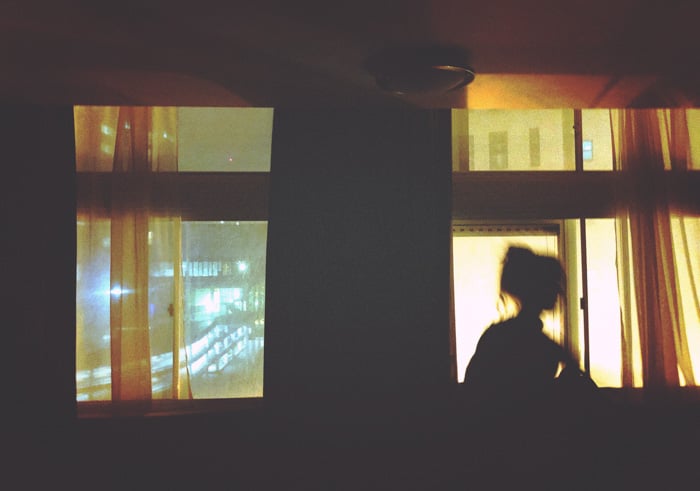
Using natural frames in a scene is a great technique if you want to add depth without including an obvious foreground subject.
The depth of field also comes into play here. Even with a deep depth of field, it’s quite likely for the background scene to be much further away from the frame in front, producing a difference in focus.
Another way to reinforce a sense of depth is by repetition, clearly demonstrated in the photo below.
It’s easy to create a sense of depth in a photo using two or more objects (like the door frames below) that are the same height. Place one further away than the other.
This makes the object appear smaller and, in doing so, provides us with a sense of depth. Read more about using a frame within a frame here.

3. Use Converging Lines
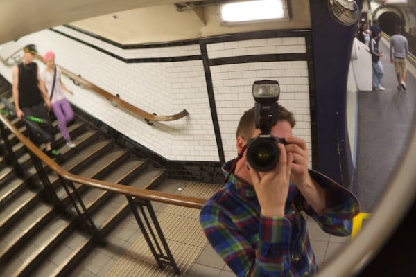
Placing yourself in the frame like this allows multiple lines to converge at a single point when given enough distance. This creates a strong feeling of depth. The lines draw your eyes into the frame to a seemingly infinite destination.
Converging lines are good at creating a feeling of depth. But due to their placement, some are more effective at doing this than others.
Placing yourself in the scene has the strongest effect on depth. And I tend to use this the most.
When the lines start at one side of the frame, the feeling of depth is lessened. But they draw your attention to a single point, as shown below.

As the photo below demonstrates, we now get into basic diagonal lines, which are great for leading the eye.
The line draws your eyes down the path and into the distance, providing a strong feeling of depth as the line diminishes into the distance.

4. Use Distance and Focal Length
The farther away you are from your subject and the wider the field of view is, the greater the sense of depth.
This is because more foreground is included, leading up to the subject. This is true whether it’s additional elements like a frame or just the ground itself.
5. Use Vertical Lines
Using vertical lines can be incredibly effective when producing a sense of depth in a photo.
It’s easy to create depth using vertical lines. Simply take two or more “vertical” objects that are the same height and place one further away than the other. The more distant vertical line appears smaller, providing a sense of depth.
Look at the trees below, and you’ll see what I mean. The trees start to appear shorter.

6. Use Dynamic Tension
Dynamic tension uses the energy and movement available in various frame features to draw the eye out of the picture in contrasting directions.
“Contrasting directions” is the important part of that sentence because this is where we start to see depth. Because we’re taking a photo of a 3D scene, the lines diminish the further away they get, creating depth.
Have a look at my photo below. It draws your eyes down two paths, trying to see into the distance.

Conclusion: How to Add Depth to a Photo
Practice our top six tips on how to add depth to a photo. Your photos will be more interesting and stronger for it! And you can incorporate it into a 30-day challenge to round out your composition skills!


