Knowing how to read a histogram graph is necessary for a correctly exposed image. We use them in-camera and when editing our images.
This article will show you how to read your histogram. And how to use one to improve the quality of your images.
Why Understanding How to Read a Histogram Is Important
Camera LCD displays are pretty bad at accurately representing what the photo looks like. This is why it’s crucial to understand histograms.
Histograms give you a mathematical representation of how well-exposed a photo is. This helps you get the best photo possible when out on a shoot.
What Is It and What Does It Tell You?
The histogram shows you a scientific review of exposure after you've taken it. It tells you how evenly exposed a photo is.
LCD screens aren't very good at conveying this information. Their effects are based on the ambient lighting conditions you're in and the brightness of the screen itself.
You'll find an option to view the histogram graph in all cameras. Some compacts that don't rely on the viewfinder to compose a photo will also show you the histogram in real-time.
How To Read a Histogram
Brightness on a grayscale is what creates a histogram. Black is on the left, white is on the right, and all the different shades of gray are in between.
In a standard jpg image, there are 256 different recorded values of brightness. Zero is pure black, and 255 is pure white.
A histogram graph maps out these 256 values, and each pixel from the image is assigned a value.
Now, let's have a look at what that looks like.

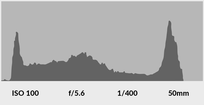
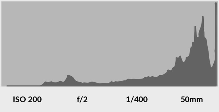
The image above has been correctly exposed. The majority of its pixels are away from the black-and-white values in the histogram.
What may appear to be black in the photo is actually a very dark shade of grey. If you were taking a photo at night, your results may be very different.
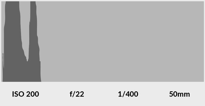
But you always want to stay away from pure black or pure white values. Pixels in these extreme values mean an over- or under-exposed picture. You’ll have to retake it.
You’re missing details that can’t be recovered in the Photoshop histogram. And you’ve lost shades of color. The photo is pure black/white.
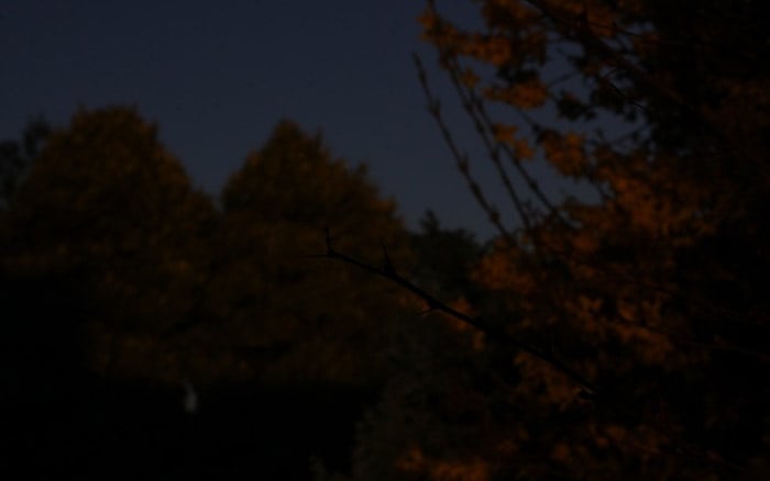
Have a look below at an overexposed image and an underexposed image. And their respective histogram graphs.
Overexposure:

Underexposure:
It's also possible to see your histogram graphs in the three channels of color: red, green, and blue (also known as RGB).
A correctly exposed image looks like this:

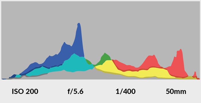
This version of the histogram graph is important when shooting brightly colored objects.
Otherwise, it’s possible to blow out the corresponding channel of the color. And it won’t appear in the main histogram graph.
This means overexposing to the extent that you lose information.
Now you understand how histogram graphs work. You’ll start to find yourself using them more and more when taking photos.
They’re a great way of making sure that you’re getting it right in-camera. And they’ll decrease your reliance on computers to finish off your photos.
When to Use a Histogram Graph
There is no simple answer to this. If you are a beginner, you should take time for your images. This is a great way to learn, and you’ll notice once you get the hang of things, you’ll get faster at the process.
When you come to take a picture, you look at your scene. You find something that interests you, and you position yourself.
Next, you look at the basic idea of composition and if you need to move. To take the image, you need to work out your exposure. Set the camera to manual and go through the ISO, shutter speed, and aperture for the best settings.
Take a shot and review it without moving. Preview the image to look for a correct composition and exposure. Look at the setting that allows you to see the image’s histogram.
