Value in photography describes the range of light in your image. Altering the light in a photo is how you create contrast. Let’s explore tonal value and how we can use it to change the feel and look of our photos.
How to Define Value in Photography
In photography, we group tones into blacks, shadows, midtones, highlights, and whites. Black and pure white are the darkest and lightest parts of your photo with no detail or texture. Shadow areas are the dark parts of your photograph that contain detail and texture. Highlights are bright areas with detail and texture. Midtones are the tones in the middle.
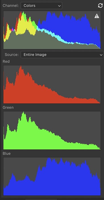
A histogram maps the tonal values with darker tones on the left and lighter tones on the right. The higher the peaks, the more of that tone is found in the scene. Lightroom shows you full black and pure white as clipping masks. These are warnings that you may have gone too far in tonal extremes. Most photographers avoid extreme tones. But you decide if you want to include pure black and white.
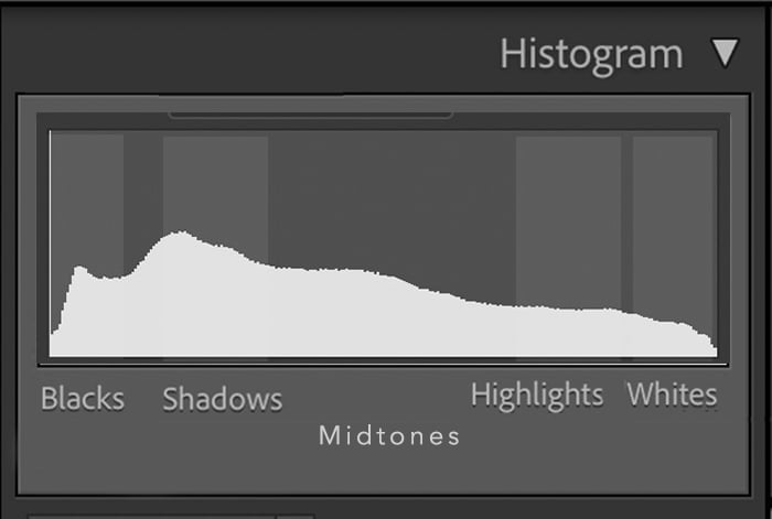
A histogram shows the amount of tonal values in your image with darker tones on the left and lighter tones on the right
What is the Zone System?
Ansel Adams developed a value scale called the Zone System. The Zone System is a way of labelling the range of light and dark tones in a photo. It was developed for film, but it is also one of the most important elements in digital photography. He divided the range of light from pure black to true white into 11 zones. Adams advocated using a wide range of light. This maximises the contrast in your photograph.
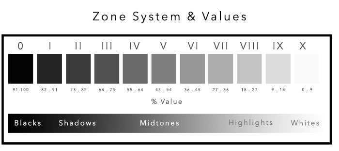
Chart showing Zone System compared to percentage value shown by Photoshop
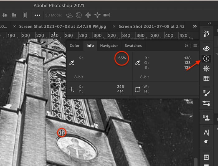
In Photoshop, you can see a tonal value by opening the Info panel and selecting Grayscale. As you hover your cursor over an area, Photoshop gives you a percentage. Zone V is around 50%. Zone X is less than 10%.
Exposure Value: Aperture, Shutter Speed, & ISO
Zone V, or middle grey, is the tonal value that your camera and light meters use to figure out the proper exposure of a scene. It is equal to an 18% grey card.
Each zone represents approximately one stop of light. Adding +1 exposure compensation on your camera will change the tonal value from Zone V to Zone VI. Or you can create a lighter image by adding a stop of light using aperture, shutter speed, or ISO.
Color Value
All light has value, whether the light has a hue or not. But it is often easier to see tones without the added dimension of color. The histograms in Lightroom and Photoshop show you the range of tones for red, green, and blue. In many photographs, the colors follow a similar pattern. But sometimes, one color has a very different tonal value than the others.
The Zone System works with colors. But the true blacks and whites lose color value along with texture. In Zone III, you can see darker colors like navy, dark browns, and greens. Zone VII is where you will see the lightest color tones like white sand or clouds.
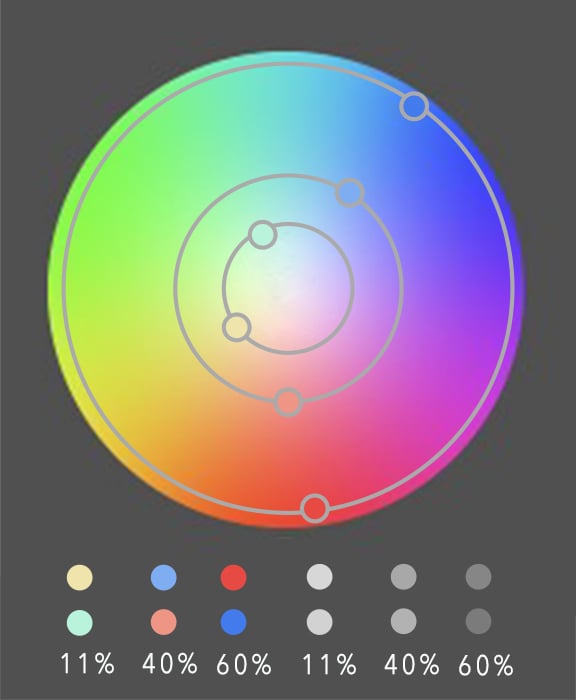
A color wheel helps us see how colors relate to each other. Contrasting colors are opposite each other on the color wheel. Complementary colors sit next to each other. The color wheel included in Lightroom’s Color Grading panel reminds us that color also has a lightness value. Lighter versions of the colors are in the middle of the circle and darker shades along the outside edge.
Color wheel with colors of similar value extracted and converted to greyscale. Notice colors with similar values convert to similar shades of grey.
When you change colors of similar value to black and white, you will get similar shades of grey. Change the value of select colors when you create a black and white image. This adds contrast.
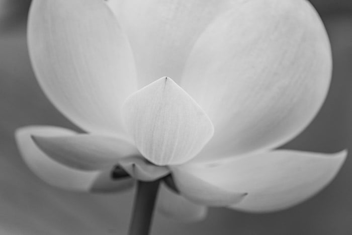
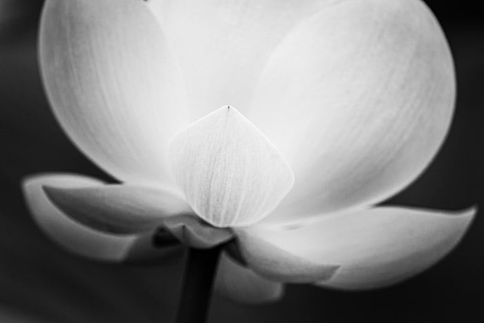
Let’s look at an example. Here are two black and white photos of a flower. The first is a simple Lightroom conversion. To create this, go to the Photo drop-down menu, and select Photo > Develop Settings > Convert to Black and White (hotkey V). In the second, I darkened the greens and lightened the yellows to create emphasis.
High and Low Contrast
Contrast describes how the light is spaced in your image. High contrast images use a wide range of tonal values. Low contrast photographs use a small range of tones. The type of contrast you use influences how the image feels. High contrast images are bold and dynamic. Low contrast images are calmer and more mysterious.
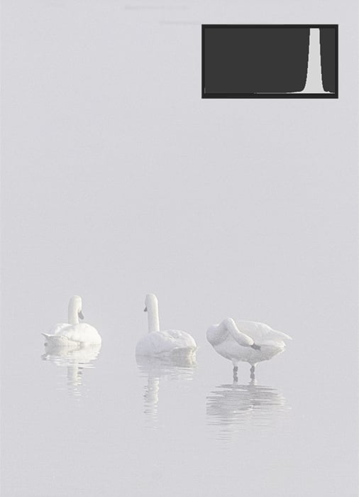
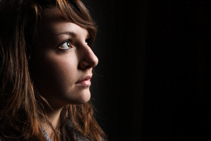
High key image with low contrast, favouring lighter tonal values.
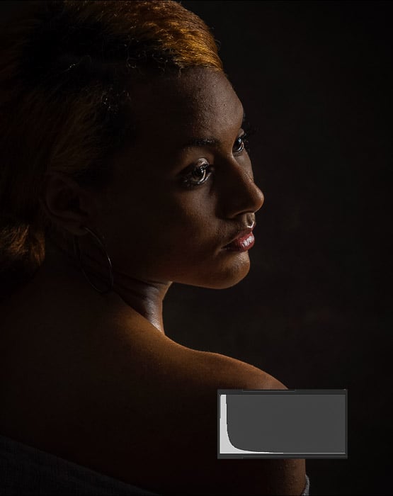
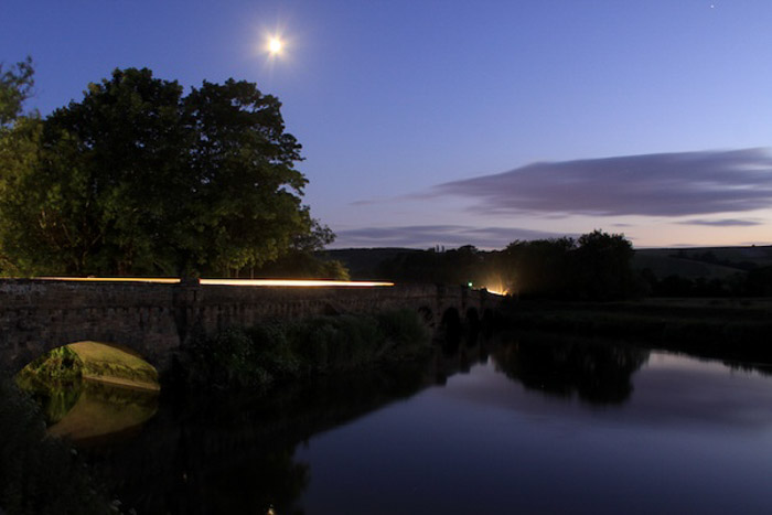
Low key image with low contrast, favouring darker tonal values
Conclusion
Photographers create contrast in their images by altering the values of lights and darks. Many avoid the extremes because there is no visual information other than the tonal value. Others try to represent all tonal values in their images. Understanding value in photography will help create an emotional response to your image.
Master powerful composition and capture stunning photos every day with our Intuitive Composition course!