If you’re looking to take your photography skills to the next level, then a photo critique is exactly what you need. In this article, we’ll share 10 tips for giving and receiving critiques that will help you challenge and improve your photos. So whether you’re a beginner or a seasoned pro, read on for the secrets to getting the most out of your photo critiques!
Photo Critique: Where Is the Visual Weight?
This is the first thing you notice when you look at a photo.
Ask yourself: Where are my eyes immediately drawn? Where do you want the eyes to go?
If you’ve read my post on visual weight, you'll have a good understanding of how to use it effectively. If not, there are a few elements to consider.
I really enjoy taking photos of models. It’s a relaxing, fun and great way to play around with some new tricks you've picked up.
The important question to ask yourself is whether the photo would still be good without the beauty of the model bearing a large portion of the visual weight? If the answer is no, you need to consider what is good about the photo?
The lighting? Your technique? Or are you just relying on your model to make it a good photo?
If you’re trying to direct the viewer’s attention to a certain part of the photo but the first thing your eyes are drawn to is something else, such as writing or a person’s eyes, you need to recompose your shot.
The sooner you learn to think like this, the better. You’ll be able to fix your photos as you’re taking them and you won’t be left wishing you could go back and re-shoot.
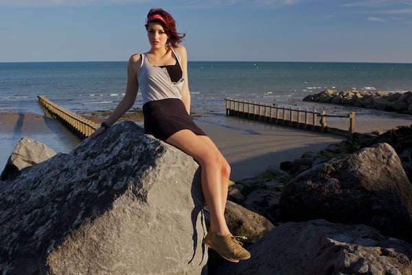
Are There Any Distracting Elements?
Whatever isn’t adding to the photo is taking away from it.
That’s my rule and it’s something that I carefully consider whenever I take a photo. It’s a very important aspect of the composition. If there’s a branch leaning into your photo, or a dark shadow covering part of the scene, it will be take away from the overall effect of your photo.
Another common problem is lines that lead out of the photo but don’t lead to anything.
This is good when you’re trying to convey a feeling of dynamic tension. The most frequent instance of this is when a limb doesn’t quite fit into the photo but really should. Unless there’s a good reason for a body part to appear unfinished, I like to include it.
Check out the photo below to see what I mean.
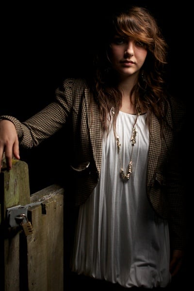
Is the Exposure/Metering Correct?
Sometimes, shooting on the wrong metering mode can give you poor results. The camera doesn’t know how to correct the exposure.
Most of the time this happens because the camera is left on evaluative when it should really be on spot mode. That’s so it can meter for the right part of the photo (often the subject), not the whole thing.
If your metering is fine but the image is still coming out too light or dark, you know what you have to do. “I’ll fix it in post” are the words of a bad photographer.
Get it right in the camera.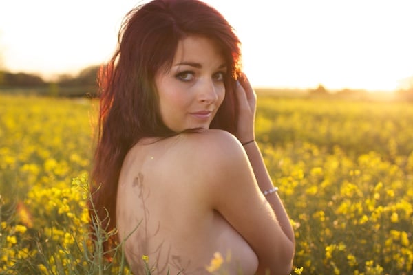
Would it Look Better Through a Different Focal Length?
There’s a lot more to focal length than meets the eye. It’s not just about how close the subject appears. If you don’t understand exactly what it is, I suggest following the link in the previous sentence. There’s a lot to know.
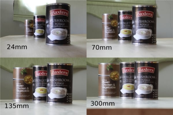
The main difference you can make by altering the focal length is a change in the overall perspective of the photo. The longer lengths appear to push everything in the scene much closer together.
Have a look at the example below to see what I mean.
You’ll notice that portraits tend to be shot at longer lengths because this compressing effect is flattering and isolates the subject from the camera. It makes the shot feel more natural.
When you understand the effect that different lengths have, you can better decide what would look best for your photo.
What Is the Background Doing?
Every pixel counts.
Whether it’s your background, foreground or subject, a pixel is a pixel – you should do whatever you can to make sure that each one counts. See what you can do to make your backgrounds more interesting.
This relates heavily to visual weight and distracting elements as it’s important to consider what makes your photo great. This is why I don’t like shooting on a white background – you limit what you can do to make the photo more interesting.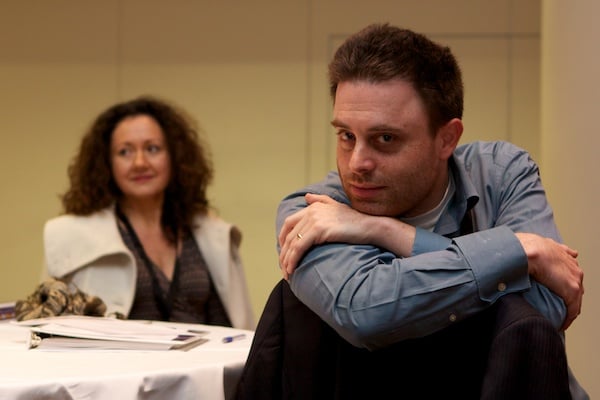
How Is the Composition & Balance?
There are plenty of composition techniques to use that will improve your photos, just make sure you’re not following them blindly.
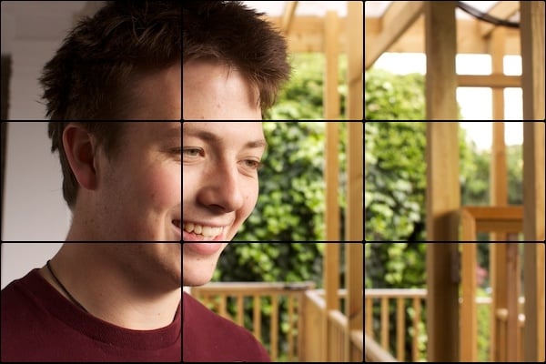
The rule of thirds is a great way to take photos but don’t just do it for the sake of it, it needs to work for the individual photo.
There are plenty of situations where a centered photo will work best, or even slightly off center – it all depends on the feeling that you would like to produce.
In most instances a balanced photo is going to work best; study the visual weights and make sure you have them placed around the photo so that they weigh each other out. If you want your photo to be unbalanced, you know what you have to do.
Does the Photo Require Post Production?
More often than not, when I take a photo, the answer is no… but that’s only true to a certain extent.
The photo is usually good enough to stand up on its own without post-production but that doesn’t mean it won’t improve the photo if I do it.
My photo below went up on the Facebook page without post-production but that’s because I wanted to demonstrate that it doesn’t really need it. I will still end up putting a few finishing touches onto it though.
If your photo needs post production purely because your technique is poor, it’s best to fix this in the camera – improve your technique.
Some people seem to think that the computer can fix most problems but there’s actually a very real limit to what you can do.
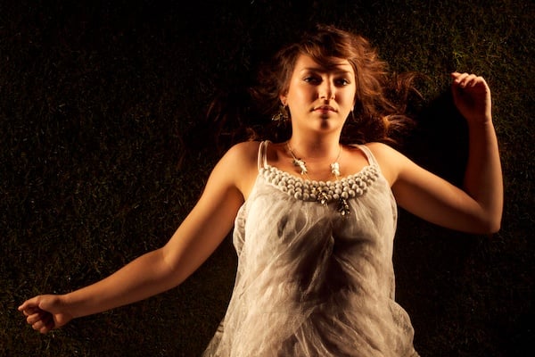
The photo below was a 30-second exposure and the only light source was a £3 torch – if you would like to see more photos like this, check out our Facebook.
Is the Color Accurate?
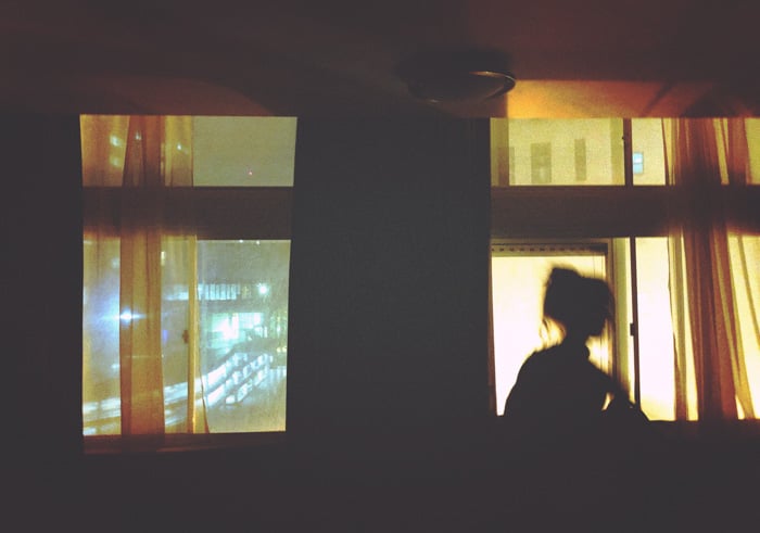
When people take photos indoors without a flash, the white balance almost always comes out wrong as the camera struggles to recognize the tungsten light.
This makes the photo appear orange and unnatural and, if you’re not shooting in RAW, you need to fix it in the camera (you’re a bit stuck with options for fixing it later on).
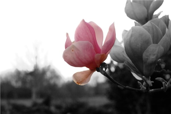
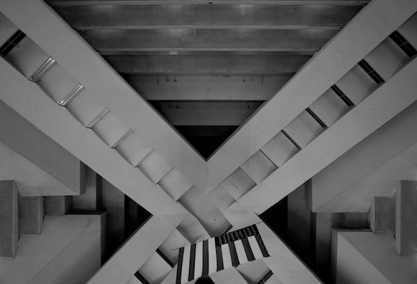
On top of this, you should consider whether the photo would suit being in black and white or whether you’ve simply turned it black and white for the sake of making it look arty?
When I’m shooting in black and white, I’m actually shooting in color with the intention of turning it black and white later. The difference is that this changes the way I’m shooting.
Black and white rely heavily on shape, form, and texture to work; these are brought out with the desaturation of color. Ask yourself if your B+W photo has this or whether you’re doing it to try and make it look good.
This is another example of misguided visual weight.
Does the Depth of Field Suit the Photo?
I recommend the 50mm f/1.8 to people because of the wide aperture and overall quality but the problem that often occurs afterward is that you start to see a lot of photos with the aperture wide open.
Shallow DoF for shallow DoF’s sake won’t do you any favors and, while you may look at it now and think it looks good, you’ll look back in a year’s time and cringe.
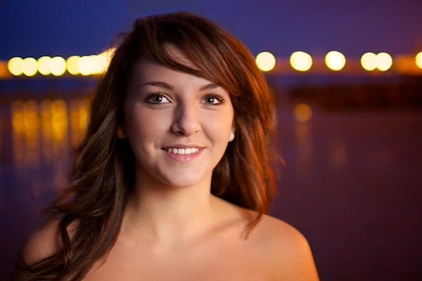
If you know what you’re doing with it, this can work really well, as in the photo below. This was set to f/1.4 (the widest aperture I have) but I focused on the model’s eyes so that the whole photo appears in much better focus.
If you have a wide aperture in a low light condition but the DoF doesn’t suit your photo, raise your ISO or use an off-camera flash.
Is the Photo Cliche?
We all see a lot of cliche photography out there and we’re probably all guilty of it at some point but it’s best to try and avoid it.
I find that the majority of cliche photos come about from a lack of photographic inspiration, which leads us to taking photos of our pets, flowers or sunsets, or putting a garish border on our photos.
If you have to implement ‘cool’ photo effects from your computer, then chances are you’re not trying hard enough with your photography.
Often, when I’m meeting with a model, I wonder where I’m going to shoot but, if you put your mind to it, it’s not that hard to come up with somewhere more interesting than your garden.
The sooner you challenge your photography and learn to critique your photos effectively, the better it will become.
