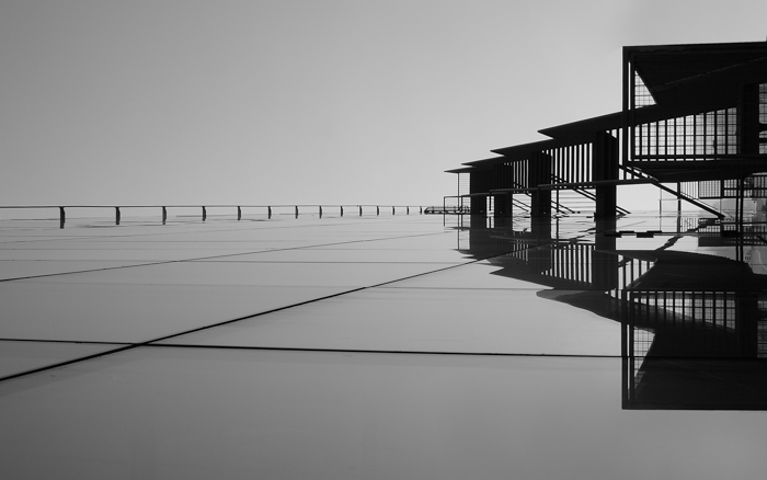
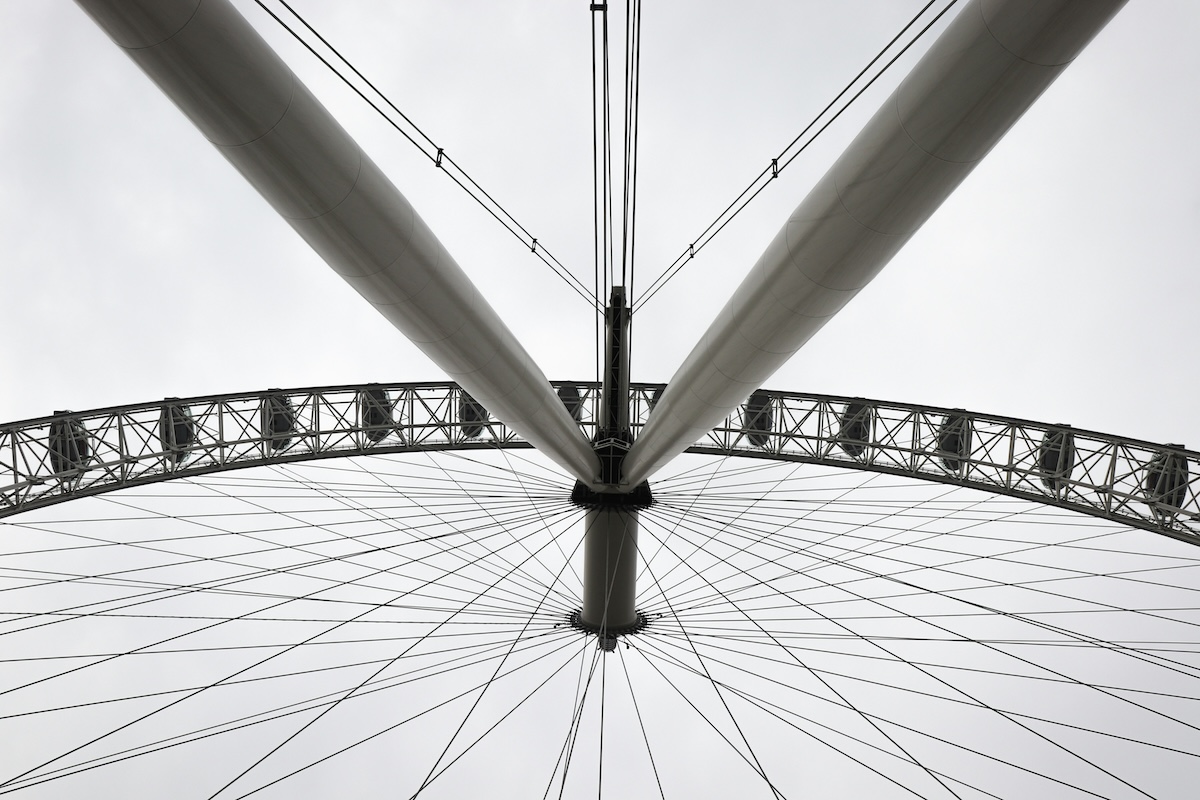
Diagonal lines in photography can add a lot of direction and dynamics to an image. They can lead the viewer’s eye through the photo and create a sense of movement and tension.
In this article, we’ll show you how to use diagonal lines to produce more interesting and dynamic photos.

- Transform mundane scenes into stunning images easily.
- Master 134 composition rules with an easy-to-follow eBook.
- Keep essential tips handy with printable cheat sheets.
An Introduction to Diagonal Lines in Photography
This is my third post on the use of lines as a composition technique.
There are a few different types of lines in photography, from horizontal and vertical to converging. And in this post, we’re going to show you how to use diagonal lines in your photos.
There are lots of times that using diagonal lines will benefit your photos. You can use them to create tension and dynamics and lead the eyes in a particular direction.
Adding vertical and horizontal lines to a photo is like hanging photos on a wall. They either have to be perfectly aligned or intentionally misaligned. If your lines are slightly off, it looks like a mistake that needs straightening.
Diagonal lines aren’t compared to the edges of the frame the same way that horizontal and vertical lines are. They have the freedom to move around and do what you want them to do. This makes them much more useful in many ways.
Three Types of Diagonal Lines
There are three different types of diagonal lines in photography. The first one is an actual diagonal line you can see. The next is implied diagonal lines. This is when you place objects in a line to imply that a line exists. And the last is a diagonal line created by the perspective you use, such as a Dutch angle.
It’s easy to spot diagonal lines just looking around. The difficult part is using them creatively to add to your composition.
Next is a photo of the diagonal lines used in a building. There’s no way to take a photo of this roof without having diagonal lines in a photo.

Leading the Eye
Diagonal lines can be used by photographers to lead the eye to a point in the image. Using the direction of the eyes is an example of an implied line, and they are extremely effective. The viewer who looks at a photo with an eyeline will almost always look in the direction the subject is looking in.
The photo below shows the model sitting on the rocks but looking off into the distance. You’ll see that the diagonal line in the background draws your attention up the photo towards the head. This is especially useful if you’re trying to draw the viewer’s attention to a particular feature.

Create Depth
When you use perspective to create diagonal lines, it also creates a sense of depth. This can be increased or decreased by the amount of the diagonal line you choose to include.
Had I taken the photo above from farther away, the image would have more depth. I chose that particular viewpoint because I wanted the rocks in the foreground to create another, less obvious diagonal line.
Another great way to add depth with a diagonal line is to include a path in your photo, as shown in the photo below. This small addition has made many of my photos a lot more interesting.

Turn a Vertical Line Into a Diagonal
A typical issue with viewpoint is that it changes the way we see a vertical or horizontal line. The slightest change in viewing angle can make a vertical look diagonal, as shown in the photo below.
But this isn’t necessarily a bad thing! You can use this technique to create tension from the imperfect lines.
If you want to avoid this effect altogether, take the photo from farther away using a telephoto lens. The compression from using a longer focal length will make those lines appear vertical again.

Use Diagonal Lines to Include Tension
Diagonal lines don’t appear as often on manmade objects. But using them in photography adds dynamic tension to a photo where you wouldn’t ordinarily see it.
The more diagonals involved, the greater the effect. Diagonal lines are great for using repetition in photography.
Look at the photo below. It looks ordinary at first glance. But if you stare at it a while longer, you’ll notice built-up tension from the repeating diagonal lines converging at an approximate point.

Use Multiple Diagonals in the Same Direction
Using more than one diagonal line in a photo helps build a sense of tension.
In the photo below, diagonal lines at roughly the same angle build a sense of direction. The movement of the stars in the sky creates implied diagonal lines, helping reinforce this sense of direction.
All of this amounts to your eye focusing on a particular point of the photo. This is usually where the diagonal lines end, on the upper right-hand side.

Create Unease With Unstable Diagonals
We tend not to see diagonals in buildings because we don’t consider them to be particularly stable. If you want your photo to look unstable, add diagonals! It’s a great way to make it appear intentionally imbalanced.
Have a look at my photo below. From the shape of the rocks, the direction of the breakwater, and my model’s positioning, you’ll see countless diagonal lines. Because of the nature of the location and the model’s precarious positioning, you’ll see that the whole photo looks unstable.

Conclusion—Diagonal Lines in Photography
Using diagonal lines in your photos is a great way to add tension and dynamism. You can also use it to lead the eye of the viewer, giving the feeling of movement within your photo.
The good news is that once you start looking for diagonal lines, you begin to see them everywhere. And they can add to any photo, no matter what type of photography you shoot.

- Transform mundane scenes into stunning images easily.
- Master 134 composition rules with an easy-to-follow eBook.
- Keep essential tips handy with printable cheat sheets.


