Soft proofing is an essential step in the photographic process, but it can be a little confusing to understand at first. This guide will walk you through everything you need to know about soft proofing in Lightroom so that you can get the most accurate results from your photos.
Camera, Monitor and Printer Color Space Calibration Using Soft Proofing in Lightroom
Monitor color spaces have names like sRGB and Adobe RGB. You will also find your camera most likely has a color space setting typically based on RGB. Red, green and blue values are most often used to define all monitor color spaces.
Depending on the type of printer they can have an RGB color space or a CMYK color space. CMYK stands for cyan, magenta, yellow and black and is used by commercial printers.
The color space is the range of colors available to your camera, monitor or printer. Different color spacesencompass a different ranges of colors. This is why Lightroom soft proofing is important when you want to have your photos printed.
Your monitor might have a different range of colors available to it than your printer. Then your photos will look peculiar when printed.
What soft proofing allows you to do is simulate the color space a particular printer uses.
Calibrate Your Monitor Before Using Lightroom Soft Proofing
Making sure your monitor is displaying colors and brightness correctly. A brand new monitor should do this.
Over time the colors your monitor displays can shift in hue, contrast and brightness. These can all be manually adjusted also.
The easiest way to calibrate your monitor is by using a tool like a Dataclor Spyder. This reads your screen display and corrects it so the colors in your photos look accurate.
How To Use Lightroom Soft Proofing
Soft proofing is found in the Lightroom Develop Module, not in the Print Module as some would expect. This is because the process must happen during development before photos are printed.
You can find the checkbox to turn soft proofing on under the main window in the Lightroom Develop Module.

Create a Proofing Copy in Lightroom
When you check this a dialogue box appears under the Lightroom histogram in the right-hand panel. The background of your photo will also change to white. This helps you remember you are in soft proofing mode.
A pop-up window will show asking if you want to create a virtual copy for soft proofing in Lightroom. It is a good idea to do this so you have your original to fall back on if you need to.
You can also create a proof copy by clicking the button in the right-hand panel dialogue box.

While in the Develop Module the 's' key will also turn on soft proofing. This is helpful to know if you ever inadvertently hit the 's' key and turn on soft proofing when you don't want to use it.
Color Profile Gamut Warning
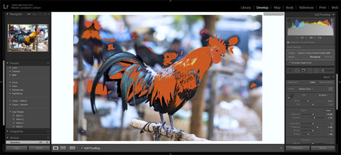
Having soft proofing turned on you will now see two new icons appear in the Lightroom histogram window. These now replace the triangles you'd click on to see the shadow and highlight clipping warnings.
At the top left is a monitor and on the right is a page. Click on the left-hand icon shows the monitor gamut warning. With the right-hand icon clicked the destination printer gamut warning is displayed.
This will show you the colors in your image which fall outside of the selected color profile.
Picking a Color Profile To Use
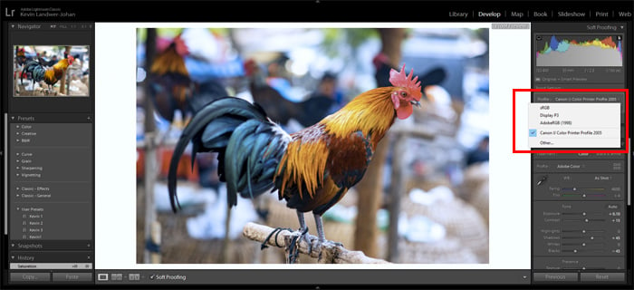
You need to match the color profile your printer has to Lightroom. This is done in the Profiles dropdown menu. The printer connected to your computer should show up.
If you want to have your photos printed elsewhere you need to know the color profile of the printer you will use. Using Adobe Lightroom Help will teach you how to obtain and load the color profiles.
Select a Rendering Intent
There are two rendering intent options. Perceptual and Relative. With Perceptual selected, Lightroom will move all the out of gamut colors and tones to within the color profiles.
Lightroom will also adjust other colors and tones in the image accordingly.
You can also select Relative. Then Lightroom will only shift the colors and tones that fall outside of your chosen color profiles to fit within it.
Try both options to see which works best. Often there will be little or no visible difference.
Simulate Paper and Ink
Turning this option on is vital in helping you make adjustments so your photo will look right when it's printed. With this box checked you might be shocked at the colors you see in your photo.
This is why you must use soft proofing in Lightroom to help you get color correct prints.
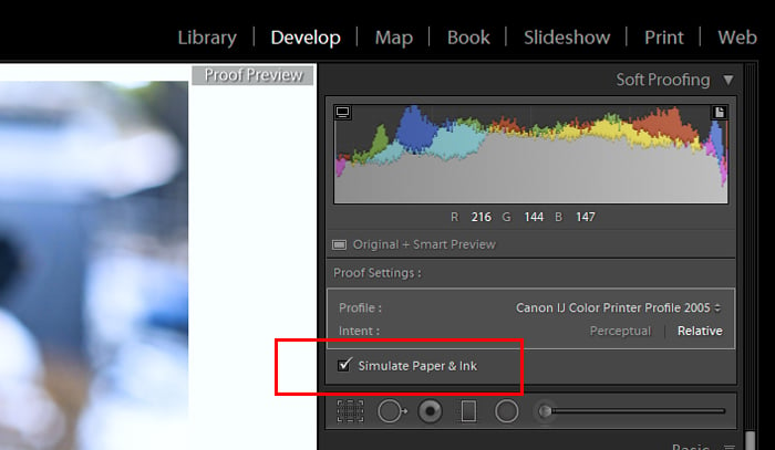
With this checkbox selected, you can now make adjustments to your photo. You can make it so the colors will fit within the color profile of the printer you will use.
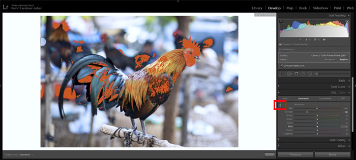
Using the Adjust By Dragging tool in the HSL/Color panel is one of the ways I find it easiest to make these adjustments.
You should use a combination of tweaks to saturation and luminance. Then you will be able to bring all or most of the colors within the chosen color profile.
Perfecting Your Soft Proofing Lightroom Workflow
Getting your photos precisely as you want them to appear when printed will take practice. If you have your own printer creating a good workflow is easier.
Work at gaining an understanding of each adjustment you can make. And how it will affect your printed photo. You’ll gain an understanding of how the process works and why different color spaces must match up. And then you will be printing better-looking photos.
Soft proofing in Lightroom may seem like a lot of extra work for some people. Have you ever had a set of photos printed that looked significantly different than they did on your monitor? You will appreciate the importance of it if you have.
Practice making adjustments in different ways on the same image. Make screengrabs of your settings and label them so you can remember your Lightroom workflow.
Once you have the photos printed, go back and compare them to how they look on your monitor. This will provide you with practical insight into the way the process works.

