By using color in photography in a thoughtful and considered way can make your images even more powerful. Colorful images are already eye-catching, but having an understanding of color theory will elevate your images to new heights.
This article is the perfect starting point if you want to learn more about color in photography. From color wheels to triadic colors, we cover everything you need to know to harness color in your photographs.
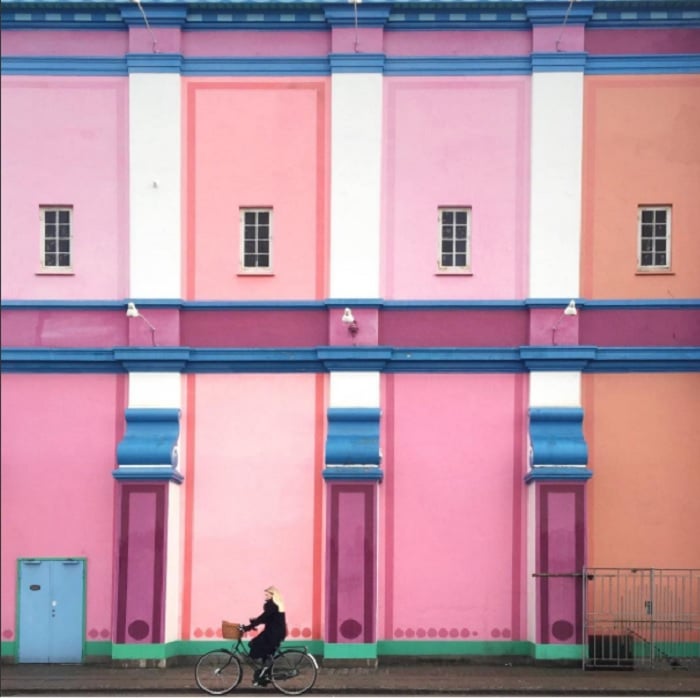
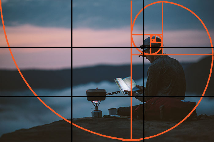
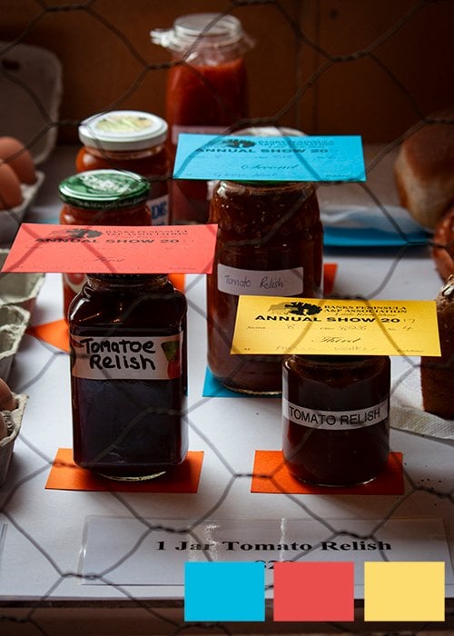
© Karen Vikke author of our Urban Smartphone Minimalism eBook
Color in Photography
Color is an often overlooked element of composition. We always find colorful images pleasing to look at, but there’s more to color in photography than just quantity. There’s science behind color, and a little knowledge on this subject will make a huge difference to how you construct your images.
There’s more to color than you might at first think. But that’s not something you should find daunting. This is an opportunity to improve your image-making skills. And the wonderful thing is that this knowledge is transferable to all types of art and design. You can even use this knowledge in marketing.
We start with a look at the basics of color theory before moving on to specific topics relating to color in photography. Each section has a link to a full article on that subject, so follow the links to learn more.
Learn the Basics of Color in Photography
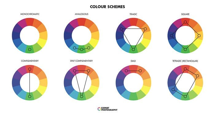
When it comes to color theory, the wheel of colors is the natural starting point. Exploring the wheel of colors will assist you in grasping various color schemes and color composition.
It will allow you to make conscious decisions in your color photography. You can create images with harmonious and balanced colors. Or you can break the rules to create discord and imbalance.
I don't always strictly follow the wheel of colors. But my favorite color photos tend to follow the rules. Hue arrangement methods have been in existence for centuries. But Newton’s and Goethe’s hue circles are two of the most well-known.
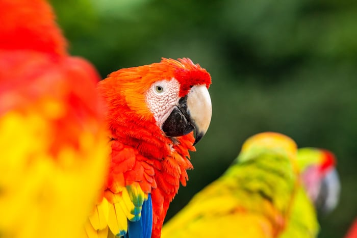
The foundation of the wheel of colors is the primary hues—red, yellow, and blue. Each hue merges with its adjacent counterpart to produce the secondary shades—green, purple, and orange. There's a whole science behind color theory.
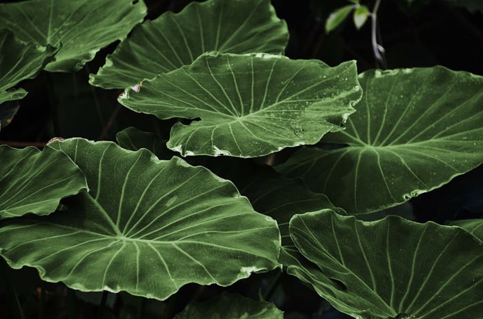
Analoguous Colors
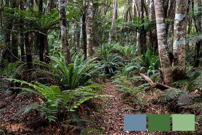
Analogous colors are three or more colors that are next to each other on the color wheel. They usually look good together because they share some common hues. Using analogous colors in your photography can create a harmonious and pleasing image.
Analogous colors are easy to find in nature, especially in macro photography of flowers and insects. Landscape photographers often use analogous color schemes without realizing it. You can also find analogous colors in urban settings.
When using analogous colors, keep your images interesting by paying attention to composition and lighting. Skipping a color can also add visual interest. Most importantly, make sure your images are balanced with every color having its place in the frame.
If you’d like to learn more about analogous colors in photography, our full article is the best place to start.
© Heather Milne
Color Blocking
Color blocking is a bold photography technique that uses two or three colors to create striking images. The colors are used in large blocks, creating a simple color scheme that jumps out at the viewer. Color blocking turns color into a key compositional tool, sometimes even making it the subject of the photo.
Photographers often mix complementary colors from opposite sides of the color wheel for maximum impact. You can use color blocking in many photography styles, from street photography to flat lays, food, product, and fashion photography.
It’s also great for minimalist compositions, using color blocks separated by straight lines like walls or the horizon.
Color blocking is a powerful way to add excitement to your portraits too. Choose backdrop colors that complement your subject’s hair and eye color for unforgettable images.
Color blocking in photography is all about being brave, bold, and celebrating color!
Color Saturation
Color saturation is the intensity of colors in an image. Boosting saturation levels makes colors more vibrant, while reducing saturation mutes and fades colors. It’s important to find the right balance and not overdo saturation in either direction.
You can change color saturation in your camera settings, with lens filters like polarizers, and during post-processing. In image editing software, saturation sliders let you raise or reduce color intensity. The HSL panel in Lightroom lets you adjust each color’s saturation separately.
Changing color saturation can create a certain mood in an image. More saturated images can portray a happier mood, while desaturated images can create a minimalist effect and a more somber feeling.
To learn more about color saturation and how to use it effectively in your photography, check out our in-depth guide.
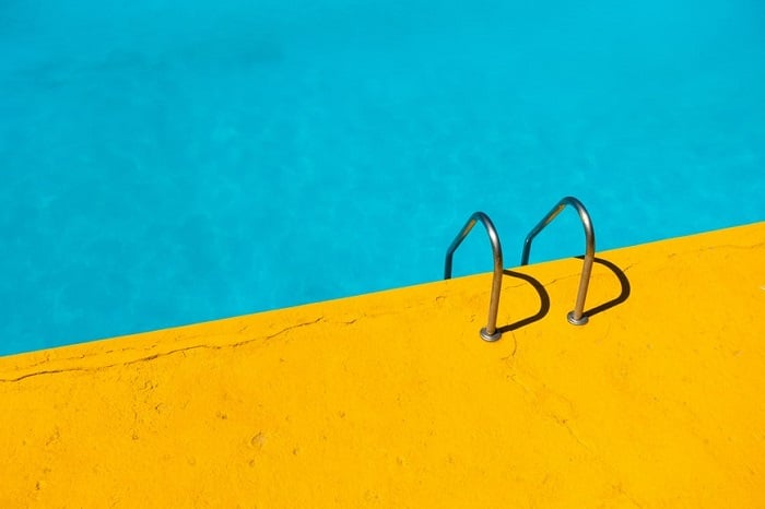
Complementary Colors
Complementary colors are opposite each other on the color wheel. They create the strongest contrast and a vivid, energizing effect that catches the viewer’s attention in a natural way. The most common complementary color pairs are red and green, yellow and purple, and orange and blue.
Using complementary colors in photography is a powerful way to make your images pop. The contrast between the colors creates a striking visual impact that draws the viewer’s eye.
However, you don’t always need to use the most vibrant shades of complementary colors. Sometimes a more subdued palette can provide a balanced, natural look while still being engaging.
To learn more about using complementary colors effectively in your photography, read our in-depth article on complementary colors. It covers the basics of color theory and provides practical tips for creating stunning color combinations in your images.
© Heather Milne
Complementary Color Examples
Complementary colors are pairs of colors that create the strongest contrast and reinforce each other. When placed side-by-side, they create a vibrant look. Some common complementary color pairs include red and green, yellow and purple, orange and blue, green and magenta, red and cyan, and blue and yellow.
Red and green is a classic complementary color scheme often seen in nature, like a ladybug on a leaf or a strawberry. Yellow and purple can feel modern and playful, perfect for color blocking and fashion photography. Orange and blue have emotional weight as they’re associated with opposing concepts like warmth and cold or earth and sky.
Green and magenta create an interesting contrast, with rich magenta against neutral greens. Red and cyan is an intense, neon-like combination, while blue and yellow together feel cheerful and reminiscent of sunshine.
Click this link to learn more about complementary colors.
Color Contrast
Color contrast is a powerful tool in photography. It can add visual interest and impact to your images. To make the most of color contrast, start by understanding complementary colors.
Colors on opposite sides of the color wheel naturally create the strongest contrast. A splash of red on a green background is hard to miss. You can also use contrasting colors to highlight your subject or add emphasis.
Don’t be afraid to experiment with bold color combinations and strong graphic elements. Find the colors that express your unique style. With practice, you can master the use of color contrast in your photography.
Check out this in-depth article on color contrast in photography to learn more.
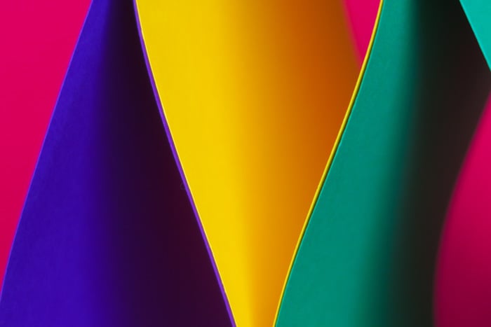
Triadic Colors
Using a triadic color scheme in photography can create vibrant and uplifting images. Triadic colors are three colors evenly spaced around the color wheel, like red, yellow, and blue. To use them effectively, balance is key.
Make one color dominant and use the other two as supporting colors. Triadic colors are easier to find in man-made objects than in nature, so street photography is a great place to start. Look for two colors first, then work up to three.
Remember, color theory is just one aspect of great photography. Composition and lighting are also important. Combine all these elements to create balanced, eye-catching images.
Triadic colors take practice to master, but the results are worth it.
© Heather Milne
Monochrome
Monochromatic photography is a creative way to add emotion to your photos. It involves using only one color in your images, either by shooting a scene that contains a single color or by editing a photo in post-processing.
Colors have the power to inspire emotions. Red conveys love and passion, while green is associated with nature and growth. By focusing on a single color in your monochromatic photos, you can simplify the image and create a strong emotional impact.
To shoot monochromatic photos, look for scenes that contain shades and tones of one color. Man-made objects like buildings, walls, and cars are great subjects, as well as natural elements like the sky or flowers.
We have a full article on this subject if you want to learn more about monochromatic photography.
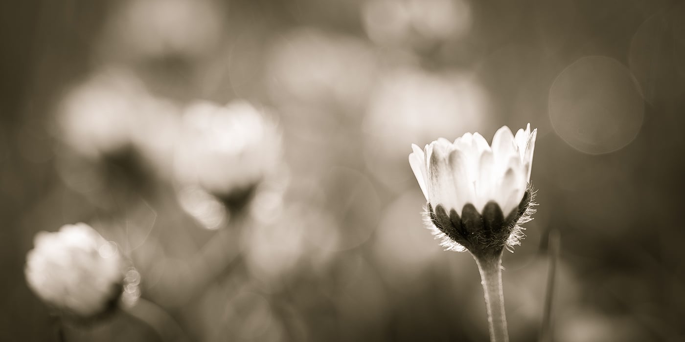
Monochrome vs Black & White
Monochrome and black and white photography are often used interchangeably, but they’re not exactly the same. Monochrome photos contain variations of only one color, like different shades of blue, green, or grey. Sepia and cyanotype photographs are common examples of monochrome photography.
Black and white photography contains variants of grey ranging from black to white. This means all black and white photos are monochrome, but not all monochrome photos are black and white.
You can capture monochrome photos in-camera by finding scenes with a single color range, or convert images to monochrome in post-processing. For the best results, always shoot in color and then convert to black and white later. This preserves more image data for editing.
If you’d like to learn more about monochromatic vs black and white photography, we have an in-depth article that covers the topic in greater detail.
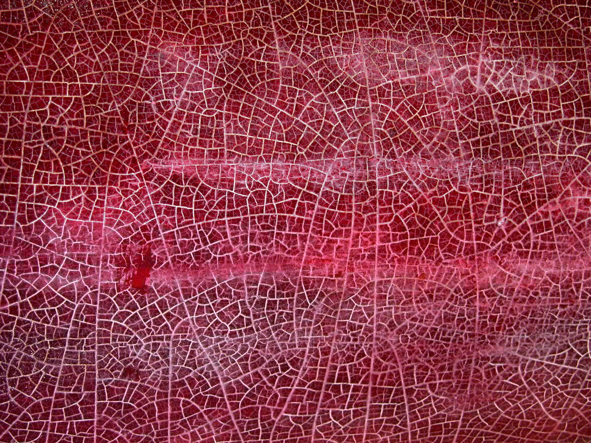
Red
Red is a powerful color in photography that can evoke feelings of excitement, passion, and energy. It draws the viewer’s attention and creates engaging contrasts, especially when paired with its complementary color, green.
In portraiture, red clothing or lipstick can emphasize the subject and convey emotion. Landscape photographers can capture striking red flowers or sunsets, while food photographers often showcase the freshness and appeal of red fruits and vegetables.
Abstract photography allows for the expression of ideas and emotions through the use of red, while street photographers can find eye-catching red elements in everyday scenes.
Read more about using the color red in photography by clicking this link.
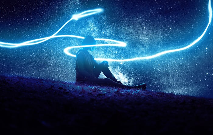
Blue
Blue is a popular color in photography that can convey a range of emotions. Lighter shades of blue can create a calming effect, while darker shades may evoke feelings of sadness or isolation.
The psychology of blue in photography depends on factors like the specific shade, color combinations, and the elements it’s paired with.
Using saturated blue tones can enhance a dramatic mood, especially in nighttime or conceptual photography. On the other hand, softer shades of blue, like those seen during the “blue hour” just before dark, are perfect for creating peaceful atmospheres in landscape photos.
Desaturating blues can lead to a calm, minimalist effect, while enhancing blues in post-processing can make your image stand out. Creating an orange/blue contrast is another way to draw attention to your subject, as these complementary colors balance each other out.
Blue in photography is a versatile tool that can be used in many creative ways to improve your images and evoke specific moods.
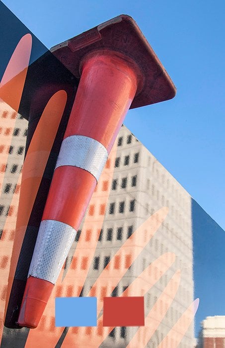
Orange and Blue
Color contrast is a powerful tool in photography, and orange and blue make the most common color combination. These complementary colors are opposite each other on the color wheel, producing the highest contrast level when placed next to each other.
Using orange and blue in your photos can make them stand out. The cold blue tones emphasize the warmth of the orange ones, and vice versa. This color scheme also appears often in nature, from the golden hour sunlight against a blue sky to the colors of land and sea.
To use orange and blue effectively, experiment with color blocking by arranging objects in a minimalist composition. You can also use these colors in a more natural way, like in food photography. Make the dominant detail the one you want to emphasize most, and use contrast to highlight important elements.
Orange and blue are excellent when used purposefully to create stunning photos.