Red is one of the most powerful colors in photography. It can be used to create a feeling of excitement, passion, and energy in your photos. Here are a few tips on how to use color red in photography.
Color Red in Photography: From Ochre to Carmine
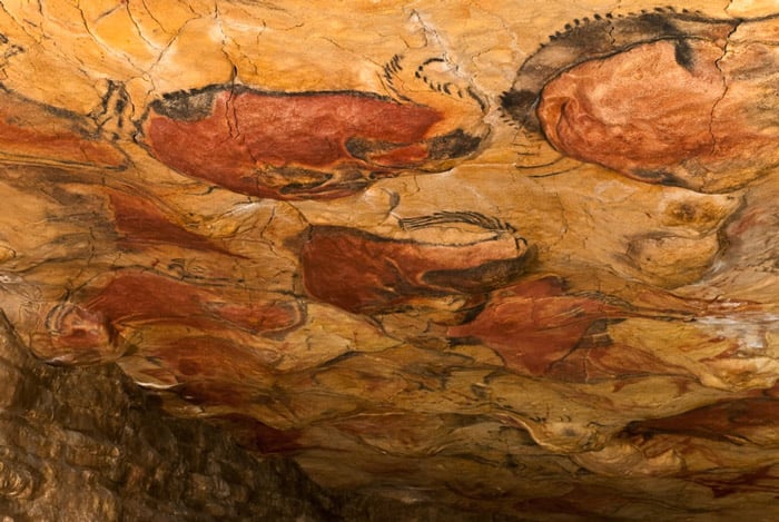
Red bison painted with ochre in the Altamira Caves in Spain. Photo from Wikimedia Commons
Red is a vibrant color, full of meaning.
There are many examples of red ochre pigment used in prehistoric and ancient times. The red ochre bison on the cave walls of Altamira in Spain is one of the earliest applications of red in ancient art.
People sourced cinnabar from volcanic veins and hot springs. They liked it because of its deep-brick to scarlet coloring.
In North and Central America, the Aztecs and Mayans made carmine (also known as cochineal).
During the 16th century, the Spanish conquistadors began exporting carmine to Europe.
Medieval to Modern Reds
Red is a color of authority and importance. Medieval artists used the color red to show status, the holy spirit and the blood of Christ and Christian martyrs. They used cinnabar, carmine and ochre.
Medieval artists also used minium. This was an orange-red pigment thought to originate in Ancient China.
During the Renaissance, red continued to signify Christian concepts. It was also used to command attention and create contrast. This hasn’t changed today, whether you’re painting or photographing.
In 1919, a patent was registered for the production of cadmium red.
Photographic technology has allowed for the reproduction of vibrant reds. Photo by James Lansbury on Unsplash
Nowadays, modern reds are available in inks, paints and digital media. They allow artists to access affordable reds with permanence and vibrancy.
The color red thrives on human history, physicality and emotion. Its endurance in art is a testament to its vivid and immersive visual qualities.
Associations With the Color Red
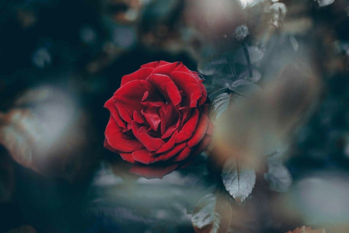
Photo by Marcus Cramer on Unsplash
The color red has become a symbol of multiple meanings and associations.
The color red is intimately tied to the experience of life and living.
By and large, red is also the color most associated with love.
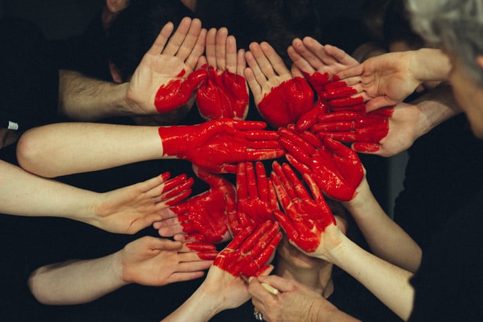
Photo by Tim Marshall on Unsplash
The color of blood, red has become symbolic of sacrifice, danger and violence.
Red is also recognised as the color of passion, seduction and sex.
Red can be viewed as an indicator of vitality, exertion, anger or embarrassment.
The color of fire, red can be a signal of destruction, warning or warmth.
Often used in celebration and ceremony, red has become a sign of status and royalty.
Red is present in autumn leaves, sunsets and flowers. Because of this it can also conjure impressions of beauty, seasonal change and time.
Using The Color Red in Photography
Color photography expanded visual language, giving artists a new medium to play with.
Early color photographers used colors already loaded with psychological associations.
Photographers have cultivated visual relationships conveyed in red tones. Examples include William Eggleston and Harry Gruyaert.
You can include red in any type of photography. Portraiture, landscape, food, abstraction and street photography are only a few. We’ll mention a few examples for each in this article.
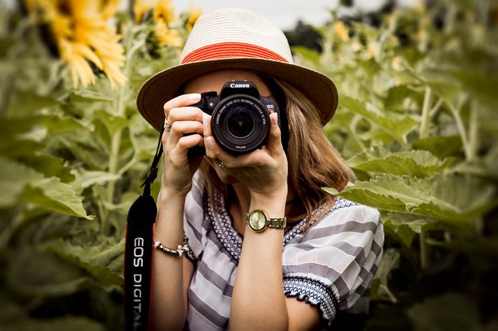
Portraiture
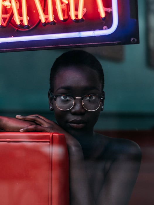
Photo by Noah Buscher on Unsplash
Red is the color of drama and intrigue. It emphasises the dynamics that contribute to a successful portrait.
The vibrancy of the color red captures the attention of a viewer. It draws focus toward the portrait sitter.
Use red in portraiture to draw attention. Whether it’s through red clothing or a pair of blood red lips, your viewer will have to stop and look. Show passion and emotion through the color red.
You can also use red to generate engaging contrasts. A portrait with red aspects also appeals to our sense of physicality, narrative, and place.
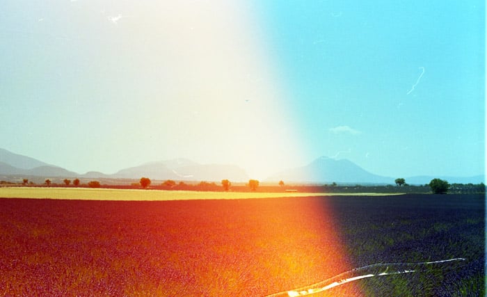
Landscape
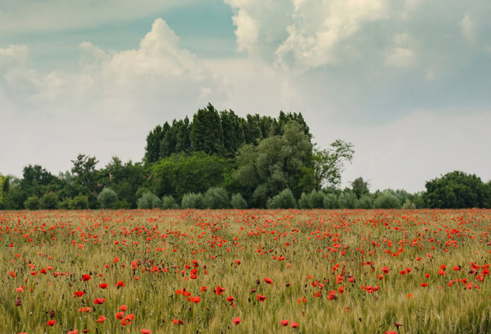
Photo by Henry Be on Unsplash
Landscape photography documents the scenery that makes up our world.
Some of the most striking examples of red in nature include flowers and sunsets.
The complementary color of red is green. Photographing red subjects in a green environment can prove particularly compelling. It creates an appealing contrast.
Naturally occurring reds can be fleeting subjects. Plan ahead for the perfect photo. You may need to check out the best time of year for your shoot or do some in advance.
Food
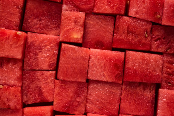
Photo by Joanna Kosinska on Unsplash
Red foods include watermelons, strawberries, cherries and tomatoes. These are usually for seasonal consumption. They’re associated with freshness and crispness.
Munching on red watermelon slices on a hot summer’s day can hint at a carefree moment under the sun.
Warm tomato soup with a hearty slice of sourdough on a cold night is a soulful delight in winter.
In art history, red grapes and pomegranates have symbolised fertility. Red apples are a religious symbol, linked to the sin of Adam and Eve.
In photography and art in general, apples can symbolize the forbidden fruit.
Red food speaks to our natural attractions. It’s an appealing asset to any delicious spread that will draw attention.
Abstraction
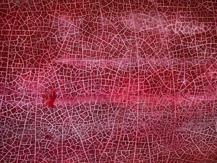
Photo by Matt Artz on Unsplash
Color plays an important role in abstract photography. You can use color to give your viewer a hint about what your photo means.
You’re free from depicting the objective world. Abstract photography aims to express emotion through abstracted impressions.
Our associations with reds lend themselves to the reading of an abstract image. It creates ideas and imparting emotions through visual experience.
An image with strong red contrasts can also create the illusion of texture. This will appeal to your viewer’s senses, making your photo stand out.
Street
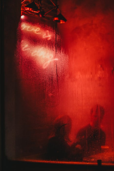
Photo by Joshua K. Jackson on Unsplash
Street photography documents random and unmediated encounters within a public environment. This is also true of candid photography.
You can find the color red everywhere on the street. A few examples include lights, cars, fashion and signage. Architecture can also include red details. You can even photograph bright and colorful buildings.
It can be difficult to plan for a specific street photograph. But training your eye to identify potential moments is a good way of harnessing the art form.
Embrace red in your street photography. It’s an eye-catching way to illustrate the dynamics of the modern human environment.
Conclusion
From antiquity to modernity, the color red has shouldered the weight of artistic meaning.
It brings to mind notions of physicality, status, love, anger, violence and danger. Red is a color of great emotional and physical impact. Whether we’re looking at a photo of a blood-red rose, a delicate piece of red silk or a spread of delicious spices.
Incorporating the color red into your photography denotes passion and bold emotion.
Certain interpretations of red differ culturally. Visually though, red is a color that commands attention. It provokes an emotional response.
As a photographer, you can use this to make your photos stand out and get their message across.
Check out our posts on using contrasting colors orange and blue or understanding color theory in photography next!

