Using the seven principles of art and design can help you produce more dynamic and eye-catching photographs. But you don’t need a degree in art appreciation to mast these principles. Even a brief introduction with improve your photography compositions skills.
In this article, we look at the seven principles of art and design. We examining what they are and how your can use them in photography. This article is just an introduction, but look out for links to in-depth articles in the text.
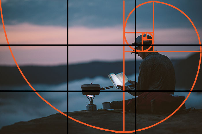
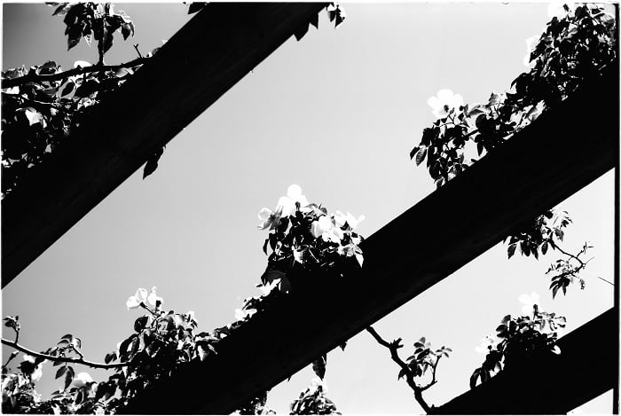
IMAGE
What Are the 7 Principles of Art and Design?
The seven principles of art and design are balance, rhythm, pattern, emphasis, contrast, unity, and movement.
Artists use these principles, to greater or lesser extent, to make their pieces visually interesting. But these principles are not limited to painters and graphic designers. Photographers can also use these principles to enhance their visual style.
You also have elements of art and design. These are line, shape, form, space, value, color, and texture. These are the tools visual artists use to construct their images. They are building blocks for any visual art form, including photography.
Photographers can create an image based on art theory by applying the seven principles of art and design. Let’s take a closer look at each principle.
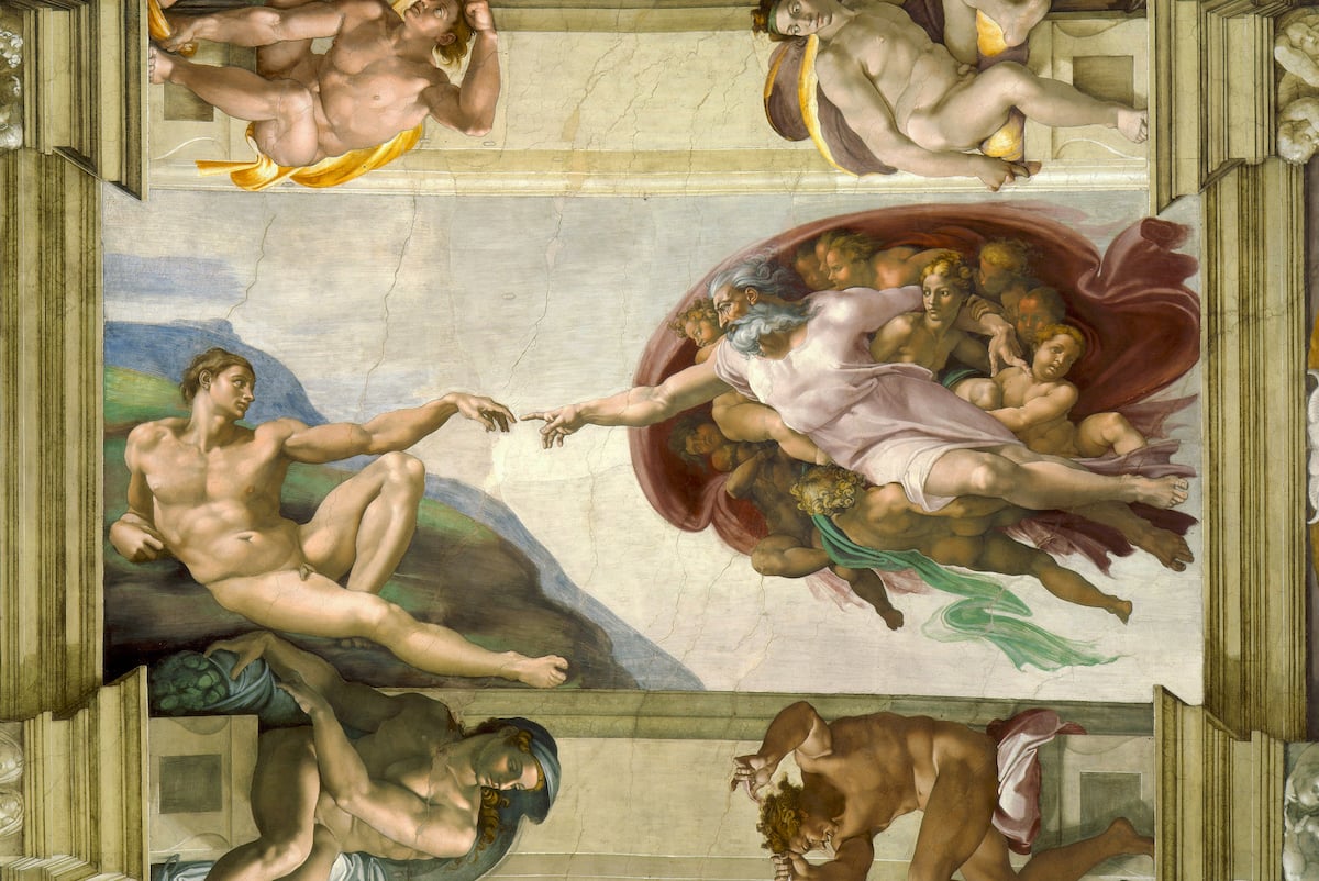
Michelangelo’s Creation of Adam demonstrates a keen understanding of the seven principles of art and design.
1. Balance
Balance is used to illustrate the visual weight of an image. It can either unite a photo or create division. You can achieve balance in three ways:
- Symmetry: Both sides of an image reflect the same subject matter, like a mirror image.
- Asymmetry: Contrasting elements balance the image. For example, a textured surface on one side of an image with a smooth, matte surface on the other.
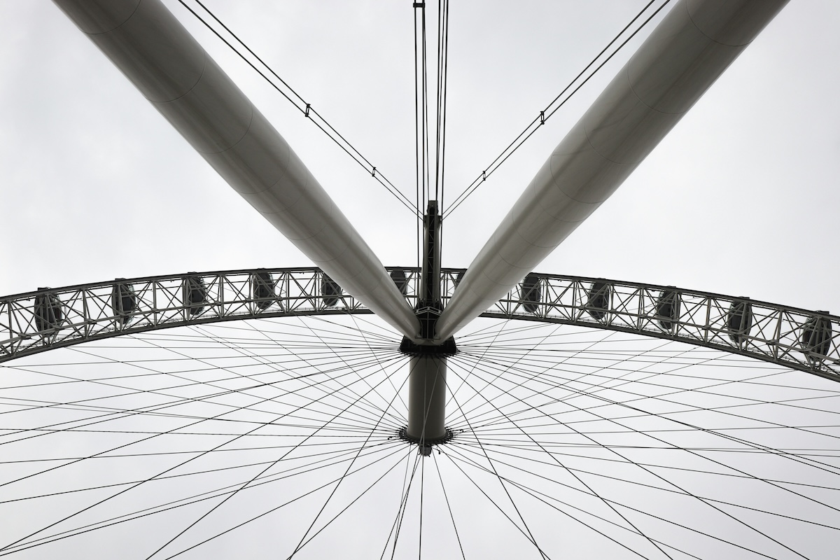
- Radial Balance Symmetry: Elements spaced equally around a central point, Like spokes on a bicycle wheel.
A carefully balanced image lends a sense of stability to a photo. An unbalanced image creates disunity or unrest. Both applications are okay, depending on the desired outcome.
Balance is sensual in that it "feels" wrong or right. Try moving your camera to achieve different perspectives to emphasize balance in an image.
You can also try to photograph different fields of texture and color. Don't be afraid to experiment a little.

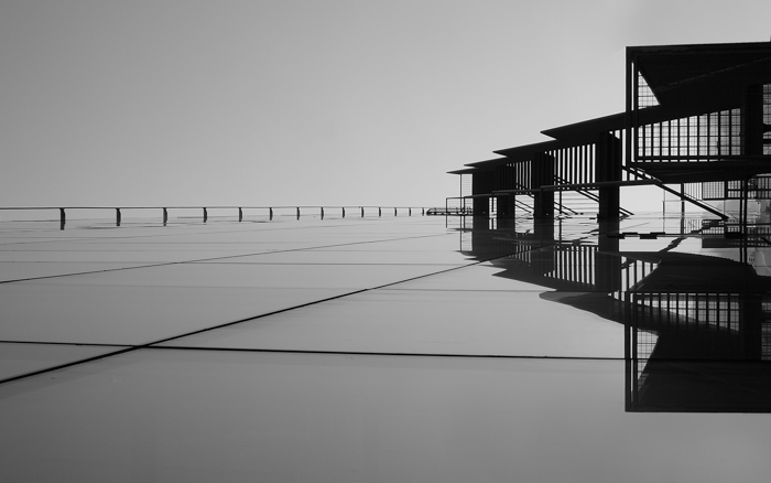
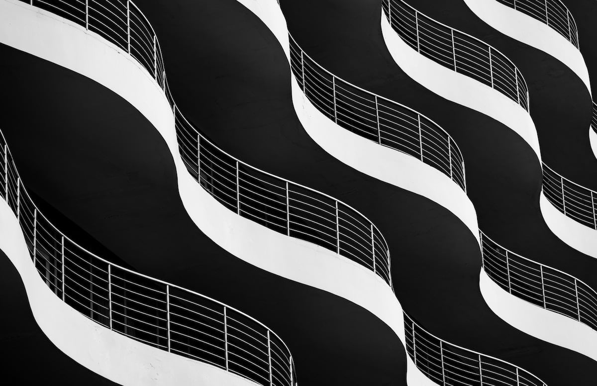
The symmetrical balance of this walkway creates depth and leads the viewer’s eye through the image. © Stephen Crane
2. Rhythm
In many ways, composition in photography is very similar to what you find in music. The photographic concept of rhythm borrows heavily from music theory.
Just like a musician reading the notes on a sheet of music, subjects in a space regulate how we view a photo. The rhythm dictates an image’s recurring organized or disorganized distribution of visual elements.
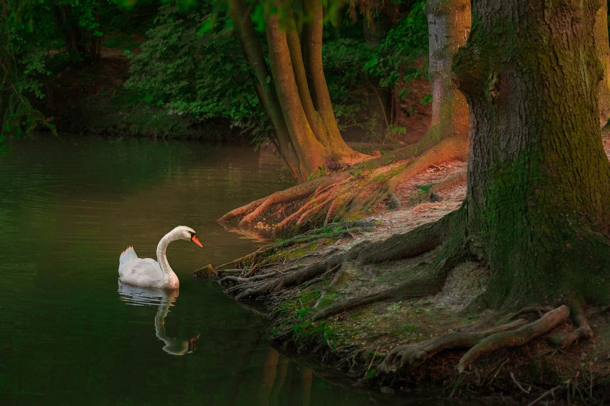
Try visualizing musical notation to introduce a sense of rhythm to your photography. The negative spaces, correlations, and differences between subjects in a photo like the one below reflect notes on a sheet of music.
© Sergey Kotenev
3. Patterns
Patterns make sense of the visual world through regularity. You can find patterns in everything from artificial, abstract objects to organic material.
The human eye is calibrated to seek out patterns. They can evoke surprising emotional reactions from a viewer.
Design elements can be organized in a predictable manner to form a pattern. Simply put, patterns are repetitions of the elements of art and design. These work in unison within a single frame.
Patterns are an active principle of art and design. They lift an image off the page. Using patterns in your photography is as much about exploring as it is about photographic technique.
Try looking for architectural and urban features or organic subjects like flowers. Once you start looking, you will be amazed by the abundance of patterns around you.
© Kim Chan
4. Emphasis
Emphasis shapes the center of interest in an image. Color, space, texture, and line work together to determine the focus of an image.
There are many ways to create emphasis in a photo. Spatial emphasis involves the orientation of a subject within the photographic frame.
A lone subject located in the center of an image will attract attention. It is the most readily available component of the photo. Selective grouping guides the viewer’s eye to particular focal points for a picture with many subjects.
The subject’s size also dictates how the viewer will “read” a photo. A larger subject suggests a closeness to the surface of the image.
It commands greater attention than that of a smaller subject in the background. Showing scale tells a story about the physicality of the subjects, adding depth and perspective.
Color is another tool that can cultivate emphasis. A bright or colorful subject within a dark scene gives an image a sense of vibrancy and life. It draws the viewer’s eye.
© Artem Kniaz
5. Contrast
Contrast is created when two or more opposing elements are present in a photo. Light against dark, warm against cool. But contrast includes physical elements, too.
Texture is another way to use the principle of contrast in photography. Including two or more textures in an image introduces tactility and creates a sense of place.
A round water droplet resting on the fuzzy tendrils of a plant is an example of a textually contrasting subject matter.
Contrasting subject matter brings the narrative to a photo. You can also try juxtaposing attributes like sharpness and softness, old and new, or curved and straight.
High contrast image on Adox CMS 20 © Kit Bryan-Smith
6. Unity
Unity describes the visual relationship between elements in an image. It helps create a cohesive image. Using similar colors, tones, concepts, or elements cultivates a sense of unity.
Disunity is the opposite. Bad cropping, awkward perspectives, overexposure, or underexposure. These all disrupt an image and can cause disunity.
Another aspect that underlies a unified image is the clear idea of a photographic outcome. A photographic outcome, or goal, is the idealized mental image of an image before it’s taken.
By pre-visualizing an outcome, a photographer can develop a clearer idea of the purpose of a photo. This, in turn, allows a photographer to take greater control of the image.
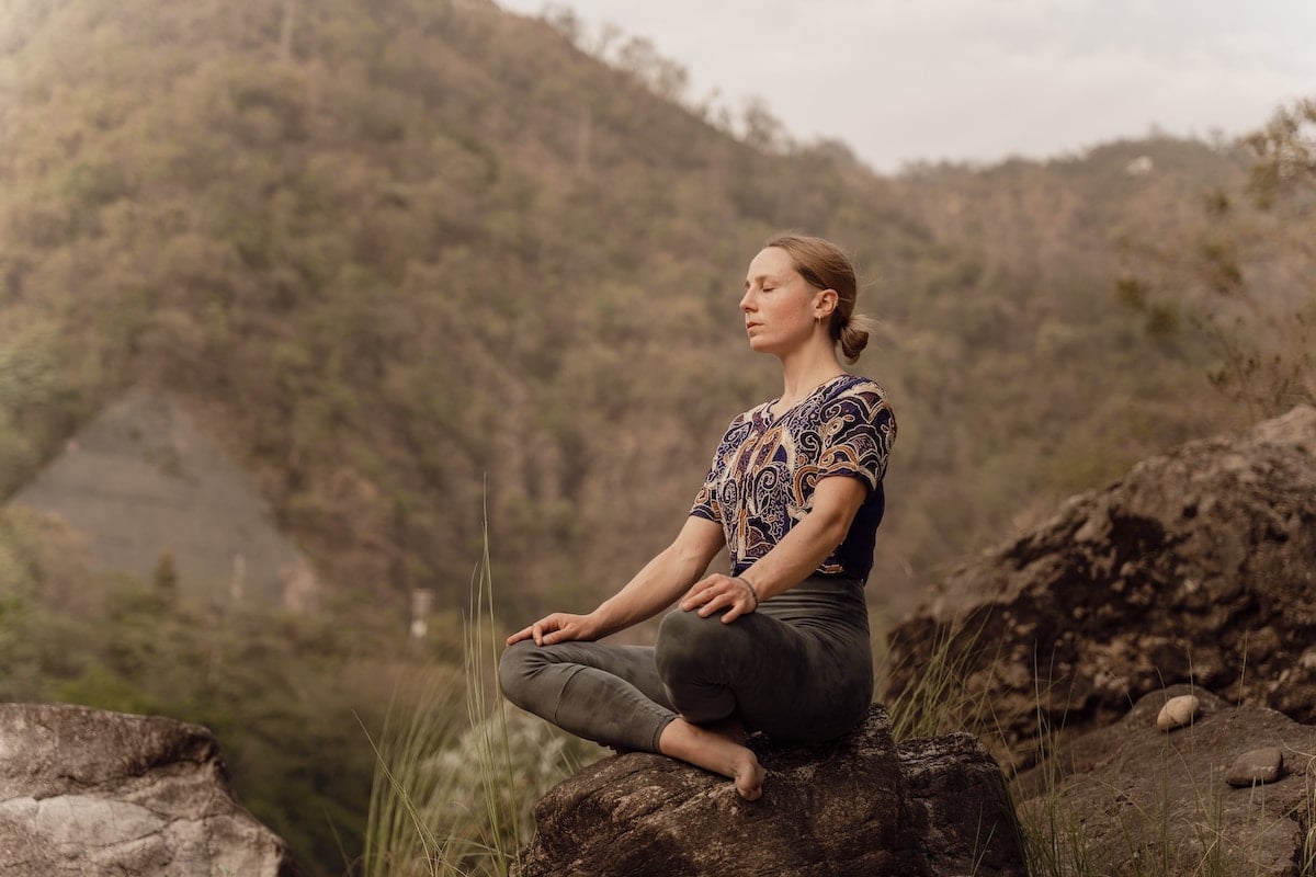
© Jaspinder Singh
7. Movement
The term “movement” in photography often describes the relationship between a camera’s shutter speed and a subject. When it comes to art and design, movement refers to the path the viewer’s eyes take while reading a photo.
The elements and principles of art and design shape movement. A photographer can take control of the way a viewer absorbs a picture. For example, using lines in photography creates “visual highways” that guide a viewer’s eye.
Jagged lines create excitement, shifting the viewer’s gaze from one point to the next. Curved lines are more subtle. These reduce the speed at which a picture is viewed.
Understanding the nature and psychology of human sight is an important part of controlling movement.
For example, the human eye is more sensitive to certain colors than others. Red grabs attention. Soft blues are gentler and more subtle. Movement can be directed through the selective use of color and saturation.
There are many different ways to guide the viewer’s eye through a photo. Movement studies the nature of the eye and the psychology behind how we absorb visual information.
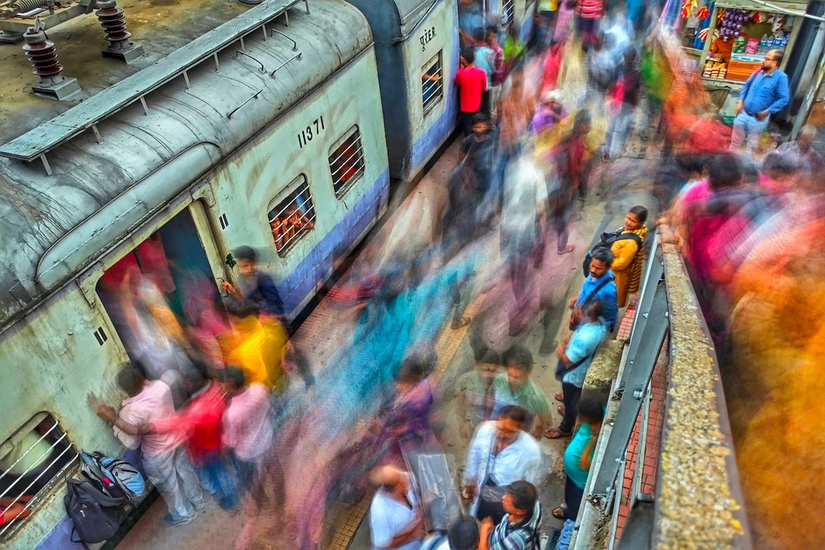
The blurred shapes move your eyes in an S-pattern around the image. Long exposure shot with a Xiaomi 13 Pro. © Dibakar Roy
Conclusion: Principles of Art and Design
The seven principles of art in photography are balance, rhythm, pattern, emphasis, contrast, unity, and movement. These form the foundation of visual arts.
Using these seven principles of art and design lets you take greater control of your photography. This leads to better photos that stand out and help you recognize photographic opportunities.