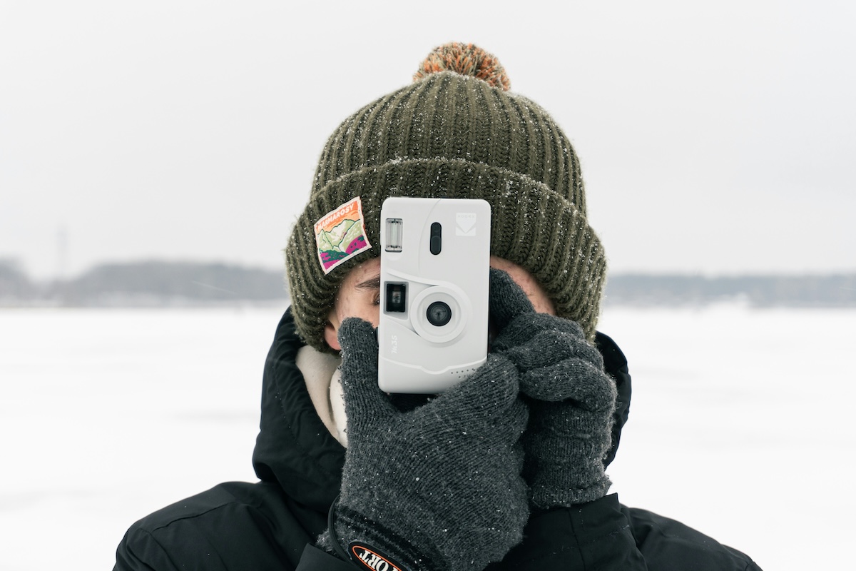
Blue is one of the most popular colors in photography. It can be used to convey a wide range of emotions, from sadness and melancholy to happiness and joy. In this article, we will explore how to use blue in photography.
The Psychology of Blue in Photography
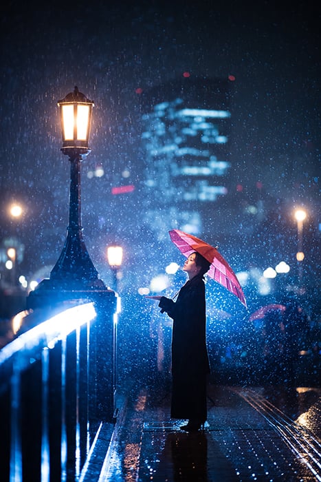
Combined with elements like rain, blurred cityscapes, umbrellas, and sad expressions, the color blue might create a sense of longing or sadness.
Many people consider blue their favourite color. Designers use it to create calming rooms. Psychologists claim that the color blue lowers blood pressure. And artists say that it helps them be more creative.
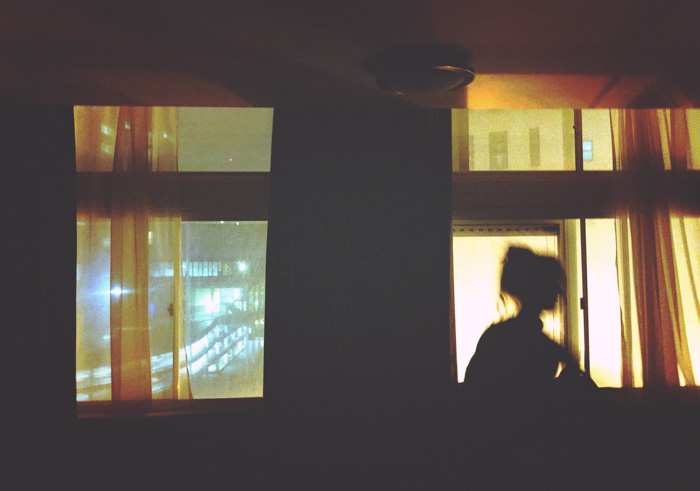
Sometimes, the color blue is associated with loneliness and sadness. This usually happens when you combine it with specific elements, like rain. Too much blue can create a sense of isolation.
These moods depend on the shade of blue you’re using. Lighter blues might seem harmless, while darker ones may appear to have a more somber feel to them.
Color combinations also play an important role in the psychology of blue. For example, blue and orange are opposites on the color wheel, and work beautiful together in almost every setting.
The contrast between cool and warm colors is a great way to emphasize a specific subject.
You can use this color information in photography. Specific tones and color combinations can shape the atmosphere of your images.
Use Saturated Blue Tones to Enhance a Dramatic Mood
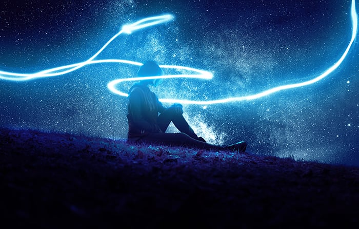
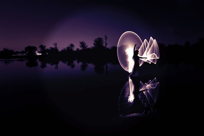
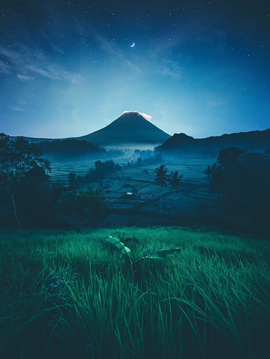
Intense blue tones are perfect for conceptual, nighttime, landscape, and portrait photography. They create powerful atmospheres that make images look both moody and dramatic.
One of the best times to use this type of blue is at night. You can light your subject using an artificial light source, such as a torch or a glow stick.
This will create a dramatic contrast between the bright light and the surrounding color blue.
For a surreal effect, move the light source around as you take pictures. Make sure your shutter speed is slow and you’re using a tripod.
This will create smooth light movements. These will look like light sabres or halos. This effect is often used in landscape photography and dance photography.
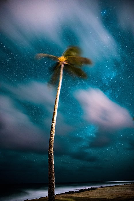
Create Peaceful Atmospheres with Softer Shades of Blue
You can take stunning landscape photos right before it gets very dark. This time of day is called the blue hour. The light is a soft shade of blue and makes everything look peaceful.
Softer shades of blue are ideal for tranquil and relaxing landscape photos. Because of the even tones, you can photograph all kinds of landscapes. And you don’t have to worry about bad dynamic range.
The only downside to blue hour photography is that it’s available for a short period of time. Also, the sky needs to be relatively clear so you can get as much blue light as possible. If you plan beforehand, you’re guaranteed to get some interesting shots.
To create a neutral mood, make sure your entire composition isn’t blue. Include patches of grass, trees, etc.
These will make your images more interesting and create a balanced atmosphere.
Desaturate Blues for a Calm Minimalist Effect
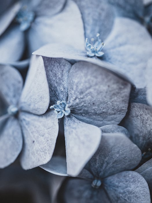
If you want a laid-back atmosphere that’s also minimalistic, desaturate your blues. So much so that they almost look grey.
You can desaturate the entire image. Or you can selectively desaturate every shade of blue there is.
You’ll notice that as soon as you do this, the atmosphere in your photo will change. This is because neutral colors have a classic and timeless look.
Desaturated blue tones work well in lifestyle, macro, portrait, and street photography.
Enhance Blues in Post to Make Your Image Stand Out
You can do the opposite of desaturating by manually enhancing blue tones in post. This technique can be approached in two ways.
In Lightroom, this is possible by dragging the blue Saturation slider to the right in HSL. In Photoshop, you can manipulate specific colors using the Selective Color tool.
One way you can use these color tools is to enhance blue skies or turn a dull grey sky into a vibrant blue one.
You can also completely change the color hue in your photos. Use the Hue/Saturation tool in Photoshop (Image > Adjustments > Hue/Saturation).
Greys can become blues, and reds can take on a purple shade.
The effect will look quite dramatic. But it will significantly affect the mood you’re trying to create. For a more subtle effect, work in a separate layer with a low layer opacity.
Draw Attention to Your Subject by Creating an Orange/Blue Contrast
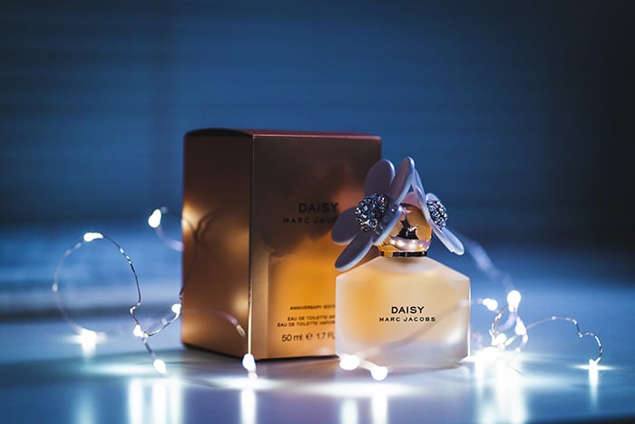
If you’re shooting in the dark, you can use white fairy lights to make your subject more visible. Small light sources like this can also intensify the color blue without taking over the entire image.
You may have noticed the teal and orange look in many Instagram pictures. The reason it’s so appealing is that warm colors and cool colors balance each other out. They create a pleasant contrast.
You can use this aesthetically pleasing combination in almost any photo you like.
Start by choosing an orange subject and making a blue background, or vice versa. You can use a warm or cool light to intensify your background color. While there can be other colors in your image, try to focus on orange and blue the most.
This atmospheric effect is great for nighttime, product, portrait, and lifestyle photography.
Use the Color Blue as a Background for Red, Grey, and Green Subjects
Other than complementing orange, blue works pretty well with every color. If you’re unsure about the kind of background to use for your subject, the color blue might be the answer.
You can use blue sheets of paper, blue walls, or blue fabric as a background for a variety of shoots.
There’s no genre limit to this. Blue backgrounds tend to work especially well in portrait and product photography.
Conclusion
Blue is a flexible color that you can use in many creative ways. You can create your own blue light using artificial light. You can shoot outside during the blue hour. Or you can create calming blue backgrounds to complement your subjects, and more.
Knowing how and when to use the color blue will help you improve, and make your photography experience more fun. And your photos will stand out in a crowd.
Check out our post on using complementary colors or how to determine your dominant eye for better photography next!