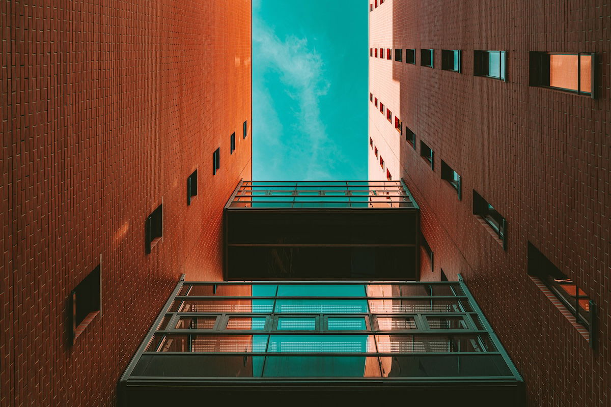
The popular teal and orange color grading effect is achievable in Lightroom. This aesthetic brings a cool cast to our images. You will notice many preset packages will have this style. Instead of buying them, we will tell you how to make your own inside Lightroom.
This is a quick and easy aesthetic to create. We will show you a few ways to achieve the teal and orange style and ways to fine-tune your edits.
The teal and orange color grading effect became popular through Instagram filters. Since then, it has popped up in hundreds of preset packages across the internet.
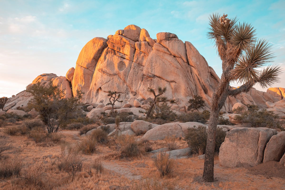
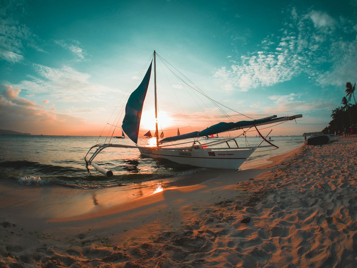
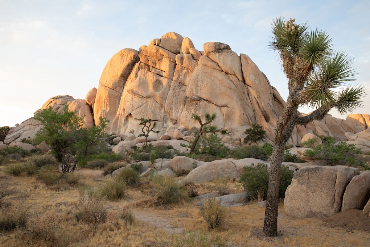
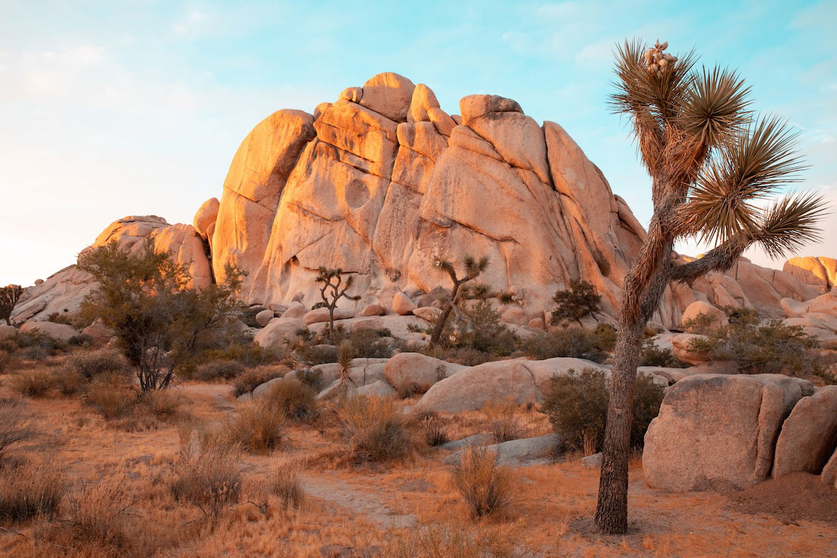
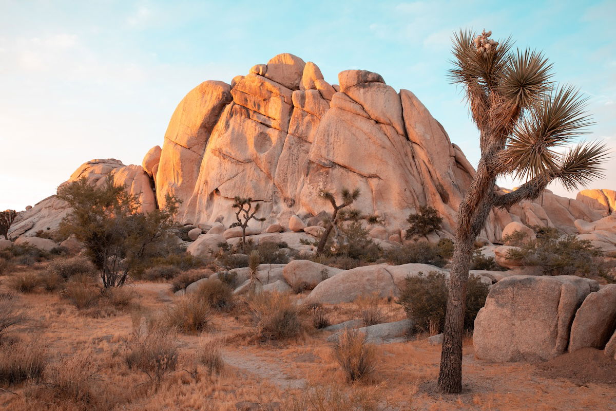
The teal and orange effect is self-explanatory. It puts a teal and orange tint over your photograph. The skies, reflection, and water in your photographs will turn a cool teal tint. The landscapes, buildings, and other elements will turn a orange tint.
Teal and orange are complementary colors. When most of the image is in these tones, we create aesthetically pleasing photographs. You can use these tones to create stylized versions of your photographs.
Adobe Lightroom now comes in two different versions: Lightroom and Lightroom Classic. Both versions have many of the same functions; what differs are the approaches to editing processes.
Lightroom favors a post-processing workflow that utilizes the cloud. This allows you to work from the same set of images on any device you want. This version also prioritizes simplicity and ease of use through a stripped-back interface. This may be easier for beginners to work through.
Lightroom Classic has an interface with which any photographer who has used the past versions of Lightroom would be familiar. It provides a wide range of features, some of which you may never need to use. You will find more in-depth controls and attention to detail in Lightroom Classic.
Both Lightroom versions produce the same results as the algorithms for adjustments are the same. They both allow you to perform the teal and orange effect. So, it will come down to personal preference or whether you need to use a very specific process. This article will outline differences in the processes we touch on in either Lightroom version.
Now, we will show you how to create the teal and orange effect in Lightroom. You can perform this easy process in both Lightroom and Lightroom Classic.
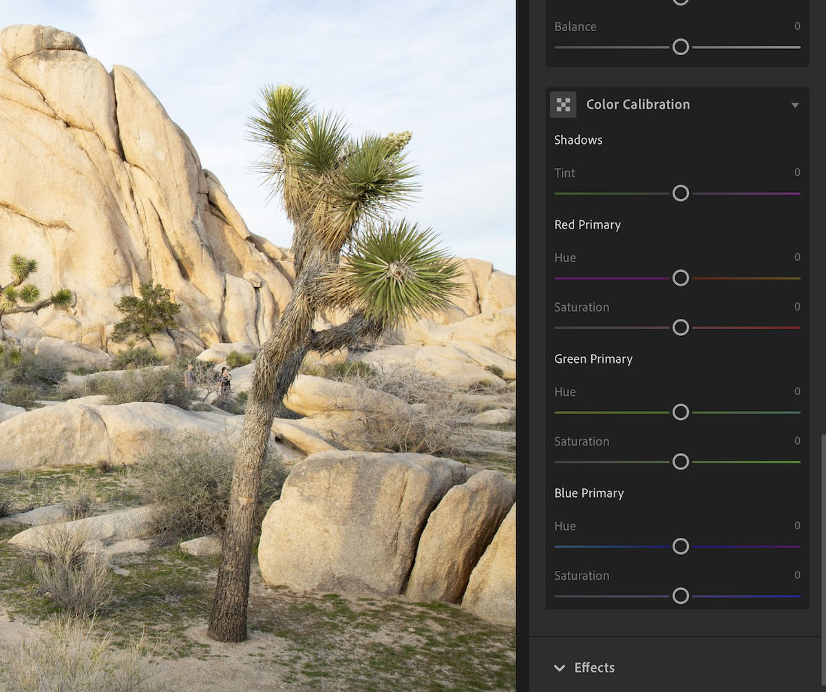
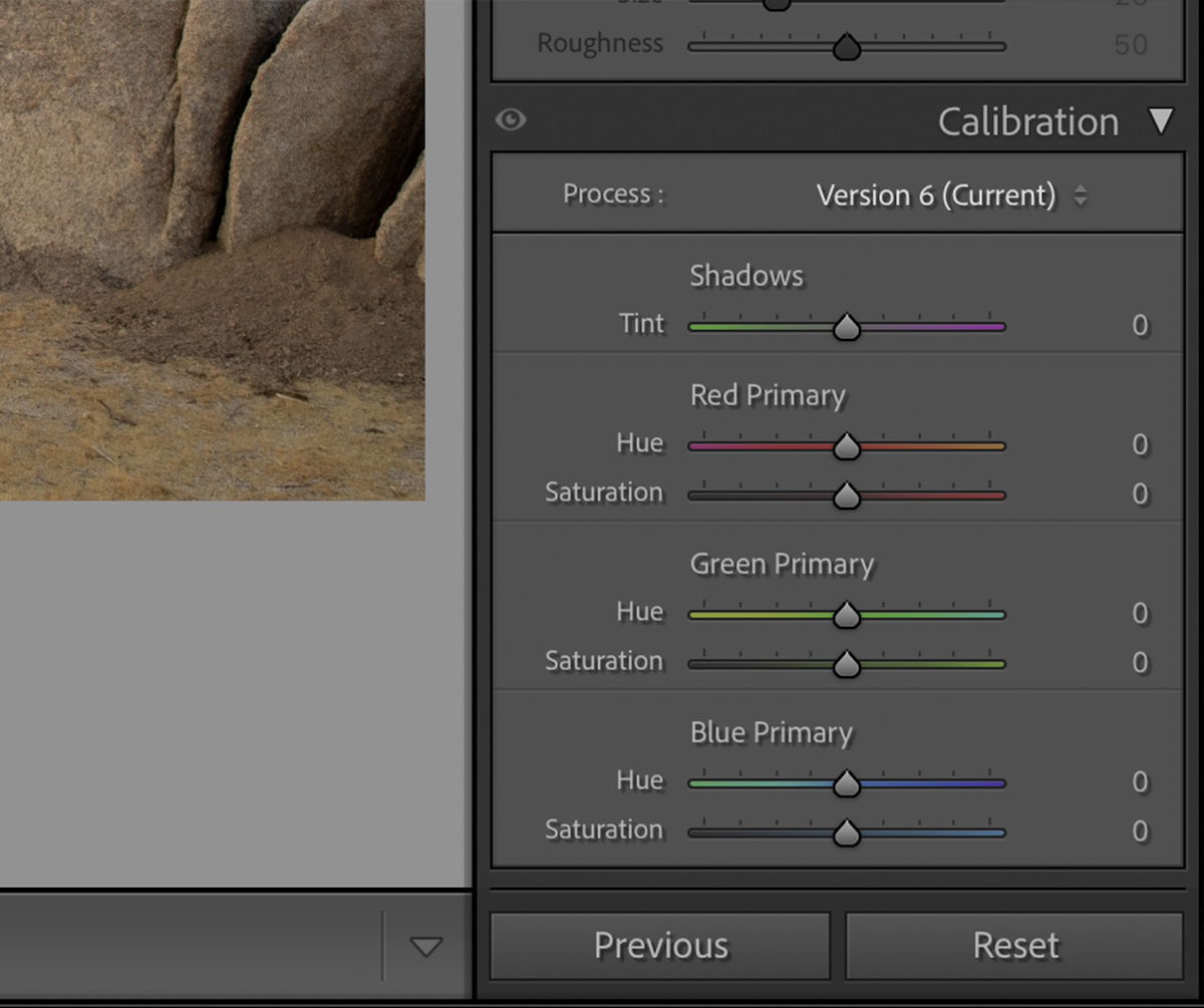
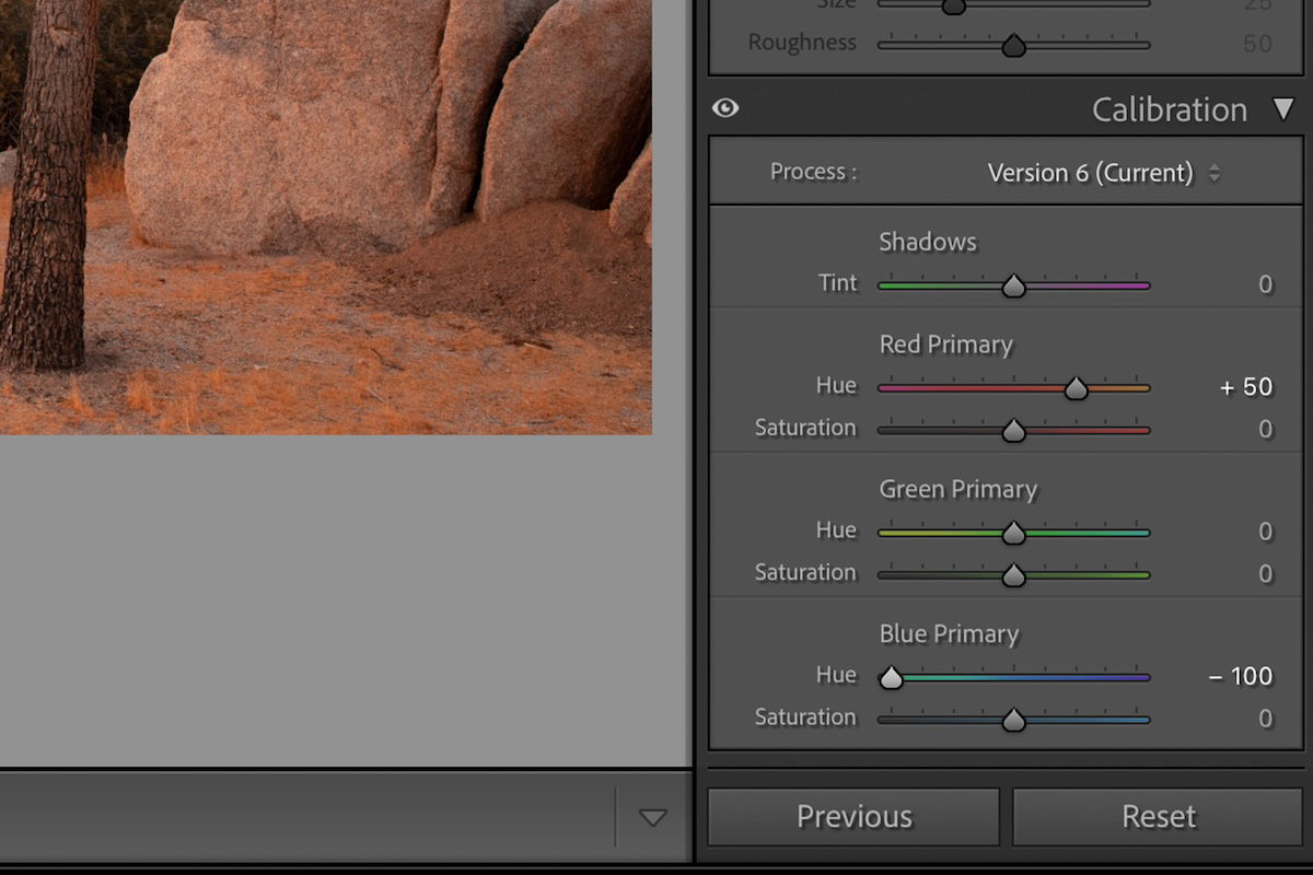
To produce this effect, find the Color Calibration section in the Edit panel in Lightroom. This will be the Calibration section in the Develop panel in Lightroom Classic.
First, move the Red Primary Hue slider to +50. Then, move the Blue Primary Hue slider to -100. This sets the base for our teal and orange effect.
Our results will likely be too saturated. To fix this, we will want to use the Saturation sliders below. This is where your personal preference will come in.
Traditionally, this effect has low levels of saturation. It’s best to keep it that way, as the saturation makes the colors look unnatural. But this is up to you, and you should experiment to find your personal preference. You can always edit the saturation more in the next step.
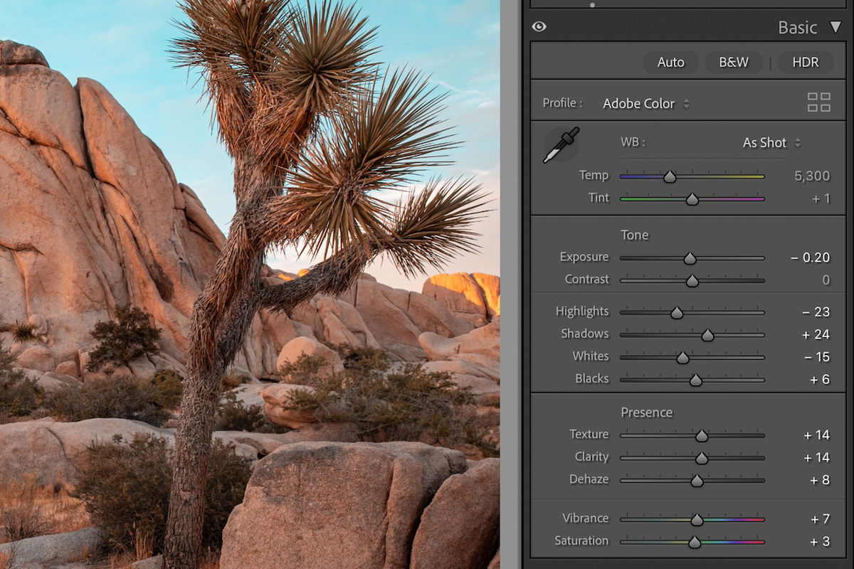
Once you have the basic teal and orange effect, head to the Light (Basic in Lightroom Classic) editing section. Here, you can fine-tune your effect to your exact requirements.
These basic adjustments should be done to your preference, or to support your current photograph. As a rule of thumb, we want to continue with the low saturation aesthetic with a low contrast.
Instead of adjusting the Contrast slider, you should adjust the highlights and shadows manually. This gives you more control over the type of contrast you want.
At this point, it is useful to have a photo you like as a reference. You can then match these basic adjustments to something similar to your desired image.
I suggest slightly increasing the Texture, Clarity, and Dehaze to add to the aesthetic.
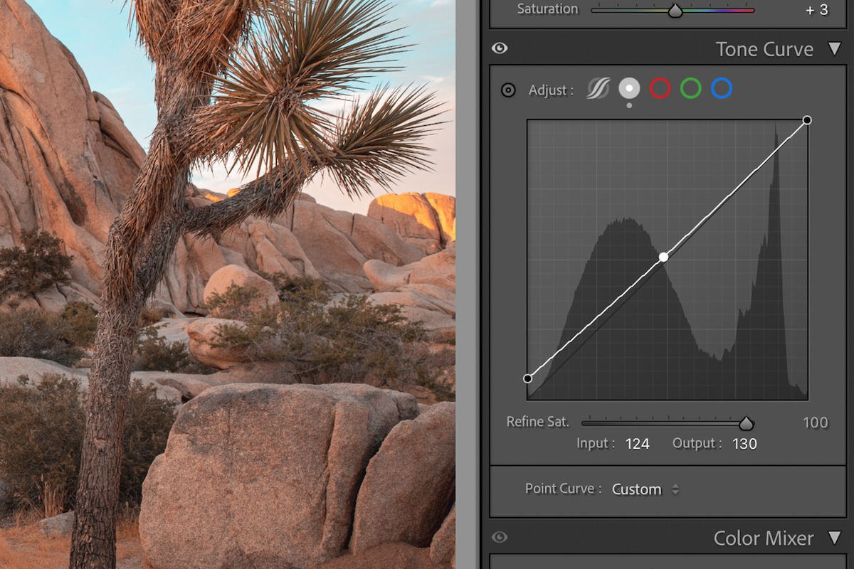
The Tone Curve is a graph that allows you to edit the different sections of the exposure. Read our in-depth article here on the Tone Curve.
In this section, I like to raise the bottom left point a bit to reduce the true blacks in the image. If this washes out too many mid-tones, click the line in the middle. You can then drag down this point to the reference line.
Color Grading
If you want high levels of control, I recommend you use the Color Grading section. These adjustment tools allow you to edit colors in the different tonal sections: Shadows, Midtones, and Highlights.
These controls make grand changes to your image. So, make sure to use these very slightly. Read our full article here to learn how to control these settings.
Save As A Preset
After all this fine-tuning, you will want to save your custom settings. This will allow you to make the same adjustments to any other photo in your Library.
Remember that the Basic adjustments were specific to your first image. Once you have applied the preset, you might have to edit these adjustments in each particular image.
To save your settings as a preset, click the ‘+’ button in the Preset section. To understand the control Lightroom gives you, check out our full article on saving presets.
From these few steps we can see that Lightroom makes it easy to create this popular effect. We also get much more control than setting a preset over our Instagram photos.
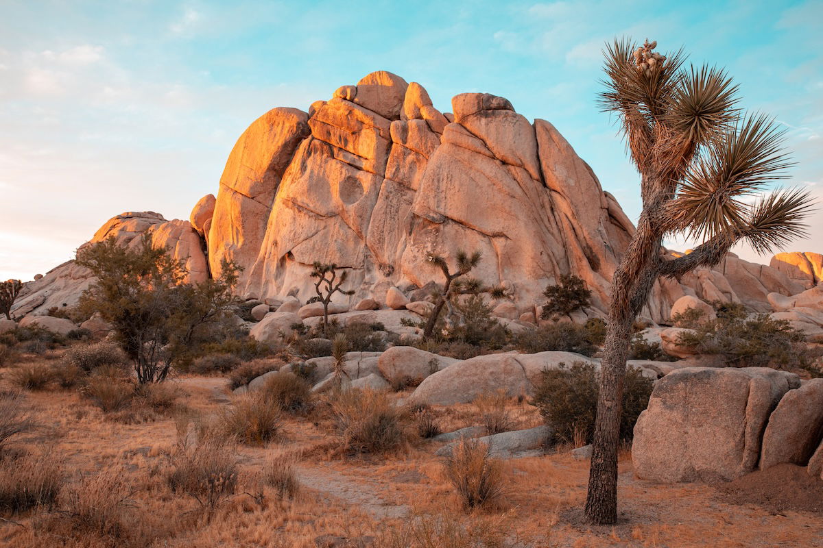
The teal and orange effect completely changes the feel of a photograph. It adds a dreamy aesthetic that makes us appreciate often overlooked and basic scenes. Check out our other Lightroom effects for more options to apply to your photographs.


![P08 [Lead Gen] Product Sidebar_v2_date_20230223](https://expertphotography.b-cdn.net/wp-content/uploads/2023/02/P08-Lead-Gen-Product-Sidebar_v2_date_20230223-300x295.jpg)
![P08 [Lead Gen] Sidebar Banner 2_date_20230223](https://expertphotography.b-cdn.net/wp-content/uploads/2023/02/P08-Lead-Gen-Sidebar-Banner-2_date_20230223-300x245.png)
![P08 [Lead Gen] Sidebar Banner 3_date_20230223](https://expertphotography.b-cdn.net/wp-content/uploads/2023/02/P08-Lead-Gen-Sidebar-Banner-3_date_20230223-300x245.png)