The displacement map in Photoshop is a great feature, but you need to know how to use it. In this article I will take you through seven steps on how to make a displacement map in Adobe Photoshop.
Using Photoshop displacement maps can add a new dynamic to how text and graphics look when added to a photo. If you simply add text on a new layer and use the Normal blend mode, it will appear quite separate from the photo.
Applying text or graphics using Photoshop displacement mapping makes the additional layer look more like it belongs in the image.
Our Displacement Map in Photoshop Tutorial
Step 1. Open Your Background Texture Image
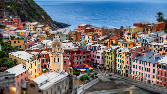
Choose a suitable photo you will use as the background for your text or graphic. The more contrast and texture the image has, the more noticeable the effect will be.
If you are experimenting with adding a displacement map for the first time, it’s helpful to choose an image with good contrast and texture.
The more contrast and texture your background image has, the more pronounced the effect of the displacement map will be. If you choose an image with low contrast and texture, you will have trouble seeing the effect at all.
Step 2. Convert the Image to Black and White
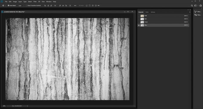
Open the Channels Panel and click on each of the channels to find which one shows the most contrast. Look to see if it's the Red, Green, or Blue channel that will enhance the look of the texture in your image the most. For the image I am using to illustrate this article, it is the Blue channel.
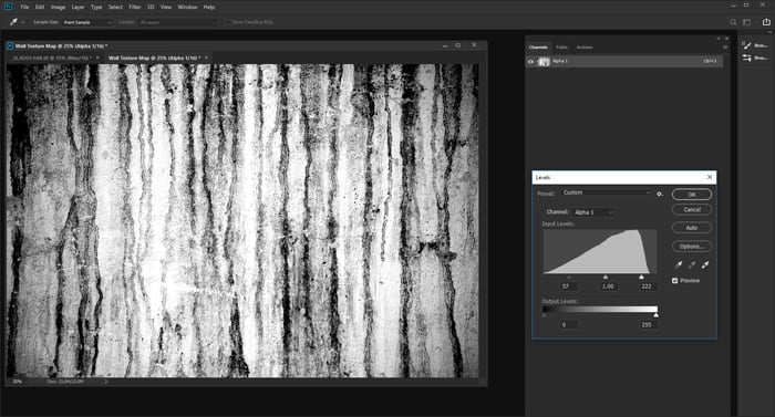
In this step you can also add more contrast. This is completely up to the style you and wanting to create. My background image is grungy, so I have manipulated Levels to heighten the contrast.
Use Ctrl+L to bring up the Levels window. Drag the sliders on the left and the right in towards the center until your contrast level is where you want it.
Step 3. Save Your Image as a New Photoshop Document
Your image must be only 8 bits per channel. In the top menu select Image > Mode > Grayscale. Then select Image > Mode > 8 Bits/Channel.
This black and white image will be the map you will use. You must now save the image as a new .PSD file.
Either Ctrl+Click or right-click on the channel you have chosen and select Duplicate Channel. In Destination > Document, select “new.” Name your new document and click OK.
Make sure to store it somewhere you can find it easily because you will need to open it again in Step 6.
Step 4. Add a Gaussian Blur
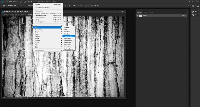
So your finished image will look more natural you need to add some blur. From the top menu, select Filter > Blur > Gaussian Blur. Set the blur radius to 1 pixel.
This may vary depending on the resolution of your image. Save your image.
Step 5. Add Your Text Or Graphic
Go back to your original image and turn on all the channels again by clicking RGB in the Channels panel.
Type in the text or drag and drop your graphic and position it where you want it. Make this new layer the color you want, or use black or white.
Step 6. Apply the Displacement Map
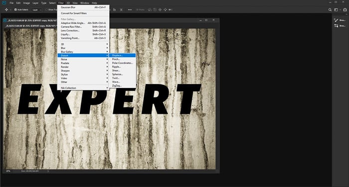
Convert your text/graphic layer to a Smart Object by using either Ctrl+Click or right-clicking the layer in the Layers panel, then selecting Convert to Smart Object.
Next go to the top menu and select Filter > Distort > Displace. Use the default settings and click OK. This will open a new window where you will choose the grayscale .PSD image you have just created. Select it and click Open.
Your text/graphic will now have the displacement map applied to it. Zoom into your image and view it at 100 percent. This will allow you to best see the effect of the displacement map on your text or graphic.
Step 7. Refine the Look of Your Displacement Map
This is where you can tweak the look of your text/graphic to make it look more the way you want it. If the blend mode of the layer is set to Normal, it will most likely not look so great.
Experiment with various blend modes until you find one you want. Often, the Overlay and Soft Light blend modes work well for a more natural look.
You can also duplicate the layer and change the blend mode and opacity for greater control.
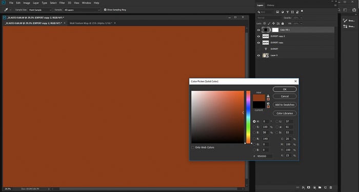
Adding a Solid Color allows you to adjust the color. In the Create New Fill or Adjustment Layer in the Layers Panel, select Solid Color and choose a color that's most suitable for your image.
On your text/graphic layer, Ctrl+click on the layer's icon in the Layers Panel. This will select only your text/graphic with the displacement map. Invert the selection using Ctrl+Shift+i.
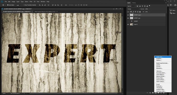
With the solid color layer selected, press delete. You will now see your text/graphic in the new color. Experiment again with blend mode and opacity to alter it to your liking.
Alternative Uses for Photoshop Displacement Maps
Most commonly text and graphics have displacement maps added to them. You can also use other photos.
Using displacement mapping you can create, among other things, more realistic looking reflections, design packaging and add tattoos to people.
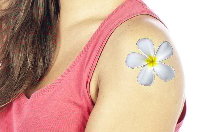
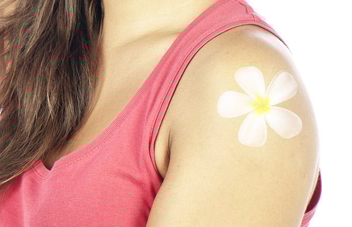
In this example, I have clear cut a photo of a frangipani flower to use as a tattoo on the girl's arm. Simply adding the flower image as a new layer without any adjustments looks very unnatural, as illustrated in the image above.
Adding the same photo by applying the steps I have outlined leads to a more realistic result. You can see this difference in the image below.
Conclusion
Starting out with a clear idea in mind for how you want your finished photo to look after you have applied a displacement map in Photoshop is helpful. You need to know what you are aiming for.
This can be difficult when you are unfamiliar with the process. Try using this technique on a variety of different photos with text, graphics and other photos.
Experiment with various blend modes, layer opacities, and colors. This will help you get a feel for the different alterations you can make to the process.
Practice each step and become familiar with the changes being made. When you have more of a feel for the amount of blur to add, what blend modes and opacity levels work best your creativity will flow more freely.
Check out our Effortless Editing with Lightroom course to master post-processing!