Do you wonder why your photos appear flat and uninteresting when you convert them to black and white? If you do, it is probably because your photos lack black and white contrast. A photo lacks contrast when it doesn’t have both dark tones and bright tones, instead having only a limited range of greyscale tones.
However, by just being aware of a few key points, you can easily learn to use contrast to improve your black and white photography.
Improve Your Photos by Planning Black and White Contrast in Advance
You’ll get the best results if you start out knowing that that you want your image to ultimately end up as a black and white photo. This way you can plan to have contrast and compose your frames accordingly.
If you want to capture a photo with high black and white contrast, you can use two approaches:
- Look for tonal contrast
- Look for complementary colors and apply a color filter either on location or in post-processing
Approach #1: Tonal Contrast
Black and white photos tend to be stronger if they have a good amount of tonal contrast.
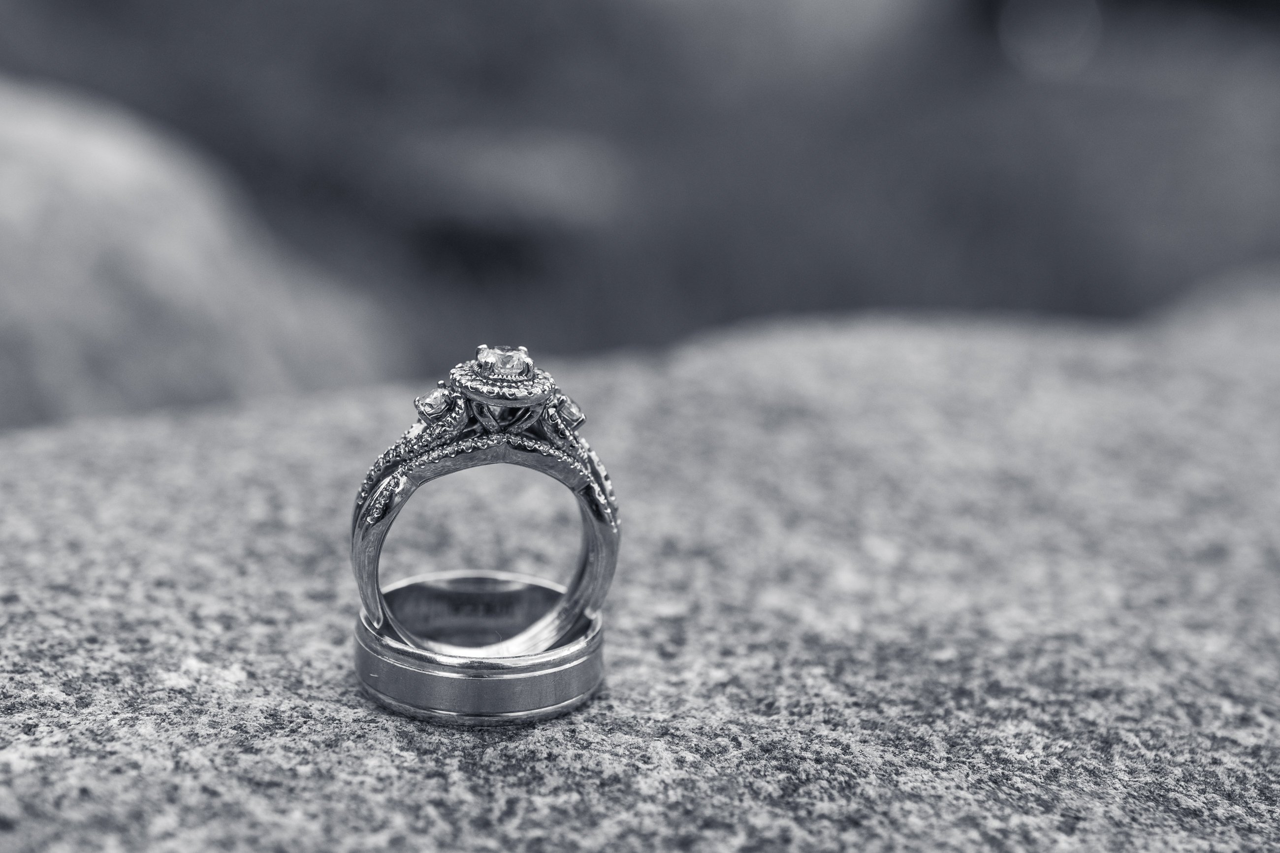
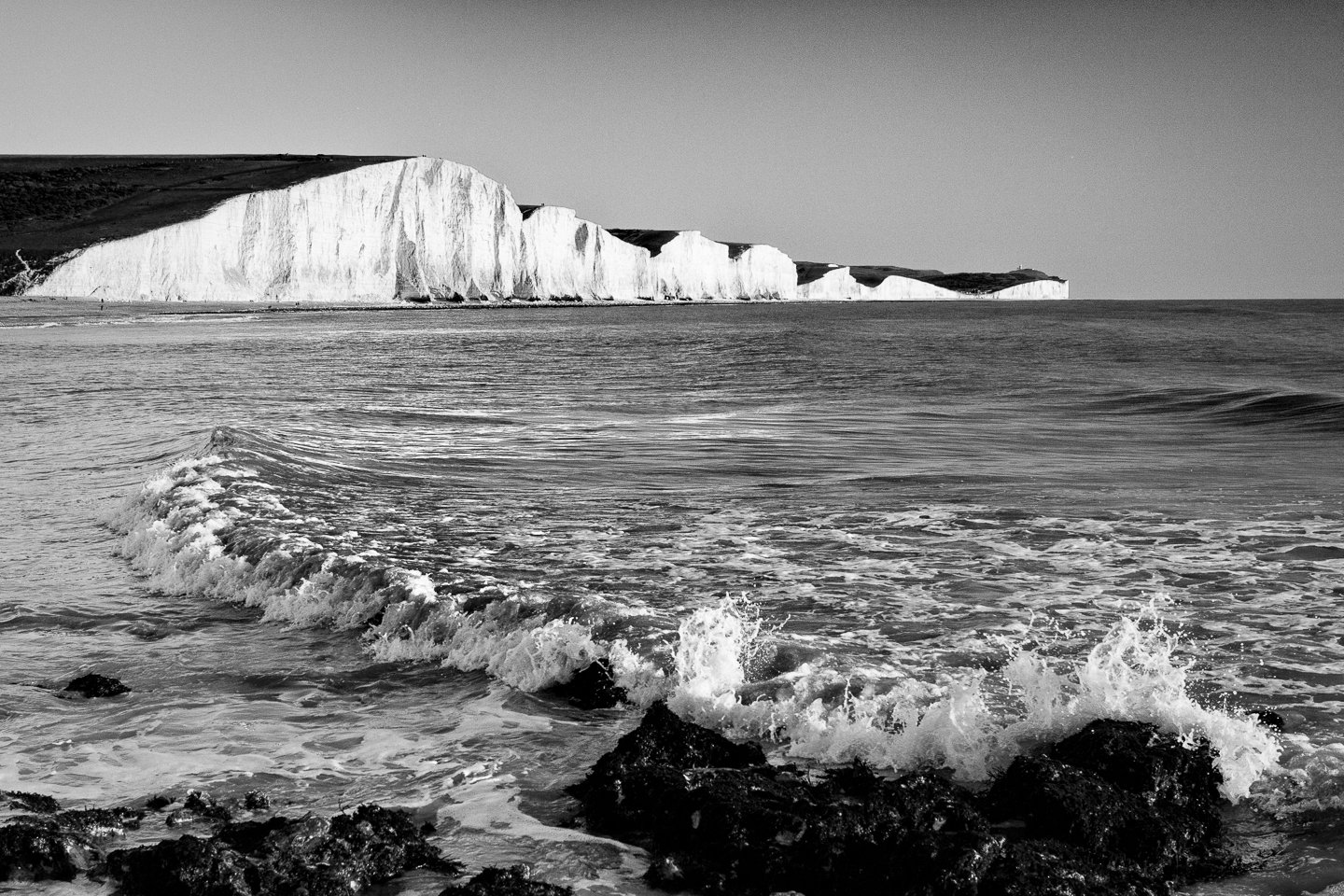
A wide or high tonal contrast means that the photo contains areas with both black or very dark tones and extreme bright or white tones.
The areas with black or white tones don’t have to be large, but having them in your photo will make your image much more appealing compared to similar photos that lack either end of the tonal spectrum.
Look For Dark And Bright Areas Instead Of Colors
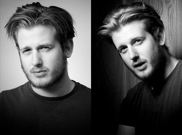
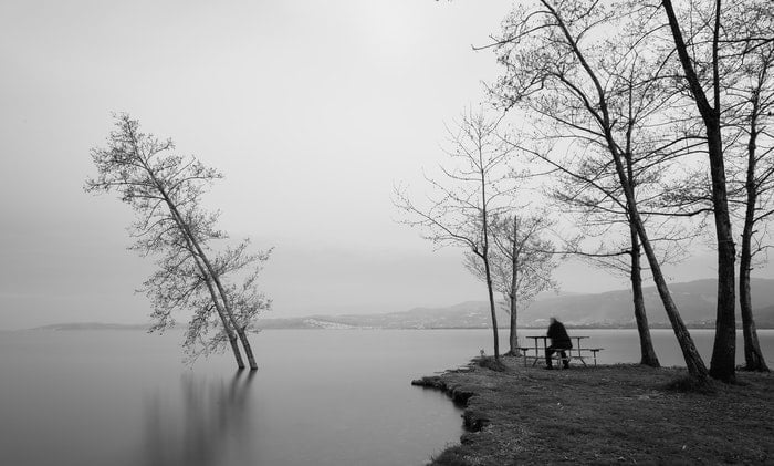
Once you have found an interesting subject that you want to capture and make into a black and white photo, you should pay attention to which bright areas and dark areas are at the scene and whether these can help you separate the subject or point of interest from the more unimportant elements.
At first, it can be a bit difficult to try to disregard the colors and look for dark and bright tones. However, if you consciously make a habit of spotting where the darkest area and where the brightest area is in the frame you will soon be able to spot whether a scene can make a great black and white photo.
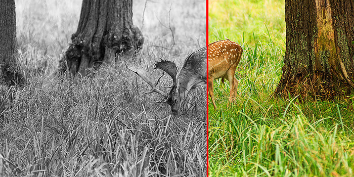
A low-contrast scene can result in a photo like this, where it is difficult to separate the subject from the rest of the scene.
If all the elements in your photos only have bright colors like bright red, bright green, bright yellow, and so on, you will end up with an image with only bright tones of grey. This will make it a low contrast black and white photo, and it will end up looking flat and dull.
Take a look at this photo above. You will find that the deer almost blends in with the high grass in the photo when it is converted into black and white. This is because the brown colors of the deer and the high grass have similar tonal values.
The green is almost as dark/bright as the brown fur of the deer, so instead of focusing on the deer, your eyes move to the trees, where there is much greater contrast with the brighter grey tones of the grass.
If you find that everything within the frame only contains dark tones or only bright tones (making it a low contrast image) try to see if you can frame the shot differently.
Change your shooting angle, rearrange the scene, or work with a different composition so that the photo will include a broader tonal range and thereby get more contrast. If your subject is bright, see if you can use a point of view or framing in which you have a dark background.
Use the Histogram as a Support
If you find it difficult to spot the dark and bright areas that will result in a high black and white contrast, you can use the histogram as a support tool.
Almost all digital cameras can display a histogram on the back LCD screen. The histogram shows the spread of tones in the photo, with the dark tones to the left of the histogram and the bright tones on the right side.
You can opt to take a test shot and look at the histogram to see if the dark and bright tones are there before deciding to compose and shoot, or you can just check whether you nailed it spot on after you’ve taken the shot you want.
A quick glance at the histogram once in a while will show you whether you have a photo with low contrast, medium contrast, or high contrast.
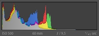
A histogram like this tells you that you have no bright tones in your image because there are no values or peaks on the right side of the histogram, which represent the highlights.
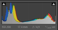
This histogram shows you that you captured tonal values both in the shadows and in the highlight because the histograms stretches to both the left and right side of the spectrum.
Seeking to include both dark and bright areas is the easiest way to get more contrast into your black and white photos.
Approach #2: Color Contrast
In a very dark or very bright scene it is not always possible to use shadows and highlights in the composition to create more black and white contrast in your monochrome image. In cases like these you should try to use the colors present at the scene to create the contrast.
How Color Contrast Affects Black and White Photos
The second technique for capturing photos with impact and contrast when converted into black and white is actually to look for colors.
More specifically, you should look for contrasting colors, which are also called complementary colors.
Here’s why.
Colors convert to different dark or bright grey tones when you change your image into a black and white photo. Per default, red, violet, and blue will convert to darker tones, while orange, yellow, and green per default will convert into rather bright tones.

If you keep this in mind when you compose your shot and seek to include colors that convert to both dark and bright grey tones, you will already have a good amount of contrast in your photo as soon as you hit the button to convert it to black and white in post-processing.
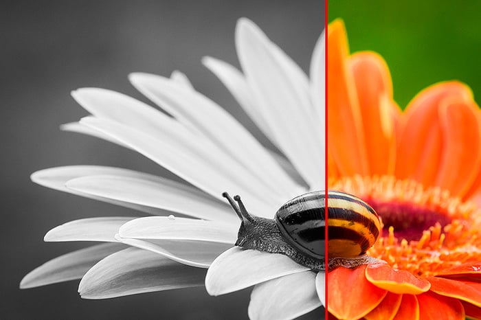
In this photo, the colors really help to separate the flower from the background because orange and green are close to being complementary, even though it is not a perfect complementary set of colors. The tonal difference between the darker snail helps to separate it from the brighter orange flower.
To Get Better Color Contrast, Use Physical Filters or Adjust in Post-processing
If you use color filters, you can actually control which colors will convert as bright tones and which will convert as dark tones.
Back in the old film days, you would have to use physical color filters attached to your lens to make a specific color appear bright in black and white when the film was developed in the dark room and turned into print.
For instance, if you attached a yellow filter, you would make blue, and violet colors appear darker than without a filter. This is because blue and violet colors are opposite to yellow on the color wheel.
You can still use physical filters to brighten some colors while darkening others, but I find that it is both easier and much cheaper to just do this in post-processing, using Lightroom or Photoshop.
The important thing, however, is to be aware of the colors you include in the photo at the time of capture. If you have no complementary colors in your photo, you will not be able to save it by just adjusting the black and white color mix in Lightroom.
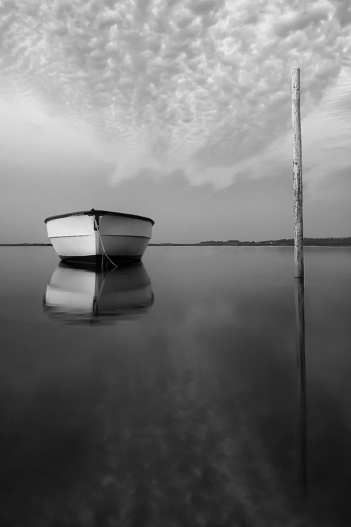
Take a look at the set of photos below. It shows how different color filters affect the same photo. The original black and white conversion gave a flat looking photo without impact. The boat became dark grey, and the water also contained a lot of fairly dark grey tones.
The red filter made the boat look darker making it difficult to clearly see the details on the boat. Because yellow and blue colors are so dominant in this photo, I find that the most beautiful conversion comes from using a yellow filter, giving the boat a bright tone.
Applying an orange filter also gave a fairly pleasing result. The filters were applied using Nik Silver Efex Pro 2, but you can get similar results by using inbuilt Lightroom controls.
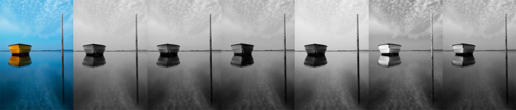
From left to right: Original color, Neutral BW (no filter), Green Filter, Red Filter, Blue Filter, Yellow Filter, Orange Filter. Note how applying a yellow filter results in a greater contrast between the boat and all the other elements within the frame.
How to Apply a Color Filter to a Black and White Photo in Lightroom
It is quite easy and straightforward to change how colors are converted to black and white in Lightroom.
To convert a photo to black and white, you first need to go to the Develop module (press 'D') and then in the Basic panel you should change the treatment to B&W.
Next, you should make the appropriate corrections to the other basic settings like exposure, contrast and so on. Note that you can use the shadow and highlight sliders to enhance the tonal contrast in the photo.
Go to the B&W tab in the Colour/HSL/B&W panel to change how colors convert into black and white to use the colors to get more contrast in your photos.
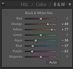
These settings are the ones used for the photo of the yellow boat on blue water. Note, that it might be necessary to adjust several of the sliders. In the case of the boat photo, the boat was more yellow-orange and the water contained aqua and purple values as well.
In the previous example photo with the yellow boat, I would push the yellow slider in the Black & White Mix to the right to make yellow colors convert into brighter tones.
Next, I would pull the blue slider to the left to darken make the blue colors convert into a darker tone.
Since your photos might have colors that have both orange and yellow, you might have to adjust several of the sliders in the black and white mix panel in Lightroom to make the black and white photo display more contrast and therefore produce the best impact.
On the image with the boat, I ended up pulling the yellow slider to +77, but also setting the orange to +49.
Note that you will only get good results if you place two sliders opposite each other if they are also complementary colors. If you set the yellow slider opposite to the green slider, for instance, you will get some strange artifacts in your photo.
By identifying the main complementary colors in your photo and positioning the sliders accordingly, you can achieve a better contrast.
As you can see it is very easy to create a contrast in your images, as long as you shoot with colors in mind. By knowing the color wheel and which colors are complementary, you are on your way to creating more impactful black and white images.
Separate Elements by Using Tones or Colors
Remember that just having dark and bright tones or having complementary colors in your composition is not enough. Now that you understand how they work, you should also seek to use them actively to separate the important elements in the composition from the unimportant elements or the background.
When possible, you can change your camera’s point-of-view and try to compose the photo so that a bright subject is completely surrounded by a dark-toned background. This will give you a cleaner composition.
You can do the same when you use colors to create more black and white contrast in your photos. If you have no dark tones in the background, look for colours instead.
Try to find a complementary color to the subject in the background and see if you can create a composition where the complementary color encapsulates the subject, making a better contrast between the subject and the rest of the composition.
Concluding Words
Looking for shadows and highlights and complementary colors from the outset when composing photos will give you a chance to get shots which have a great amount of contrast when you convert them into black and white. This will make your photos stronger and much more interesting.
And even when you don’t achieve it fully in camera, you can still work with optimizing the tonal contrast and how colors convert into greyscale in post-processing.
Mastering contrast is one important step in improving your black and white photography, so the next step is to try it out for yourself—try to be aware of both tonal values and complementary colors to achieve the best black and white contrast when you capture your shots.