Have you ever looked at a fine art black and white photography image of a building, landscape or nature, and thought you wouldn’t be able to do it too?
We’re here to tell you, you can! In this article, we’ll look at basic editing techniques for black and white fine art photography. It will help make your images stand out.
General Editing Techniques for Fine Art Black And White Photography
My typical black and white fine art editing consists of two stages.
Stage one is the initial selection and quick editing of the selected image in Adobe Photoshop or Lightroom. I usually work with large batches of images so this workflow works best for me.
Lightroom allows you to apply a selected preset or settings to a group of images all at once.
This saves a ton of time. But if you are only working with a few images, you can start with stage two: editing in Photoshop.
Make sure you always abide by the non-destructive editing principle. It means that all edits you make are reversible.
Lightroom stores your editing history in the catalog file. That way you can always go back and make adjustments if you need to.
Photoshop is a bit less forgiving. Photoshop history stores only a limited number of manipulations. Going back, especially after using the brushes, can be tricky.
But there is a workaround: always work with layers in Photoshop. Make sure your original image is in the background and locked.
You can duplicate it as many times as you want and perform edits on the duplicates.
If you ever need to pull any detail from the original – you will be free to do so at any time.
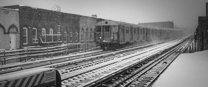
A train arriving at the platform in winter in Brooklyn, New York.
How to Convert to Black and White Using Adjustment Layers
There are several ways to convert an image to black and white. I recommend doing it in post rather than in-camera.
One way to make the conversion is using the black and white adjustment layer in Photoshop. You can also click on the Black and White handle in Lightroom in the General tab in Develop mode.
This allows you to manipulate individual color values. You can adjust each specific color control.
This technique will make the conversion more precise. But watch out for color artifacts and chromatic aberrations.
Use Layers & Masks
You can add several effects, apply healing brush etc. on a single layer and mask out all areas you don't want to be seen. And you can do this as many times as you need.
This way you can gradually achieve the desired result and avoid any mistakes.
Think of the final result as a collage of many pieces (layers). You can hide certain parts and drive attention to the others.
Use Levels to Add Depth & Increase Contrast
I recommend using levels adjustment layers to control the tonal balance. You can apply these either to a single layer or to all of them.
I usually apply adjustment layers to a single layer. There’s a downward arrow beneath the adjustment layer controls in Photoshop. Click it. Leaving it inactive enables the change globally.
Use Curves to Further Adjust Tonal Balance
The curves adjustment layer is an often underestimated but very powerful tool.
Curves correlate with the histogram. You can see the spread of various tones in your image on a histogram and the curves graph reflects it as well. The bottom left corner represents blacks and the top right – whites. All other tones lie in-between.
You can manipulate the curve by creating a reference point and dragging it up or down. This changes the values of a selected tonal group.
Don't be afraid to experiment with this one on a separate layer and mask out all undesired parts. Little by little your puzzle will come to life.
2. Editing Black and White Fine Art Architecture Photography
General Advice
Architecture presents a myriad of opportunities for black and white fine art photography. Rigid geometric and smooth even lines constitute the DNA of architecture.
You can use the perspective warp tool available in Adobe Photoshop here. It allows us to correct the perspective of an object in the frame.
The changes you make will depend on the look and feel you are after. You can use adjustment layers to lighten or darken specific areas of the image, add detail or smooth them out.
Example: The Oculus
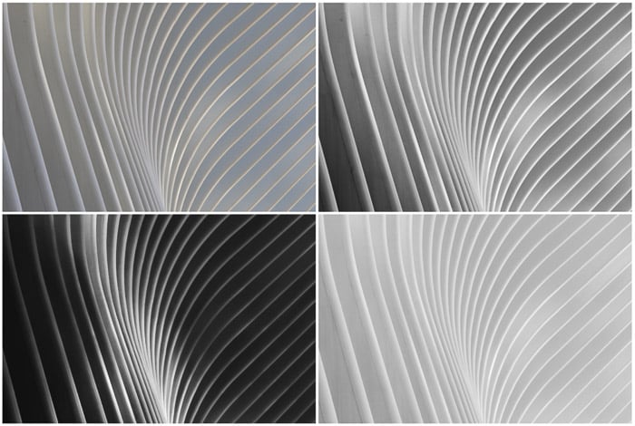
Various editing results of a single original architecture piece (top left)
This image is a quite sophisticated piece of fine art example. To get to the two bottom results I used Photoshop heavily. Single Lightroom edits weren’t enough.
The example on the top right is an intermediary version. I converted it to black and white from the original on the top left using Black & White Mix in Lightroom. I raised all warm colors and pulled down all cool colors to create additional depth to the curves.
Then, I increased exposure by 20 points and contrast by 80 points. I also pulled up the highlights by 59 points to make sure the curved lines of the building stand out as much as possible.
Shadows were brought down to -100, whites by -15 and blacks by -42.
For the bottom results, I spent a couple of hours cleaning up the steel defects in Photoshop, getting rid of the spots, stains and irregularities. I used the healing brush and patch tool, employing several layers.
Two Results
The bottom images differ drastically. The left one has a very strong color contrast, emphasizing the light in the middle of the structure. The bottom right result has almost universal smooth lighting all over.
In case of the high contrast image, I spent hours meticulously making the dark areas darker. I used the soft brush tool, masking out the brighter curves.
This is because I almost wanted to leave out all detail in the shadows.
I applied light noise to add texture to the blacks and pulled the black point in curves quite a bit.
The bottom right image was an entirely separate edit. Conversely, here I had to lighten all darker areas from the top right sample. This was easier to do than darkening.
I went for the low contrast and soft look. So I pulled the shadows up by 30 points and blacks by 20.
Then I used multiple layers to lighten all dark areas with the soft brush.
In the end, two different editing techniques gave me two completely different results. I still can’t make up my mind which one I like better.
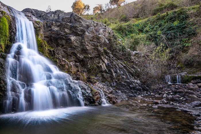
3. Editing Fine Art Black and White Nature Photography
Nature is one of my favorite subjects to photograph. Every moment is unique and has its own beauty.
I shoot nature in color most of the time. But there are a couple of situations where I prefer black and white.
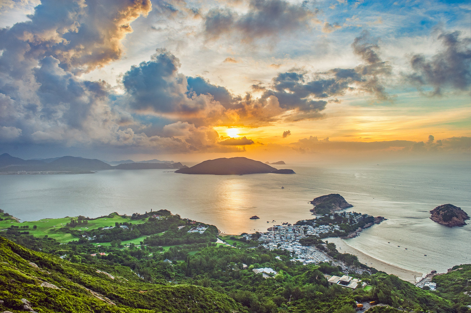
The first case is that of fog or low clouds. These create a captivating mysterious look and feel that B&W can enhance.
Fog hides the details of daily life, leaving only the most prominent lines to our sight.
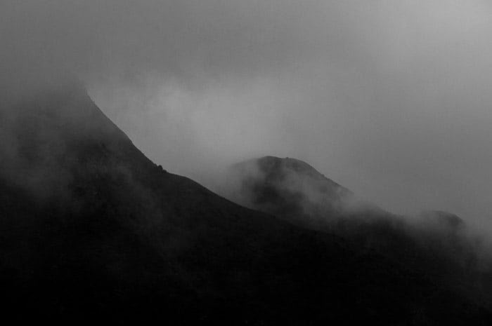
Foggy mountains in Hong Kong, China.
You can further emphasise this effect in post-production by editing in layers.
Another case are bodies of water. When using a long exposure, water resembles smooth icy surfaces. This adds a surreal degree to the capture.
You can use smoothing techniques to emphasize this effect. Or you can clean up the image with the healing brush tool or patching certain areas.
4. Editing Fine Art Black and White Flower Photography
General Advice
Flowers are a part of nature, but it is important to put them aside in a separate section. This is because of the great variety of colors that exist in the flower world. Flowers are often defined by their color and presenting them in black and white is a delicate task.
When converting an image of a flower in black in white, you have to watch how the colors transform. This means looking out for aberrations and color artifacts.
Use slides in Photoshop or Lightroom to achieve the desired result. Pay close attention to blues and magentas – those colors exhibit distortions on a more frequent basis.
Try to focus on the shape of your subject and tonal transitions between the parts. Use high contrast and unconventional cropping to add character to the image.
Flowers are easy to make abstract and it's always a powerful technique in fine art photography. Deliver your unique vision by making your subject seem a little bit surreal. It will drive more interest to it.
Example: Rose Image
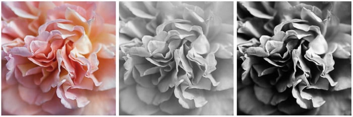
Conversion of an image of a rose to black and white. Color version (left). Black and white adjustment layer applied in Photoshop (center). Finished image (right).
The initial color version was already edited for contrast and vibrance. I brought the shadows down to 0 (-100) and sharpness increased by 60 points.
The center image is the result of applying the black and white adjustment layer in Photoshop. It lacks depth and looks a little bleak.
To deepen it and catch attention I increased the contrast (100 points in Lightroom) and brought up the exposure by 80 points. I brought down all shadows and blacks to the minimum.
Highlights are muted here as well, and whites increased by 13 points. During black and white conversion I increased the lightness of purples by 53 points. This made the petals stand out even more.
I sharpened the whole image even more and applied a slight vignette to the edges (15 points). The difference from the middle version is quite drastic.
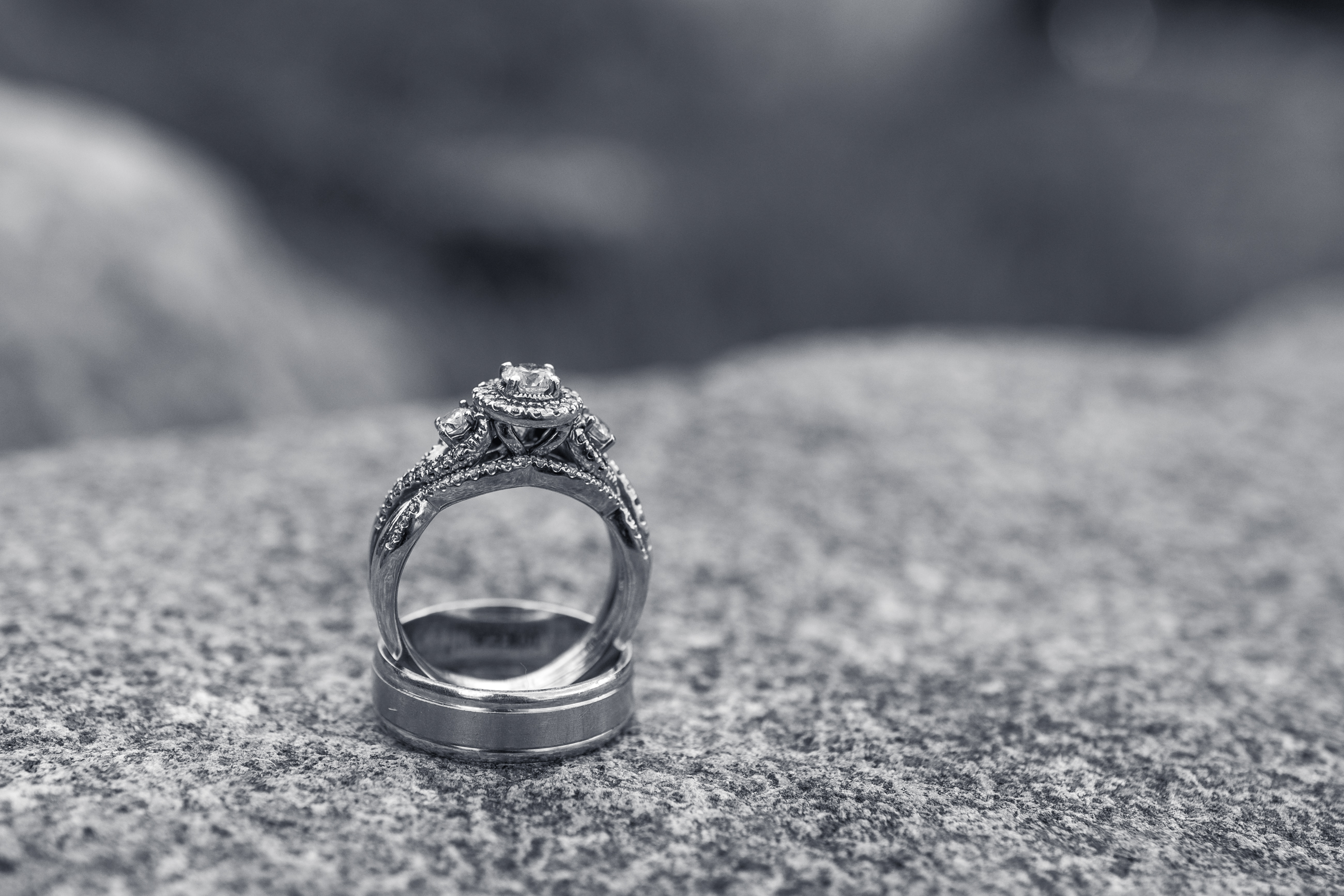
5. Editing Fine Art Black and White Still Life Photography
Still life photography sets itself apart from other genres through its focus on composition. Whether you have one subject or several, balancing them within the frame is crucial.
Smart cropping is a good way to achieve a good composition in post-production. Make sure the negative space surrounding your object is even from all sides. A central as well as two-thirds composition can be fitting.
Make sure all the important objects are in focus in the image you chose.
Finally, balance the shadows and highlights to show as much detail as you can. This makes the objects more interesting and appealing to the viewer.
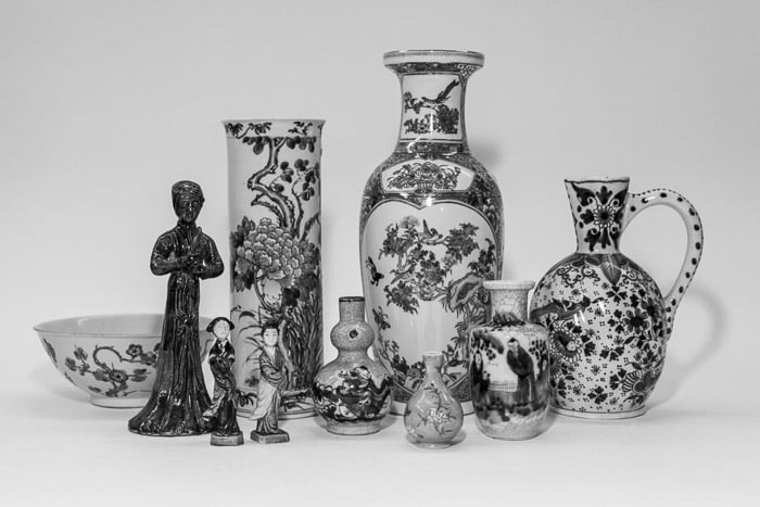
Asian art pieces photographed for an auction house catalog in Cologne, Germany.
6. Editing Fine Art Black and White Portraits
General Advice
Before editing B&W fine art portraits, you have to decide what kind of emotion you want your image to convey.
Losing the colors can help emphasize thoughtfulness and mystery. Or it can add glamour to the character.
I usually increase the contrast of my black and white portraits, and focus on the face or figure. I leave the background blurry but still visible.
You can also enhance black and white portraits by adding textures. In case of the photo shown below, we have natural snow adding depth to the image.
I also enjoy pulling up the blacks a tiny little bit using curves and throwing in some grain for a more analog feel.
Example: Portrait in Red Hook
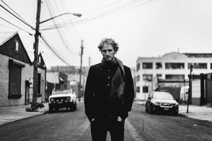
Winter portrait in Red Hook, Brooklyn, New York.
The original was slightly underexposed. So I increased the exposure by 2 full points in Lightroom. Then raised the contrast +70.
I pulled down all highlights (value at 0) to save the sky and give it a gentle grey feel.
Shadows were brought down to -25, and blacks were pulled down to -65. I increased the whites by +45 and raised the clarity level to +50. Using the curves I raised the black point and brought down the top whites.
There is a minor local brush adjustment to the model’s face. I used local editing to increase exposure by 20 points.
The image was shot in color and converted to black and white using Black & White Mix in Lightroom.
I brought down the blues significantly. This restored the cloudy sky. Then I pulled up reds, purples and oranges slightly to add contrast to the face and show more of scarf detail.
Important to point out that I am working in the Version 3 (2012) Lightroom profile. All profile corrections and chromatic aberrations are done automatically if you check the respective boxes.
Finally, I added a 15% vignette to the edges and 35% grain sized 25 points. Grain roughness is set at 71. This provides the desired texture to the image, giving it a deep vintage film look.
Conclusion
In this article I’ve covered the basics of editing black and white fine art photography. From architecture & abstract forms, still life, flowers/nature to portraits of people.
Each fine art black and white genre has its own nuances in editing as well as in shooting. I’ve given you an idea of what to look out for in each category. I also provided some editing guidelines for all black and white fine art photography.
These tips will help you broaden your horizons and take your skills to a new level. Remember, in black and white fine art photography your vision is central to your work. The above-mentioned tools are here only to help you express it.