Juxtaposition in photography means placing two or more elements together so viewers compare them. A small person beside a mountain, a tree against a building, or a real face beside an old portrait can reveal differences in scale, shape, or time.
The 27 juxtaposition examples below show how those comparisons work. Some use obvious contrasts. Others connect similar shapes or colors in unexpected places. Look for the relationship between the subjects, then think about how you could make it clear in your own frame.
© Kendrick Nguyen
What Is Juxtaposition in Photography?
Juxtaposition brings two or more elements into a visual relationship. Their differences or similarities can suggest a theme, create humor, or change how we read the scene.
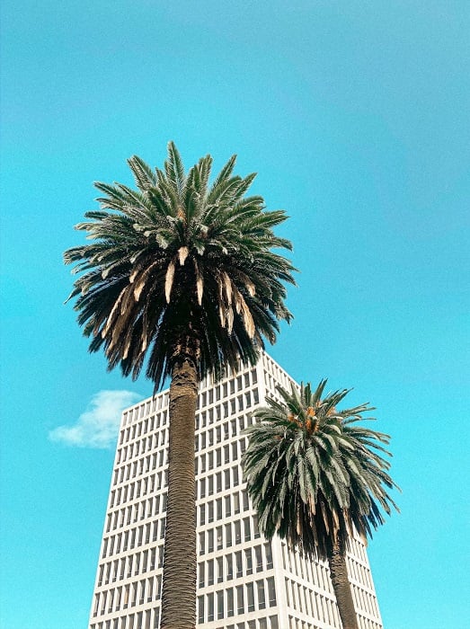
A tree next to a building is a simple example: one is natural and irregular, while the other is built and ordered. The photograph becomes more interesting when your framing makes that comparison easy to see.
The subjects do not need equal size or equal visual weight. A tiny person can be the key to understanding a vast landscape. Both elements just need to be noticeable enough for the viewer to connect them.
As a compositional tool, juxtaposition is about the relationship between elements. Contrast describes a difference, such as light against dark. Juxtaposition uses placement to invite comparison. It can also connect things that look alike but have different purposes, such as a striped scarf and striped road barriers.
You can find these relationships in everyday scenes, stage them with props, or create them in a composite. If you combine photographs, make that clear when you present the result as an example or a record of an event.
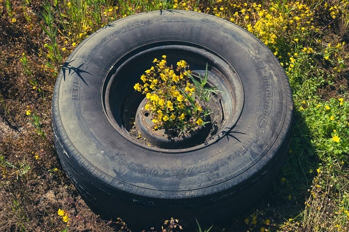
© Dan Meyers
Make the Relationship Clear
Before you take the photo, name the connection: big and small, old and new, matching shapes, or an unexpected setting. Then ask whether the viewer can see it without a long explanation.
Understanding composition helps you keep both elements in the frame and remove distractions. Move sideways, change your height, or wait for a subject to enter the right part of the scene. These small choices can help you take a better picture.
When people are involved, avoid assigning them a story based only on their appearance. A pose does not prove a mood, and clothing does not establish someone's income. Use a verified caption when the photograph needs context.
27 Juxtaposition Examples
These examples cover scale, color, shape, setting, and ideas. Each gives you a different relationship to look for when you compose a photograph.
1. Animate vs Inanimate
In Robert Doisneau’s Picasso and the loaves, bread sits where we expect to see Picasso’s hands. The finger-like shapes connect a living person with an everyday object.
The joke depends on placement. The bread would have a different effect if it sat in the middle of the table, away from his arms.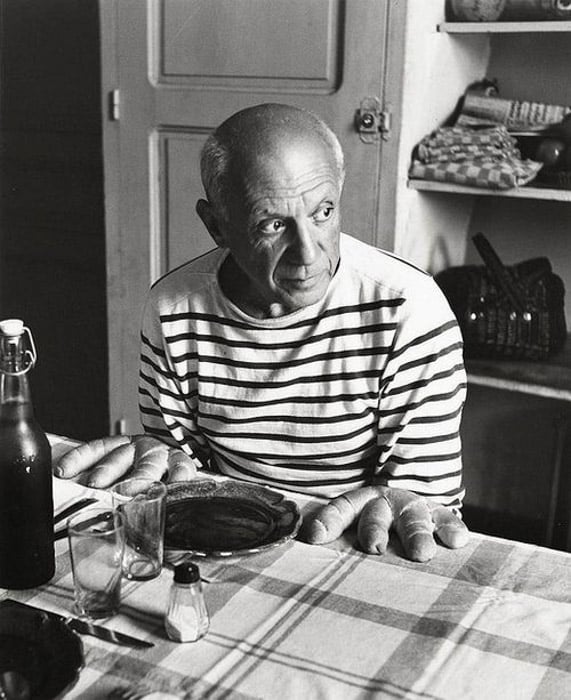
2. Big vs Small
Basic examples of juxtaposition can use size differences. Include something small alongside something much larger, and the comparison gives the scene a sense of scale.
Here the person near the waterside structure is dwarfed by the mountains. When you try this, keep the person visible against the background; they do not need to fill much of the frame.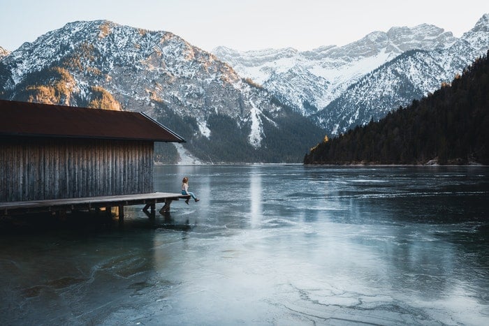
3. Big vs Small in a Composite
You can also create an impossible size difference in post-processing. Here, a child appears enormous above St. Peter’s Square, seen on a visit to Rome.
This is a composite, not a record of a giant child. Its humor comes from placing a familiar subject at an unfamiliar scale.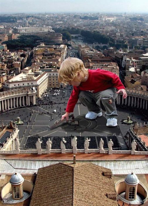
4. Black vs White
Colors and tones can create a clear visual comparison. Here, the painted halves of a face bring the bright and dark extremes of black and white together.
The shared outline of the face makes the difference easy to read. You can apply the same idea with contrasting colors, without needing the subjects themselves to be opposites.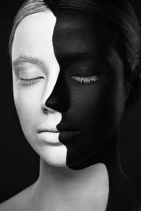
5. Contrasting Body Shapes
The two figures have different body shapes, clothing, and poses. Placing them together makes those differences more noticeable than separate portraits would.
Describe what the photograph shows without turning appearance into a judgment about health or character. The useful composition lesson is how two neighboring silhouettes invite comparison.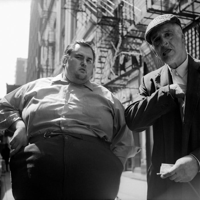
6. Closeness vs Separation
Photographers use the relationship between foreground and background to create meaning.
Here, the couple pictured in the background lean toward a kiss, while the people in front face in different directions. The contrast is in their visible poses. We cannot know how the people in the foreground feel from this photograph alone.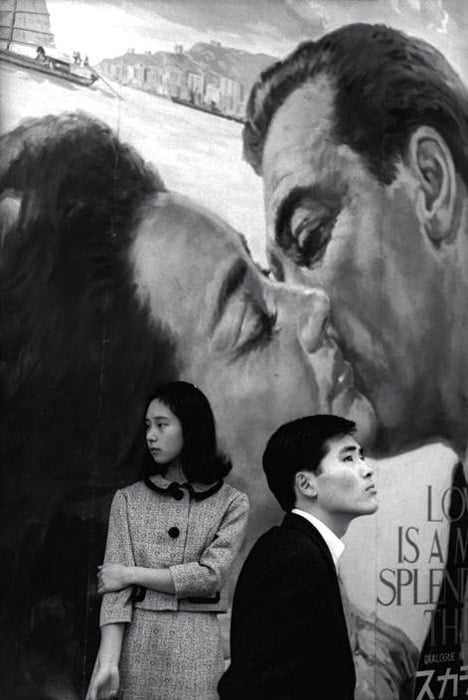
7. Food vs Weapon
A pomegranate fitted with a grenade-like top combines familiar objects with very different associations. Its rounded form helps the two ideas fit together.
The comparison can suggest nourishment and danger. That is a reading of the image, not proof of the photographer’s intended message or a claim that the fruit is harmful.
8. Human vs Machine
Juxtaposition can touch on the surreal. Here, a person occupies a space within an orderly arrangement of cars.
The body interrupts the repeated patterns. Once you notice the missing car, the difference between the human form and the surrounding machines becomes the focus.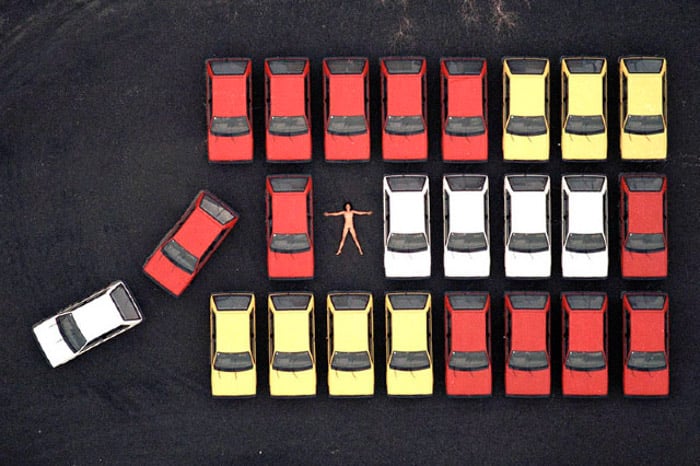
9. Lines vs Circles
Shapes and forms offer a simple way to create juxtaposition. In this building, round ceiling openings sit among straight beams and repeated lines.
The circles and their projected shapes interrupt the rectangular structure. Look up when photographing architecture; a change of viewpoint can reveal a comparison you miss at eye level.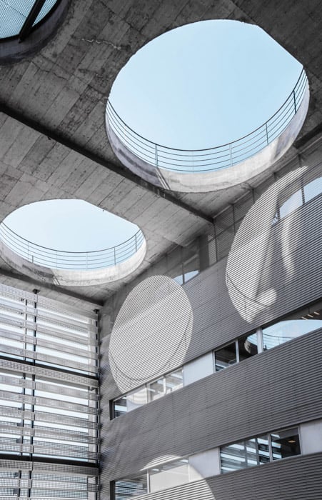
10. Growth vs Destruction
This composite joins the rounded canopy of a tree with a mushroom cloud. Their similar outlines connect two very different subjects.
Growth and destruction are possible associations. The comparison works through both the matching forms and the contrast in what they represent.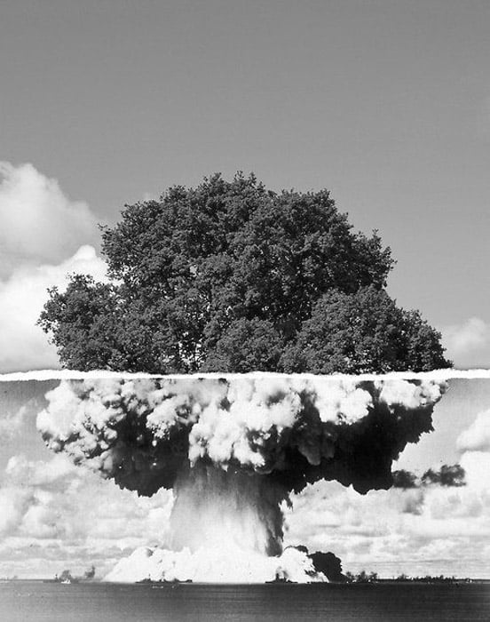
11. Natural vs Man-Made
The picture below combines a building’s grid with a tree’s irregular branches. It is a useful juxtaposition to look for in everyday streets.
The windows create repetition, while the branches break across it. Frame enough of each subject to show the difference between the ordered structure and the organic shapes.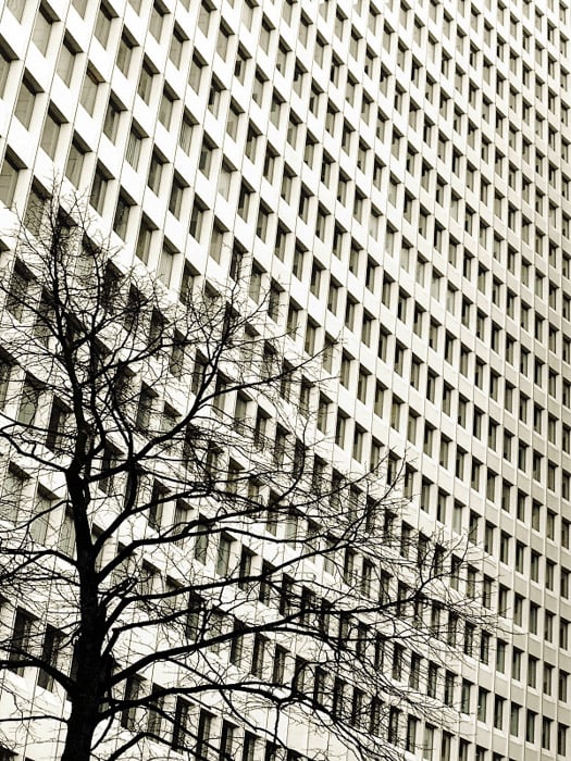
12. Large vs Small in the Sky
The large angular aircraft silhouette draws attention first. A much smaller flying shape near the left edge creates a second point of interest.
Their separation and apparent size difference are visible in the frame. The photograph alone does not establish their actual sizes or distances, so the comparison here is about how they appear in the image.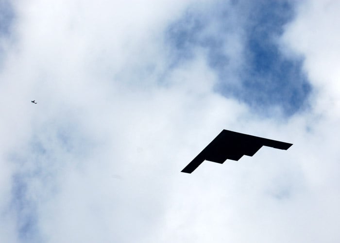
13. New vs Old Architecture
Architecture can bring different building styles into one frame. Here, the smaller, detailed facades in the foreground contrast with the tall glass building behind them.
The difference in scale strengthens the comparison. You do not need to know the exact construction dates to see how their materials and shapes differ.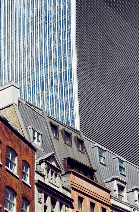
14. Young vs Old
An older person and a child share the same activity at a table. Their differences in age sit alongside a visible connection: they are engaged in something together.
For your own generational photographs, look for a shared gesture or task. Juxtaposition can express a relationship as well as a difference.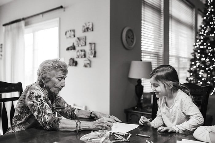
15. Patterns and Colors
Patterns and colors are a basic but striking way to show juxtaposition in photography. In the image below, the photographer managed to capture a scarf that resembles the environment in the road work barriers and tape.
The colors and patterns may be the same, but the juxtaposition comes from the use of the objects. You can find lots of juxtapositions when shooting street photography.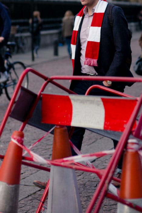
16. Play vs Warfare
Documentary photographers use the relationship between people and their surroundings to form a story. Here, children climb and hang from an artillery weapon.
The contrast between play and an object associated with warfare is visible. The image alone does not tell us whether the weapon is safe or operational; that requires verified context.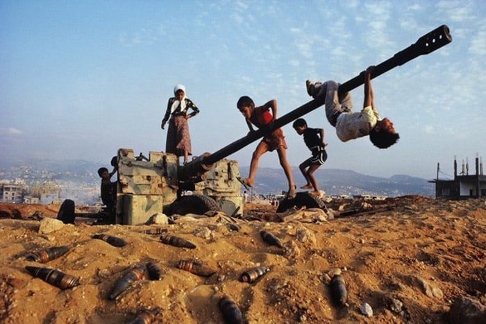
17. People vs Perception
At first glance, the person appears to cling to a ledge. Then the court markings reveal the overhead viewpoint, and the scene reads differently.
This example uses an illusion as well as juxtaposition. The person’s pose and the flat court line combine to suggest a situation that is not actually shown.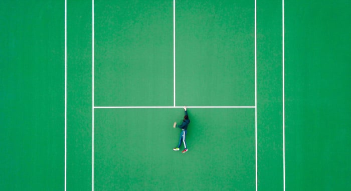
18. Wealth vs Poverty
This aerial photograph places tightly packed buildings beside a greener area with more space between homes. The boundary makes the difference in the built environment easy to see.
Social comparisons need context as well as composition. Establish the location and circumstances before making claims about the people who live there; the appearance of a neighborhood cannot tell every resident’s story.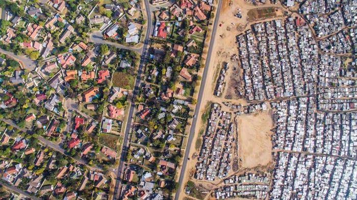
19. Advertising vs Lived Reality
Margaret Bourke-White’s The Louisville Flood shows African Americans waiting outside a flood relief agency in 1937. Above them, a billboard presents a smiling white family beneath the claim “World’s Highest Standard of Living.”
The advertising promise and the need for relief occupy the same frame. That documented context makes the contrast more precise than describing the scene only as a breadline.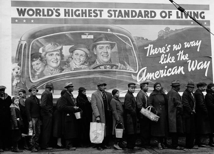
20. Repurposing Through Alignment
A hand holds a trumpet-shaped cutout in front of a distant structure. From this viewpoint, the structure appears to complete the instrument.
We can see the separate pieces and the new shape they form together. To try a similar idea, move the camera or a safe handheld prop until their outlines line up.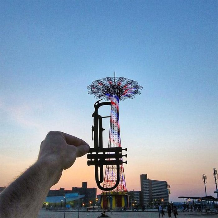
21. Childhood vs Responsibility
A child peels a carrot at a kitchen sink, with another child visible in the background. The scene can suggest a contrast between childhood and responsibility.
It does not establish that the child has taken a parent’s role or is cooking for a sibling. Keep that distinction clear when a composition suggests a story beyond what the photograph can confirm.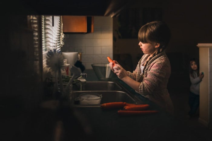
22. Straight vs Curved
Lines can create a comparison without a complicated subject. Here, a thin straight line crosses the scene above the curved edge of the water.
Light and dark reinforce those shapes: the straight line crosses a pale area, while white surf meets a dark shore. A clean background helps a simple shape remain visible.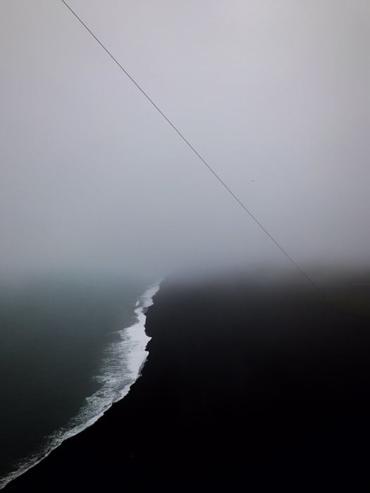
23. Small Figure vs Large Steps
The small child beside the broad flight of steps gives the structure a sense of scale. Repeated horizontal lines make the staircase appear imposing.
The comparison may suggest a challenge ahead. We do not need to claim that the child cannot climb the steps for the composition to work.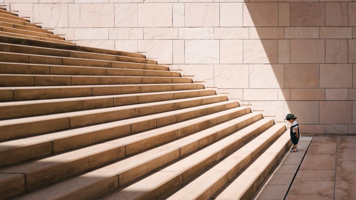
24. Vintage vs Modern
The boys’ clothing contrasts with the older-looking furniture and decor. The room becomes a setting against which we read the people.
For a similar vintage comparison, look for visible differences in style. Avoid treating an old-fashioned room as proof of a particular date unless you have supporting information.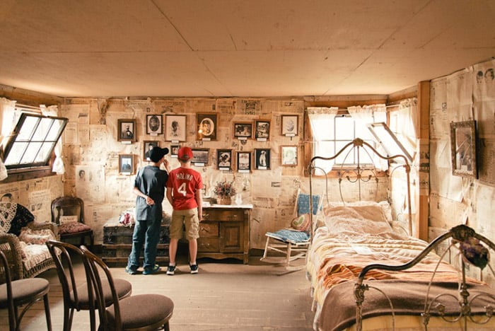
25. Past vs Present
In this portrait, Terence Stamp holds a photograph of his younger face over one side of his face. The aligned halves let us compare the same person at different ages.
Photographer Betina La Plante described using an older photograph of Stamp to show the passage of time. The matching eye level is what makes the comparison immediate. You can explore the same idea in a self-portrait with a print from your own past.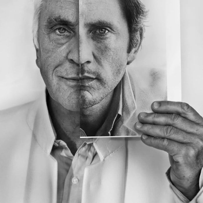
26. Expected vs Actual Size
A low view makes this toy car resemble a full-size vehicle. The nearby grass and twigs provide clues to its actual scale.
The shallow depth of field blurs much of the background. The juxtaposition comes from the recognizable car shape beside natural details that reveal how small it is.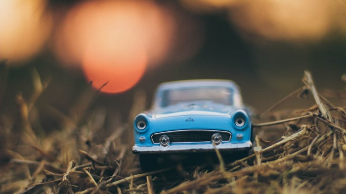
27. Different Styles, Shared Affection
The women’s different clothing, ages, and visible tattoos create points of comparison. Their affectionate pose brings them together.
This example does not need an assumption about what either person thinks of tattoos. The photograph can show both difference and connection without assigning beliefs to its subjects.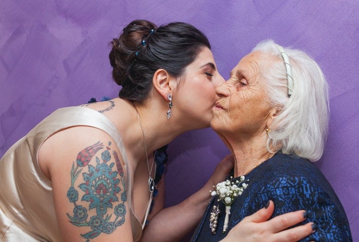
How to Try Juxtaposition in Your Own Photography
Start with one simple pairing: a plant against a wall, a small object beside a large one, or two items with matching shapes and different uses.
- Choose the relationship. Decide what you want the viewer to compare.
- Make both elements readable. Change your position until neither is lost in the background or hidden behind the other.
- Remove distractions. Check the edges of the frame and leave enough context for the comparison to make sense.
- Test another viewpoint. Take a second photograph from higher, lower, or farther to one side. Compare how the relationship changes.
Conclusion
Juxtaposition works when placing things together helps us notice something about them. The contrast can be as simple as scale or as complex as the gap between an advertisement and real life.
Use these examples as starting points. Look for a clear relationship, frame it carefully, and let the visible details do the work. Add accurate context when the photograph alone cannot tell the whole story.