And find the styles and approaches that work best for you...
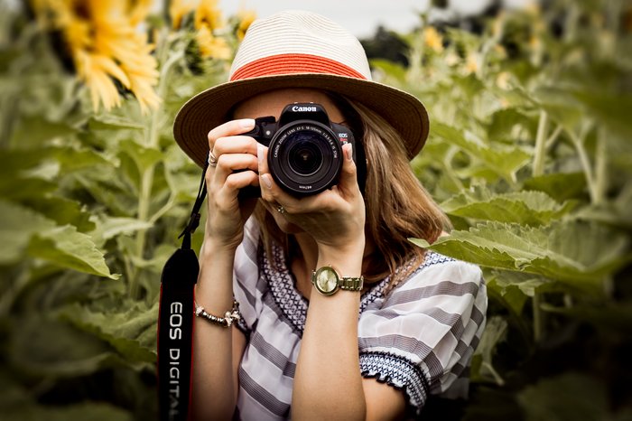
Cameras are complicated, but photography for beginners doesn’t have to be. When I started shooting, I was frustrated with my first DSLR camera. I couldn’t…

Adobe Lightroom is the most popular digital organization and editing software on the market today. It caters to both complete beginners and seasoned professionals, successfully…

The landscape has inspired painters and musicians for centuries. And landscape photography remains one of the most popular genres in the art form, with an…

Milky Way photography can be incredibly rewarding. We’ve all gazed at the night sky in wonder, but Milky Way photography lets you capture the stars…
Macro photography is a genre that can transport us to another world. It gives photographers a unique ability to capture elements that aren’t otherwise visible…
These creative photography ideas will help you learn and grow as a photographer. Some focus on cool photoshoot ideas or still life. Others focus on…
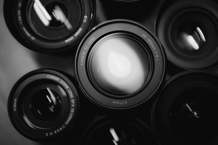
Different lens types do different things, meaning certain types of lenses are better suited to different types of photography. Choosing the right camera is important,…
By Christopher Bryan-Smith

Today, we are comparing Capture One vs Lightroom. These are two of the top photo software on the market today, and you will come across…
By N Constant
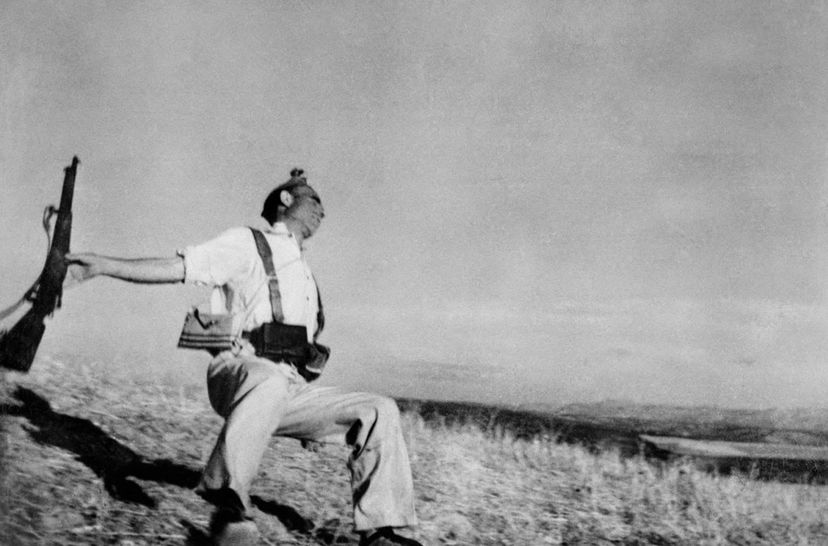
Many documentary projects and images that photographers capture are controversial pictures. Either the subject is hard to look at, or the story it tells does…
By Christopher Bryan-Smith

Street fashion photography is a genre all its own. And the best street fashion photographers combine high-fashion and street photography, taking the top labels off…
By Christopher Bryan-Smith

Every photographer needs to know about aspect ratio for photo. It relates to the shape and dimensions of an image, so it’s important for composition,…
By Christopher Bryan-Smith

Adjusting your white balance in Lightroom is one of the most convenient ways to color-correct your photographs. Shooting in different light conditions can cause unwanted…
By N Constant
Every photographer needs a basic understanding of crop factor. It’s something that comes up quite a lot in photography, especially when you’re buying a new…
By Christopher Bryan-Smith
Equivalent focal length is something every photographer needs to know about. But while it might seem complicated at first, it’s actually quite simple once you…
By Christopher Bryan-Smith
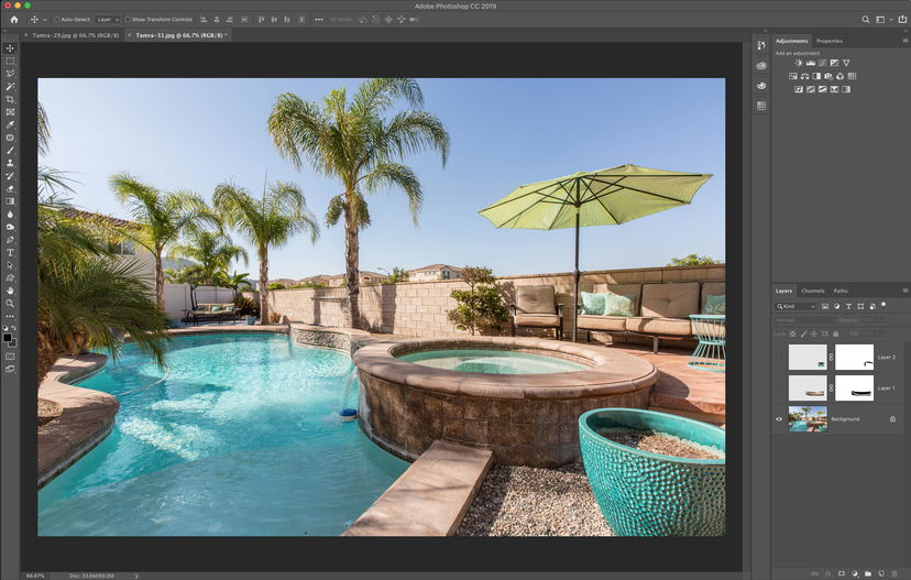
The Warp tool in Photoshop is a powerful tool you can use in many different ways. You can use it both to correct a perspective…
By N Constant

The best music photographers bring us closer to the stars we love. As music lovers, we want to be involved with the bands and artists…
By Christopher Bryan-Smith
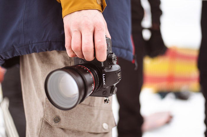
Micro Four Thirds is a mirrorless, interchangeable-lens camera system. It was introduced in 2008 by Panasonic and Olympus to rival the larger mirrorless and DSLR…
By Christopher Bryan-Smith
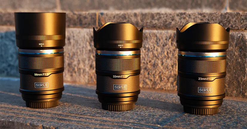
The Sirui Sniper Series f/1.2 lens set is fantastic, but not without flaws. The value is exceptional, and they are specialist APS-C format lenses videographers…
By Szilard Kovacs