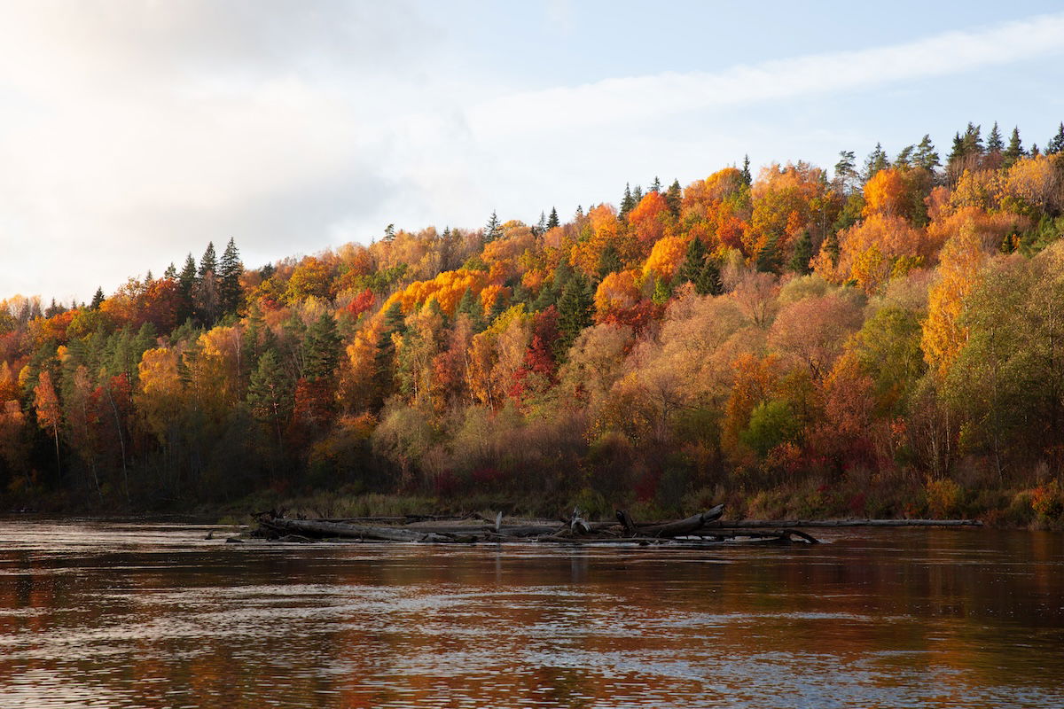
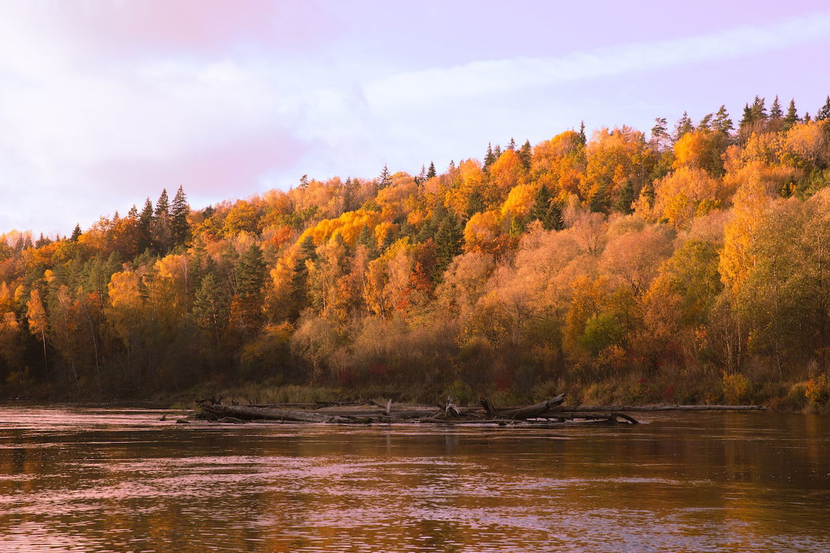
Learning how to edit color in Lightroom is an important skill. Lightroom gives us a few different ways to fine-tune the colors in our photos. This is crucial in digital photography as it allows us to get the most out of our photographs.
Today, we will examine the different methods you can use to produce more interesting or accurate colors. Each section will link to a longer article that discusses each process in more detail. By the end of this article, you will be familiar with all the ways to edit color in Lightroom.
There is no right way to edit color. It all depends on what style you’re trying to achieve. Lightroom knows this, so it provides us with various methods to edit color. These range from simple sliders that can enhance your colors in a single motion to detailed and professional controls.
Color editing is simple, thanks to Lightroom’s attention to detail. You can adjust the whole spectrum of colors in one slider or adjust particular colors or locations in others.
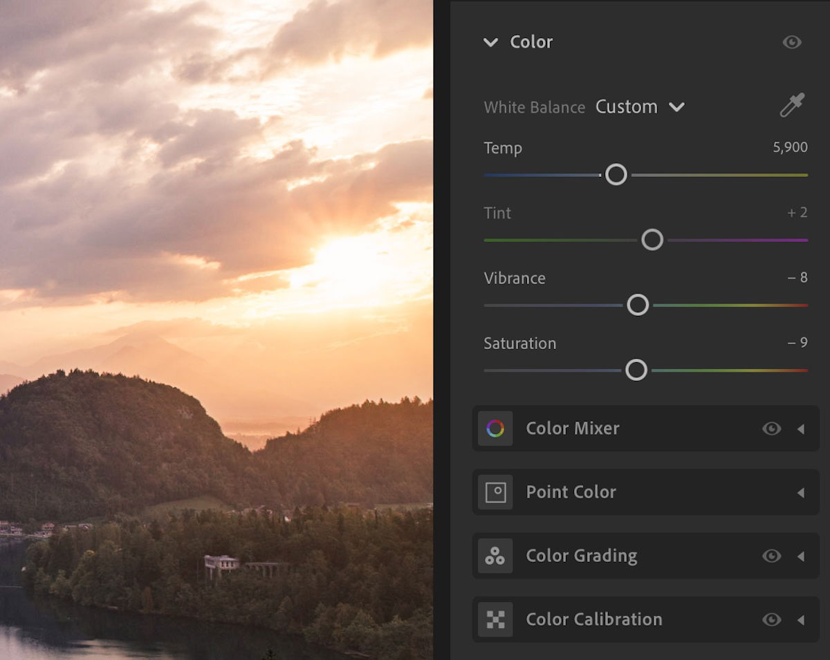
Lightroom has multiple panels for color editing. You can find adjustments in the Basic, Tone Curve, Color Mixer, Color Grading, and Calibration panels.
The two current versions of Lightroom include the same adjustments and methods to edit color. However, the panels and adjustments are ordered differently in the Edit (Lightroom CC) or Develop (Lightroom Classic) workspaces.
Lightroom CC provides a panel that condenses all the color editing actions together. Meanwhile, Lightroom Classic spreads each color editing action into multiple panels. This makes it easier to find all the color adjustments in Lightroom CC. But this isn’t an issue, as you will likely only use the editing actions you need, not every single one.
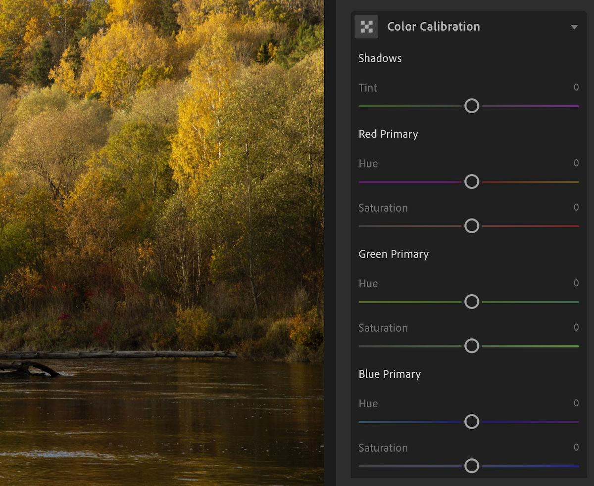
A noticeable feature you will have to find is the Color Calibration for Lightroom CC. At first glance, it seems they don’t have it, but they do. Click the “…” on the right-hand toolbar and select “Show Color Calibration.” This reveals the Color Calibration section under the Color panel.
There are a few different ways of editing color in Lightroom. And each way has specific uses for specific situations. Continue reading to learn which method is best for you.
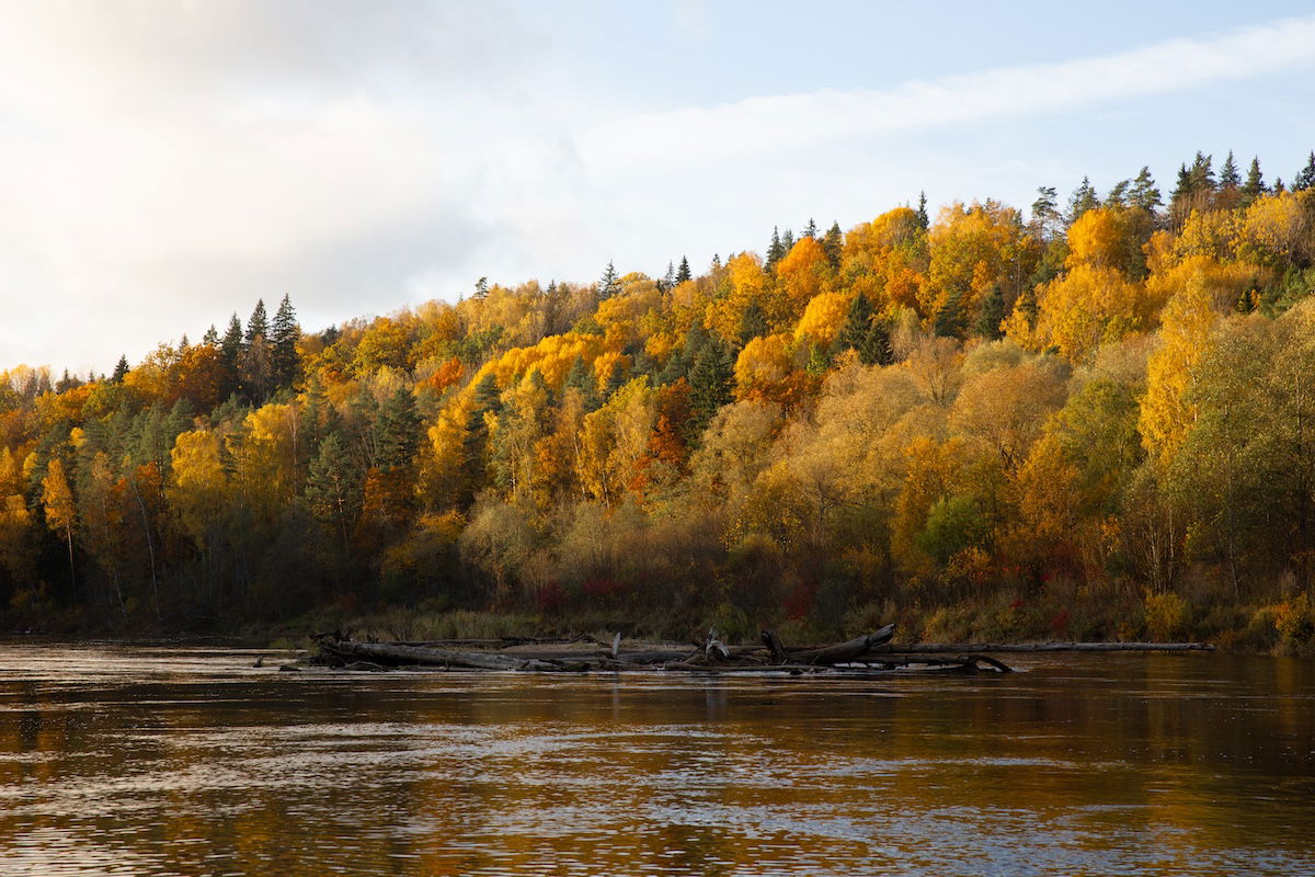
The quickest and easiest way to enhance the colors in your photographs is with the Vibrance and Saturation sliders. You will find these adjustments in almost every photo editing software.
Vibrance and Saturation sliders act differently. Vibrance boosts the colors and potential colors in your photograph. By potential colors, I am referring to areas that seem void of color. If you shoot RAW, there should be enough information to draw out colors from these areas.
Saturation boosts the color intensity and enhances every color in your photograph. This only affects areas where the color is clear and obvious. But be careful when using this slider. It’s easy to go overboard and make the colors look fake.
You can slide both these sliders all the way to the left to reduce the colors to monochrome. Vibrance and saturation adjustments are located in the Color section of Lightroom CC and in the Basic section of Lightroom Classic.
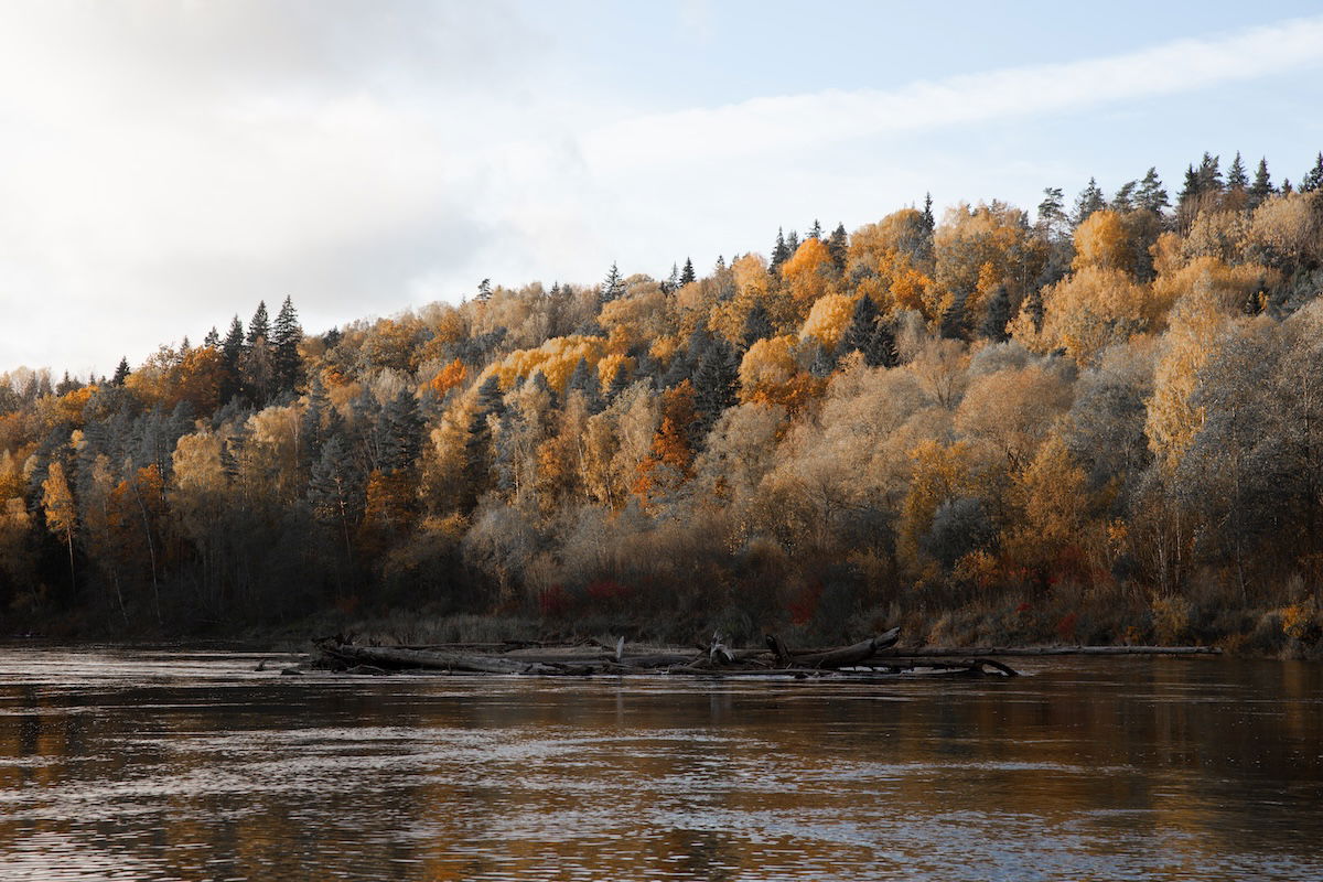
Understanding white balance is extremely important if you want to take photography seriously. Different lights and different times of day produce different colors. Adjusting the white balance in Lightroom depends on the color temperature and color tint.
Our camera normally adjusts to these colors automatically. But sometimes, the colors may look different than they do in real life. Color temperature is measured in Kelvins. Lightroom allows us to adjust the color temperature according to this scale, ranging from warm to cool light.
You can also use this slider to manually edit the feel of your photograph. If you want a more summery feel, you can warm your image slightly. Or you can make the colors cooler for a more wintery feel.
The color tint is also affected by the type of light in your photos. This scale is between a green tint and a pink tint. You can adjust this slider to create a more natural-looking result.
Using a color card is the best way to get the perfect white balance. This is an essential piece of equipment for editorial or commercial photographers.
You can find the White Balance adjustment in the Color section in Lightroom CC and at the top of the Basic adjustments in Lightroom Classic.
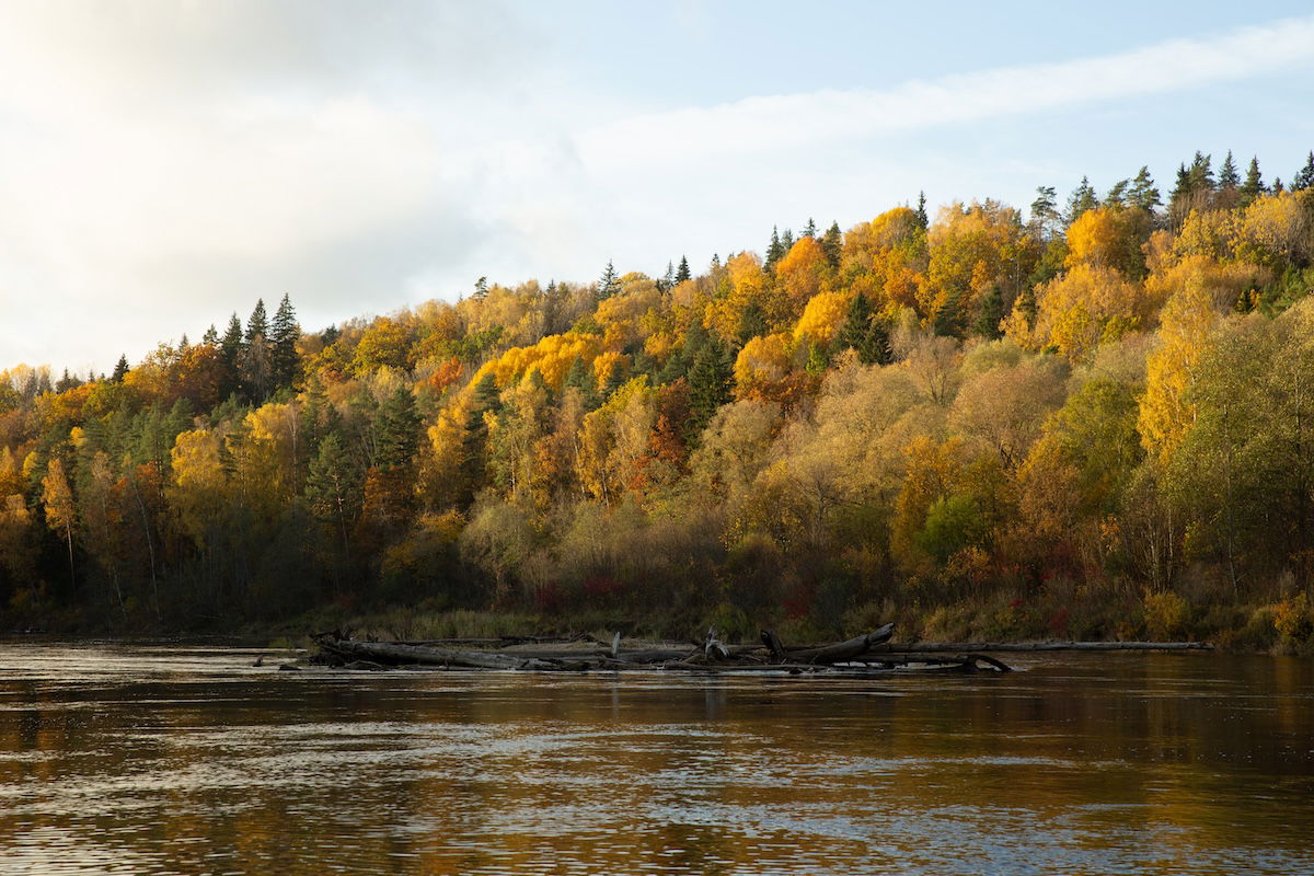
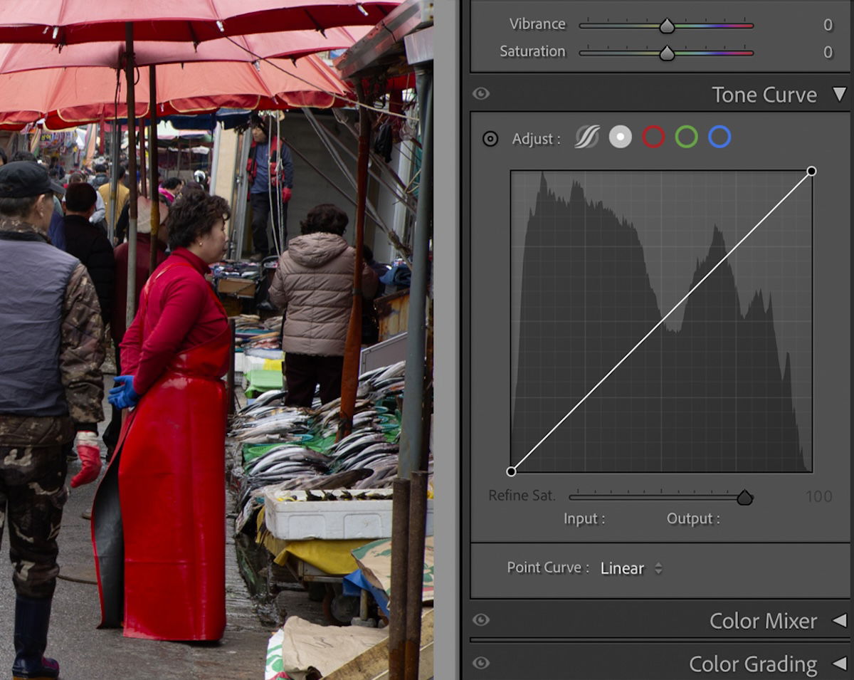
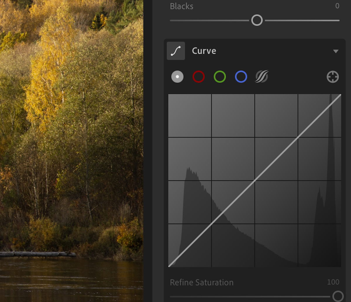
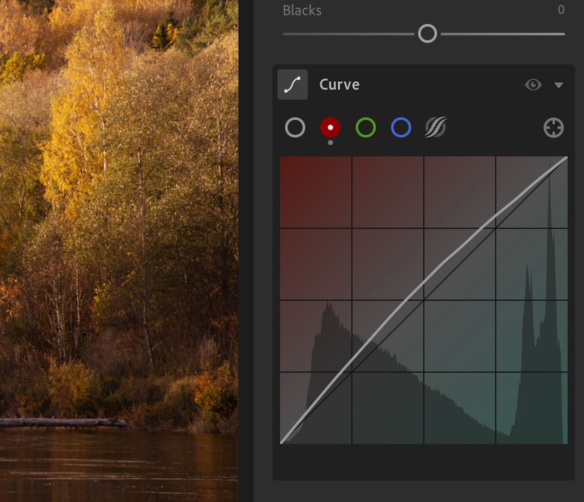
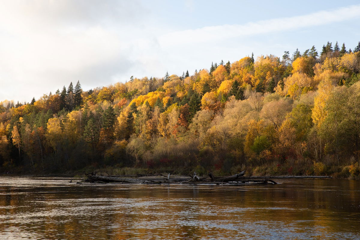
A tone curve chart is an editing tool that all photographers should be familiar with. You can use the tone curve graph to perform global adjustments to your whole image. But more experienced photographers will use it to control specific colors.
In the tone curve graph, you can split the adjustment into three different color channels: red, green, and blue. Adjusting the line that passes through the graph can produce different effects. This is similar to a histogram, so you should be familiar with these first.
A tone curve graph allows you to place anchor points, giving you full control over your edit. Lightroom now provides a great color layover when adjusting the different channels. This helps you understand which color to add or subtract.
The tone curve exists as its own panel in Lightroom Classic. You can find the tone curve in Lightroom CC as a drop-down feature in the Light section.
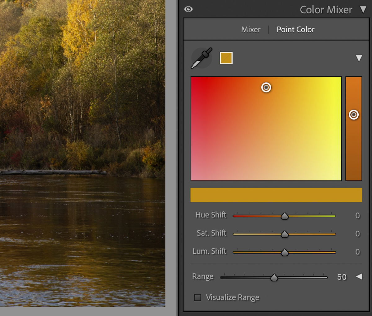
The Color Mixer or HSL adjustments are a great way to adjust a particular color, especially for beginners. This section allows you to control the appearance and pungency of each color in your photograph. You are even able to take entire colors out of your photograph!
HSL stands for Hue, Saturation, and Luminance. Lightroom splits each color and tone into eight different sliders covering the color spectrum. The Color section of the Color Mixer allows you to make the same adjustments. But here, you can adjust each color separately.
The hue of a color dictates which side of the color spectrum shows in your photograph. This allows you to get the exact color you want. The saturation we covered previously lets you adjust how pungent your color is (or remove it completely). Luminance lets you decide how bright or dark you want this color.
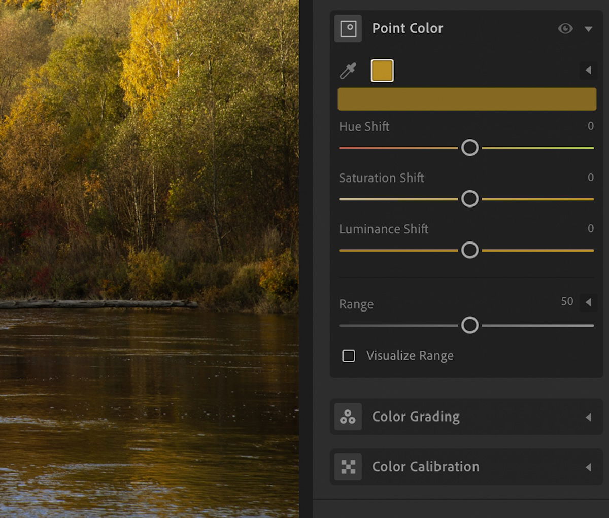
A Point Color tool also makes selecting the color much easier. You simply click on the dropper and then click on the color in the photograph you want to adjust. You can then apply the same HSL adjustment to this color.
In Lightroom CC, you get a useful color comparison in Point Color. This shows your original color and your current edited result. Lightroom Classic gives you much more control in its Point Color section. It allows you to move the color around your selected spectrum. It also adjusts the sliders automatically.
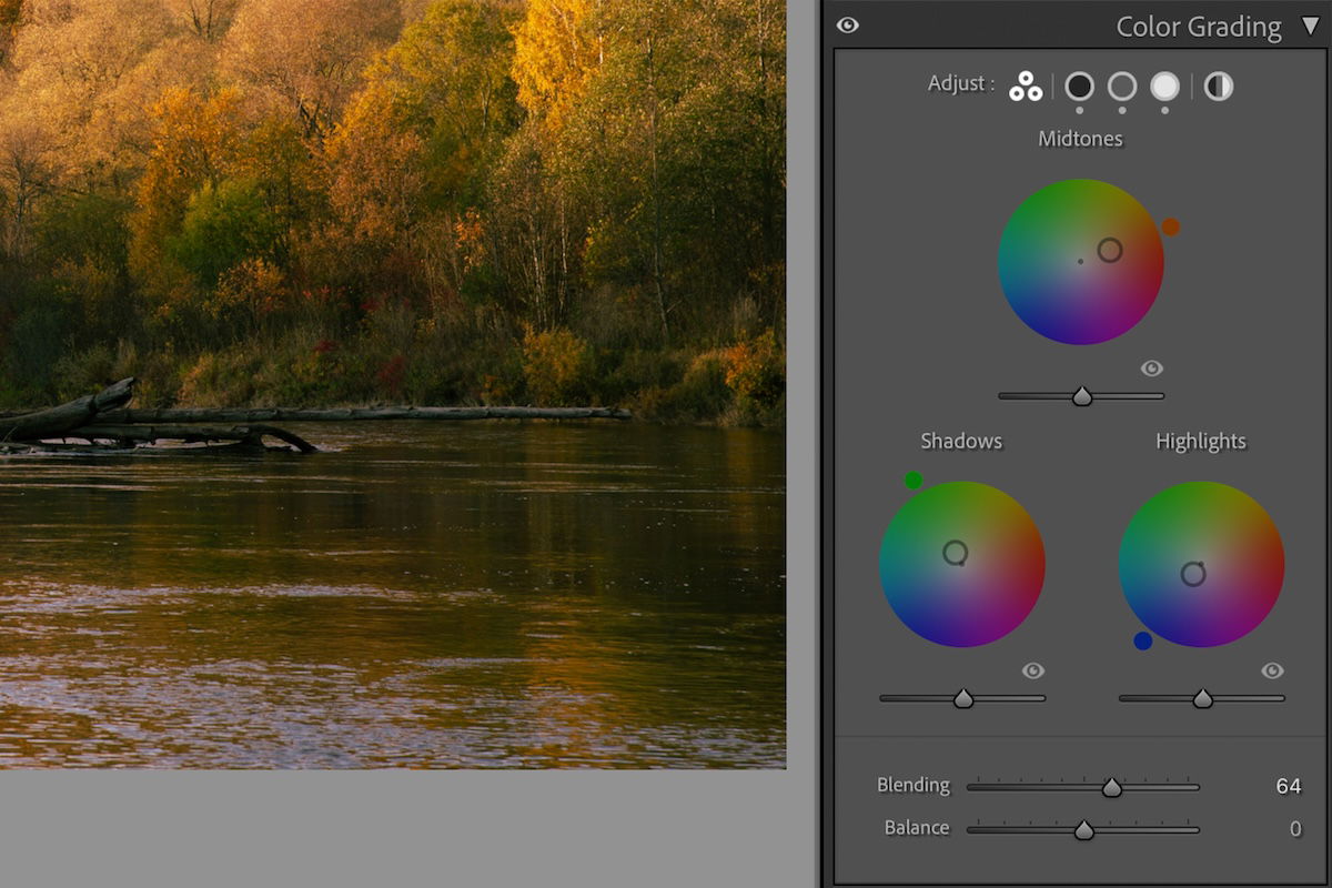
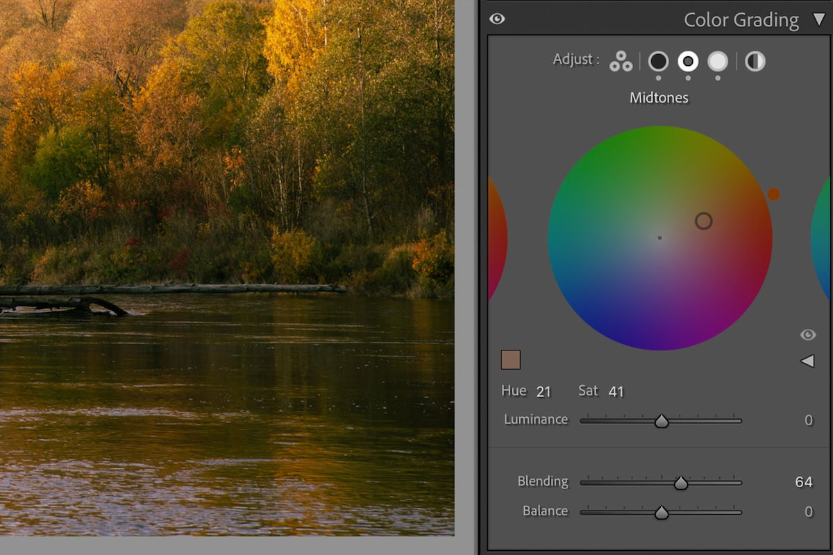
The Color Grading tool in Lightroom is another method that gives you expert control over the colors in your photos. This tool may seem similar to the HSL sliders, but instead of adjusting each color, it adds a filter across your photograph in your chosen color.
The Color Grading tool takes the shape of a color spectrum. You can pull the center point (white) toward the color tones you want your photograph to have. The Color Grading tool allows you to do this globally or separately for the midtones, highlights, and shadows. You also get a Blending and Balance slider to make your filter look natural.
The addition of this Color Grading tool is perfect for creatives who want to achieve a particular feel in their photographs. Lightroom has made color grading incredibly easy with this tool, so even beginners can use it.

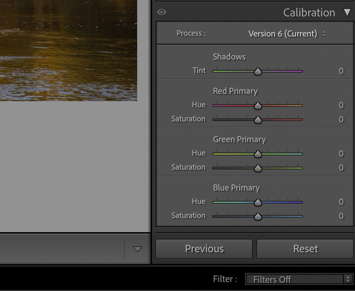
The Color Calibration tool is a quick and easy method to calibrate the colors in your image if you feel they are off. Lightroom does a great job identifying the key colors and tints that affect our images. And it gives us specific sliders to combat these unwanted colors.
The sliders are simple and let you control each color however you like. Like other color adjustments in this list, Lightroom has different ways of solving the same problem.
Color calibration is particularly important for commercial or editorial photography. It is also super important for film photography as scanning film can produce a strange color cast you will need to work against.
In Lightroom CC, you will need to enable Color Calibration through the Edit Options “…” icon on the right-hand panel. In Lightroom Classic, you can find this section near the bottom of the Develop panel.
Color editing in digital photography is extremely important. Luckily, there are numerous ways to edit color in Lightroom. Lightroom constantly offers new and user-friendly ways to perform professional adjustments.
Once you understand all these color adjustment tools, you will have a much better understanding of photographs as a whole!