If you want to boost your photography, you must understand the seven elements of art and design. When used correctly, each one of these elements contributes to turning a dull photo into a work of art.
In this article, we explore what each of these elements of art in photography are and how to use them.
What are the 7 Elements of Art?
To compose a perfect photo, you need to understand the basics of fine art theory. Understanding the seven elements of art is a great first step.
The seven elements of art are:
- Color
- Texture
- Line
- Shape or form
- Value
- Pattern
- Space
These elements work together with the principles of art and design. Those principles include repetition, contrast, balance, unity, and emphasis.
A good composition uses these elements for the photo to be aesthetically pleasing and well-balanced.
1. How to Use Color in Photography
When it comes to art, color is an important element. The colors in each frame should contribute to the entire composition or enhance a particular aspect.
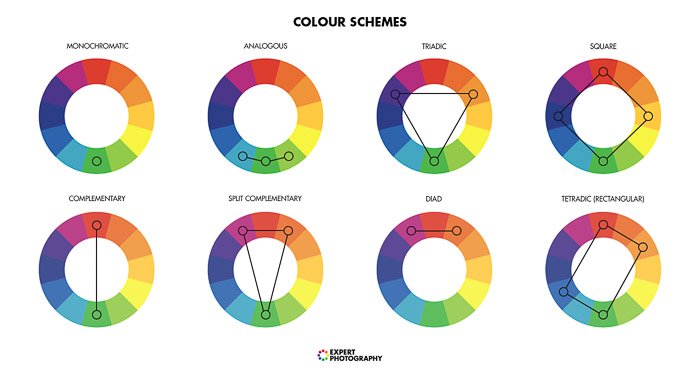
Use a color wheel to get started. Begin by focusing on these color schemes;
- Monochromatic – Using different shades of the same hue, often with dark and light versions.
- Analogous Colors: Using three or more colors next to each other on the color wheel.
- Triad Colors: Colors that are evenly spaced around the color wheel. These three colors will provide a sense of harmony in your photo.
- Complementary Colors: Any two colors that sit opposite each other on the color wheel. Using these can create tension and high contrast in your photos.
- Contrasting Colors: Colors that are directly opposite on the color wheel.
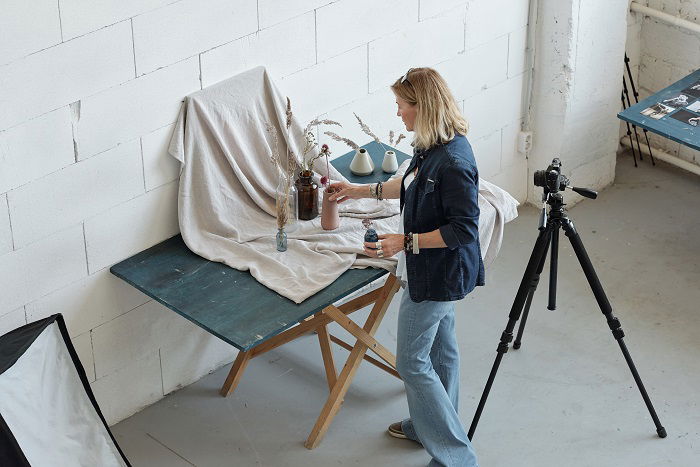
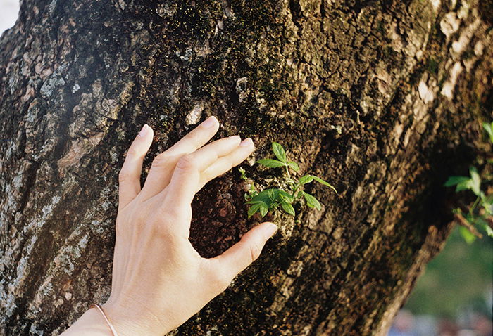
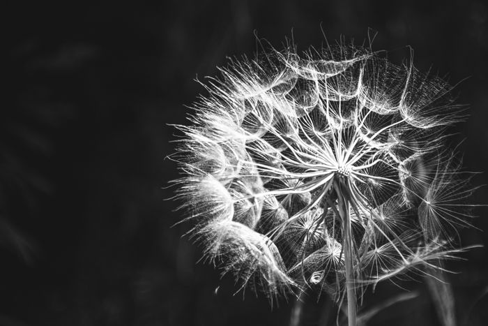
2. How to Use Texture in Photography
The world is full of textures. Using texture in photography is an excellent way to add depth and interest. Texture also can add contrast and drama to otherwise flat images.
Practice taking photos where the subject itself is texture. Focus on bumps or ridges on a surface with your camera’s macro function. Try taking photos of wood grain, bricks, or concrete block walls. You can also create textures using paint or other materials on surfaces like canvas boards.
You can further intensify the texture in your photos during editing.
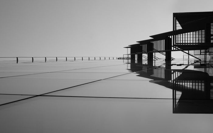
3. How to Use Line in Photography
The boundaries of a shape mostly create line in photography. Using lines to create a path to explore the essential elements of your image are called leading lines.
Leading lines will naturally draw the viewer’s eye to a particular spot. They also create depth and space in photos that would otherwise appear flat.
Types of leading lines include straight, diagonal, converging, and vanishing points.
Architecture is a great genre to explore using lines in your images.
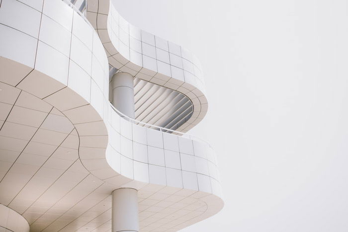
4. How to Use Shape in Photography
A shape in photography is an outline of an image. This element is closely related to lines.
We usually define shapes in photography as geometric or organic. Geometric shapes typically have straight lines and sharp angles, such as triangles and squares. Organic shapes are more natural and often rounded more free-form with rounded curves.
Shape can be used to create a sense of depth or to impact the balance of your composition. Shapes can be the focal point of an image or used to draw the viewer’s eye to another subject matter.
Use easily recognisable shapes to draw the viewer’s attention.
5. How to Use Value in Photography
In photography terms, value means how light or dark the colors are. A photo with high contrast will have a strong sense of value. One that has an even spread may look flat or less interesting.
A high contrast image might portray a sense of drama or intrigue, while even values may be more appropriate for minimalist or calm images.
Value is essential to black and white photographers as it is the only way to discern between different shades and tones.
When you are photographing, be sure to use natural lighting to get those rich shadows and highlights.
6. How to Use Pattern in Photography
The human eye naturally seeks out patterns. Pattern and repetition create relationships between different objects. You can use patterns to help build depth or state movement.
Common patterns to photograph include:
- Repeating objects in the foreground and background
- Repetitions of natural patterns like waves or ripples
Patterns are also a great way to highlight details within your photo, such as an object or person otherwise lost amongst other elements.

7. How to Use Space in Photography
Think of space as the areas around your subject usually empty. These spaces are often a vast expanse like the sky or water.
In photography terms, this is called negative space. In contrast, positive space is the subject itself.
To create a balance, make sure that you leave enough negative space when framing your photo. We use negative space to contrast other elements. It can create visual interest by adding different shapes and textures into an otherwise empty frame.
Practice using the rule of thirds grid to add more or less space to a photograph strategically.

Conclusion
When you start thinking about your photography through the seven elements of art, it will be much easier to create beautiful images.
You do not need to be an expert in art theory. Keep an eye out for the signs you will see in your own photos. Use these tips for making a creative and cohesive photograph today.
Do you want to compose stunning images, even in ordinary situations? Our Intuitive Composition course allows you to master it in no time at all.