A good background is essential for a great photo. It can make or break an image, and can add interest, depth, and atmosphere.
But what makes a good photography background? And how can you use it to your advantage? Read on to find out.
Why Is It Important to Have an Interesting Photography Background?
You may have noticed by now that there are no photos of models on a white background on this site.
There’s a good reason for this. I find these photos boring and unimaginative. The shooting environment isn’t conducive to interesting photography.
The way I see it, every single pixel in a photo bares equal importance with the next. It’s your job as the photographer to ensure that every part of the photo looks good.
When you start to make your backgrounds more interesting, you’ll find that people spend more time looking at them. More often than not, they do this without even realising.
There are plenty of ways to do this. We’re going to have a little look at a few methods now.
Bokeh
This is a term used quite frequently on this website. I’ve spoken in detail about in this post. Essentially, it's the aesthetic quality of the out-of-focus areas of a photograph. If you have a close subject, a distant background and a wide aperture, you magnify the bokeh effect.
Check out the photo below.
The soft circular blur in the background is an example of good bokeh. In this photo, the background has as much appeal to the viewer as the subject – the BBQ. I really like using a strong bokeh as the softness is very appealing and easy to look at.

Lights
When light shines directly into the camera’s lens and the aperture isn’t too wide, you can end up with some really cool ‘star’ effects on the light source.
As well as lighting up the background and providing interesting detail, the subject is also lit up in a way that don’t typically see.
Use the lighting to illuminate your background and provide a point of interest. Arrange your lights so that they provide details to the most important parts of your background.

High ISO
If you’re shooting at night, in order to reveal any detail in your background, you’ll need to raise your ISO.
Even in the photo above, I used an ISO of 1200 as it allows us to make out the finer details, attracting the viewer to the photo.
The photo below was shot with an on-camera, external flash unit at ISO 1600 and an aperture of f/2.8. As you can see, this has produced a very shallow DoF but, by providing more detail, has turned a simple photo of a man on a street into much more than that.
Rule of Thirds
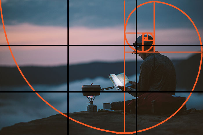
As you can probably see from the photos I’ve use so far, I like to adhere (roughly) to the rule of thirds when trying to include an interesting background.
The rule basically dictates that photos should be split into 9 equal parts divided up by two equally-spaced horizontal lines and two equally-spaced vertical lines. The important features within the frame should intersect with these lines at some point.
This allows me to include a background that people can actually see.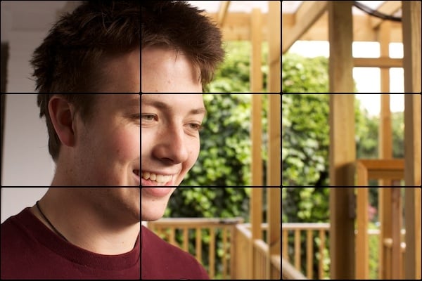
Background Subjects
There’s no reason why your background shouldn’t be another subject, like my example below.
This, believe it or not, was a candid photo. The foreground subject was looking in the same direction as the background subject. The moment he looked towards my camera that I took the photo.
This contrast in subjects’ interest makes you wonder where to look – no longer is it a simple photo of a person.
Contrast in background and foreground is key here.
Lines
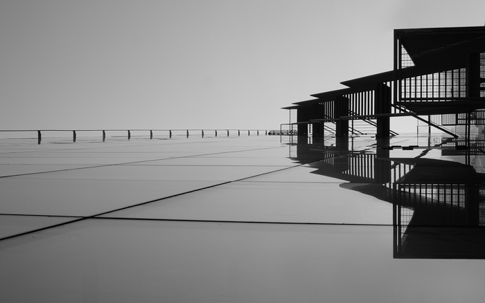
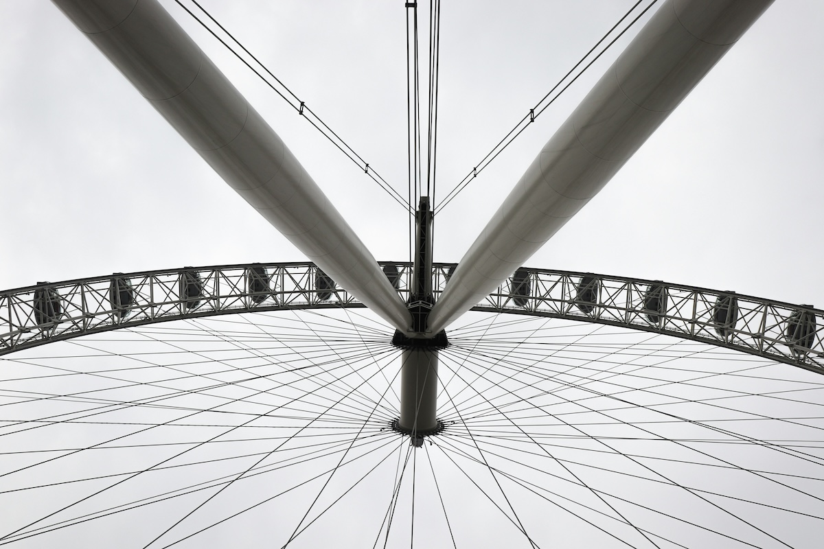
I’ve written in depth about horizontal, vertical, diagonal and converging lines in photography and the power that they convey, directing the viewer’s eyes in a certain direction. I recommend that you read about that in further detail.
The great thing about using lines in your background is that they’re remarkably subtle – you may like the background in my photo but, without mentioning lines, it’s hard to pinpoint exactly what it is that interests you.
Once again, there’s contrast present in the photography and, this time, it’s also present in the background – the lines are sharp and soft.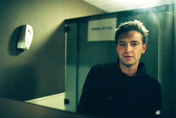
Paths
The great thing about paths in photography is that, if you include a subject as well, together, they can provide dynamic tension.
By this I mean that your eyes don’t know whether to go up and down the subject or along the path, which causes a tension in your eyes. This is a superb trick to convince your viewer to look at the photo for longer without them even realizing why. The added sense of wonder keeps the viewer entertained.
Background Focus
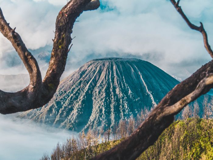
Sometimes, I like to use a frame within a frame to focus the attention towards the background.
In the photo below, I’ve used two parts of a banister to act as a sort of tunnel, directing the attention towards the subject.
Frames do an excellent job of providing context to a photo while adding a soft border by providing an out-of-focus blur around the edge of the primary subject.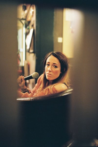
Color
This is at the end of the list because it’s probably one the easiest techniques to implement, especially if the colors you’re using in the background contrast with those in the foreground, as mine do below.
Contrast is the most important point to make here; if your background and foreground are too similar, they merge into one, ceasing to be two effective and different points of interest. I love using color in my photography when possible as it really helps to make the photos stand out from the rest of an album.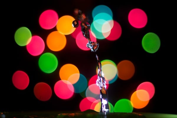
For more great photo background tips, check out our post on making a black background for portrait photography!
