Vibrance vs saturation is a popular photography debate. Right up there with Nikon vs Canon, or mirrorless vs DSLR.
Which tool is better? Which one should you use? Which one will make your images even better?
In short, saturation enhances colors. And vibrance is its subtler counterpart.
But there is more to these tools than definitions. We’ll show you the differences between the two and how to make your photographs stand out even more.
Vibrance vs Saturation: What Do They Mean?
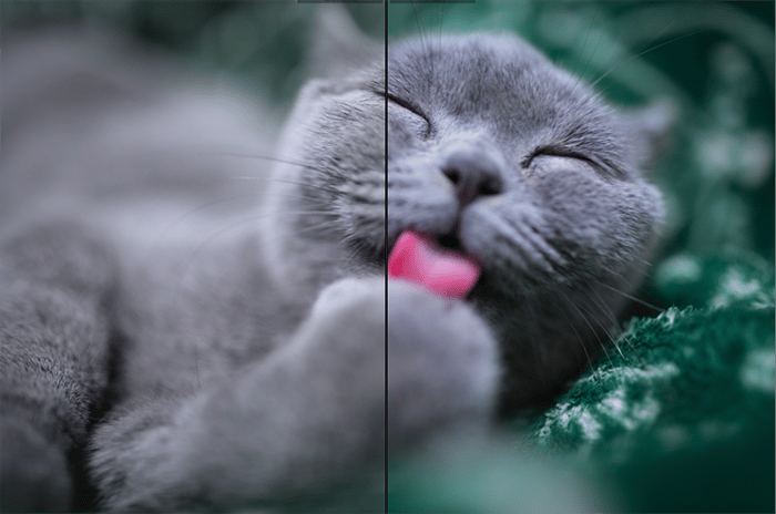
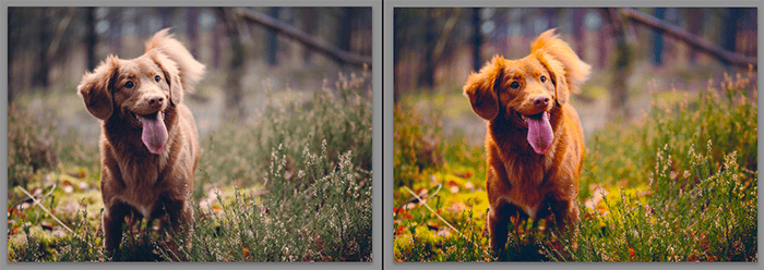
Thanks to the saturation tool, the right side of this pet portrait looks more colorful and interesting.
Saturation affects color intensity and enhances every color in an image.
Vibrance is a little more specific. It saturates the parts of a photo that aren’t that colorful. This allows every color to stand out without making the composition look too busy. The intensity of colors also raises.
These definitions are somewhat similar. So why is it important to know the difference?
Some photographers avoid vibrancy and saturation because of their intensity. But you’ll miss out on valuable creative opportunities.
If you use them too much, you’ll end up with unflattering photos. And these will discourage you from experimenting with these tools again.
Knowing when to use one over the other will help you avoid these mistakes.
Once you familiarise yourself with both, you’ll know when to use them. You’ll also know which tool is more appropriate for your photography genre and style.
For example, portrait photographers gravitate towards vibrancy because it doesn’t oversaturate skin tones. Macro photographers might use saturation to highlight every color detail.
Which Program Do You Need to Adjust Vibrance and Saturation
To increase your photo’s vibrance or saturation, all you need is an editing program. And, of course, a few photos to experiment with. Once you get the hang of it, post-processing your images with vibrance will come naturally.
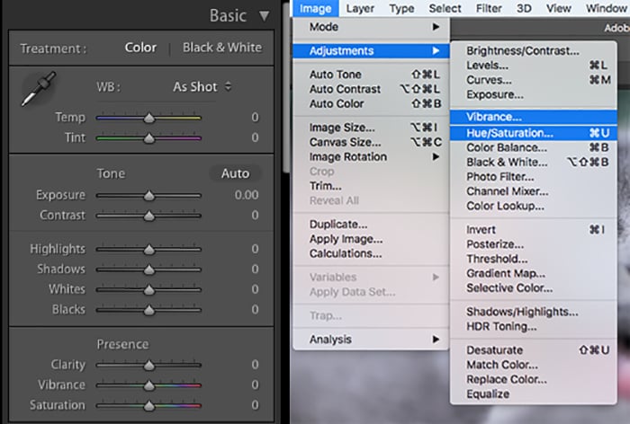
The vibrance and saturation tools look different in every editing program. But they usually work the same way. For the examples below, I used the vibrance and saturation sliders in Adobe Lightroom. You can find both of them in the Basics panel.
In Photoshop, they’re located in two different sections. Go to Image > Adjustments > and select either Hue/Saturation or Vibrance.
The Visual Differences Between Vibrance and Saturation
Here are a few examples of what vibrance and saturation can do to different kinds of images.
Portraits
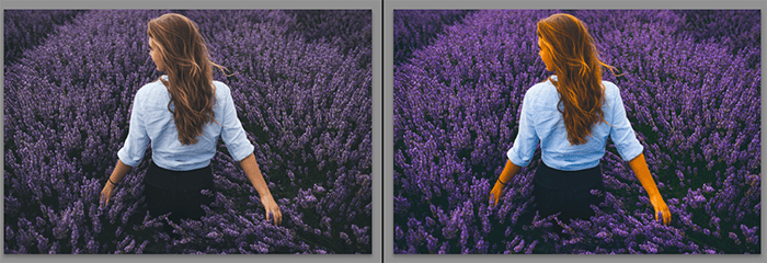
Setting the saturation slider to +100 made every color stand out. Portrait and wedding photographers prefer not to use the saturation tool often. Oversaturation of colors isn’t very flattering.
The surroundings look vibrant. But the subject’s skin color has changed, creating an unnatural look.
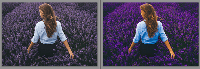
Setting the vibrancy slider to +100 resulted in a less dramatic effect. Vibrance focuses on enhancing dull colors.
In the original photo, the surrounding flowers and t-shirt are duller than the subject. This is what the tool focused on.
The subject’s skin tones and hair haven’t been affected too much. This is because they were already vibrant in the original image.
Pets
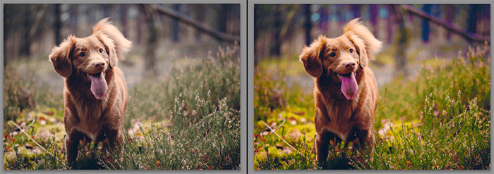
Vibrance enhanced every muted color in this photo. That includes the grass, background, and the subject itself.
If it were set to a less dramatic number, like +50, the result would look great.
Saturation enhanced every color regardless of how muted or colorful it was. This made certain colors, like the leaves and dog fur, look a bit too saturated.
But the result would look much better if the saturation were less intense. Like the example above.
Let’s see what the photo would look like if the vibrance and saturation were set to +50:
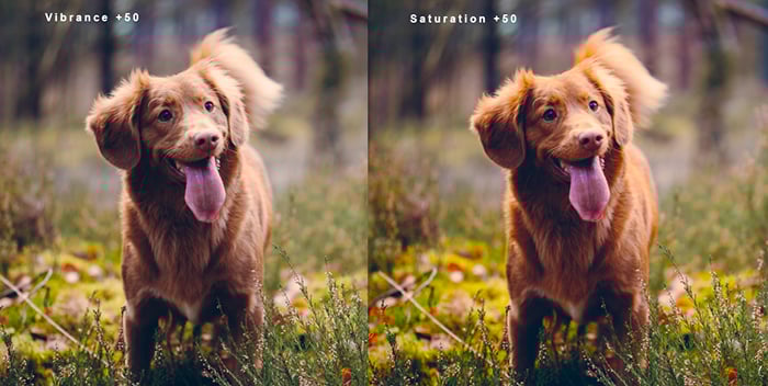
Both results look less dramatic now. As you can see, saturation at +50 is much more colorful than vibrance at +50.
Which version do you prefer? Your answer will give you a better idea of which tool you should use in your own editing workflow.
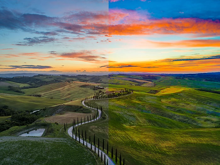
Landscapes
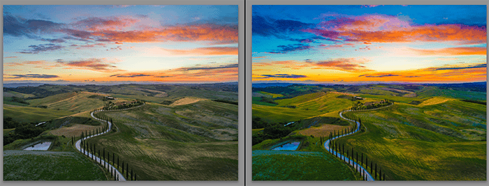
Vibrance brought out the blues in this landscape photography shot. They were quite muted in the original photo.
This created more contrast between the colors and made the image look darker.
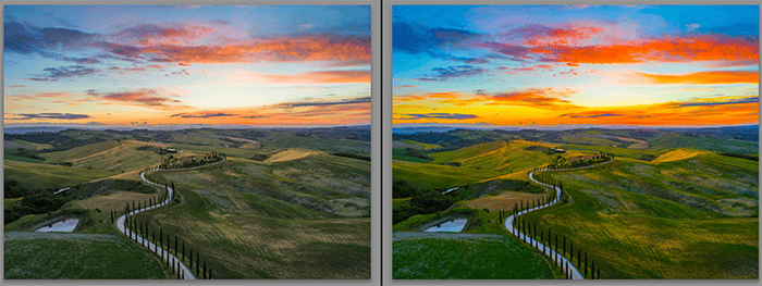
The original image doesn’t have any colorful subjects (except for the sky). That’s why the saturation tool enhanced every color evenly.
This made the location look brighter than the one edited using the vibrance tool only.
Macro
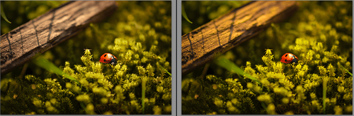
The original macro photo is already quite colorful. The vibrance tool didn’t create a dramatic effect, even though the slider was set to +100!
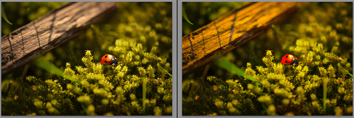
The saturation tool didn’t dramatically enhance this photo, either. In this case, the saturation and vibrance examples look almost identical.
Sometimes your photos will already be colorful. In those cases, avoid using the vibrance and saturation tools. Unless you want a small boost of color.
If you increase them too much, you’ll end up with unappealing results.
So When Should You Use Vibrance vs Saturation?
The beauty of photography lies in its flexibility and openness to all kinds of ideas. It’s likely that your preferences might not match with someone else’s.
Nonetheless, here are a few general rules for using the vibrance and saturation tools:
- If your photo is already very colorful but needs a few enhancements, use the vibrance tool;
- If almost all the colors in your photo are muted, use the saturation tool to give them a boost;
- When editing portraits, don’t overuse the saturation tool. Your subject will end up looking unnatural;
- Once you increase your vibrance or saturation, check your before and afters. The eye tends to adapt to what’s in front of it. You might not notice that your results look too dramatic unless you look at the original photo; and
- I set the vibrance and saturation to +100 in the examples above. But I don’t recommend doing the same thing when editing your photos. Subtle changes will give you the best results.
Extra tip: you don’t have to use vibrance and saturation separately. Some photographers like to decrease saturation and increase vibrance. This creates a photo whose colors work in harmony.
The effect is very subtle. But it will add that extra pop of color to your photos without ruining their original tones.
Conclusion
Saturation will enhance every color in your photo. Vibrance will find and enhance the dullest parts of your photo. If you use both of these tools in moderation, your photos will stand out.
The most important thing you should remember is subtlety. Whether you prefer saturation vs vibrance, make sure you don’t overuse them. Treat them both like salt and sugar.
If you use them excessively, your work won’t look good. If you don’t use them at all, the absence of that colorful spark will be visible. If you use them with care, your photos will look perfect.
Compared to a tool like curves, vibrance vs saturation might not seem that important. But if you learn when and how to use them, they’ll become invaluable parts of your photo editing process.
Before you go, check out this cool video.