Every photographer needs to know about aspect ratio for photo. It relates to the shape and dimensions of an image, so it’s important for composition, editing, displaying, and printing photographs.
There are several common aspect ratios in photography, so you need to find the best one to suit your work. You need to consider the type of photography you shoot, as well as where you want to display your work. The camera you use also affects your aspect ratio options.
We explain everything you need to know about aspect ratio for photos in this article. We look in detail at all the common aspect ratios as well as why you might prefer one over the others. Keep reading to find out which aspect ratio is best for your photos.
- Learn to effortlessly set up your camera for any situation.
- Master the art of selecting the perfect exposure every time.
- Discover 10 composition rules that elevate your photos instantly.
What is Aspect Ratio for Photos
The aspect ratio is the proportional difference between the width and height of an image.
An aspect ratio is expressed as one value, which is two numbers separated by a colon. The first number represents the width, and the second the height.
The most popular aspect ratio in photography is 3:2, which means the photo is three units wide for every two units across.
An aspect ratio is not the same as the dimensions of an image. You can change an image’s dimension while keeping the aspect ratio the same.
Changing the size of a photo while keeping the aspect ratio the same means the width and height both change in proportion to one another. The photo holds its shape while the image’s size increases or decreases in equal measure vertically and horizontally.
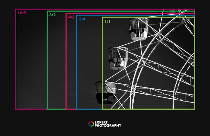
While 3:2 is the most common aspect ratio for photos, it isn’t the only one photographers like to use. 4:3 is becoming more and more popular, and 1:1 is now widespread thanks to social media. 16:9 is another common focal length for images in photography.
We look at all these aspect ratios in the following sections.
Aspect Ratio and Camera Sensors
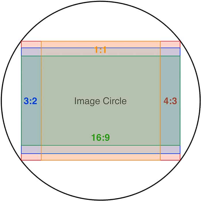
The main camera sensor types have a native aspect ratio. That means the photos produced by that camera have a default aspect ratio.
With full frame and APS-C cameras, this aspect ratio is 3:2. Even though full frame sensors are bigger than APS-C sensors, the aspect ratio is the same for both sensor types.
Full frame sensors are based on 35mm film cells from analog photography, and APS-C sensors are “cropped” versions of full frame. Despite being cropped, APS-C sensors still have a 3:2 aspect ratio.
This also means film photos from your 35mm camera have a 3:2 aspect ratio. You can have them printed in different sizes, but the aspect ratio will always be 3:2.
Micro Four Thirds (MFT) cameras, on the other hand, have a 4:3 aspect ratio. The MFT sensor is smaller than both full frame and APS-C sensors. The shape is also slightly different, giving it a 4:3 aspect ration, which is where these cameras also get their name.
Medium format cameras also sometimes have a 4:3 aspect ratio. But some analog medium format cameras use the 1:1 (square) aspect ratio.
However, no matter what the native aspect ratio of your camera, you can also edit the aspect ratio in post-production. All good editing programs allow you to crop or resize to fit a new aspect ratio.
Popular Aspect Ratios For Photos
We’ve already touched on the most common aspect ratios for photos, with the 3:2 ratio being the mos common in photography.
But now it’s time to look at each aspect ratio in more detail to see which is best for your photos.
3:2 Aspect Ratio
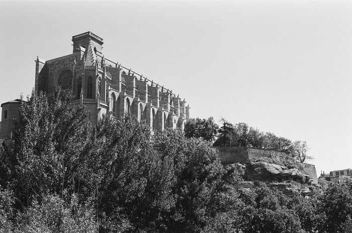
We’ve already seen that the 3:2 aspect ratio is the most common in photography. 35mm film and full frame and APS-C sensors are set to this aspect ratio.
Whenever you take a picture with a full frame camera, the unedited photo has a 3:2 aspect ratio. The same is true with APS-C cameras.
Canon’s APS-C sensors are smaller than those of Nikon, Sony, and Fujifilm. But even though they are smaller, the images still have the same 3:2 aspect ratio.
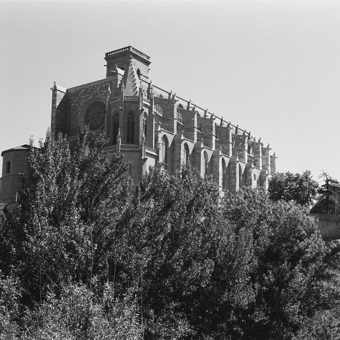
3:2 is the closest to the golden ratio, which makes it visually appealing and more balanced. Painters and artists used it long before the camera was even invented.
3:2 has been the standard aspect ratio in photography for decades. While it remains the most common, other aspect ratios are becoming popular with photographers.
4:3 Aspect Ratio
The 4:3 aspect ratio has been around for a while in photography as it’s one used in medium format cameras.
It’s now even more common, being the native aspect ratio of Micro Four Thirds cameras.
This aspect ratio gives you a slightly squarer image than 3:2. It’s also the aspect ratio of most modern TVs, monitors, and computer screens, which is why many photographers prefer this option.

1:1 Aspect Ratio
As you might be able to work out, the 1:1 aspect ratio gives you a square image. The width and height are equal, so all sides of the image are the same length.
Some analog medium format cameras produce 1:1 images, so it’s not totally new to photography. But it has become far more commonplace in recent years.
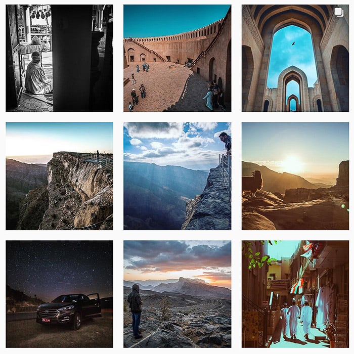
This is mainly due to social media, and Instagram in particular. When you view a user’s profile grid, all the images are square, meaning they have a 1:1 aspect ratio.
Instagram is one of the best social media platforms for photographers. But the square image format was a point of difficulty and frustration for many when they were new to the app.
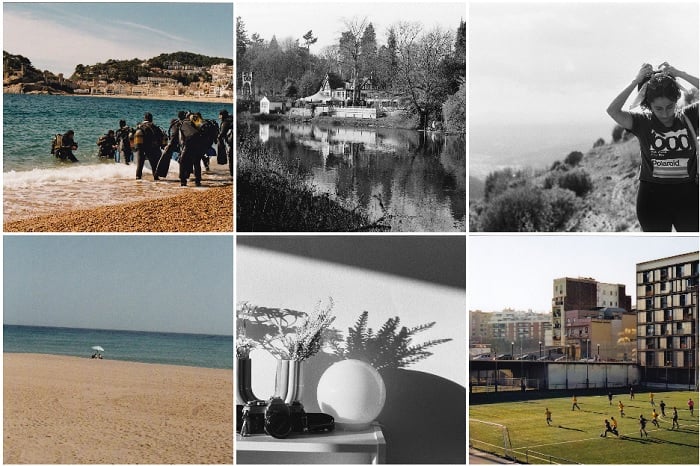
Instagram grid of images with a 1:1 aspect ratio © Kit Bryan-Smith
Some photographers adapted by editing their images to have a 1:1 aspect ratio, making them fit the display square perfectly. Others place a 3:2 or 4:3 photo on a 1:1 square background. This way the entire 3:2 or 4:3 image can be displayed without the edges being cropped.
Photographers have grown accustomed to the square photo format and are now using it away from social media.

16:9 Aspect Ratio
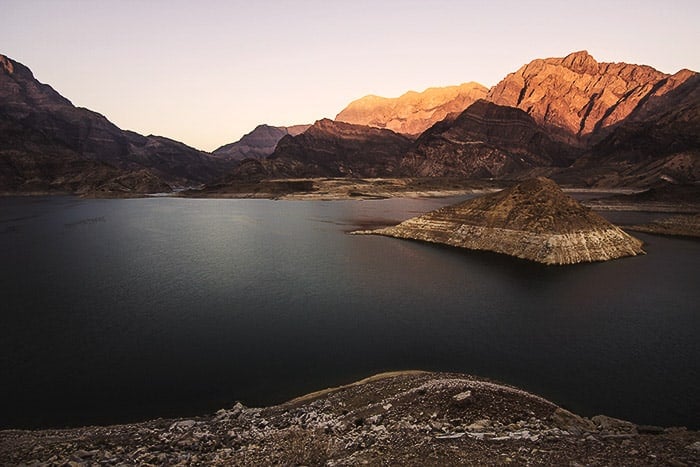
This is the standard aspect ratio for HDTV and movies. The width is far greater than the height, giving the image a wide-screen, cinematic look.
Certain types of shots look particularly beautiful in this ratio. Although, it is not a widely used aspect ratio for photos.
While not commonly used for photography, this aspect ratio does lend itself to landscape, particularly panoramas and broad scenes.
Now let’s talk about how to choose the aspect ratio for specific work. And what to keep in mind while choosing one aspect ratio over another.
Finding the Best Aspect Ratio for Your Photos
Now we’ve looked at the most common aspect ratios in photography, you need to start thinking about which is best for your photos.
Best Aspect Ratio for Composition
Sometimes, it’s the composition that dictates the aspect ratio of your photos. Certain aspect ratios work well with particular styles of photography, and this can help you decide which is best for you.
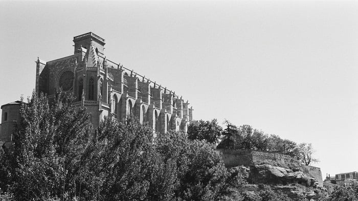
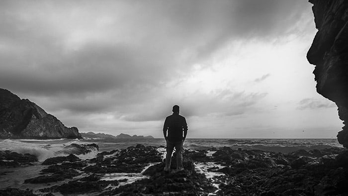
If you are shooting a landscape in horizontal orientation, then the 3:2 aspect ratio is the best choice. You can even try a 16:9 aspect ratio for really broad scenes.
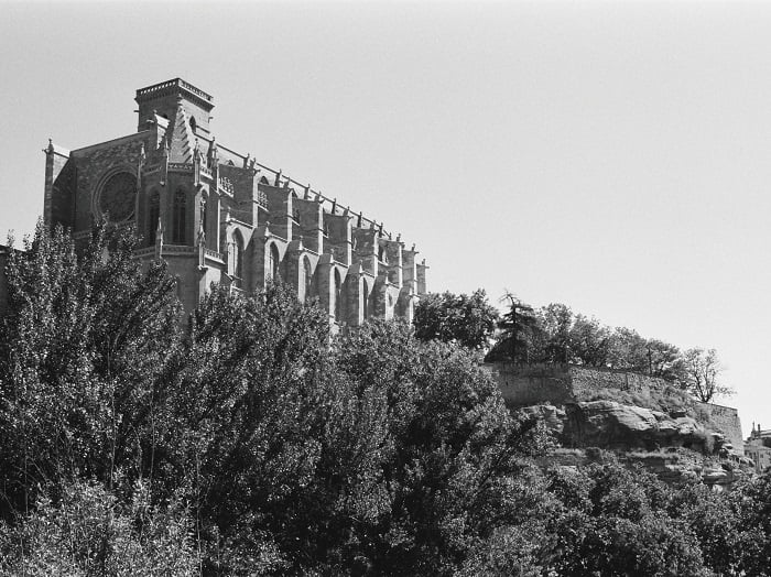
But if you want a landscape with a portrait orientation, then 3:2 aspect ratio is a bit awkward. There is too much free space either for the sky or foreground. If you don’t have a lot of details in foreground or background, then 4:3 is a better choice.
3:2 can also leave a lot of unnecessary space when shooting portraits. It’s a great aspect ratio for environmental portraits, but the squarer 4:3 is a better choice for classic portrait composition. The 1:1 ratio also works well with portrait photography.
Think about your target composition and select your aspect ratio accordingly. This will let you frame your subjects with better balance.
Best Aspect Ratio for Social Media
Social media is now an integral part of a photography business strategy. It’s great for displaying your work and gaining exposure. But platforms like Instagram have some limitations, like the 1:1 aspect ratio for grid images.
You should keep this in mind if you’re planning on displaying your images on Instagram. If you plan your composition within the 1:1 aspect ratio, you won’t lose any details at the sides when you upload your images.
To add to the confusion, you might need to consider Instagram Reels and TikTok videos. Videos are being used more and more to display photography work.
But these social media video formats have a 9:16 aspect ratio. That’s the 16:9 ratio in portrait orientation. This aspect ratio perfectly fits the smartphone screen, so it’s another format style you need to consider.
The YouTube thumbnail image ratio is 16:9. Google+ and Pinterest work best with 2:3 aspect ratio. For a photographer, getting traction on social media is of prime importance.
Since photography is a visual medium, presenting your images in the best possible way on social media is the only way you can gain more visibility.
Best Aspect Ratio for Printing Photos
It’s always a pleasure to see a picture in its physical and tangible form. Nothing can replace an album stuffed with photos or a framed picture hung on the wall.
Ask any wedding photographer and they will tell you that finding the perfect aspect ratio is tricky when sending the images to print.
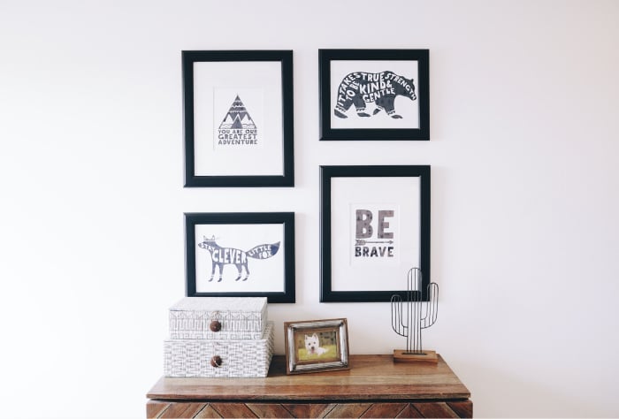
The aspect ratios of most common printing papers and photo frames don’t match the default aspect ratios in cameras these days. You will find plenty of photo frames on the market that match aspect ratios like 5:4, 5:7, and 8.5:11.
It’s a good idea to check with your client and ask how they’re going to display their photos. You might need to edit your photos so they fit one of the photo frame aspect ratios above. That might mean cropping parts of the image. It’s important to keep this in mind when shooting, not after.
This is good advice even if you’re taking photos for fun. Consider whether you’re going to print your images, and use the correct aspect ratio.
How to Change the Aspect Ratio of Photos
When you take a photo with a camera, the aspect ratio is determined by the sensor. As we’ve seen, full frame and APS-C sensors have a 3:2 aspect ratio, while Micro Four Thirds sensors use 4:3.
Some cameras have different aspect ratio options built in, allowing you to try different ones in real time.
But the best way to change the aspect ratio is to use editing software. Every digital photographer needs a good editing program that allows for aspect ratio editing.
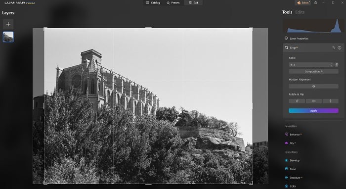
Luminar Neo allows you to change the aspect ratio by using the crop tool. It has plenty of ratios to choose from, and then you can adjust the crop for the perfect composition.
The miracle of editing software allows you to work with any aspect ratio. However, you still need to keep your preferred aspect ratio in mind when you’re shooting. It’s easy to misjudge the composition and end up losing detail when you crop to your preferred aspect ratio.
Changing the aspect ratio gives you even more control over composition. You can play with your images, giving them new dimensions and means by changing the aspect ratio.
Conclusion: Aspect Ratio For Photos
Simply, the aspect ratio is the proportional relationship between the width and height of your photo. 3:2, 4:3, 1:1, and 16:9 are all popular aspect ratios in photography.
Finding the best aspect ratio for photos depends on your style and the camera you use. You also need to think about how you like to display your images, whether you prefer physical prints or social media.
Changing the aspect ratio in post-product gives you compositional power like never before. Other than a bit of darkroom trickery, changing the aspect ratio of a photo was nearly impossible in the analog days. Now all you need is some decent editing software.
Play with different aspect ratios. Crop your images in different ways to find out which aspect ratio is best for your photos.
