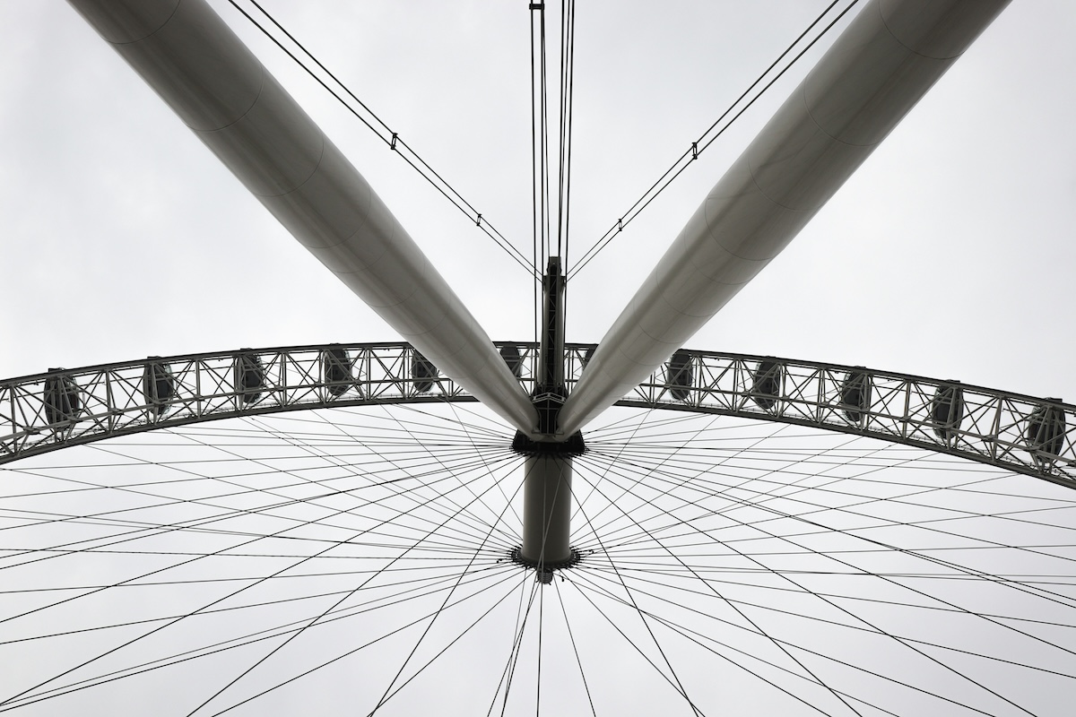
Visual weight—also known as balance—is one composition rule that can enhance your photos. Let’s examine how understanding visual weight will help you as a photographer.
Photographers are always looking for the best compositions for their images. You’ll learn how to create stunning pictures by learning the essential rules of photography.
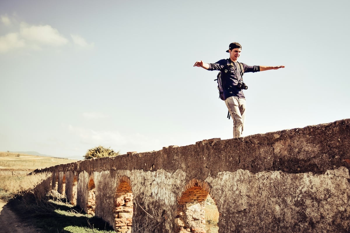
Shot with a Nikon D3300. 22mm, f/3.5, 1/2000 s, ISO 100. Pablo Guerrero (Unsplash)
What Is Visual Weight in Photography?
Weight and balance are photography terms that refer to the visual impact of elements in your composition. The stronger an element’s visual weight, the more it draws in the eye.
To achieve a balanced composition, pay attention to the visual weight of the objects. Some objects have a stronger presence than other frame elements. You can choose whether to include or remove elements.
There are different rules you can use to balance your image. One simple yet effective way is to include light and dark areas.
Like other areas of photography, unique images that go against the rules can also work well. But it’s best to learn the rules before you start breaking them!
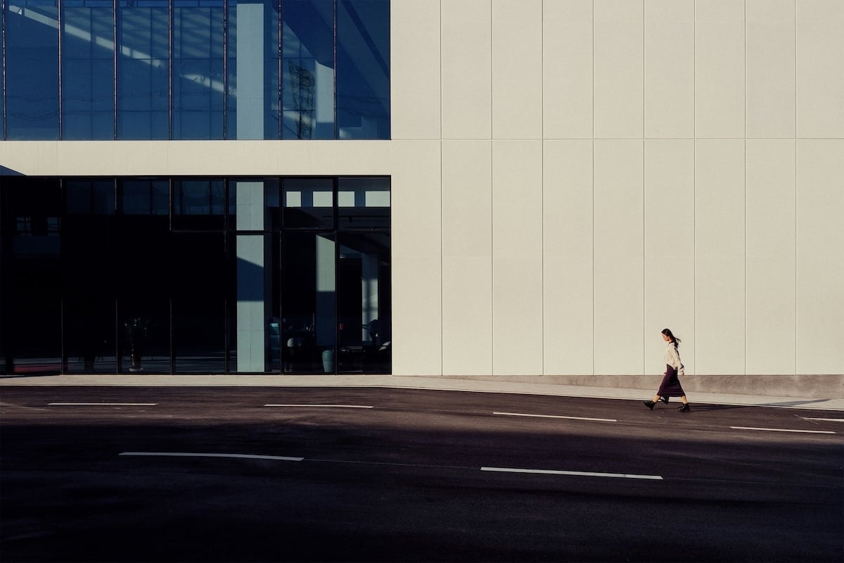
Shot with a Leica Q (Typ 116). 28mm, f/11, 1/250 s, ISO 100. Uran Wang (Unsplash)
Types of Weight Balance in Photography
1. Symmetrical Weight Balance
Symmetrical weight, or “formal balance, ” is the most obvious way to compose your images. This rule involves arranging your most important element in the center of the frame.
Most images with symmetrical weight balance have a horizontal format. This makes it easier to show the symmetrical elements. The elements don’t need to be exact and perfect. They only need a similar feel in weight and presence to appear balanced.
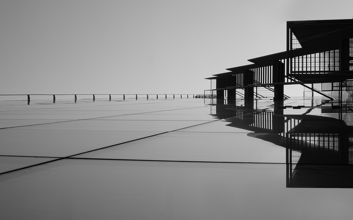
There are four main types of symmetry in photography. They are vertical, horizontal, radial, and reflective symmetry (pictured below). Experimenting with these visual weight balances is best for architectural and landscape compositions.
Unsplash photos by Massimiliano Morosinotto, Uran Wang, Leon Beckert, and An Pham (left to right).
2. Asymmetrical Weight Balance
Asymmetrical weight is also known as “informal balance.” This can be tricky to achieve, as it is more natural to favor formal balance.
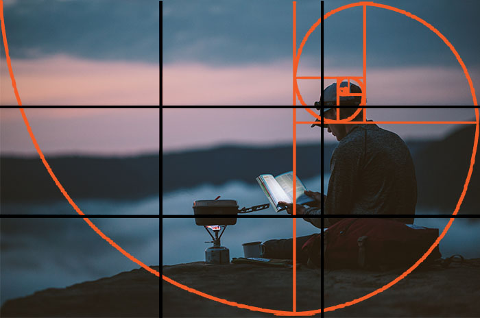
Following the rule of thirds makes it easier to compose your image in this manner. An informal balance helps achieve unique compositions that grab attention.
If the scene isn’t balanced, place one or more secondary subjects in the remaining space. For example, a bird or plane in the sky’s negative space could complement the building in the image below.
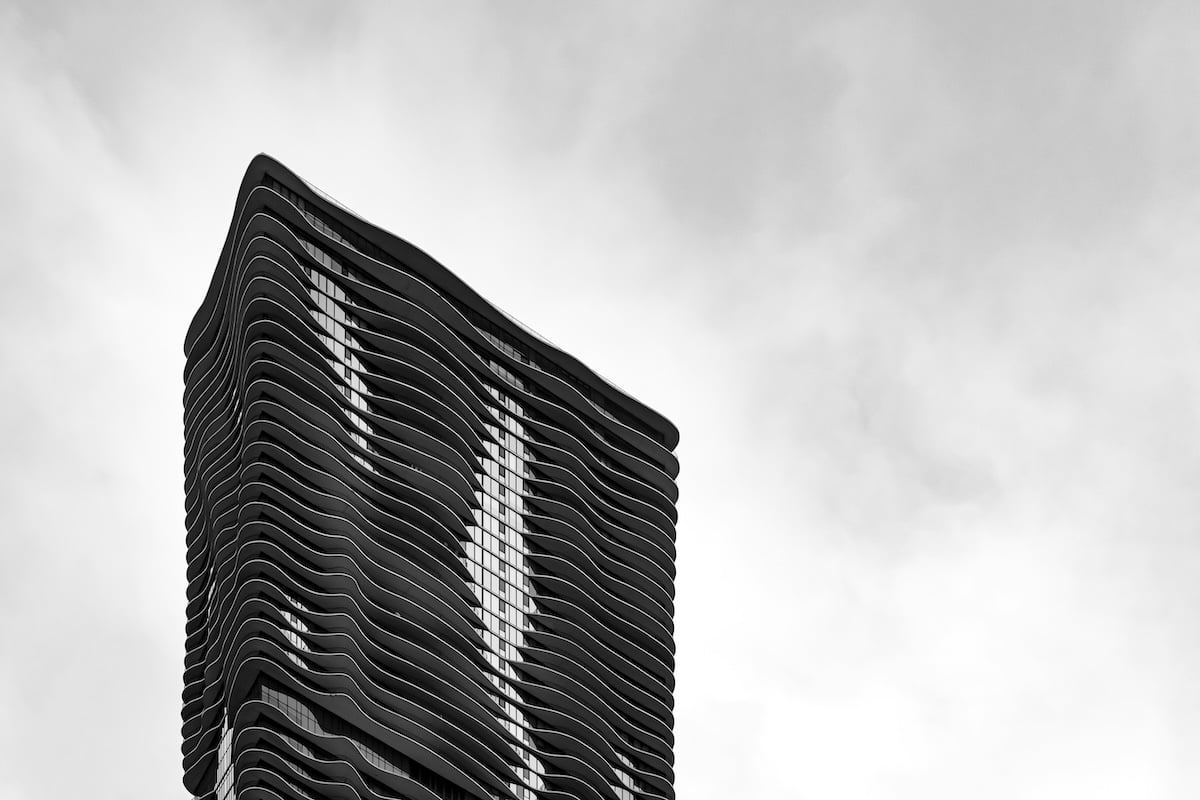
Shot with a Nikon D3300. 55mm, f/8, 1/250 s, ISO 280. Ally Griffin (Unsplash)
3. Image Balance Using Size
Size is one of the best ways to show a balanced composition. We sometimes perceive bigger subjects as closer than they are, even if this is not always true. Manipulating this idea can help you to create exciting images.
Bigger objects carry more weight than smaller items, attracting the viewer’s attention more. You can apply this principle to your perspective. You can also reduce the distance between you and your main subject to make them appear bigger.
Or you can use the juxtaposition of elements with different sizes. Play around with size and distances to achieve a good balance between subjects. Use this approach for landscape, street, or architectural composition.
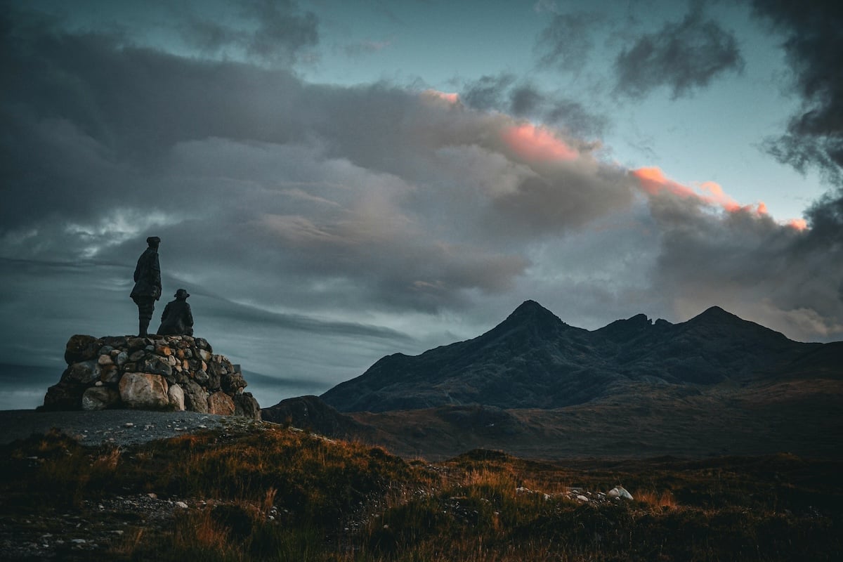
Shot with a Nikon D3100. 28mm, f/4, 1/50 s, ISO 200. Victor Bouton (Unsplash)
4. Creating Weight Balance With Color and Saturation
Bold, bright colors stand out more than desaturated ones. A burst of color against a plain, monotone background grabs the viewer’s attention. This lets you set up the image to force attention on one or two objects.
Colors can complement each other. Try having comparative or contrasting colors to help make an image more interesting.
Putting similar colors next to each other can help create a fluid transition from one item to another. This can help keep the viewer engaged for longer.
This approach is useful for landscape, portrait, and food photography compositions. Learning about color theory is also useful for mastering harmonious compositions.

Shot with a Canon EOS R5. 50mm, f/7.1, 1/800 s. Jéan Béller (Unsplash)
5. Creating Weight Balance With Tone and Contrast
Contrast and tone play a huge part in the photographic process. Darker objects hold more weight than lighter ones. You can use this for the benefit of your photography.
Tone and contrast are very powerful in black-and-white photography. In B&W photos, the viewers’ focus is on the subject, textures, and patterns instead of the colors. Areas of high contrast draw the eye. Try to capture dark objects on a light background or vice versa.
It’s smart to have some detail in the negative spaces to help engage the viewer. This technique is useful in landscape, architecture, and street photography.
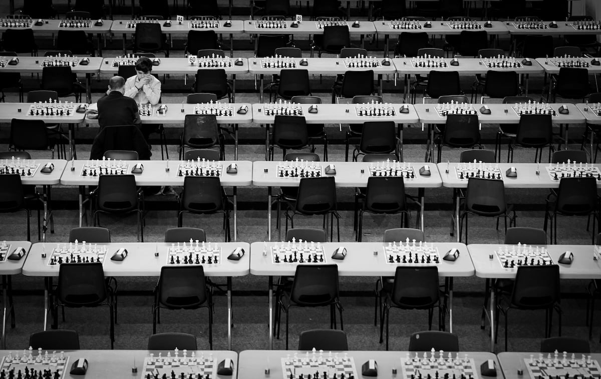
Shot with a Sony a7 II. 75mm, f/4.5, 1/80 s, ISO 400. Florian Cordier (Unsplash)
6. Focusing on Textures for Different Visual Weight
Patterns and textures are interesting because people look for and focus on them, even without trying. Strong textures can help support an image by balancing an off-center subject.
But you must be careful because textured backgrounds distract the viewer from the main focal point.
When used properly, textures can strengthen other compositional rules. The shape and form of the foreground and background play off each other. Plus, different textures give each element a different visual weight.
This visual weight tool can be used in portrait, street, landscape, abstract, and urban compositions.
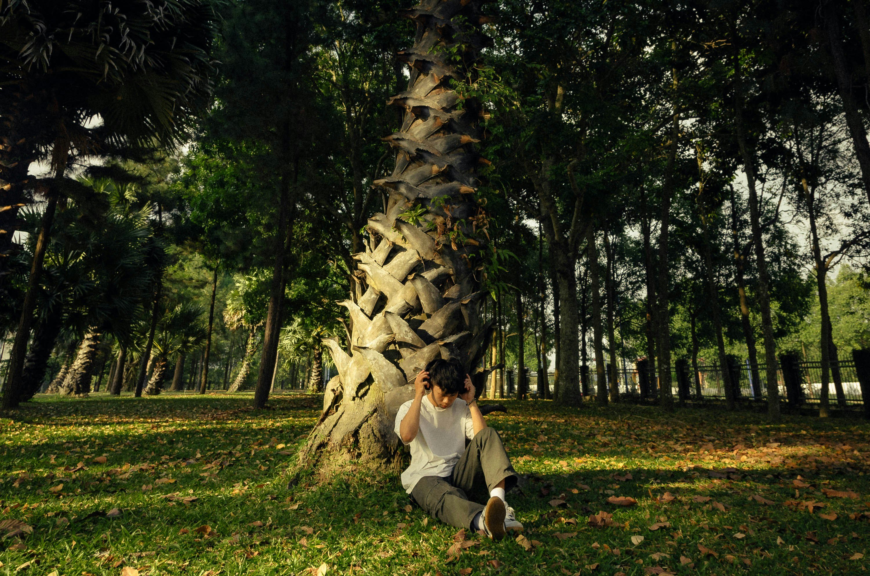
Shot with a Nikon D7000. 17mm, f/6.3, 1/125 s, ISO 200. Vinh Thang (Unsplash)
7. Focal Weight Balance
Focus is one way to attract the viewers to an area or subject within the frame. Items in focus have more visual weight than areas out of focus. Shallow depth of field, or differential focus, is a powerful tool for removing unwanted areas of a scene.
The out-of-focus areas are best because they give a useful texture to the composition. They may even be repetitions of what is in focus, which lets the viewer’s eyes drift toward them once they find the in-focus area.
Use a shallow depth of field to achieve this effect. Focal weight balance works well in landscape, macro, and food compositions.

Shot with a Canon EOS R10. 85mm, f/2, 1/200 s, ISO 250. Hannah Tu (Unsplash) – sweets
8. Using Light and Dark for Visual Weight Balance
Light and dark are very powerful tools in photography. Every image combines lights and darks—whites and blacks or highlights and shadows.
A darker image can help create a moody atmosphere appropriate for more serious and controversial topics. Conversely, a lighter image can convey a softer, more innocent feel.
If you mix these two, you can give certain elements a different visual weight. You can also use the light-dark balance to create a narrative for your image.
The darker areas draw the viewer’s eyes to the lighter ones. You can use this technique for natural framing, for example. Natural framing creates a pull-through effect, as the eye tends to follow the lighter areas. You can apply this visual weight tool in almost all photography genres.

Shot with a Canon EOS 90D. 19mm, f/9, 1/800 s, ISO 100. Yves Alarie (Unsplash)
9. Including People or Animals for Weight Balance
Including people or animals can work well in balancing a composition. They are noticeable subjects that we can quickly identify.
Thus, placing them in an image gives a sense of scale and helps keep our interest in the frame.
They also give us a sense of place and time due to their placement and surroundings. For example, this image taken in Seattle (below) is humorous. But we would find it boring without the boy blowing a bubble against the gum wall.
Photographing people or animals has the potential to create an interesting image. A unique background can help make the foreground look more attractive. This visual weight technique is a good fit for landscape and street photography.
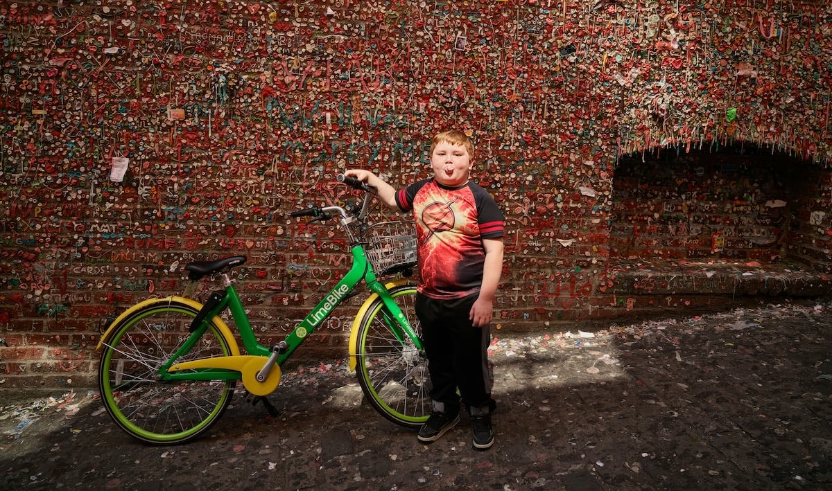
Shot with a Phase One IQ3. 35mm, f/3.5, 1/200 s, ISO 100. Carol Highsmith’s (Unsplash)
10. Lead Room Weight Balance
The “Lead room” or “nose room” is a concept in photography where you leave space in front of the photographed subject’s gaze. This lets the viewer see that the person is looking elsewhere, not only at the end of the frame.
We expect to see space in the direction the subject looks. Otherwise, it doesn’t make for a well-composed or balanced image.
If you feel the image is unbalanced, include the object the person is looking towards. It also adds a feeling of curiosity to the image. Use the lead room technique for portrait and street photography.
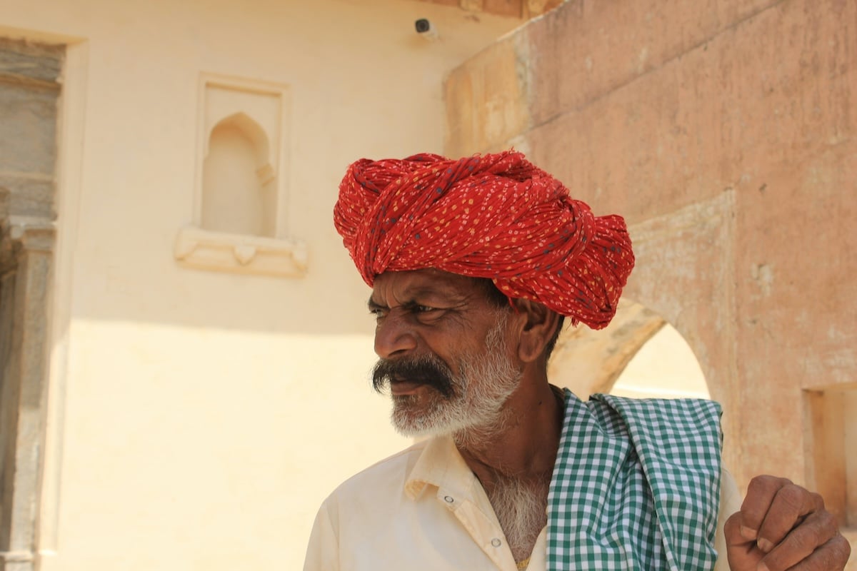
Shot with a Canon EOS 60D. 36mm, f/,9 1/125 s, ISO 100. Mohammad Bagher Adib Behrooz (Unsplash)
11. Conceptual Weight Balance
A conceptual idea can be a powerful tool for creating a composition with visual weight. Juxtapositioning concepts can create a story or interest through the contrast of ideas.
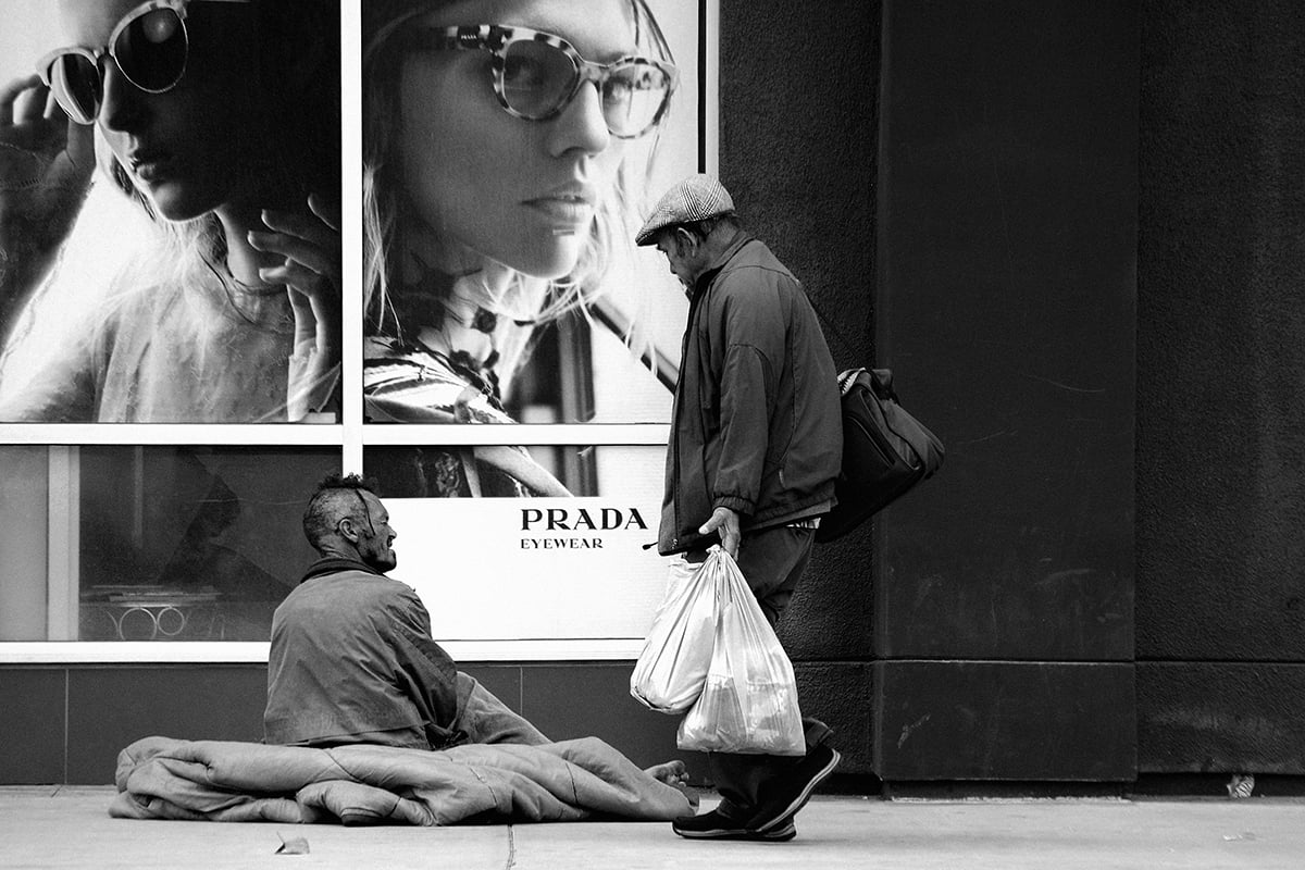
For example, the first image below shows the divide between rich and poor. We can see the stark difference between a homeless person’s situation and luxury products like Prada being advertised. The person walking by bridges the gap between the two.
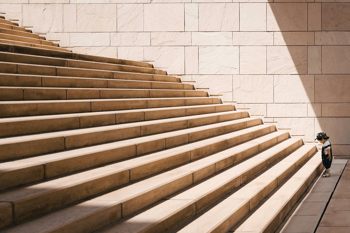
The conceptual ideas behind composition can range from the obvious to the thought-provoking. In the image below, we see some steps and a boy at the bottom, looking at the first step.
This represents a challenge the boy must overcome with purpose, effort, and courage. The two contrasting ideas work well together because they balance each other. This technique works well for photos that hope to evoke emotions and trigger thoughts in the viewer.
Unsplash photos by Max Böhme and Jukan Tateisi.
Conclusion: Visual Weight in Photography
There are many ways to use visual weight in your photography. Try applying the rules in our article one image at a time. If you try to use too many in one image, your composition might become too confusing!
Instead, experiment with symmetry, size, and colors. Then, you can move on to the trickier composition ideas.
Check out our Intuitive Composition eBook for more tips!


