There are a number of important rules of composition in photography. Composition in photography is about what to include or leave out of your frame. It’s also about how you decide to place the elements in the scene.
Rather than thinking of these as "rules," think of them as guidelines for making your images more visually appealing and interesting.
[courses category="Composition"]
How to Use the Rules of Composition in Photography
There are tons of different composition rules in photography. And knowing which one to use for which shots is the best way to take your photos to the next level. Read on to learn everything you need to know about composing your photos!
1. Use the Rule of Thirds to Add Interest
Composing your image by using the rule of thirds means placing your main subject a third of the way into the image. Placing your subject off-center is much more interesting than placing it in the center.
Many cameras, including smartphones, can overlay a rule-of-thirds grid on the screen. It looks like a tic-tac-toe game. Two horizontal lines and two vertical lines divide the frame into thirds.
When photographing, place your main subject on one of the intersection points. This works for both the horizontal and vertical lines.
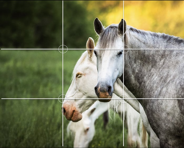
This image shows the rule-of-thirds grid lines with circled intersection points.
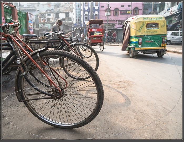
2. Simplify a Scene with the Rule of Odds
The rule of odds can simplify a complex scene with lots of subjects. In general, we find an odd number of subjects more appealing to the eye than an even number. Three is the magic number, but five and seven also work.
The rule of odds helps us select our subjects thoughtfully. The rule guides us on what to include and what to leave out. It also reminds us to isolate our subject in a busy scene because one is an odd number.

3. Focus on Your Subject by Filling the Frame
Filling the frame is about getting close to your subject. Really close.
Filling the frame is about making your main subject clear and distinct. Ask yourself, how much sky do you really need? Or could you do with less of the background in the frame?
We can fill the frame by using a zoom lens and getting close to our subject. But it's often better to "zoom with your feet." Get physically closer to your subject. In post-processing, consider a tight crop on your subject to fill the frame.
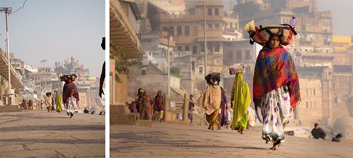
The image on the left is the original. I cropped the image on the right much tighter eliminating much of the sky and the pavement.
4. Choose the Right Depth of Field
Choosing the right depth of field is deciding how much of the image should be in focus. This isn’t so much a rule as a compositional decision you need to make.
A shallow depth of field means only a small part of the image (usually the subject) is in focus. The background is blurred.
A deep depth of field means the image is in focus from the foreground to the background. Use a shallow depth of field to blur distracting backgrounds. Sports photographers blur backgrounds so athletes stand out against a busy crowd. To get a shallow depth of field, use a wide aperture like f/2.8.
In general, it’s best to use a deep depth of field for landscape photography. To get the entire scene in focus, use a narrow aperture like f/16.

A shallow depth of field isolates individual flowers in a field.
5. Use the Best Orientation for the Scene
Orientation refers to whether you’re holding the camera horizontally or vertically. Orientation and aspect ratio determine how much and what you capture in an image.
Aspect ratio is the proportion of the height compared to the width. If your image has a lot of vertical elements or is very tall, use portrait orientation. This means you would hold your camera vertically.
If there are a lot of horizontal elements or you have a wide image, use landscape orientation. Hold your camera horizontally. You can also take panoramic shots if your scene is very wide (or very tall!).
We usually think of panoramas as long, horizontal images, but they can be vertical as well. I often take the shot both ways and see what I like later. Then I try different aspect ratios in post-processing.
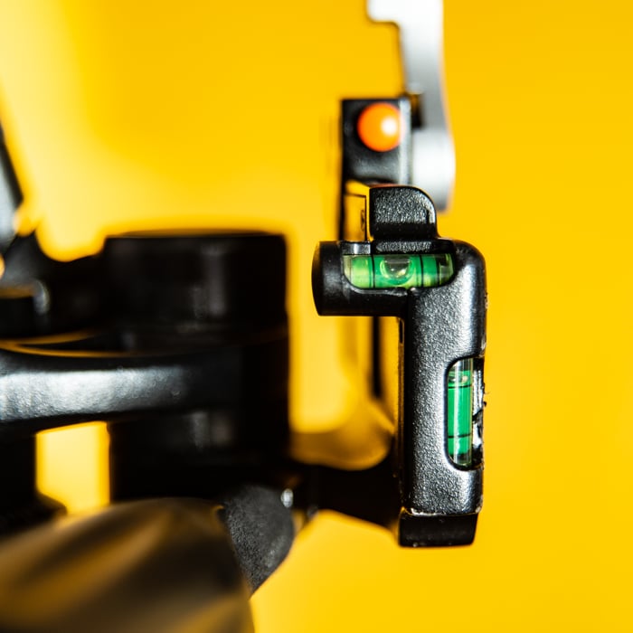
Tripods usually feature several spirit levels corresponding to different orientations.
6. Straighten Lines for an Aesthetically Pleasing Image
Not all lines in an image need to be straight, but there are some lines that are expected to be straight. And if we’re used to seeing them straight in real life, you’ll want to make them straight in your composition.
Take the horizon line in a landscape, for example. A tilted horizon in an image is immediately noticeable and distracting.
Many cameras and tripods include a level. Use these tools to help orientate your camera. It's also easy to correct a tilted line in post-processing.
Straight lines are also important in architecture. Using a wide-angle lens often distorts lines. Leave space on either side of the building so you can straighten lines in post-processing.
In an image with many different lines, choose one to be your main focus. Make this line straight, even if the others are a bit off.
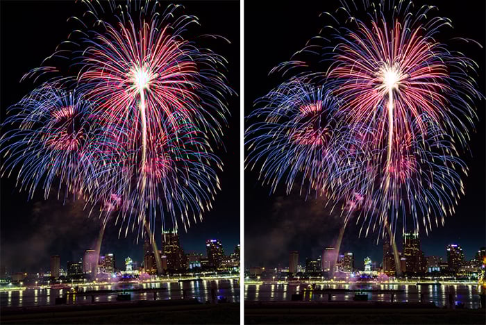
I bumped my tripod during a fireworks display (left). The tilted horizon is easy to fix in post-processing (right).
7. Create Depth with Leading Lines
Our eyes naturally follow lines through an image. Leading lines direct our eyes to the main subject. Used well, leading lines create a sense of depth.
Lines may be actual lines or implied by elements in the scene. Sometimes the lines are straight and lead directly to the subject. Other times, the journey is roundabout. S-curves are a favorite of photographers.
Leading lines must lead to something interesting in your photo—almost always the main subject. If a line doesn't lead anywhere or it leads the eye out of the frame, change your position.
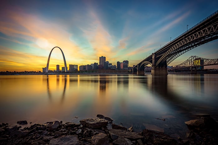
This image is full of lines leading to the cityscape of St. Louis and the Gateway Arch.
8. Use Diagonal Lines to Add Energy
Diagonal lines add interest and energy to photography compositions. Try photographing lines on a strong diagonal rather than straight across the frame.
Make sure your diagonal is obvious. A little tilt to a line looks like a mistake. Think about where lines intersect with each other. Converging lines draw the eye. Also, consider where lines enter or leave the frame. Photographers sometimes try to have a line enter or leave the frame in a corner.
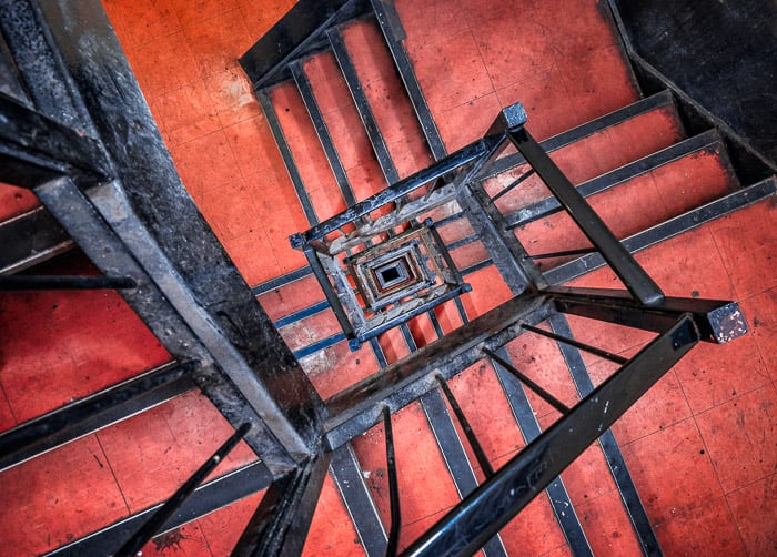
Rather than straightening out the lines of this spiral staircase, I shifted them to a diagonal.
9. Attract Attention Using Light
Our eyes naturally go to the brightest part of an image. Knowing this affects how we compose an image. The main subject should be the brightest part of the image.
Portrait photographers use a flash or reflectors to highlight the faces of their models, for example.
In post-processing, techniques like dodging and burning can help you direct the viewer’s eye. Dodging is selectively lightening certain parts of the image. Burning is selectively darkening certain parts of the image.

I use a lot of dodging and burning in post-processing to guide my viewer's eyes to important elements in the frame.
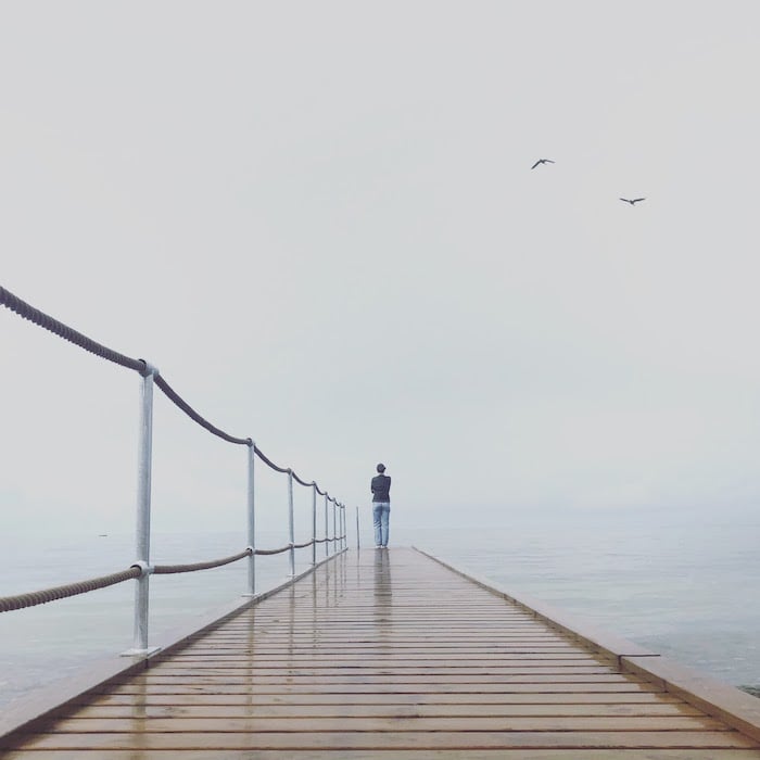
10. Use the Negative Space Around Objects
Negative space is the use of the space between or around subjects as an important element in the image. It sometimes becomes its own subject with its own shape.
Negative space can show scale or imply an “empty” feeling. Sometimes it's difficult to see negative space because we're so used to focusing on a subject. Try flipping your images upside down in post-processing. This will help you see space without being too focused on the details of your main subject.
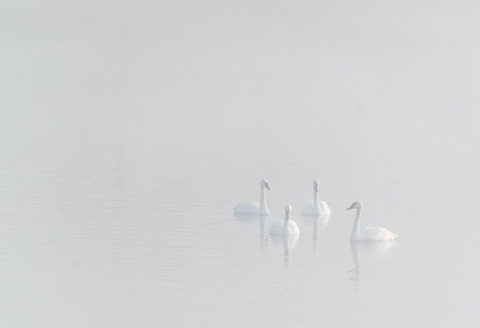
This photo of white swans in the fog is impactful mainly because of the negative space.
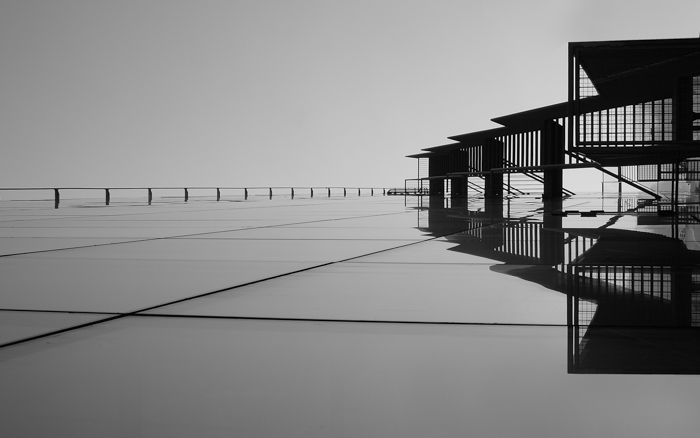
11. Balance the Subjects for Symmetry and Visual Balance
Visual balance is the relationship between two or more elements in your composition. The elements look balanced when they both have similar visual “weights.”
Composing symmetrically creates visual balance. The left half of the image matches the right, or the top half matches the bottom. Reflections in photographs work so well because they show symmetry.
Even asymmetrical images need visual balance. You can balance a large, visually heavy subject on one side of the frame with many smaller subjects on the other. You can also effectively balance a foreground element with a background element.
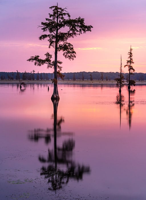
This image shows symmetry through the reflections but also another type of visual balance. The tree in the left foreground is balanced by two trees in the right background.
12. Change Your Perspective
Perspective is about where you are in relation to your subject. Changing perspective means getting down low or going up high.
Everyone sees the world from about the same perspective—eye level. You can make images more interesting by using a different perspective. Photographing from a low angle makes the subject look more powerful.
It's also fun to change your perspective and go high. This is one reason drone photography is so interesting. We rarely get this bird's-eye view of our world.
Using a low perspective is important when photographing subjects close to the ground. It’s also important when photographing children. It’s best to get down to their eye level.

This photo is more powerful because I'm photographing up toward my main subject.
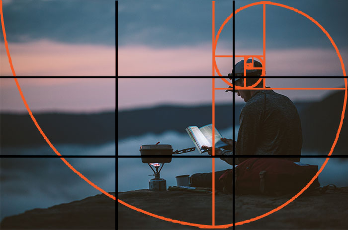
13. Emphasize Your Main Subject with the Golden Rule
The golden rule is about placing your main subject in an important part of your frame. This rule is like the rule of thirds. But the golden rule suggests a different arrangement of compositional elements.
The golden rule is based on the golden ratio. The golden ratio is a naturally occurring mathematical phenomenon, with a ratio of 1:1.618. Mathematically, this may mean nothing to you. But visually, you see it everywhere. A good visual representation of the golden ratio is the spirals on a nautilus shell.
In photography, the golden rule is represented as a spiral. Some cameras allow you to see an overlay of the golden ratio on your viewfinder. Lightroom also has overlays to help you crop images using the golden rule.
I used the golden ratio spiral overlay in Lightroom to help me place important elements in the frame.
14. Capture Movement from Left to Right
We look at images like we read text, from left to right. Movement in a photograph should also move left to right in the frame. This compositional rule is particularly important for wildlife and action photographers.
It's not always easy to capture motion from left to right in the real world. But you can flip your image horizontally in post-processing to create left-to-right movement. This often works as long as there isn’t text in the image.
Make sure to leave lead room in the frame for the subject to move into. This means leaving space to the right of the subject. Otherwise, it looks as if the subject is moving out of the frame.
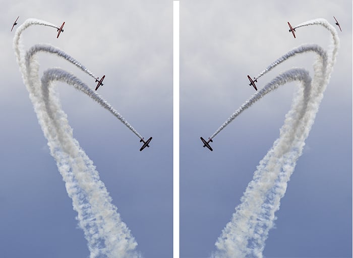
I flipped the image horizontally to show the difference when the planes are flying left to right or right to left.
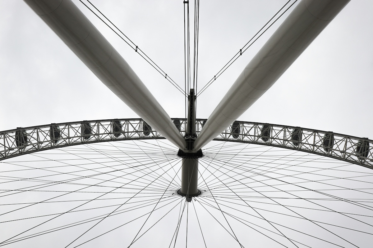
15. Incorporate Patterns and Repetition for Stronger Compositions
Our brains like patterns and repetition. We'll even impose patterns on random elements. Think of the fun we have finding patterns in clouds. Incorporating repetition and pattern makes our photographic compositions stronger and more interesting.
Repetition and pattern are often found in shapes and colors. You may have to change your perspective to make patterns pop. Notice how changing perspective can alter spacing or hide the pattern.
Adding contrast to repetition makes your photos even more dynamic. The contrasting element may be a different color, shape, or height. Breaking up the pattern emphasizes the pattern.
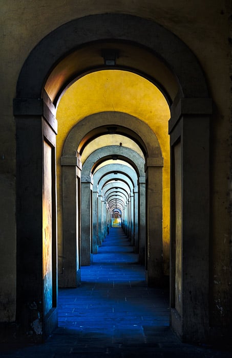
Look for repetition in architecture.
16. Find a Relationship Between Elements
Look for interesting relationships between the elements in your image. For instance, look for tension. Two elements that appear to pull at each other create visual tension. This tension can be created by clashing colors or a size discrepancy.
Street photographers often juxtapose elements. This could be something in the environment that conflicts with people on the street. This can create funny photos or tell a story.
You can also look for a relationship between colors in your scene. Color theory is about how the colors in your image relate. You can use the color wheel to emphasize different color schemes. For example, colors across from each other on the wheel are complementary.

I noticed the sign behind this street performer. This street performer's smile is "lovelier." Juxtaposing the sign and the person creates a deeper meaning.
17. Simplify Images to Capture the Essence
Simplifying the image means including only what you need to convey your message. When you include unnecessary elements in your image, it can be distracting. So it’s best to remove everything you don't need.
Simplifying an image doesn't necessarily mean creating minimalist images. Simplicity is distilling the idea of a photograph into its purest form. Decide what your photo is about. Then take out everything that doesn’t add to this idea.
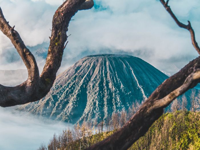
18. Draw the Viewer’s Eyes with Framing
When it comes to framing in photography, try including one element of your image inside another. This creates a frame within your frame. For instance, you might shoot through a window or through an opening in the trees.
Frames add depth and draw our eyes into the image and to the main subject. And this is exactly what you want to do with your image.
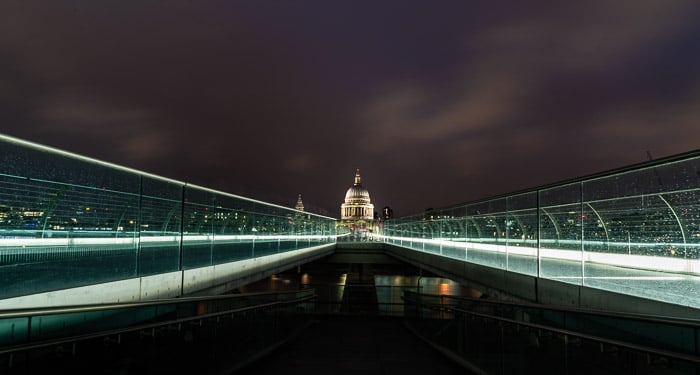
The Millennium Bridge over the Thames frames St. Paul's Cathedral.
19. Use Layering for Depth and Dimension
Layering is the process of finding elements that stack from the front to the back of your image. It adds depth and dimension.
Layering includes adding a foreground element to a landscape. Rather than the scene being on the same flat plane, a foreground element leads the viewer into the scene. Rocks or flowers are common examples of natural foreground elements.
Layers should be visually distinct in color or light. This helps avoid mergers and lets the eye easily distinguish the layers.

Photographers travel from far and wide to capture the layers of the Smokey Mountains.
20. Avoid Mergers
Mergers happen when elements in an image overlap in a way that makes it difficult for our eyes to separate. Our 3D eyes separate things separated by distance. But in a 2D photograph, the objects “pancake,” especially if they are similar in color or shading.
Watch for distractions in the background. In outdoor portraiture, for example, it’s easy to overlook a tree branch that appears to be coming out of someone's head.
To create a clear composition, make sure your main subject has space around it. If objects or people overlap, step to the left or right. Changing the angle even slightly can often get rid of mergers.
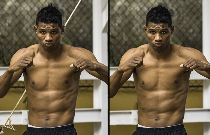
The rope behind this Cuban boxer creates a merger and is distracting (left). I had to remove it in post-processing (right).
21. Check the Edges for Distractions
Scan the edges of your frame before snapping a photograph. We're often so focused on our main subject that we forget to look at the entire frame.
Look for trapped space. Trapped space is when an object and the edge of the frame intersect to create an odd shape of light.
Also, look to see how objects or people are cut off by the edge of the frame. Some photographers live by the rule: "Include everything or include nothing." This means that rather than cutting an object off at the edge of the frame, it's better to cut it out completely.
Other photographers are ok with cutting off an object or person as long as the crop looks natural. Portrait photographers try not to cut people off at the joints.


Conclusion: How to Use the Rules Of Composition in Photography
Compositional choices make the difference between a snapshot and a great photograph. Following these photography composition rules is a great way to take more impactful images.
But there is no one right way of seeing the world. Once you master the rules of photographic composition, it's time to bend or break them.
Use these photography composition rules as guides to help you decide what to include in your image and how to compose the elements. Sometimes the right thing to do is to break the rules of composition!
[courses category="Composition"]