Some images catch our eye faster than others. Do you know why? One reason is down to the use of complementary colors.
Complementary colors create a natural contrast that our eyes find attractive and intriguing.
Let’s see how you can take advantage of the complementary color scheme to improve your photography.
Color Theory 101: What are Complementary Colors and the Color Wheel?
If one thing affects how a viewer sees your images, it’s color. Different colors can be striking and bold or subtle and muted. They could be vibrant, luscious, or pastel and soft.
Luckily for you, there is a concept behind the colors we use. Color theory helps us understand all these shades and tones.
It is a set of practical guidelines on the visual effects of color combinations.
Color theory helps us mold this diversity of colors into a logical structure – from warm colors to cool colors. To make sense of color combinations and understand how colors work in general.
Color theory encompasses a variety of definitions, concepts, and design applications.
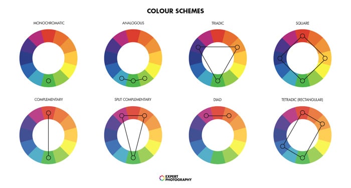
But for our purposes today we’re going to use only the simplest and most important one: the color wheel.
The color wheel is a circular scheme that visually represents the relationships between colors. It presents a sequence of pure hues. And it shows the most common types of color pairings:
- analogous colors
- complementary colors
- monochromatic colors
How Do Complementary Colors Work
Colors that are opposite each other on the color wheel are complementary colors. They “cancel” each other, if you mix them.
This means that they create an achromatic (white, gray or black) light mixture.
That’s why you can describe a shade of yellow as having a tinge of orange/green. But you can’t say ‘reddish green’ or ‘purple with a hint of yellow’.
Basic color theory says that the more different two colors are, the more contrast they produce.
Complementary colors are as different as it gets. They reinforce each other's brightness while preserving color balance.
Complementary colors offer the strongest contrast, creating a vivid and energizing effect. This effect is most prominent at maximum saturation.
But the beautiful thing about complementary colors is that they create contrast in a natural way. You don't need to try to create it in post-production.
Combining them is the natural technique to catch the viewer’s attention. And to have a strong, contrasting palette.
How to Find Complementary Color Pairs
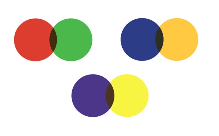
There are three traditional pairs of complementary colors:
- red and green;
- yellow and purple;
- orange and blue.
But the way you find these pairs depends on which colors you count as primary colors.
That is to say, colors that you can’t create through any combination of other colors. All other colors derive from these limited number of hues.
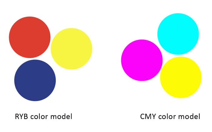
The most common color model takes red, yellow and blue as its primaries (RYB color model). This is a historical set of colors used in subtractive color mixing.
Painters considered red, yellow and blue as primary colors for centuries. But they still used more than three RYB primary colors in their palettes. And at one point they considered red, yellow, blue and green to be the four primaries. (Color Research and Application. Volume 32, Number 2, April 2007.)
In the additive model (RGB, the model from your monitor and phone) the primary colors are: red, green and blue.
However, printers and designers who use modern subtractive color methods use magenta, yellow, and cyan. This is the CMY color model.
Here the compliments are: green and magenta, red and cyan, and blue and yellow.
Other color models produce different complementary pairs. We’re going to use the most common pairs from RYB and CMY models:
- red and green;
- yellow and purple;
- orange and blue;
- green and magenta;
- red and cyan;
- blue and yellow.
Let’s see how you can use these pairs to enhance natural color contrast in photography.
But first, one quick note about the difference in saturation.
Difference in Saturation
The most vibrant shades of complementary colors provide the most striking contrast. But that is not always what you want.
Sometimes you won't want such high contrast. You might still want a visually energetic photo. But nothing too vibrant.
You can go for a more balanced, natural look. Subdue one or both of the colors for a less overwhelming but still engaging effect. Often one of the two complementary colors is purer and more saturated than the other.
It helps to save the appeal of high color contrast. But at the same time, it lets your image look natural and unprocessed.
The difference between a highly saturated and calmer color palette, featuring basically the same hues
How to Master the Colors: Photography Exercise
Developing a right eye for color takes a lot of time and practice. The best way to improve your vision of complementary colors is taking a lot of photos.
The trick? They have to have a special focus on one color relationship.
To help you with this, I recommend this little experiment with color blocking. Our goal here is to create a bold composition with loud but harmonious color combinations, vibrant hues, and strong graphic elements.
It will help you to get a sense of color. It will allow you to use more subtle and complicated palettes from these primary combinations.
Let’s get started!
1. Pick a Background
First of all, decide which color you want to use as a background. It could be a large sheet of colored paper, painted plywood, vinyl or anything you find suitable.
Try to find something smooth, without an explicit texture.
2. Choose Your Object
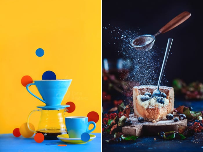
As your main model, pick an object of a complementary color to your background. It could be blue plates on a yellow background (try to add a lemon here). Or some green apples on a magenta cloth.
Start simple, keep basic geometric forms in mind. See where it will lead you.
You can look for objects with natural bright colors. Yellow bananas would look great on a purple ceramic dishes, for example.
Or make it as unnatural and weird as possible. Use spray paint to make bananas purple and place them on a yellow background.
Paint oranges blue. Place red lemons on a bunch of green leaves. Let your imagination run wild!
You’ll be amazed how useful versatile the spray paint may be!
3. Create a Composition
Working outside your comfort zone is challenging, so here you can relax. Pick the most comfortable composition for your work-flow.
Are you used to shooting flat lay? Shoot flat lay now. Do you like the 45-degree view? Stick to it.
Keep your composition simple and concentrate on colors.
Repeat this exercise several times, adding more colors or more objects.
Try each pair of complementary colors we were talking about: red and green, yellow and purple, orange and blue in RYB model. And green and magenta, red and cyan, blue and yellow in CMY model.
Find a pair that looks the most attractive to you and make the most of it!
 Conclusion
Color in photography is a powerful tool. It can make a photo shine and wow a viewer. It can also ruin a photo if you don’t handle it with thought and care.
Keep asking questions about how changing colors affect your image, keep practising and take the most beautiful photos. Good Luck!
Want to learn more about the basics of photography? Why not check out our course Photography for Beginners next!
If you are looking for inspiration, see our 25 Stunning Examples of Complementary Colors article.