Family portraits can be a treasured memory for years to come. It’s worth learning about family photography composition techniques. They’ll help you capture perfect moments the whole family will love!
Continue reading for our top tips on family photography composition techniques. By the end of this article, you’ll be able to frame your family portraits perfectly!
Family Photography Composition Techniques
Continue reading to learn everything you need to know about family photography composition!
1. Use the Rule of Thirds for Family Portraits
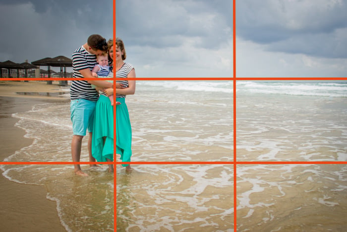
This is a classic composition guideline in photography. The rule of thirds helps us place our main subjects in the frame so that the photo looks natural and the viewer’s eyes are attracted to them.
Imagine that your frame is divided by two horizontal lines and two vertical lines to create nine equally sized rectangles. The rule of thirds says that you should place the key elements in the scene along these lines or on the intersecting points. Most cameras have a grid displayed when you look through the eyepiece to make it easier.
In family portrait photography, the key element of the image is the family. Adjust your framing to place the family on one of the lines or intersecting points.
Experiment with it until you get a portrait composition that you like. This might not work so well with big families because in order to place the family in one of the lines, they need to really squeeze together. You could try placing the horizon on one of these lines in that case.

2. Look for Symmetry
Using symmetry in your family portraits is an excellent way to compose your shots. You can find symmetry in architectural elements such as stairs or a bridge. This is a great spot for the family to stand to take advantage of the symmetry in the frame. In fact, the family members themselves can be part of the symmetry!
You can use their reflections in water, glass, or a mirror to create interesting and original portraits. Or you can place them one in front of the other. This works especially well if they are dressed similarly.

3. Frame the Family
Framing your family is a way to highlight that they are the main element in the image. Use certain elements in your composition to create a frame around your subjects. Look for natural frames in your environment, such as doors, bridges, trees, or windows.
Placing your family within these structural frames is called creating a frame within a frame. It’s a great way to bring focus to your subjects and add dynamism to your photos. It’s also a fun composition resource that will help you keep your creativity in shape!

4. Check Where You Place the Horizon
Many photographers recommend placing the horizon in accordance with the rule of thirds. But that doesn’t mean you should follow it all the time! For example, I wouldn’t want the horizon to pass at the same height as people’s necks. It will look like their heads are separated from the rest of them.
This “cut-off” effect creates a feeling of discomfort. This is less preferable than having the photo’s composition a bit out of balance. What you can do instead is place the horizon in the middle of the frame or really high above their heads.

5. Leave Negative Space
Zooming in on the family is a good way of framing the portrait. But I also like doing the exact opposite, leaving a lot of empty space around them. This is known as negative space.
It is a way to keep the image simple and minimalist. It eliminates distractions and helps the viewer focus on the important part of the image. But for this technique to work well, the negative space has to be relatively empty.

6. Avoid Distractions in the Background
When you take a family portrait, there are a lot of things to pay attention to—correct exposure, light direction, and the placement of the family members are just a few. It’s easy to forget to look at the background and check that there are no distracting elements.
You might end up with a garbage can right under the family or a crazy antenna coming out of their heads. It is a good habit to check the background quickly before pressing the shutter release. If you see something you don’t want to include, you can always change your perspective to change the composition.
You might need to change your position or make the family move a bit. But believe me, it is totally worth it! This simple trick will save you tons of hours of editing!

7. Add Leading Lines
The human eye likes to search for and follow lines. We can take advantage of this natural tendency when we compose our photos. If you have lines in the frame, such as the outlines of a road or a building, highlight these lines. You can use them to lead and guide the viewer through the image to focus on your subject.
Leading lines won’t always be this obvious, though. Sometimes they’re subtle aspects of the environment that seem like a line. You can use paths, walls, benches, or even a breaking wave. Any line works, even if it’s not straight! Curved and diagonal lines work really well as leading lines.

8. Change Your Perspective
Sometimes it is difficult to find the perfect composition. If you’re having trouble finding it, try changing your perspective. If you usually shoot straight-on at eye level, try moving around and shooting from the side. Or lie down on the floor and shoot upwards. If there’s something around for you to safely climb on to get a higher perspective, shoot from that height.
If not, you can ask the family to sit down or crouch. Depending on the location of the photo session, you can even ask them to lie down. These alternative perspectives are good for adding diversity to the family photo collections. They’re also an excellent way to eliminate distractions from the background.

9. Not Everything Has to Be in the Frame
What you decide to include in or leave out of the frame is a personal decision. Realizing that I don’t need to include everything in front of me changed my way of taking pictures. You are free to experiment and frame your photos in different ways, even with your own subjects.
For example, when taking a group photo, toddlers can get overlooked because they’re usually being held by an adult. In order to bring the viewer’s attention to the kids, I sometimes partially crop out the adults.

10. How to Crop People for Better Portraits
When cropping, there are certain rules to follow so as not to give the viewer the feeling that the body part is incomplete. In general, it’s not recommended to crop at the joints—wrists, elbows, knees, etc. Just place the cropping point a bit higher or lower than these areas.
Another tricky body part is the neck. If you crop the neck in half, it will seem like the person just lost their head. Instead, crop at the chest.

11. Make Your Group Photos More Dynamic
If you want to convey the sense that the family is moving, you need to give them some empty space that they can move into. If the family is moving towards the left, leave some empty space on the right of the frame.
Having them walk or move around is also a great option to avoid taking photos that look too posed.
You can also highlight where the family is coming from if you leave the empty space behind them. Leaving this space makes the images look more dynamic and interesting.
Something similar happens with the direction your subjects are looking in. If they are all looking in the same direction, leave some space in that direction. This will make the viewer wonder where and what the family is looking at.

12. Break the Rules
What we call composition rules should be considered more as guidelines than as rules. Although they are extremely useful, do not let them restrict you. As a matter of fact, ignoring the rules can help you be more creative.
Composition techniques are meant to be helpful guidelines for creating interesting, memorable pictures. But they’re not set in stone! Do not sacrifice capturing a special family moment in order to stick to a technical guideline.

Conclusion—Family Photography Composition Techniques
I invite you to try these family photography ideas and start experimenting with composition guidelines. It might require more thought at first, but soon you will integrate composition techniques into your workflow.
Spend time mastering the guidelines. Once you learn them, you can decide whether to use them or ignore them to create the best composition for your family portraits.
Check out our Dreamy Childhood Portraits eBook to capture family moments that you will treasure for a lifetime!


