In a perfect world, all camera lenses are perfect. They would allow for 100% of all light passing through it to reach the sensor, without any imperfections or loss in resolution.
But this is not the case. All-glass elements present limitations.
Read on to find out what an MTF chart is, and how to use an MTF chart to understand the optimal performance of your glass.
Understanding an MTF Chart for MTF Testing
Camera manufacturers use MTF charts to see how their lenses capture and reproduce patterns, such as repeating fine lines. The better the performance of a lens, the better it can reproduce these fine lines.
The contrast level of a lens is how well the lens performs with broad, thick lines. The lines used are set at 10 lines per millimetre, which is big enough for optical testing. We are looking to have a clean break between these lines and the background.
The resolution of a lens is how well the lens looks at fine details. The lines used here are much thinner at 30 lines per millimetre. Here, we want a clear distinction between the lines.
If they start to blur together, it means the lens has reached its resolution limitation.
We look at lines because they represent and render differently depending on their orientation. You might think that a scene with diagonal lines will capture the same as one with parallel lines. You’d be wrong.
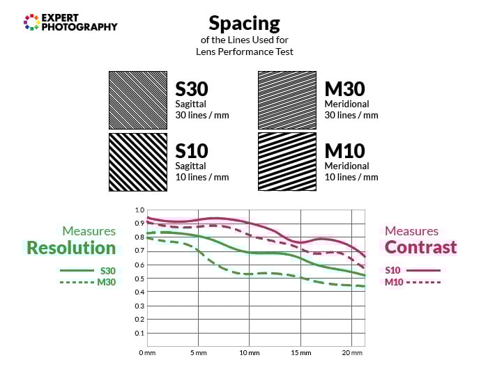
Diagonal lines, running from the center of an image to the corner, are easier for a lens to reproduce compared to parallel ones. We use two different groups of diagonal lines on the chart. They are called Meridional and Sagittal lines.
Sagittal lines (full) are the lines that run from the center to the corners of the frame. They are parallel to a given radius of the image circle.
Meridional lines (dotted) are the lines that run perpendicular to sagittal lines, parallel to the tangents of the circle.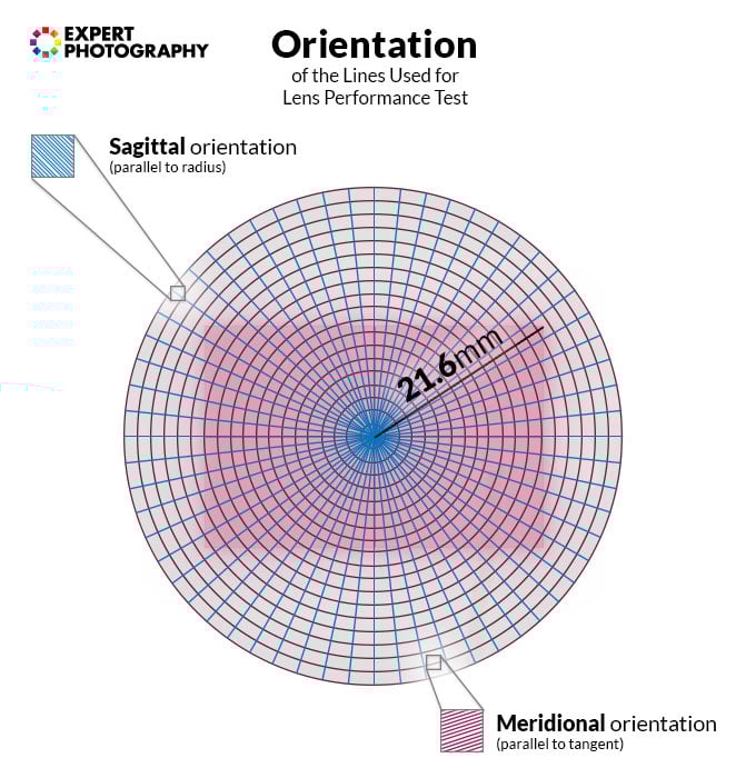
MTF charts present us with a lot of information in the form of lines. Both contrast and resolution show themselves through sagittal and meridional lines.
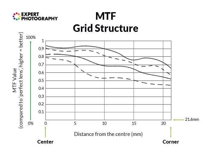
This information comes from a test of any given lens wide open. This means that the above data shows the performance of the lens at it’s widest aperture.
We can see that the contrast of this lens is stronger in the center. It reaches 0.92 or thereabouts, for sagittal lines. It drops to 0.82 or thereabouts at the edge of the frame.
For meridional lines, it starts around 0.9 in the center but ends with 0.69 at the edge of the frame.
The resolution of the same lens has a lower performance. They start at 0.85 and 0.79 at the center and end at 0.55 and 0.41 at the edge of the frame respectively. It shows how the performance drops the further you get from the center.
When we look at the performance of a lens, the closer to the top the data is, the better. While 0.6 is acceptable, lenses with high-performance will present around 0.8.
What Is an MTF Chart for a Lens?
The MTF chart is the favoured way of looking at lens performance. This scientific review looks at equations rather than public opinion. Even camera features or computer software can change the perceived performance of a lens.
The MTF chart or graph uses two axes.
The horizontal axis (x-axis) shows the distance between the measurement point and the center. The ‘0’ in the bottom left-hand corner is the center of the lens. The other numbers represent the distance, given in millimetres.
For full frame (36x24mm) cameras, the distance from the center to the extreme edge is 21.6mm. This is one-half of the full diagonal frame area. So, the bottom of the MTF chart for a full frame camera runs from ‘0’ to ‘21.6’.
For APS-C Canon (1.6x crop sensor), the distance from the center to the extreme edge is 13.3mm. APS-C Nikon (1.5x crop sensor), the distance is 14.4mm.
For such cameras, you can ignore the parts that fall out of their coverage. Keep in mind that APS-C cameras need sharper lenses to perform similarly to full frame.
The vertical axis (y-axis) shows the transmission of light that travels through the lens. The largest value is 100%, shown as ‘1.0’. It is important to know that no lens can reach this, as glass is not 100% transparent.
If the point of the graph is closer to the value of ‘1’, it performs better.
When we look at contrast and sharpness/resolution, the center of the image is where these values are at their highest. The edges are where the performance drops.
One of the most significant benefits of using an MTF chart is that all companies use it. Thus, making it easier to compare two similar lenses from different manufacturers.
Differences in MTF Charts
Currently, some companies show the data from two different apertures – both at its widest and at f/8. Canon, however, revamped their data and now only shows the widest aperture.
Canon also uses black and blue lines to represent their data, where others use blue and red.

Photo by Jonas Svidras from Pexels
Benefits and Drawbacks of Using MTF Charts
Manufacturers use MTF charts to show how their lenses perform. However, they might use different methods, meaning you won’t get an accurate, comparable performance.
The same goes for when you compare two lenses with different focal lengths. This is especially true for a prime lens and zoom lens that present the same widest aperture. These lenses are built very differently, and there isn’t a great way to compare them.
These charts are useful as they show contrast and lens resolution. But they don’t show all the critical aspects of the lens. Information about distortions or aberrations are not included. Plus, the charts look at one or two focus distances, and not the entire range.
There is something you need to think about when it comes to using a full frame lens on a crop sensor camera body. The x-axis of the lens will go to 21.6mm. Due to the crop factors, there is no point in looking at data beyond 14.2mm (13.5mm for Canon).
This is actually a benefit, as you’ll see, the extreme edges present the lowest performance. By cropping them out, the edges of your image will keep a higher contrast and resolution.
You can’t cross-reference lenses to others from other camera manufacturers. It might even be challenging to compare lenses from the same manufacturer as the aperture they test at is different.
Some MTF charts use the widest aperture, and others use a different f/stop.
Where to Find MTF Charts
For higher-end lenses, manufacturers themselves release official MTF Charts.
If you want to compare lenses using MTF charts, we recommend visiting The-Digital-Picture.com’s MTF Tool. They have a vast database and have measured lenses using more copies from each.
They also have a detailed post on measuring and creating MTF charts, with a lot of mathematics and technical knowledge.
Using MTF Charts to Assess Bokeh
Bokeh is a valuable feature in some lenses. Especially portrait or standard lenses with very wide apertures. It is the blurred effect you get from your background when shooting.
You can tell the quality of blur or ‘bokeh’ from an MTF chart. To see if a lens has a more natural-looking background blur, look at the distance between the sagittal and meridional lines. The closer, the better.
Common MTF Lens Chart Questions
What Does MTF Mean in Photography?
You might be asking ‘what does MTF stand for?’ MTF stands for Modulation Transfer Function. At its most basic, an MTF lens chart shows you the measurements of the optical performance of any given lens.
An MTF chart is a convenient way of seeing where your lens does or doesn’t perform well. What we are looking for is optimal focuses, contrast, or the resolution of the lens we are using or wanting to use.
The information comes in the form of a chart where each lens compares to what we would call a ‘perfect’ lens. A perfect lens is one that allows 100% of entering light to pass through it to the sensor. Here, contrast is essential, as it relates to the resolution of the lens.
What Is Lens Contrast?
Contrast is a lens’ ability to distinguish between light and dark areas of a scene or subject. A perfect lens would be able to show a dark subject in front of a white background without any fuzziness.
What Is Lens Resolution?
The resolution of a lens is the measurement of a lens’ ability to reproduce and render the fine details. A high-resolution lens with low levels of contrast can produce low-quality images.
This quality is due to the difference between light and dark areas not rendering correctly. A high-quality lens has a balance of both contrast and resolution.
Photo by Steve Johnson from Pexels
Conclusion
Most photographers believe that everything comes down to sharpness. It is the most crucial thing they look for in a lens. But there is more to lens quality than sharpness.
Understanding how to use an MTF lens chart can help you achieve optimal lens performance.