Analogous colors are three or more colors that are next to each other on the color wheel. They usually look good together because they share some common hues
When used in photography, analogous colors can create a harmonious and pleasing image. Here's how to use analogous colors in photography.
Analogous Colors in Photography: An Overview of Color Theory
You might think color theory is something only painters need to study. That’s not true. As a photographer, you can benefit from learning at least the basics.
Color theory is a collection of rules and guidelines describing the use of color in art and design. It was developed a long time ago.
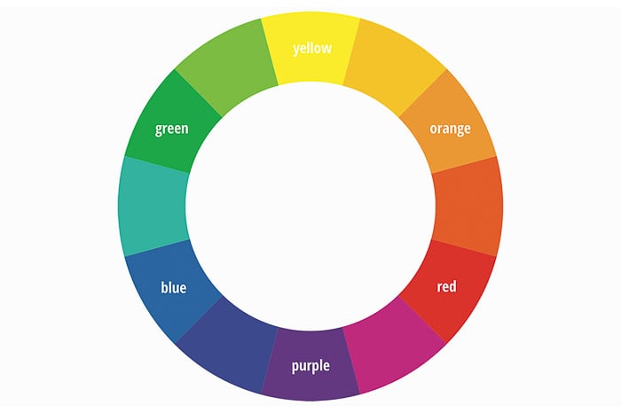
It’s easier to make a great photo if you know which color combinations look pleasing to the eye. It all starts with the famous color wheel. It shows the relationship between colors. From there, it’s easy to learn about analogous and triadic colors.
Photographers should know the messages that colors communicate. Add color theory to your knowledge of composition, lighting, and exposure.
This will definitely make you a better photographer.
What Are Analogous Colors
Analogous colors are not difficult to find. Just pick a color from the color wheel and pick the three colors to the left or right from it. For example, the color red can be picked with orange or purple.
You can also pick one color to the left and two to the right, for example. Those four colors are analogous colors.
You can also choose just two colors next to each other. They’re also called analogous colors.
© Pixabay
Why Use Analogous Colors in Photography
Use colors next to one another on the color wheel in your photos. This will make them look harmonious and easy to the eye. The combination always looks calm and soothing.
Using analogous colors creates a softer contrast. Still, it’s more interesting than monochrome colors for example.
That doesn’t mean it’s always the right choice for your photos but it’s a good guideline to experiment with.
How to Use Analogous Colors in Photography
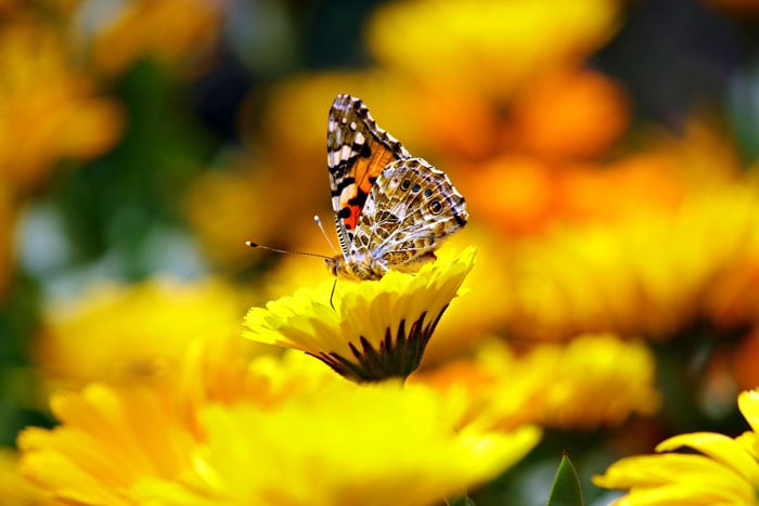
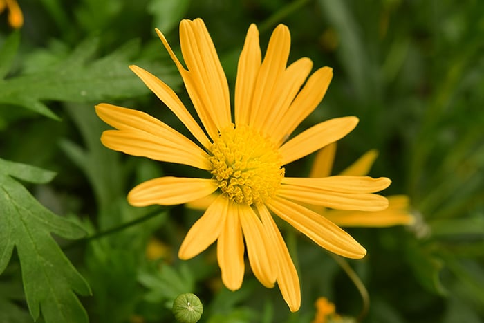
Analogous colors are easy to find in nature. In macro photography, for example, you’ll see analogous colors fairly often.
The easiest way to start is by looking at analogous color schemes in flowers. Also, pay attention to certain insects and flowers. Often, the combination creates an analogous color scheme.
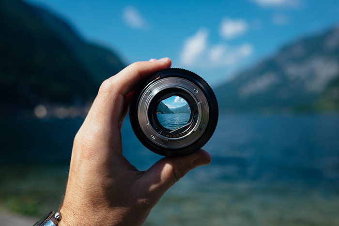
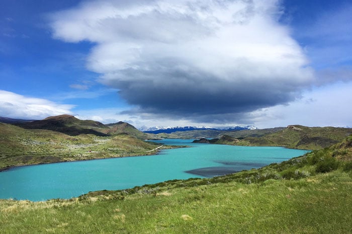
If you’re a landscape photographer, it’s also easy. You’ll probably have photographed a lot of analogous color schemes unknowingly.
Here’s an example of analogous colors in a landscape.
© Pixabay
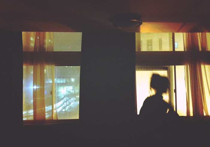
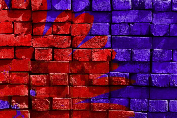
But also in the streets, you can find analogous colors.
© Pixabay
Don’t Focus on Colors Only
When using analogous colors, it’s important to keep it interesting. Colors so closely related to each other could look boring.
As a photographer, you should also pay attention to composition and lighting. Only then can you make a photo with analogous colors visually pleasing.
Skipping a color is also a good idea. Instead of using green and yellow-green, use green and orange.
And the most important thing is to make sure that your images are balanced. Every component and color should have its place in the frame.
How you arrange everything is your task and the most difficult part of being a photographer.
© Pixabay
Conclusion
Color theory might sound intimidating but it’s absolutely not. Learning how the color wheel works will definitely make you a better photographer.
Use guidelines like analogous and triadic colors to your advantage but don’t forget your own creativity. They’re guidelines, not laws.