Contrast in photography is one of the most important components. Our article will show you how to improve your photos by enhancing or decreasing the contrast.
Knowing how to manipulate contrast in photography will change your pictures for the better.
Now, let’s have a look at what you need to know!
What Is Contrast in Photography?
Contrast means difference. In photography, the most common differences are achieved by changes in the tones or colors that compose the image.
Contrast has been a key element from the beginning of photography. It is the degree of difference between the elements that form an image.
Higher contrast will give your image a different feel than a lower contrast. The type of contrast can also influence your images.
Here’s how.
How to Understand Color Contrast to Improve Your Images
Creating an interesting color contrast photo requires some color theory knowledge. But don’t worry! You only need the basics to start experimenting.
This is where Color Schemes and the Color Wheel come in.
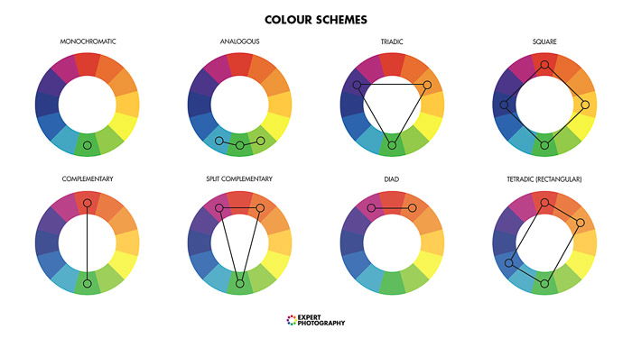 The Color Wheel is a chart widely used in arts. It simply represents the relationship between various colors.
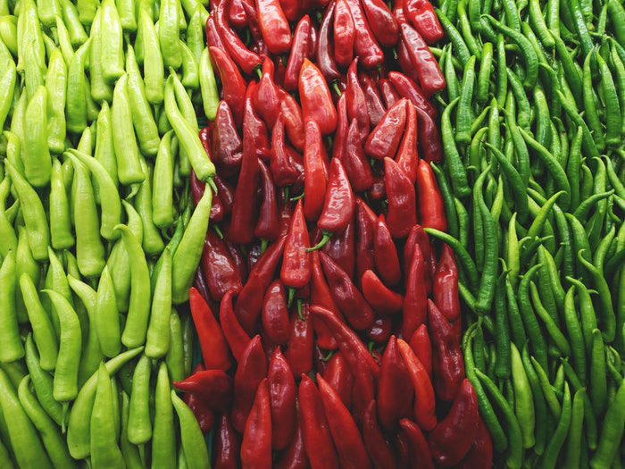
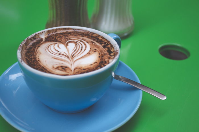
Using Color Schemes, you can figure out which combinations have the most contrast. The most contrasting combination is usually that of complementary colors.
It is easy to recognise complementary colors since they are located opposite one another.
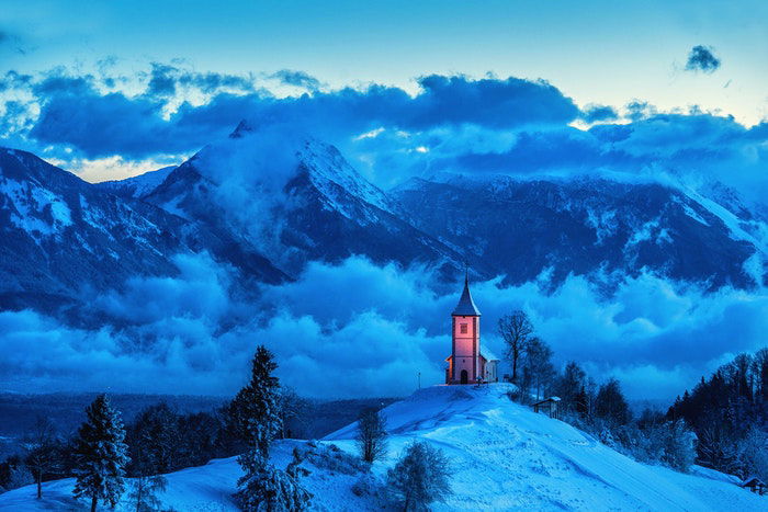
One common example is the juxtaposition of green and red.
If you don’t want to think about the color wheel, you can classify the colors into two groups: warm and cold.
Combining a cold color with a warm one will result in a color contrast photo.
How to Understand Tonal Contrast
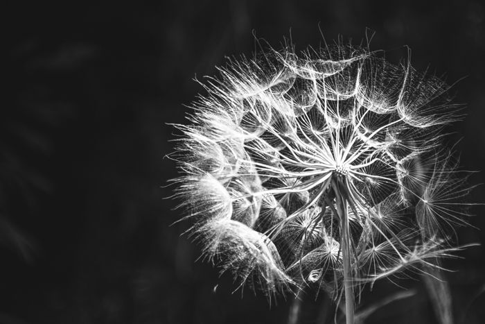
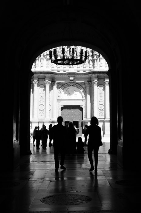
The best-known type of contrast is tonal. It refers to the difference in brightness between the elements of the image.
Tonal contrast is especially relevant in B&W images. These lack other types of contrast, such as color.
If the image has both very dark and very bright tones, it has a high tonal contrast. This is especially relatable to high key and low key photography.
 If the photo has a wide range of tones from pure white to pure black, it is considered a medium contrast image.
 If it has a range of middle tones, but it lacks the pure whites and blacks, the photo is a low contrast image.
Tonal contrast is the best known, but there are other types that are quite interesting.
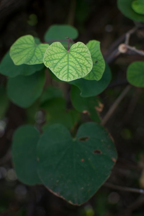
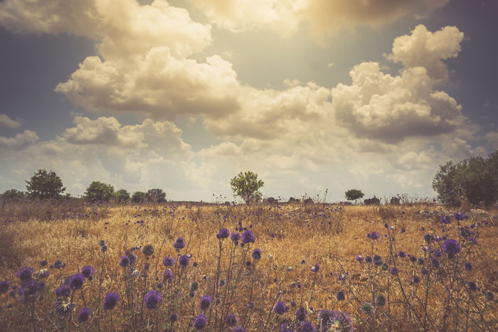
Use Analogous Colors for Low Contrast Images
Some color combinations will result in less contrast. This is because they are harmonious, such as analogous colors. These colors are next to each other on the color wheel.
The colors still have some contrast between them so they can be differentiated by the viewer.
 Another way to make contrast in photography with similar colors is to include an element with a different tint/shade. It won’t be a strong contrast but it will allow your subject to stand out.
 One last thing about color contrast in photography. Keep it simple. Having fewer colors in your image will create a strong contrast effect because it looks more dramatic.
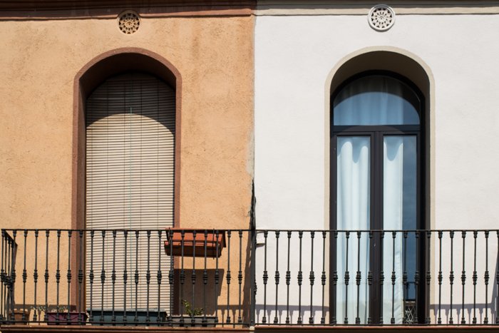
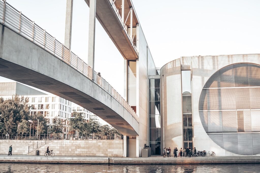
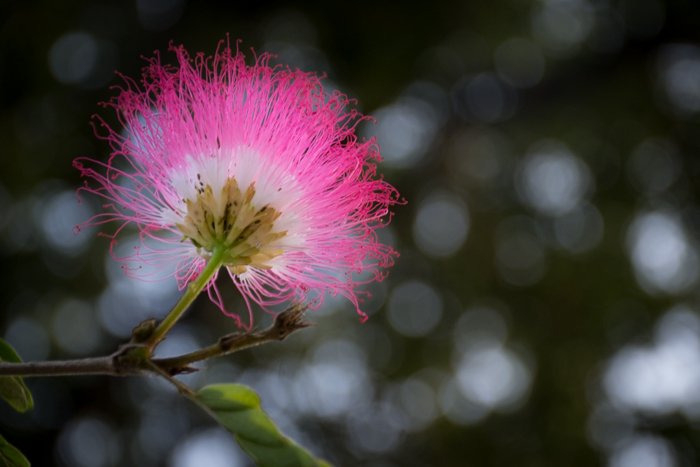
Contrast Through Textures
Differences between textures are also a great way to create contrast in photography. You can combine rough with soft elements to give your image that extra punch.
 An easy way to do so is by using the background. If you are taking a photo of an element with a lot of texture, place it in front of a soft background. It can be a clear sky or a flat wall.
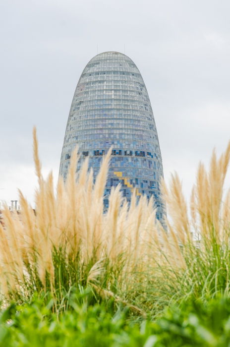
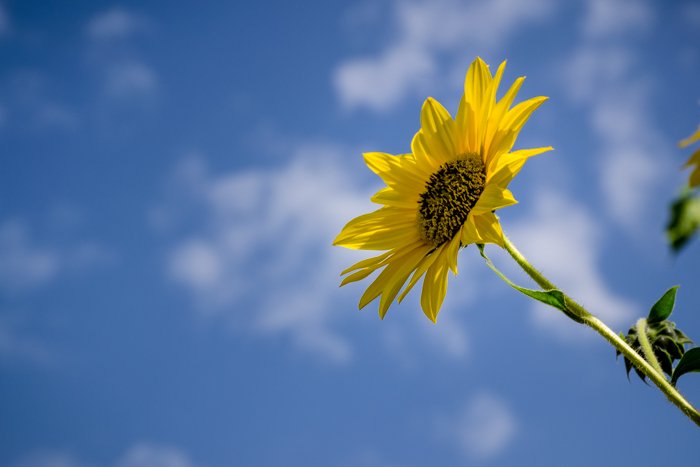
If you don’t have a clear background, you can use the depth of field to soften it up. Using a wide aperture (f/3.5 or lower) and placing your subject farther from the background will create a shallow depth of field.
The background will appear blurry and soft. It will stand in contrast to the sharpness and texture of your subject. If you have a soft element, it will pop out in a textured background.
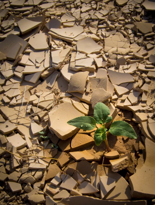
Use Conceptual Contrast to Tell a Story
Conceptual contrast images are abstract and much more subjective. This is because these are based on ideas.
Images with this type of contrast have a strong storytelling component. It consists of putting together things that you don’t expect to see in the same image.
You can use conceptual contrast images to highlight differences between elements. Some examples of conceptual contrast are old and new, big or small, even artificial and natural.
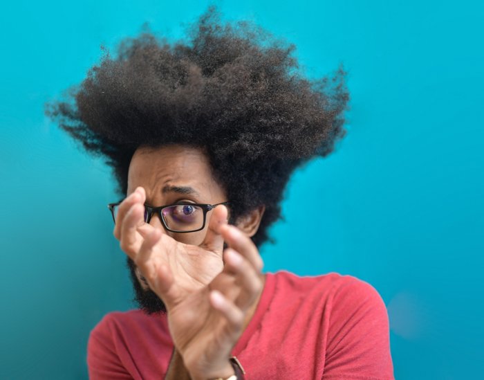
Use Contrast to Convey a Particular Mood
Contrast is a key element to convey certain moods through your images.
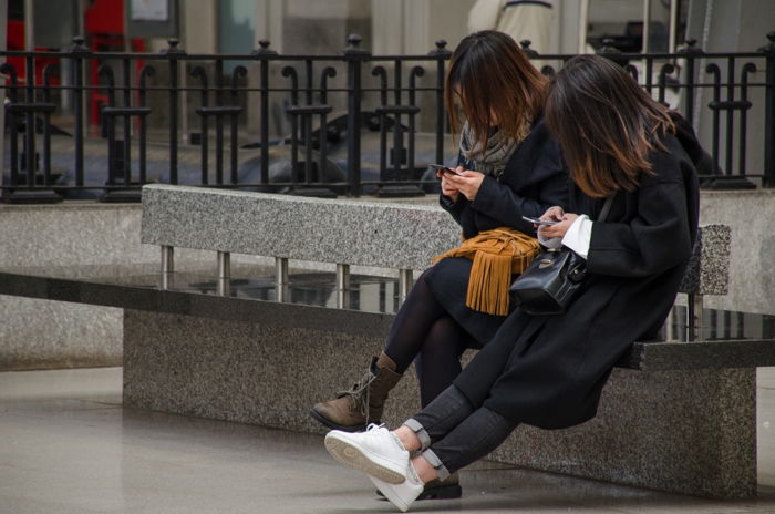
High contrast photos pop out, show textures in the subject and give a feeling of edginess, high energy and strength. High contrast is used a lot in street photography and nature photography.
 Low contrast images tend to have a dreamy feeling. Low contrast works well for outdoor portraits, especially if you are looking for a vintage look.
 Before you take any photo, think about what mood you want to convey. And then look for the types of contrast that will make it stand out.
How to Practice With Contrast in the Field
For tonal contrast, something that really helps is to set the camera to black and white. This is a trick I learnt from Gala Martinez, a portrait photographer from Barcelona, and I really like it!
Taking out the color helps you focus on light intensity and how it affects the image. You can also try looking for strong light-shadow contrasts.
 You can also start training with contrast by “building” your own scenarios. Go to your arts and crafts store and get a couple of cardboards: white and black are great for tonal contrast. You can use these as backgrounds for objects of different colors that you already have at home.
See how the different combinations affect the contrast of the final image.
How to Adjust Contrast in Lightroom
You can also adjust the contrast of the whole photo (global contrast) by using the Contrast slide in the Develop module of Lightroom.
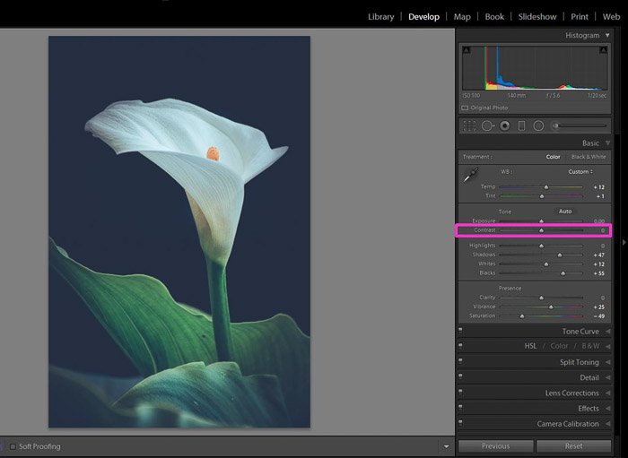 You can add contrast by sliding it to the right. To the left, you can decrease the contrast of the image.
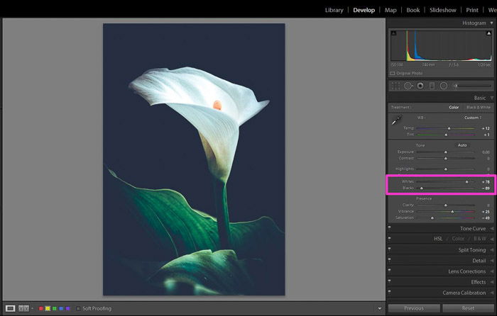
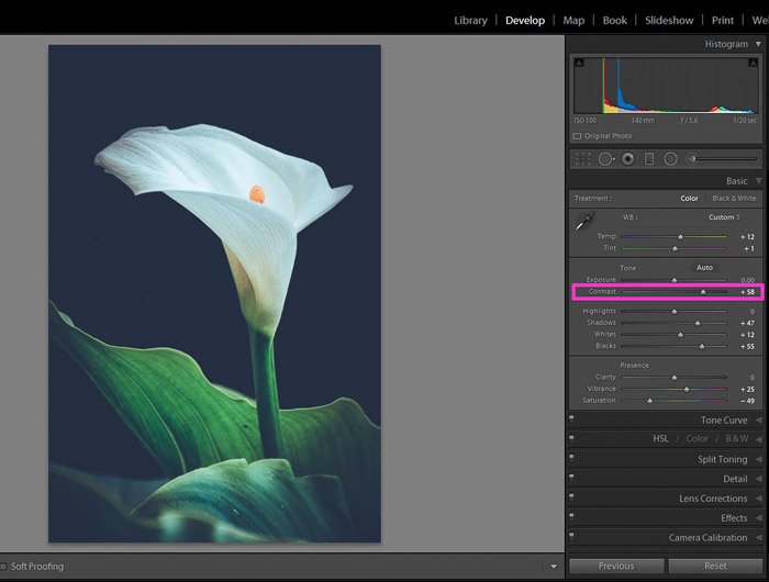 If you want to have more control over the whites and blacks, you can use the White and Black sliders instead.
By making the whites whiter and the blacks blacker, you can increase the contrast of the image.
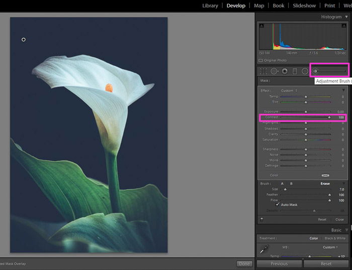
 If you prefer to adjust just certain areas of the image, you can use the brush tool. This will give you a bit more control than the global adjustments.
Paint the area where you want to adjust the contrast. Then move the contrast slider until you get the effect you are looking for.
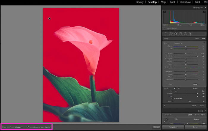
 You can visualize which area you have painted by checking “Show Selected Mark Overlay”.
Conclusion
As photographers, contrast is a crucial element to consider in all our shots. It helps us to convey a mood or a message to the viewer. Tonal contrast is the best-known, but there are other types such as color and conceptual contrasts.
You can train yourself to see contrasts around you. You can even arrange the scenarios to achieve the result you want.
Lightroom and other post-processing software are great tools to give that final touch to your image!
For more Lightroom know-how, try our Effortless Editing course!