Do you have paintings at home that you’d like to share online? Or what if you’re going to the museum and want to take photos of the art? You’d be surprised, but photographing artwork can be quite challenging.
The process becomes more predictable when you control the camera position, light, color, and focus. The following steps provide a repeatable starting point.
Best Camera for Photographing Artwork
Some galleries and museums use specialized digitization systems and digital medium format cameras. Most people can document artwork effectively with more accessible equipment.
A digital SLR or mirrorless camera gives you useful control when photographing artwork. A compact camera with manual controls can also work, and a smartphone may be sufficient for web-sized documentation.
If you use a smartphone, consider the required file size and detail before shooting. A camera app with manual exposure, focus, and white-balance controls can make the result more consistent.
Camera Settings
Settings affect detail, noise, color, and consistency when you photograph art. Make these adjustments before you press the shutter.
Use Low ISO to Minimize Image Noise
For the cleanest file, turn off Auto ISO when the lighting is stable and choose the camera’s base ISO where practical. The base value is often 100, but it varies by camera.
Higher ISO settings can introduce more noise and reduce color or shadow detail. If the light is dim, use a tripod or add light where possible so color accuracy and sharpness are not compromised.
Switch to a Narrow Aperture for Sharp Results
Using a wide aperture such as f/1.2 or f/1.4 creates a shallow depth of field. A flat painting reduces that concern when the camera and artwork are parallel, but uneven or textured work can still require more depth of field.
Start around the lens’s sharper mid-range, often about f/5.6 to f/11, and adjust for the artwork’s surface and lighting. Very narrow apertures can introduce diffraction.
To keep the aperture fixed while adjusting shutter speed, select aperture priority mode or use manual exposure.
Use White Balance and Color Management for Accurate Representation
Most digital cameras have a white balance control on the camera body or within its menu. The user can select settings from cloudy to sunny or flash to tungsten. They even have the option to choose Auto or Custom to match the scene’s lighting.
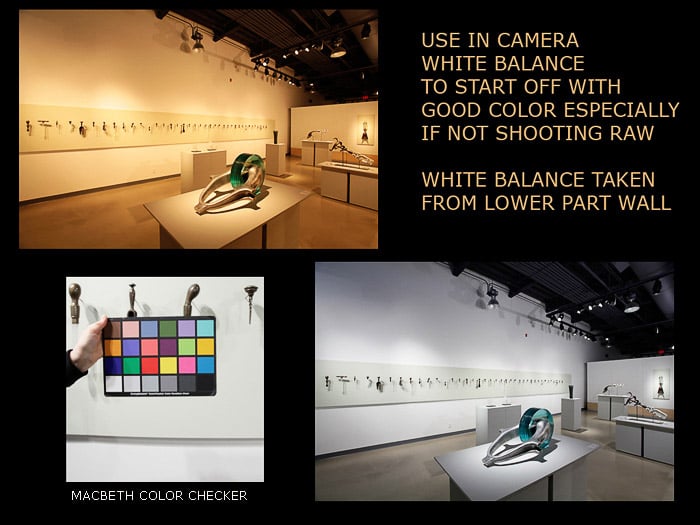
Many variables affect color balance throughout the process. A custom white balance is a useful first step for managing image color.
A color checker is a handy tool for managing color if you are looking for an even more accurate result. It has panels of various colors, which you can use as a reference to correct your white balance.
You should also calibrate your monitor. Check its color quality, contrast, and brightness so the artwork’s colors and tonal range display more consistently.
Lighting for Artwork Photography
One useful lighting setup for flat art uses two similar lights positioned at roughly 45 degrees to each side of the painting. Adjust the angle and distance for the surface and reflections.
These two lights need to match in wattage or output and be the same distance from the center of the artwork.
This arrangement can provide more even illumination across a flat surface, but it will not remove every shadow or reflection. Check the edges and corners with a test frame.
A setup like this may require space to move the lights away from the artwork. If glare appears near the edges, change the light angle or distance. A longer focal length, such as roughly 80–100mm on a full-frame camera, can also let you position the camera farther back.
You can bounce lights off neutral side walls or massive pieces of white foam core. Or you can diffuse them through white material for a softer look with reduced glare.
If the artwork is behind glass, a black flag or foam core near the camera can reduce reflections, although the angle of the lights and camera still matters.
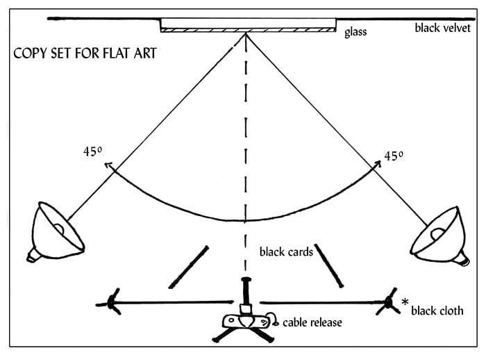
Avoid mixing lighting sources when consistent color matters. If you use artificial lights, limit stray window light; if you use a window, turn off nearby lights with a different color temperature.
Artificial lighting can make exposure and color more repeatable. Natural light can also work, but its brightness and color temperature change throughout the day.
Natural light can work well in a bright room with neutral-colored walls. Leave enough space to position the camera several feet back from the artwork and keep the setup stable.
How to Photograph Artwork
Prepare the Scene Before the Shoot
Start by hanging your art on a neutral-colored wall. White, grey, or black often works. But remember that shooting in a room with bright-colored walls can skew the color balance of your photo.
Positioning the art in a vertical orientation makes it easier to have evenly balanced lighting across the work, especially if your primary source is coming from one side.
You can then rotate your photo in post-production to achieve the correct orientation.
If the work has a framing wire, hang it at a comfortable height and make sure it’s flat against the wall. If necessary, use spacers made of cardboard or foam core behind each corner to make sure it’s flush against the wall.
Use a level to check that your art is vertical. Set up the camera so its lens height matches the center of the artwork, and use a measuring tape or grid to keep the alignment consistent.
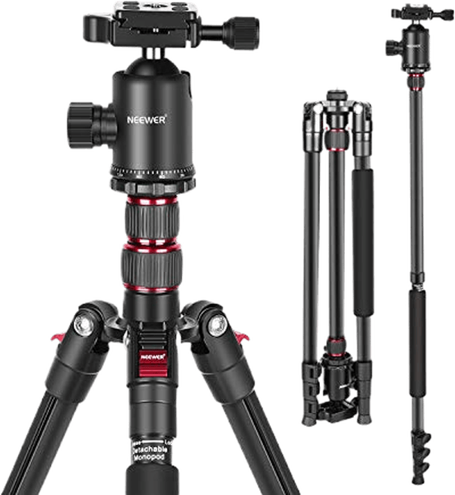
A tripod is useful for sharp photos and accurate squaring, especially at low ISO or with small apertures. Use a cable release, mirror lock-up, or self-timer to reduce camera movement.
Check the level on your camera screen again to ensure it’s parallel to the shooting wall. When both the camera back and artwork are parallel to each other, the perspective should be close to correct. This also minimizes distortion.
Get as close as possible, leaving only a small amount of space around the edges of your artwork. You can crop this out later.
For loose prints, use an approved support or board that will not damage the artwork. Do not attach magnets, tape, or metal directly to an original unless the conservation or framing method specifically allows it.
You could also lean them up on a stiff board slanted against the wall and then parallel the camera back to this board. This method works if the prints are all the same size. If size varies a lot, then it is much easier to square up the work keeping everything in a vertical plane.
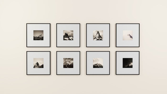
Photo by Medhat Ayad from Pexels
Consider the Direction and Quality of Light
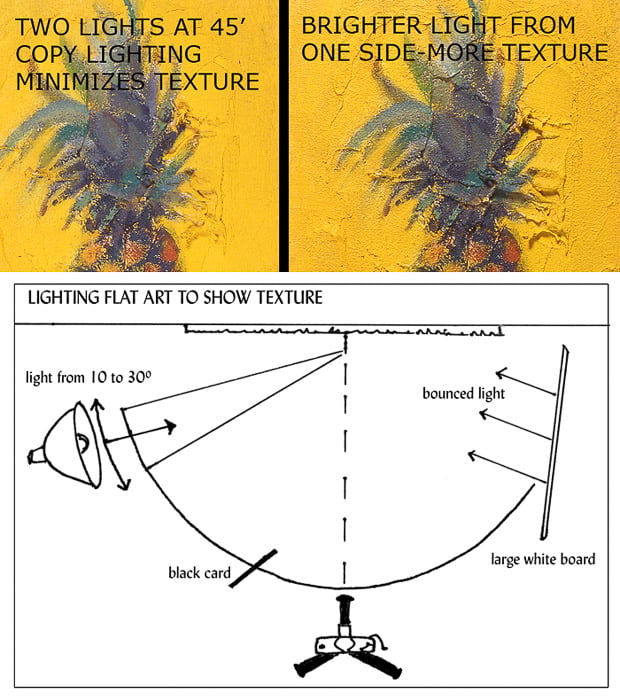
Are you using window light as your primary source? Then position a large white piece of foam core on the opposite side of the window beside the painting. Doing so bounces some of the window light back to balance out the darker side of the work.
You can control the texture by changing the whiteboard’s distance from the work. You can also adjust the artwork’s angle and distance from the window.
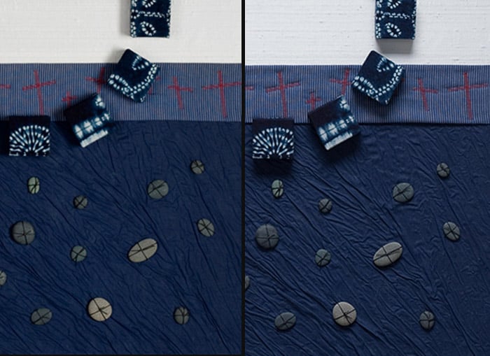
Check out the diagram and samples below for a lighting setup to show more texture in a painting. Notice where the shadows in the image on the right are falling. This tells you where the light is coming from (in this case, from above).
In the example below, rotating the painting changed the direction of the stronger light; the image was rotated back in post-production. Use the shadow direction as a guide and choose the angle that best describes the artwork’s texture.
Use a Grey Card to Capture Colors Accurately
Including a white or grey card in one of your photos gives you a known reference point. You can use this while editing to clean up any color cast present.
If you use an “eyedropper” to read various tones in your photo editor, the neutral colors will have equal RGB numerical readouts. For example, pure white is 255 255 255, neutral mid-grey is about 120 120 120, while a very dark grey might read 50 50 50.
The point is that the neutral channels are close to the same value, which can indicate that a color cast is limited. Neutral references can help correct the other tones, but they do not replace a calibrated workflow.
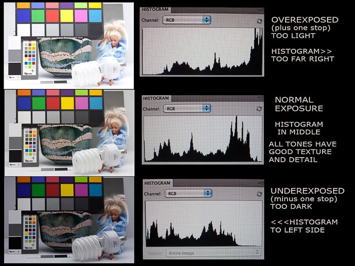
Take a photo of the entire artwork and check the exposure. An in-camera histogram is one useful check; the button or menu that opens it varies by camera.
The histogram shows the tonal range in your photo. Do not aim for a centered shape automatically; check for clipped highlights or shadows and compare the file with the artwork. You can also use the histogram in your image editing program.
Check Focus and Shoot Fine Details
Expand the photo to 100% on your camera or computer screen. Check the focus at the center and in all four corners. Check your framing is as square as possible. You can use the Crop or Perspective tool for slight adjustments and squaring.
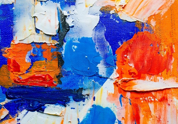
Consider moving in closer for a detailed shot rather than cropping or enlarging the overall picture. Doing so can preserve more detail than enlarging a heavily cropped file. Check the submission rules for any gallery or contest rather than assuming a close-up is required.
Tips for Editing Images of Artwork
Use an image editing program to crop, correct perspective, retouch dust, and manage color. Photoshop, GIMP, and other editors can work; choose one that supports your files and color-management needs. TIFF and JPEG are common delivery formats, while RAW files require a compatible RAW converter.
Archive the original camera files and work on a duplicate. Retouch at a useful viewing scale, then make a delivery copy and resize it to the required pixel size. Save the format requested by the client, printer, or platform.
JPEG is compact and widely supported, while TIFF or another format may be preferable for a print master. Save the appropriate profile, such as sRGB or Adobe RGB, for the destination.
Avoid resaving a JPEG and resetting the quality level more than once, as this affects sharpness. You may need to add a little sharpening if you have resized the file.
Make sure to check sharpening effects at 100% and 50%, but don’t overdo it. You can always add more sharpening later, but too much will make the image look jagged.
Conclusion
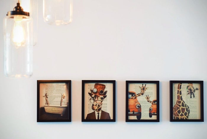
Photographing artwork becomes more repeatable when the camera is parallel to the work, the light is even, and color and exposure are checked before editing. Make a test frame, review it at full size, and adjust the setup before recording the final image.