A well-designed photography logo can make all the difference for a business. It’s the first thing people see, and it’s what will stick in their minds long after they’ve seen your work. So it’s important to think about it and create something that perfectly represents your brand.
10 Fantastic Photography Logo Ideas
If you need some inspiration, here are 10 fantastic photography logo ideas to get you started.
1. Using Acronyms
Acronyms are a great way to make your photography logos smaller and more concise. Rather than using entire words, you use the first initial of each word.
You can use the initials of your full name or your business name. It’s a particularly good idea if the acronym spells another word.
Acronyms can help keep your logo compact, especially if you have a long name. Or, if you have a common name, using a middle name initial in an acronym can help make it more distinct.
Having a more compact logo is good for business. You want to say a lot with a small amount of information. And it’s also good for publicity and watermarking your work.
The photography logo for the company Strike A Pose is the perfect example. They’ve reduced the name down to SAP for their logo. It’s smart, concise, and easily recognizable.
They’ve also incorporated a common photography phase into their business name. If you still haven’t settled on a title, read through our photography dictionary for inspiration.
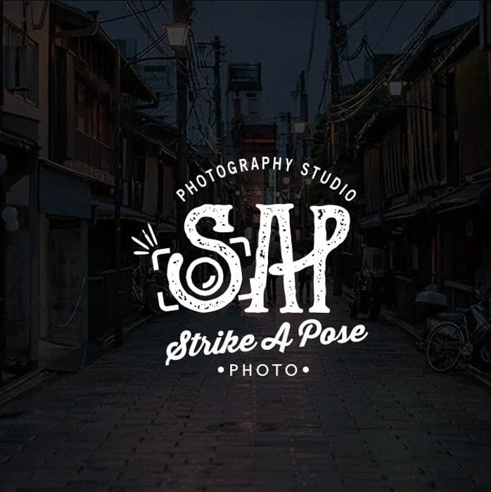
Logo for Strike A Pose
2. Use a Signature or Script Text in Your Photography Logo
Using a signature as a logo is a proven strategy in many business areas. And photography is no different.
It’s simple and classy. It gives everything a personal touch. And even though it’s a common type of logo, each is unique.
A personal signature is also a logo design you can create yourself. You can use a text program or a digital drawing pad. Or you can digitize a written signature. With minimal editing, you’ll have a high-quality photography logo.
The main concern is making sure it’s eligible. Your name has to be recognizable. Otherwise, it has failed as a photography logo.
Sharon Wellings has the perfect example of a photography logo using a signature. The logo design is simplistic and clear. And her name is recognizable in the text. She has used the word photography in typed letters for extra clarity.
It’s simple and elegant, and it looks great on her website.
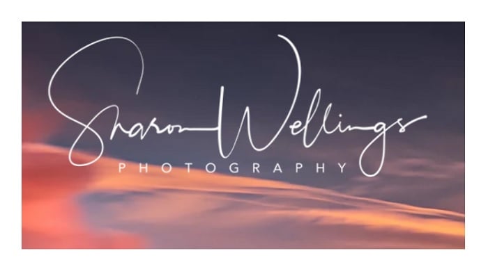
Sharon Wellings Photography
3. Go For Simplicity With a Bold Font
When it comes to photography logos, simplicity isn’t a bad strategy. Sometimes, simple text is all you need.
A bold but minimalist logo design makes a statement about your business. It says professionalism but tells potential customers you let your work do the talking.
A busy photography logo can be counter-productive. If too much is happening, a logo can look like nothing in particular. Using bold text has the opposite effect. It’s punchy and gives you just enough information.
Melanie Bellemare has a photography logo that fits this concept exactly. The text is simple and bold. And she adds interest with two font colors. It’s clean and clear; it’s simple but effective.
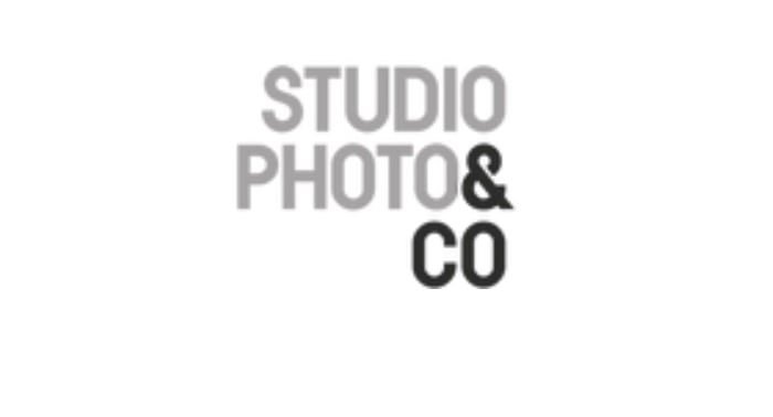
Melanie Bellemare, Studio Photo & Co
4. Incorporate Photography Imagery In Your Logo
Bringing imagery related to photography is a good approach to photography logo design. It clarifies that you are a photographer or in the photography business.
You don’t need to use lots of objects. You can stick to one or two. This will stop your logo from becoming messy or busy.
The object you use can also imply the area of photography you work in. The Baku Photography logo, designed by Mehman Mammedov, uses a roll of film. It has a simple graphic design. And it gives you the impression that they work with analog photography.
The name is clear, and the font is clear. But including the film image gives more insight into the Baku Photography brand.
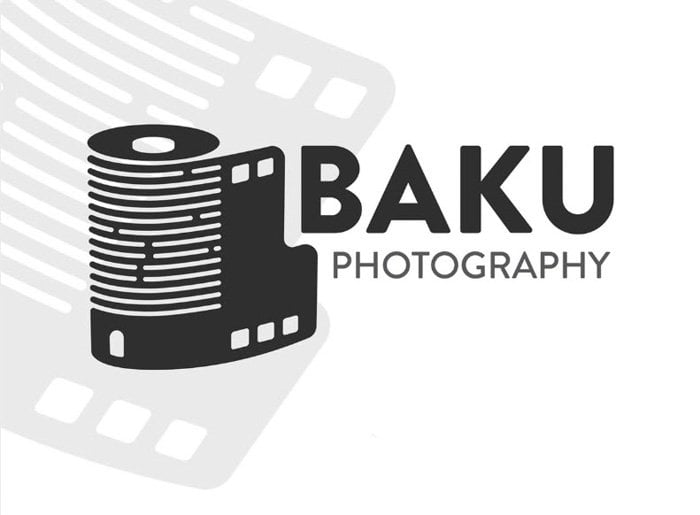
Baku Photography
5. Use Your Initials to Create a Symbol
This type of photography logo might take a bit more development in the graphic design stage. But if it’s possible, it will be worth the effort for a customer photography logo.
Logos of different types turn letters into a symbol that represents their brand. An O can be turned into an eye. Or an H can become a bridge over a road.
Angela Fouquette has the perfect illustration of this technique. She uses her initials to form a tripod. She uses a simplified camera graphic to explain and symbolize her business.
She’s combined her initials, but both letters can be made out. Her name accompanies the symbol on the complete logo. But the picture alone is creative and memorable. The graphics explain her business.
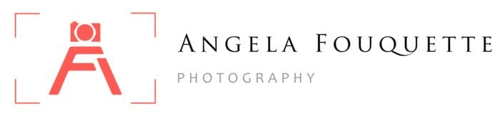
Angela Fouquette Photography
6. Use Camera Imagery for Your Logo
Bring your camera into your graphic design process to generate photography logo ideas. This is your photography business, so you want people to recognize that as soon as they see your logo.
Like in the example above, you can use a simplified camera image or symbol. Or you can get a bit more technical. Use camera anatomy to create shapes and graphic elements.
You can use viewfinders or control dials in your custom logo. Or you can use an aperture ring, like in the TNS Photography Logo below.
Davy Vermote, the graphic designer, has created a logo that gives the impression we are looking through the camera’s aperture. They have the word photography in the logo, too. But we could identify the company’s purpose if the word was removed.
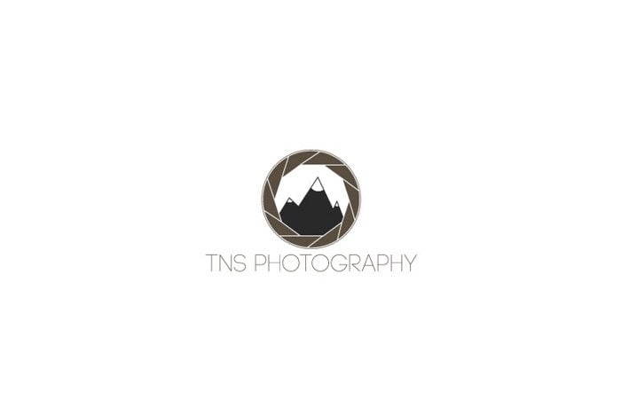
Davy Vermote, TNS Photography
7. Show Your Photography Style in Your Logo
To generate original photography logo ideas, think about the type of photography you practice. What is your niche? And what service does your photography business provide?
We’ve seen these elements in previous examples. The Baku Photography logo includes a roll of film, telling you they work with analog and film photography.
The TNS Photography logo above has a mountain range in the aperture ring. It shows potential clients that they specialize in landscape or travel photography.
We can see a similar logo design for Abdullah Aldeghaither. He has a mountain range within a semi-circle. It’s sharp and punchy. But it also explains he’s a landscape photographer.
The photography logo has a clear design that matches his portfolio. It matches his business brand and makes his website look professional.
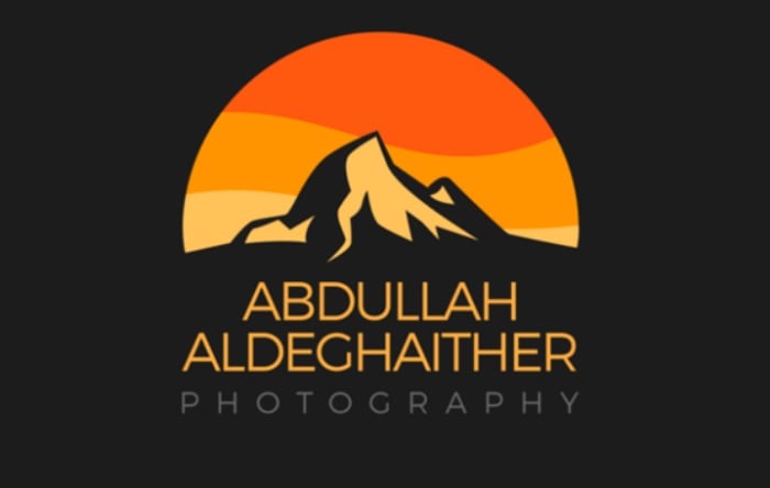
Abdullah Aldeghaither Photography
8. Play With the Company Name
The business name is an excellent source of inspiration for creating a custom photography logo. If the company name differs from your own, that’s the place to start for photography logo ideas.
If your company name relates to the location, you can use landmarks or objects associated with that place. If your company name relates to wedding photography, you can play with flower and dress imagery.
Pulpo Productions has a great logo that is unique. And it hits two of our suggestions.
The word Pulpo means octopus in Spanish. And in their logo, they’ve included an octopus’s tentacle. It’s a clever play on their name. And it makes their logo stand out.
They’ve also included a film negative symbol. This is to show they are a photography production company. It would be easy for them to be mistaken for a food company. But the film element keeps the logo true to their business.
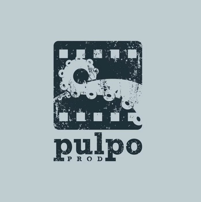
Pulpo Productions
9. Use a Simple Illustration Style
If you’re not a fan of digital fonts and images, you can try something with a hand-drawn feel. A hand-drawn style can give your photography logo a distinct look in a busy marketplace.
If you’re a talented illustrator, you can give this a go. You can use modern or traditional techniques for your photography logo design. It’ll bring an element of fun to your business cards.
Joshua Grasso uses a simple illustration style for the Photo Sushi logo below. The image looks hand-drawn. But it’s not messy or complicated. He’s gone with a simple color palette, using black on white with a splash of red.
He has also used a simple camera symbol to illustrate the company’s purpose. And the red circle also resembles the Japanese flag, linking the logo design back to sushi.

Joshua Grasso, Photo Sushi
Conclusion: Photography Logo Ideas
Your photography logo is often the first thing potential clients see. They’ve seen your photography logo before they’ve even seen your work. That’s why it’s so important.
Every freelance photographer or photography business needs a logo representing their work.
There are plenty of other photography logo ideas out there. But with a little inspiration from our list, you’ll be able to create the perfect photography logo for your business.