Using split toning in Lightroom is a great way to add some extra color and interest to your photos. It's a process that involves adding a second color to the shadows and highlights of your photo. This can be done in Lightroom by going to the Develop module and clicking on the Split Toning tab.
Split Toning In Lightroom: Basics and Color Selection Tips
Split toning is a method of processing an image that colors the highlights and shadows separately. This is a process that has carried over in the digital age from the darkroom. It allows photographers to adjust the colors in an image without toning the entire image at once.
Split toning adds tone or color to the highlights without affecting the shadows and vice versa. A split tone can be applied to just the highlights, just the shadows, or to both.
Both color images and black and white images can use the split toning technique. On a color image, the process adds that tone to the existing colors in the highlights and shadows.
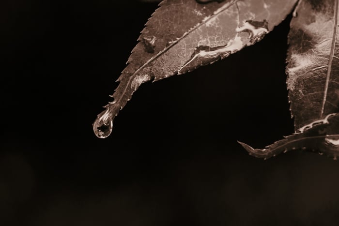
Working with a black and white photo, split toning can replace the blacks, grays, and whites with a tint. This can mimic a cyanotype or sepia image.
The split tone possibilities are endless. A number of common edits use the technique. You can use split toning to adjust the white balance of only the highlights or shadows. You don’t have to adjust the entire image at once.
You can also use this technique to create a film look. Other times, split toning isn't about correcting something, but getting creative. Many filters and presets use split toning along with other tools to get a certain look.
You can choose any color for split toning. Some colors are more popular than others for the look that they create.
- Orange: Adds a warm glow or correct white balance, used most often for the highlights.
- Blue: Adds a cooling effect, correct white balance, or create a cyanotype look. Blue is used most often for the shadows.
- Brown: Creates a sepia image or tone down the colors.
- Teal: Creates a cinematic look.
- Pinks: Adds a "blush" effect.
Split toning can use a single color or two colors. When working with two colors, choosing complementary colors is ideal.
Complementary colors are opposite each other on the color wheel, like orange-blue, red-green, or yellow-purple.
Analogous color schemes can also work well for split toning too. These are colors that are next to each other on the color wheel, like green-blue or orange-yellow.
Whenever you work with color in photo editing, consider colors that look good together on their own. You’ll find that those colors look great together in a photograph as well.
Look for inspiration in nature, or even the paint sample section of a hardware store.
How to Use Split Toning in Lightroom
Lightroom makes split toning easy. You can use a panel in the Develop module that's called, well, split toning. (See what I mean by easy?)
While easy to find, there are a few different steps and controls you may miss by winging it on your own. Here's how to apply a split tone in Lightroom.
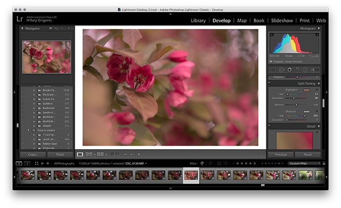
1. Open the Image in the Develop Module
To get to the split toning options, you'll need to select the image that you want to edit inside Lightroom's Develop panel.
Make any necessary corrections in the Basic panel first. For example, correcting an underexposed image.
Before you even get to the split toning options, you have a choice to make: color, or black and white?
Applied to a black and white image, split toning no longer looks black and white. It looks blue and white, brown and tan, or whatever color combination that you select.
If you want to create a sepia or cyanotype look, you'll want to start with a black and white image.
On a color image, split toning adds to the existing colors. Using the split toning options, you can choose subtle toning. Or you can choose toning that starts to overpower the other colors in the image.
If you want to correct the white balance, add a color film effect, or tint a photo without wrecking the original colors, stick with a color photograph.
Once you've decided whether to work with a color or black and white image, choose that option under the "treatment" tool. This is at the very top of the basic panel.
If you choose color, you don't have to do anything. Unless you already switched to black and white but have changed your mind.
2. Choose Your Highlight Color
Navigate to the split toning section in Lightroom's Develop toolbar. It's between the options for HSL (which is now called B&W if you converted your image) and detail.
If the panel is minimized, click the triangle right after split toning. This will expand the different tool options.
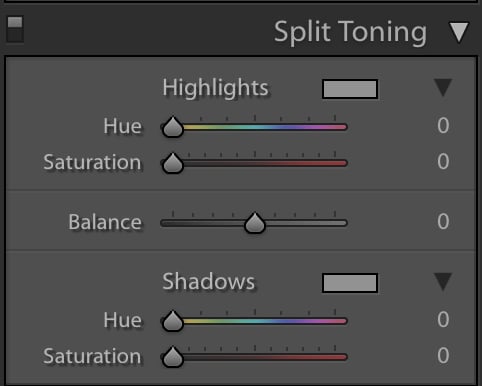 Start working with split toning by choosing a color for your highlights. There are two ways to choose the tone that you'd like to add to the highlights.
First, you can click on the gray rectangle next to the highlights label. This will open up a pop-up. You can use the mouse to click on a color in the rainbow of options provided.
If I wanted to create a more golden hour glow, I would pick orange. If I wanted a sepia effect, I would choose brown tones on a black and white image.
The other option to choose a color or to make minor adjustments to the color you selected from the first option is to use the hue slider.
Drag the hue slider to the color that you'd like. The image will adjust in real time. This makes it easy to see the effect that your color choice has on the image.
You can also hold down the ALT or option key while dragging the slider. You’ll see a fully saturated version of the color. This can be helpful when working with more subtle color toning.
Finally, use the saturation slider to adjust how much of that color appears in the shadows. Positioned to the left, the effect will be subtle.
The color appears more obvious and bolder as you drag the slider to the right. This increases the saturation.
3. Choose the Color of Your Shadows
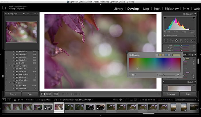
Next, choose the color you'd like to add to the shadows. You can also add a color to only the shadows or only the highlights. You don't have to do both.
This process is the exact same as for the highlights. This time you are working with the tools under the shadows section.
You can click the rectangle to open the color picker, use the sliders, or use a mix of both.
If you decide that you don't want to add any color at all, you can slide the saturation slider all the way to the left to return to normal. This works for both the shadows and the highlights.
4. Balance the Highlight and Shadow Colors
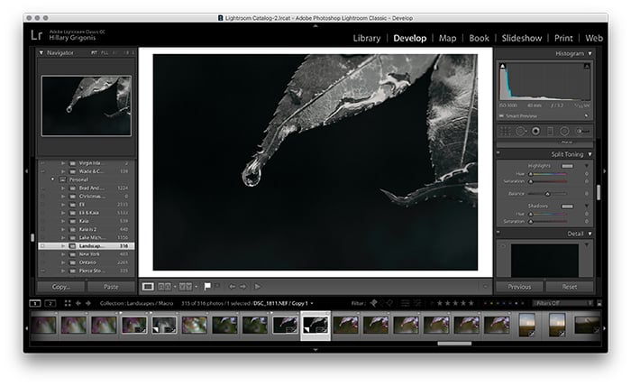
There's one more split toning tool that you haven't touched yet: Balance. The balance slider tells Lightroom how much of the image is shadows and how much are the highlights.
You can use this slider to make the colors that you choose for either the highlights or shadows more prominent than the other.
The balance slider defaults to the middle. Slide over to the left to increase the amount of shadows or make the shadows colors more prominent.
Slide to the right to increase the amount of shadows or to make the shadows color more prominent.
5. Finish Your Edits in Lightroom
Lightroom is a non-destructive editor. You can come back to those split toning controls later if you decide the colors aren't just right.
That mixed with the instant preview of the effect makes experimenting with split toning fun and easy.
Try different color combinations to find one that you like. And experiment with adjusting the sliders to see the effect in action.
Once you're finished with the split toning, you can use the rest of Lightroom's tools to perfect the image. The HSL panel adjusts each color separately rather than the highlights and shadows only. This can also help with creative color adjustment.
Other adjustments to consider when working with a split toning image include the shadows and highlights slider, curves, exposure, and white balance.
Conclusion
Split toning can be used as a creative tool to play with the colors in an image. But split toning can also be used as a corrective tool as well. Used with color images, split toning can make color corrections or add film-inspired or other creative effects.
With a black and white photo, split toning turns those blacks and whites to a different color. This is popular for sepia toning.
Whatever way you use it, ignoring the split toning section in Lightroom because you don't know how to use it could be doing your photography a huge disservice.
Using simple sliders and/or a color picker, the split toning tool in Lightroom makes it easy to perfect the color in any photograph.
We have great articles on using the new Texture Control Slider or Tone Curve in Lightroom you can check out next!
