Some colors go together like chalk and cheese. But, with a little research, some practice and the use of your ‘eye’, you can find complementary colors.
Look at our 25 stunning complementary colors examples to set you on the right path.
Complementary Colors Examples: Red and Green
I often hear that red and green is not a pleasing combination. To those who agree with this statement, I would like to show some Christmas decorations. Or a strawberry.
Red and green is a common pair in nature. Take a look at red flowers on green grass, apples in a foliage, tropical birds or even a ladybug on a leaf.
-
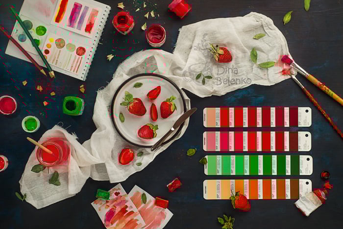
The commonality of red and green in nature can be a theme for your photo. Photo by Dina Belenko
- You should be careful when red dominates the image. This is a strong color, so make sure you turn up the intensity of your photo.
When you let green take the lion’s share of the image, red becomes a perfect anchor to your point of interest. Our eyes are naturally drawn to bright warm colors.
So don’t be afraid to use a spot of red to mark the focus of the viewer’s attention.
-

Green here doesn’t cover a large area of an image. But it is placed very close to red letters, separating them from the background and adding contrast. Photo by Dina Belenko
-

Clever red and green lighting can be used together. Photo by Daniel Herron on Unsplash
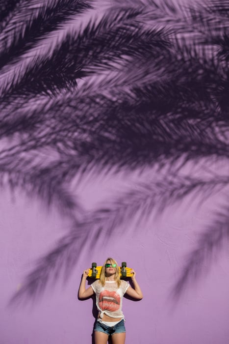
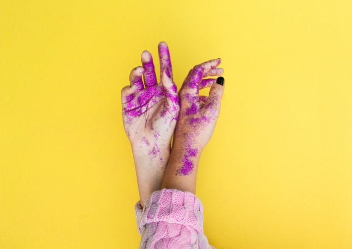
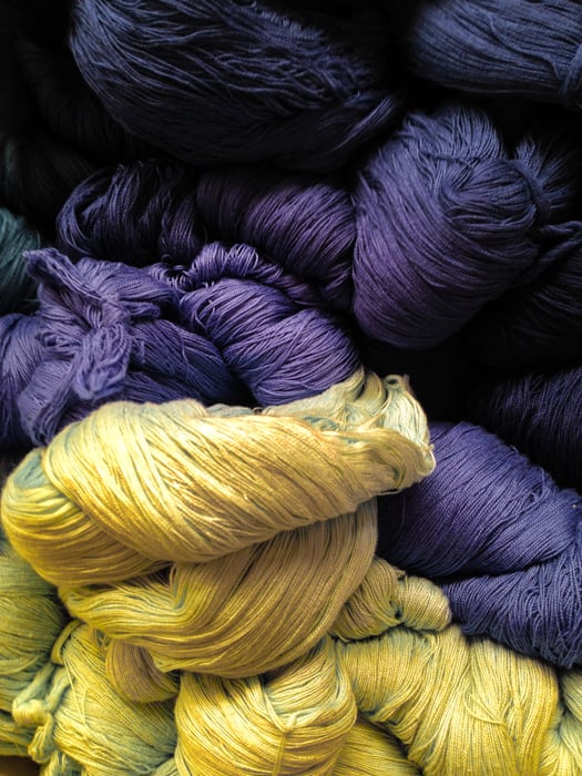
- Yellow and Purple
Yellow is the most visible color from a distance. It is often used to highlight an accent, to present an emergency and cautionary signal.
If you need to grab attention fast, use a splash of yellow. It works well with its complementary color, purple.
This combination often feels modern and playful. Perfect for experiments with color blocking and fashion photography!
-
Even one splash of yellow can create a strong visual contrast. Photo by Kyle Smith on Unsplash
-
Unlike green and red combination, purple and yellow can be safely used in large areas, covering the entire background. Photo by Nicole Honeywill on Unsplash
- Yellow is the color of the sun, so it’s often used in landscape photography with purple clouds.
Sometimes photographers tend to overdo it a bit. Keep this combination in subdued, darker, less saturated tones.
-
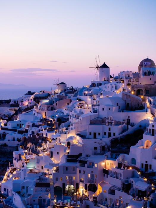
Unusual and slightly unnatural purple shade adds to the feeling of a fairy tale town. Photo by Tom Grimbert on Unsplash
-
Texture and clever lighting give the colors the ability to change their contrast. Photo by Oscar Aguilar on Unsplash
- Orange and Blue
Amber and teal. A fantastic combination, and the most notable one between complementary pairs.
Orange and blue have significant emotional weight. This is because both are associated with opposing concepts.
Warmth and cold, earth and sky, land and sea, fire and ice. They are very close to ambient light. And tend to harmonise well with human skin.
-
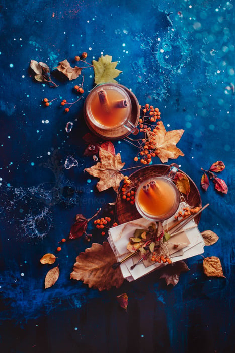
Cool blue background makes tea look even warmer. Photo by Dina Belenko
- This is a powerful combination. But try to use it with care and thought. Sometimes photographers use these two colors without a clear purpose.
Because of that, an image can look over-processed and too artificial.
Check out our article How to Use Color Contrast in Photography: Orange and Blue for more details.
-
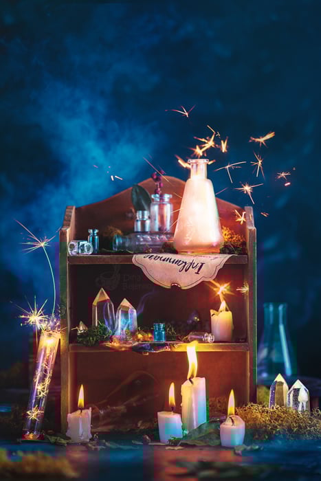
Sparklers and candle flame combine perfectly well with a dark blue background. Photo by Dina Belenko
-
A simple yet effective orange on a delightful blue. Photo by Daniel Hansen on Unsplash.
Green and Magenta
Green is everywhere in nature. Usually, photographers use it in analogous color harmonies. They’ll mix green tones with yellows, teals, and blues.
But you can combine it with its complementary magenta for an interesting result.
-
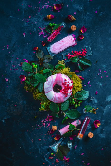
Saturated shades of magenta create an interesting contrast with natural green of leaves. Photo by Dina Belenko
- Rich, saturated magenta looks gorgeous with darker shades of green. And also with more watery greens, such as sage or mint green.
These more neutral greens take the background role while magenta steps forward. It also works with colors analogous to magenta. Try different shades of violet and pink for stunning results.
-
You can push magenta shades to a dusty pink and it still would hold its own against green. Photo by Dina Belenko
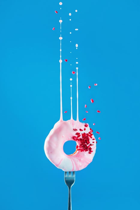
- Red and Cyan
Cyan is a lighter shade of blue. It’s close to teal, turquoise, electric blue, aquamarine, and other shades of blue-green. In combination with red, it creates a very intense neon palette.
It could be a powerful combination if you need a fresh, modern and energetic look.
Remember that red tends to appear as the most saturated color on camera sensors. It’s very easy to blow out. You have to be careful with saturation.
I prefer to change red for the less intense pink in combination with cyan.
This way photos still look captivating and engaging. But they are a bit more subtle at the same time.
-
You can find complementary colors naturally occurring. Photo by Benjamin Sow on Unsplash
-
Analogous red and pink with a vibrant complementary background. Photo by Dina Belenko
- Blue and Yellow
This is a lighter variation of orange and teal. I love the combination of a blue background and a bright yellow object. It always reminds me of sunshine and The Simpsons.
Images like this always have a happy and cheerful atmosphere. And this combination is great when you want one object to “pop” against a smooth background.
Keep the colors clear and simple. No need for more subdued and darker shades. Don’t be afraid to keep it bright and colorful!
-
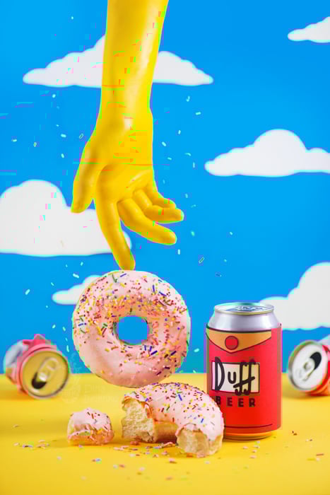
My first association with blue and yellow is always The Simpsons. Photo by Dina Belenko
-
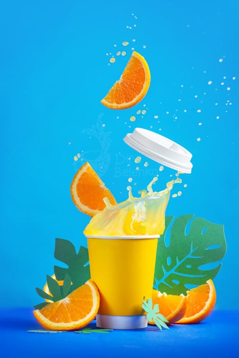
Cold blue background makes yellow juice splash “pop” even more. Photo by Dina Belenko
Conclusion
Combining complementary colors in the right way can enhance your photos a lot more than you would expect.
Look for them in nature, in your surroundings or put them together for eye-pleasing compositions.
Check out our Creative Photography Cookbook for incredible still life ideas!