The gradient map in Photoshop is a powerful tool for color correction and image manipulation. It allows you to create custom gradients and apply them to your images to achieve a wide range of effects. In this tutorial, you’ll learn how to use the gradient map to correct colors, add contrast, and create special effects.
How to Create a Gradient Map in Photoshop
Adding a gradient map to color images you gives you the ability to control individual photos and whole albums will look.
As with pretty much every method of photo manipulation, there are many ways to achieve the same effect.
In this article, I will share with you the steps I take to apply and handle gradient maps.
© Kevin Landwer-Johan
Step 1
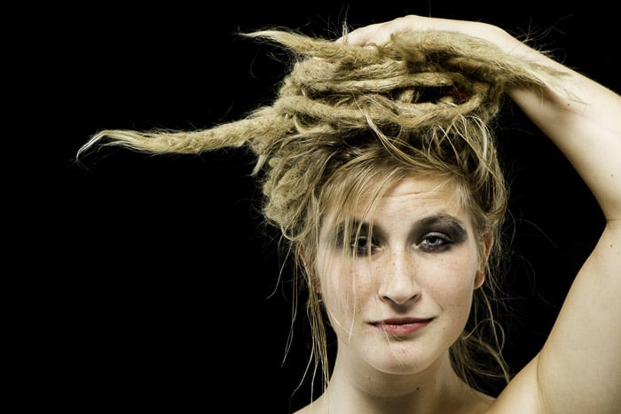
Choose a suitable image. Visualise the way you want your finished picture to look after you have added the gradient map in Photoshop.
Step 2
Set your foreground and background colors to 50% gray. Double click on the foreground color and "808080" next to the hashtag at the bottom of the left-hand column of options.
Do the same for your background color.
Step 3
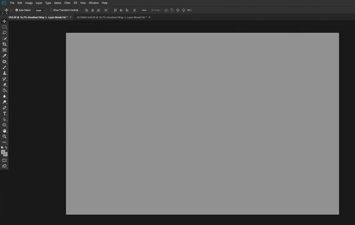
Add your Gradient Map adjustment layer by choosing Layer > New Adjustment Layer > Gradient Map.
This will create an adjustment layer that looks like this.
Step 4
Change the blend mode of this new adjustment layer to 'Soft Light'. Your photo will appear unaltered.
This is because you have chosen a flat gradient map of middle gray. There is not yet any tone or color gradient.
Step 5
In the Properties dialogue box of this layer, click the small box under the left of the gradient editor bar. Change the color to black, (or the darkest color you want to use.)
Next click on the box to the right of the gradient bar and change the color to white for a white gradient (or the lightest color you want to use).
You will now see the effect of the gradient map on your photo. This is the most basic Photoshop gradient map.
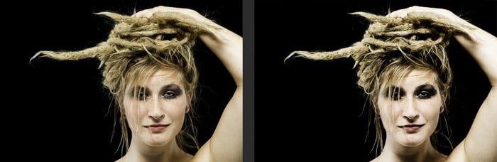
Sticking to these steps exactly will give your photo more contrast, as in the example below.
The original image on the left is unaltered. The image on the right shows the effect of the gradient map.
© Kevin Landwer-Johan
Further Alterations
This is where you can begin to experiment to give your photo the look and feel you like. It's possible you will be happy with the first outcome, but there are an infinite number of adjustments you can make.
Change the Blend Mode
By choosing a blend mode other than the default 'Normal' you have a huge range of creative options available. You can completely change the feel of your photo depending on what blend mode you set for your gradient map layer.
Most often I prefer to make my images look relatively natural. I find the Soft Light blend mode option works best. Soft light keeps the mid tones transparent and affects only the darker and lighter areas of the image.
This adds contrast and the gradient map effect is not so likely to overpower the photo.
Try scrolling through the various Blend Mode options to take a look at how they affect your photo. You may wish to choose a more radical look if you are wanting to create a more surreal image.
Vivid Light is the blend mode I used to create the picture below.
© Kevin Landwer-Johan
Experiment to Achieve the Look You Desire
You may not find the perfect mix in any of the Blend Modes. There are a few options to try to achieve the look and feel you want.
Altering the opacity of the gradient map layer will decrease its effect on the layer below it. Use the opacity slider on the gradient map layer to further refine how much the map affects your photo. The further you slide towards the right, the lower impact it will have.
Stacking gradient maps is also worth experimenting with if you can't quite get the look you want. Duplicating the map layer and changing the blend mode can produce some very different effects.
In the image below I used two different gradient maps. I could not achieve the look I wanted with a single map. I created a map with blue tones and set the blend mode to Screen. Below this I created a map with gray tones and set the blend mode to Hard Light.
© Kevin Landwer-Johan
When you duplicate a Photoshop gradient map, you can keep the colors the same and change the blend mode to manipulate the look of your photo. Alternatively, you can keep the blend mode the same and change the colors. Or you can alter both the colors and the blend mode.
Using the brush tool set to black on a gradient map will erase the map. The brushed area will be diminished or erased entirely depending on the opacity setting of your brush.
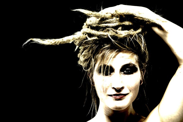
In the image below I used a brush on the woman's face and some of her shirt to help isolate her from the busy background.
© Kevin Landwer-Johan
Clicking just underneath the gradient map bar in the Gradient Editor will add new nodes. You can use these to diversify the colors and tones within your gradient maps. Sliding the nodes also changes the effect the map has.
Take your time and experiment. You can save any gradient map you make by first typing in what you want to call it in the Name dialogue area. Then click New. Your maps will be saved and added to the available presets.
Gradient Map Presets Can Make Your Life Easier
When you open the Gradient Map you will see a small number of presets.
To add more preset options click on the small cog icon in the Gradient Map Editor and go to Photographic Toning. Click OK in the pop up window that appears. Now you will see a lot more preset gradient options.
Most of these are geared towards portraits. You will notice in these gradients the mid to light tones are predominantly beige and cream colored.
These colors will help preserve more natural looking skin in Caucasian and Asian people in your photos.
© Kevin Landwer-Johan
Be Creative With Photoshop Gradient Maps
Creative toning of images is easy with gradient maps, but once you start, the creative possibilities are truly endless.
Visualising the outcome you want will help you reach your goal. If you are not sure of the look you are after, allow yourself plenty of time.
Thinking about the look of the original photo you are working with and in what context you will use it is important. Working on a series of images that will be displayed together it's often best to use similar gradient maps on each photo.
Albums of wedding photos can be enhanced by creating gradient maps which produce a soft, romantic feeling. Model portfolios given a more edgy look with the careful application of maps with a higher contrast can work well.
Develop your own collection of maps, or find a set online, that fits well with the style of photo you like to take. Using them consistently will help you build your own style.
For more great Photoshop tips, check out our article on using lab color or Photoshop templates!