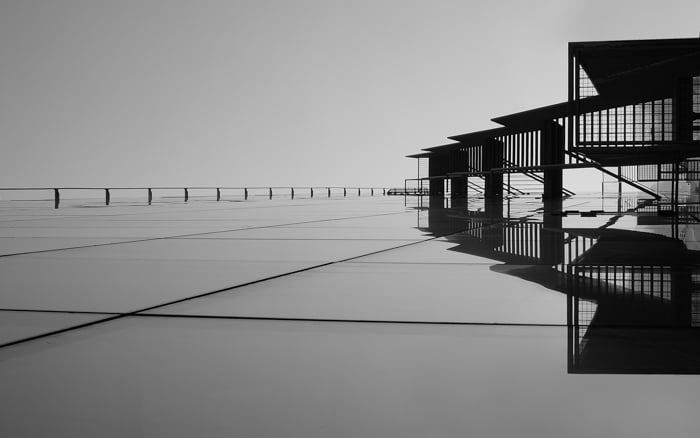
Product photography composition is about emphasising your subject to draw the viewer’s eyes towards it.
There are certain rules you can follow to improve your composition. You can even combine a few rules to create a spectacular product photo.
1. Product Photography Composition: Utilizing Front and Central Placement to Highlight the Product
Compositional rules work well when applied in the correct way. In product photography, you often need to ignore the most common compositional rules and place your product in the front and center.
It makes the item the center of attention. No distractions, your eyes go straight to it. Plain and simple.
You can also only show part of the product, making the viewers imagine the rest and fill in the gaps.
The placement of the product can be either in the foreground or middle ground. It is a good idea to create some depth in this compositional method and utilise negative spaces.
You can create depth with lighting or using color contrast and reflections. You want to avoid giving your product a two-dimensional feel.
2. Choose Camera Angles That Highlight the Best Features of the Product
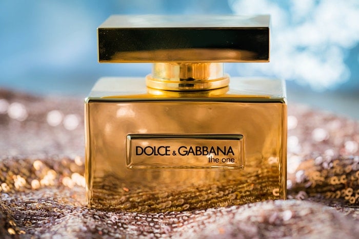
Camera angles not only make products interesting. The 45-degree downward glance is similar to how our eyes look at objects on tables and shelves. This technique makes the product seem obtainable and more realistic. As if the viewer already owns it.
The right camera angle can add depth and show as much of the product as possible. You may not see some of the features if photographed straight-on or from a top-down perspective.
The camera angle you choose can enlarge some products and create extraordinary textures. Experiment with the angle and choose the one that highlights the best features for the product.

3. Use Negative Space to Draw Attention to the Product
Negative space helps draw the eye to the products in the image. It also gives your product photos room to breathe.
In product photography, you often have to add text to your images. Allowing space means you can address this in an easy way. You can leave some space and add the text in post-production. This is often a requirement from the designers when they create advertisements.
Using negative space can be tricky. Avoid making the composition look too forced. Shift your expectations from regular product images and keep an eye on billboards to notice how professionals use negative space.

4. Apply the Rule of Odds to Make Your Product Composition More Appealing
The rule of odds is a useful product photography composition technique. What makes it so exciting is that it works on a very subconscious level.
The idea is that it is easy for a viewers’ mind to organize an even number of objects in a scene. Therefore, that scene feels boring.
An odd number causes tension and interest.
If you have only one product, you can place other items in the scene that strengthen the concept of the advertisement. For example, shaving foam would work well with a towel and a razor.
This helps create a story through a setting, making the product more believable.
5. Use the Rule of Thirds for More Exciting Product Images
We all know the rule of thirds from other areas of photography. This is the golden rule that we learn at the beginning of our photography career.
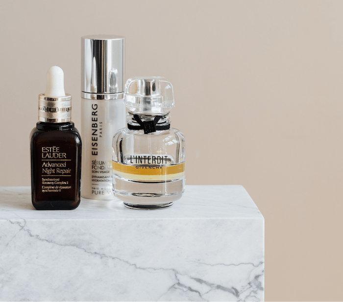
The rule of thirds goes against placing the subject in the middle of the frame. Rather, the subject of the product photo should be placed on the intersections of the horizontal and vertical lines. The intersections appear when you split the frame into three equal columns and three rows.
The rule of thirds makes the image more exciting as our eyes have to search for the product.
6. Apply Differential Focus to Make the Product Pop Out From the Background
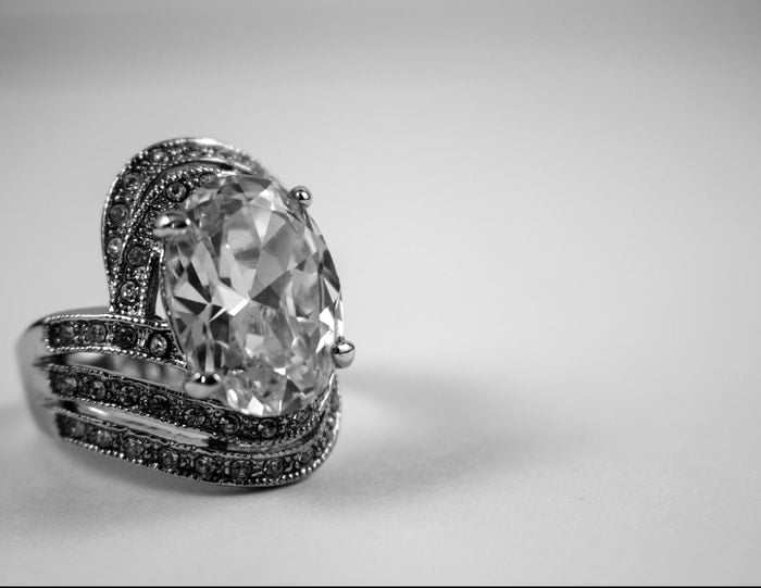
Differential focus is a technique where you choose which part of the image should be sharp and which part should be out-of-focus.
In product photography, you can place the foreground in focus and background out of focus. This is a great way to highlight the product in the foreground.
Through product placement, setting and dressing of the scene, you are able to give an accurate story, rather than only a plain shot of an item.
In the image below, we see that the Nike shoe is in focus. The background is blurred, but we can still say that it has graffiti on the walls. It looks like a skateboard ramp or an urban sports field. The background conveys a young, sporty and rebellious message.
Further away, we spot objects that could be trees. This gives an outdoorsy twist to the image. All these elements enhance the brand message of Nike shoes. It speaks to the active, young and trendy crowd.

7. Use Dynamic Diagonals to Lead the Viewers’ Eye
The dynamic diagonal compositional technique is a popular method in product photography. It involves either arranging or photographing your product with lines in mind.
Lines are the strongest elements of design. You can use them to place the focus on your product. They also add a touch of movement to a scene.
According to the diagonal rule, we should place the important elements of the picture along diagonal lines.
The lines help guide the viewers’ eyes from the frame to the product, placing emphasis on the most important element of the scene.
Diagonal lines are a simple, yet effective way to breathe life and energy into a static composition.
8. Shoot From a Top-Down Perspective for a Unique View
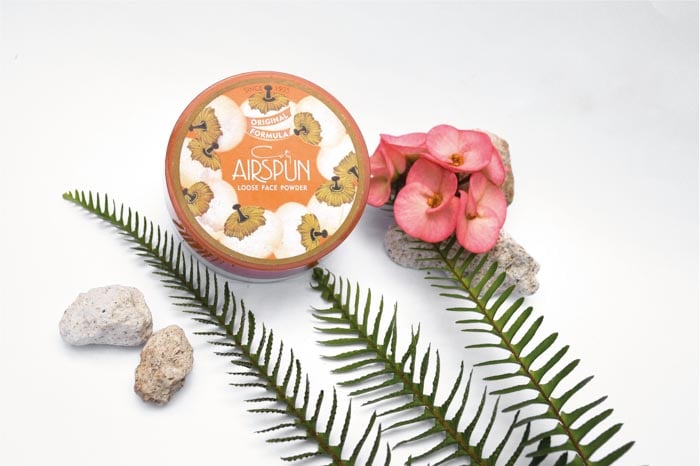
A top-down or flat lay perspective is a great compositional technique to show off your products. The top-down viewpoint offers a unique look at a product.
We are used to seeing products at a 45-degree or straight-on angle. A flat lay photograph makes products look more exciting and unique.
It’s a powerful look, intensified by a blurry, out-of-focus background.
This perspective is often used in food photography. The flat space offers an opportunity to spice up the scene with extra items, creating a story rather than a plain image.
You can find amazing food photography tips in our Edible Images ebook!

Conclusion
These eight golden rules of product photography can help you find the best composition. Keep in mind that you need a different approach to every product.
Always create a composition that makes the product look the best. If you work for a client, follow their guidelines when creating product photography.
For more great tips, read our product photography checklist!
