Adobe Photoshop Lightroom has a new Texture slider that can be used to control the amount of texture in an image. This slider is found in the Effects panel and is available in the Develop module. We’ll show you how to use the texture slider in Lightroom.
Understanding the New Texture Slider in Lightroom
The texture slider works on a scale from -100 to 100. You can apply a positive and negative texture to the images.
As always with Lightroom, Texture is a non-destructive control. You can change its value at any time.
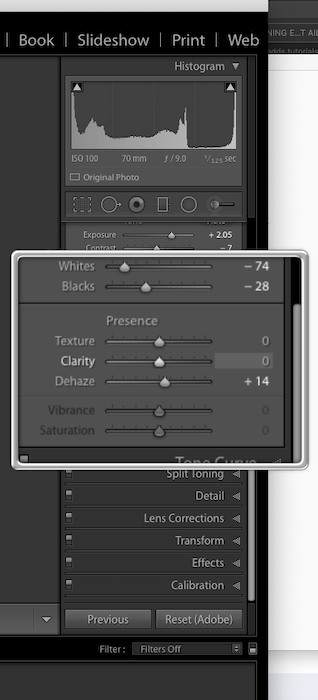
The Texture Slider is located in the Basic panel, with the other sliders to control the Image Presence.
Texture is also available for all local adjustment tools. This means that you can also apply it locally.
If you use Photoshop for your editing, you can find the slider in the latest version of Adobe Camera Raw.
How the Texture Slider Compares With Clarity, Sharpening and Noise Reduction
Together with Clarity, Sharpening and Noise reduction, Texture works on the image ‘presence’.
The concept of “image frequency” helps to understand how these sliders work. You can consider an image as made up by the combination of three frequency ranges:
- High-frequency details;
- Mid-frequency features;
- Low-frequency areas.
With the term “frequency,” we mean the rate of change of pixel intensity.
High-frequency details are edges. Low-frequency areas are the part of the images that appear homogenous, i.e. the blue sky or shadows.
Larger features are in the Mid-frequency range.
In this regard, Clarity, Sharpening, and Textures work mostly on different frequency ranges.
With positive texture, you will bring out more of the texture in the image. It is somehow like adding positive clarity and/or sharpening, but the effect is more subtle.
The Clarity slider is best used for stronger adjustments in the middle and lower frequency ranges. The Texture slider, instead, is best for making subtle adjustments to mid-frequency features.

In practice, Clarity will affect the luminance and saturation more than Texture.
Sharpening enhances edges, i.e. ‘high frequency’ details. The downside with sharpening is that it can bring out the noise in the shadows. That’s why you have a masking tool for it.
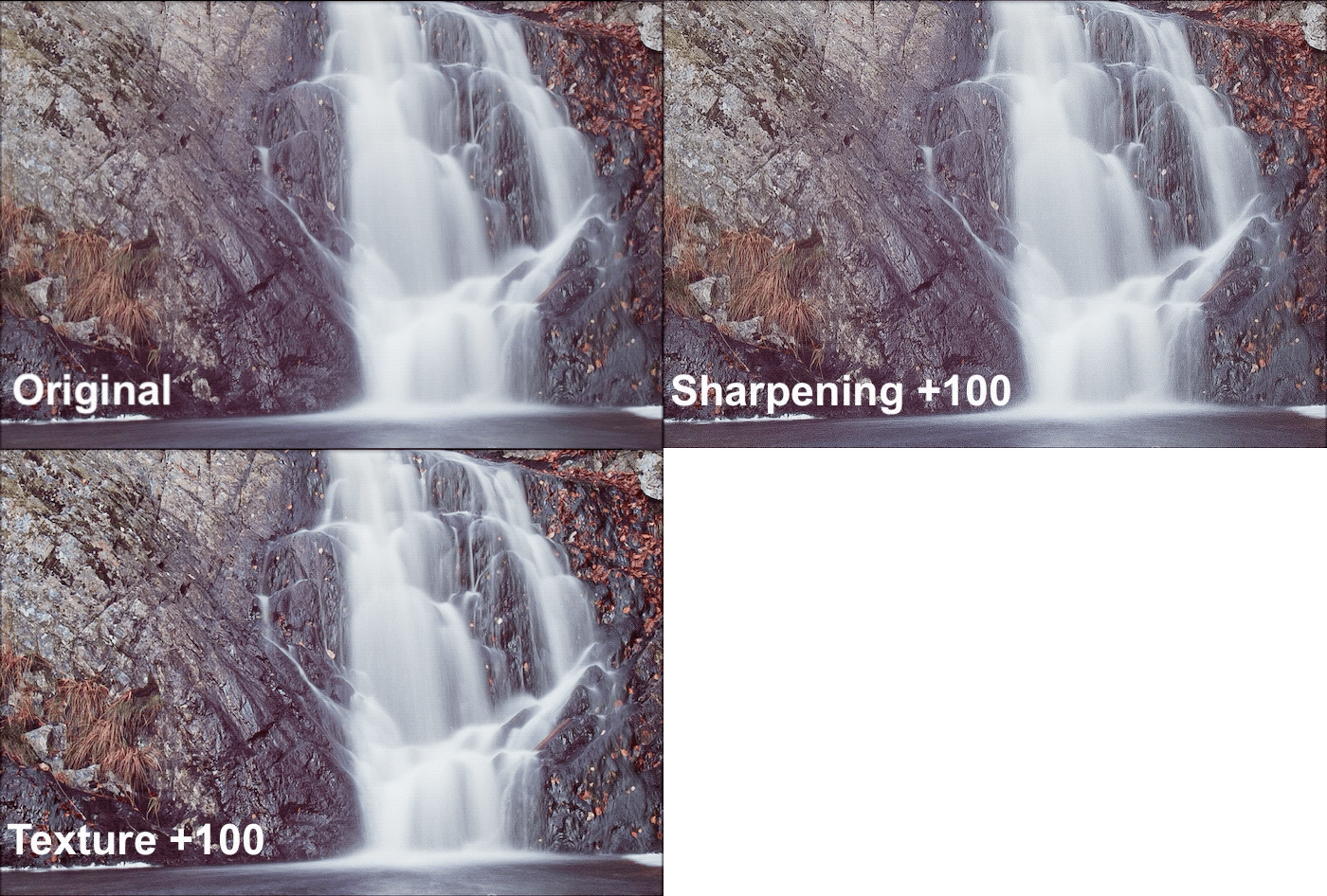
Texture works on the “mid-frequency” details while leaving the noise most untouched.
The effect of negative Texture is to smooth the image, a bit like noise reduction.
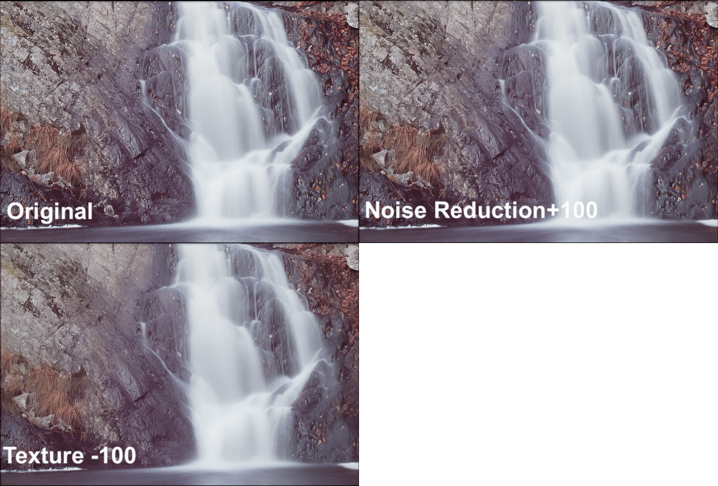
The main difference between the two methods is that with Texture you will be able to better keep the finest details.
How the New Texture Slider Will Make Your Portraits Better
The Texture slider was Adobe response to the photographer’s need of a better way to smooth skin. A must when it comes to editing portraits.
How to Use Texture For Smoother Skin in Portraits
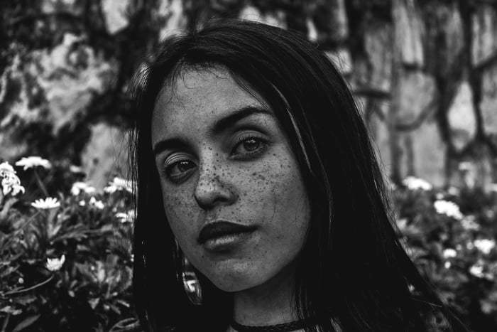
To smooth skin in a portrait, you could reduce Texture, Clarity or apply Noise Reduction. The gif below shows the results from smoothing the skin with those sliders.
To better show the differences, I set Clarity and Texture to -80. For Noise Reduction, I used +80.
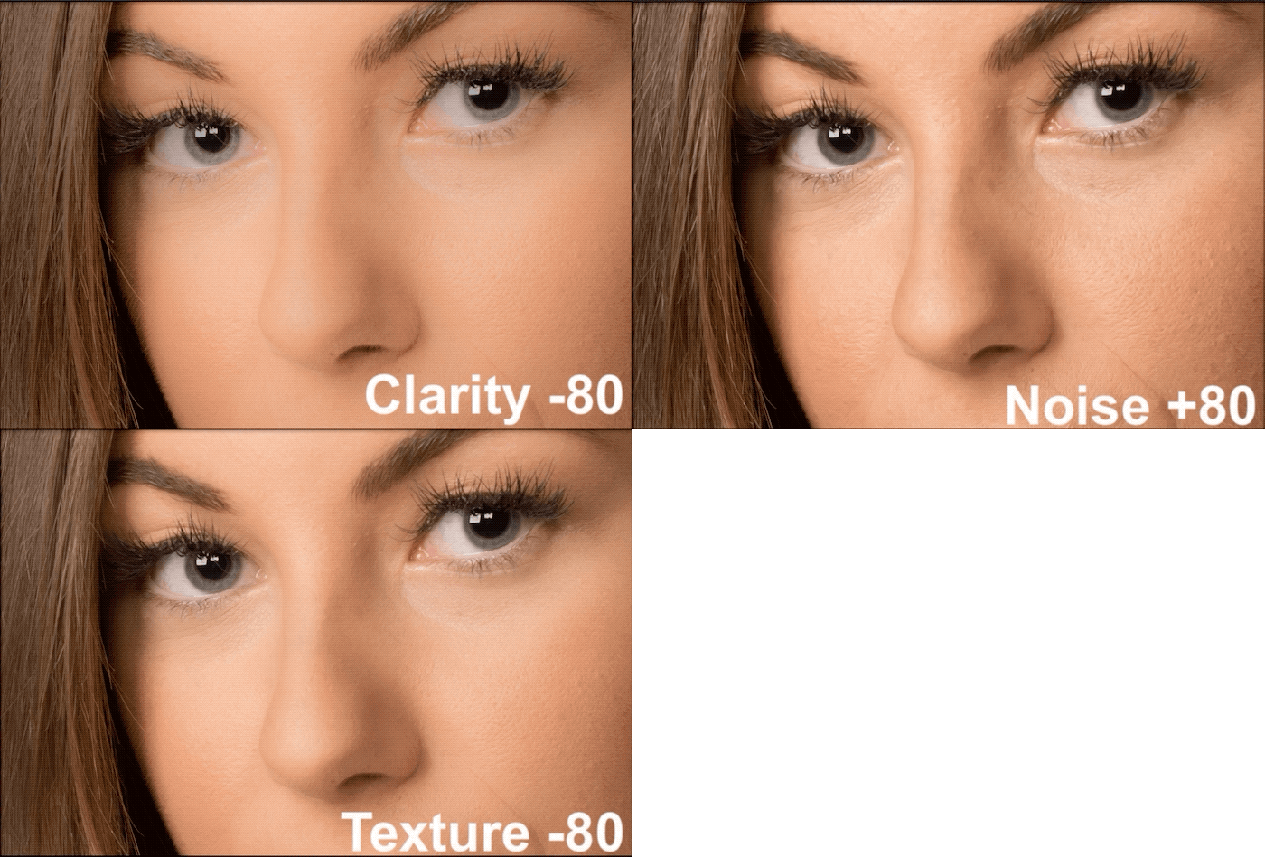
By reducing the clarity too much, the skin will get a plastic look. Also, saturation and luminance will be altered.
Noise Reduction is not strong enough to smooth the skin. But it wipes out a lot of details in the irises.
Texture smooth the skin in a much better way that either Clarity and Noise Reduction. The skin is smoother but looks natural, with lots of details still visible. The same is true for the iris.
Good editing for the skin is more than just turning down a single slider.
The best way is to use different sliders together. By combining Texture, Clarity, and Sharpening, you can, in fact, do a kind of frequency separation editing in Lightroom.
The gif below shows the difference between applying “Texture -80” only and the final image.
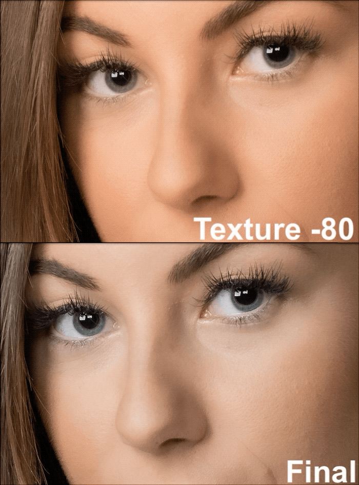
For the final image, I used Texture -80, Clarity +20, Sharpening +60 with radius 1.5 and mask 66.
How to Use the Texture Slider to Edit Eyes In Portraits
Editing the skin is a must in portraiture, particularly for female portraits. As discussed above, smoothing the skin means applying a negative value on the Texture slider.
A good portrait begins from the eyes. They are a focus point used by the viewers to connect with the image. The eyes deserve proper editing. Use a positive value on the Texture slider to make your model’s eyes pop.
In Lightroom, there is already a nice brush preset called Iris Enhance that works rather well. This preset has:
- Exposure +0.35;
- Clarity +10;
- Saturation +40;
This is a basic preset that works nicely most of the time. I like to tweak it to fit my needs. The animated gif below shows the difference in my model’s eye for:
- the original image;
- the image with the standard Iris Enhance brush preset;
- my final image with the Iris Enhance brush preset with also Texture +100 and Sharpening +35.
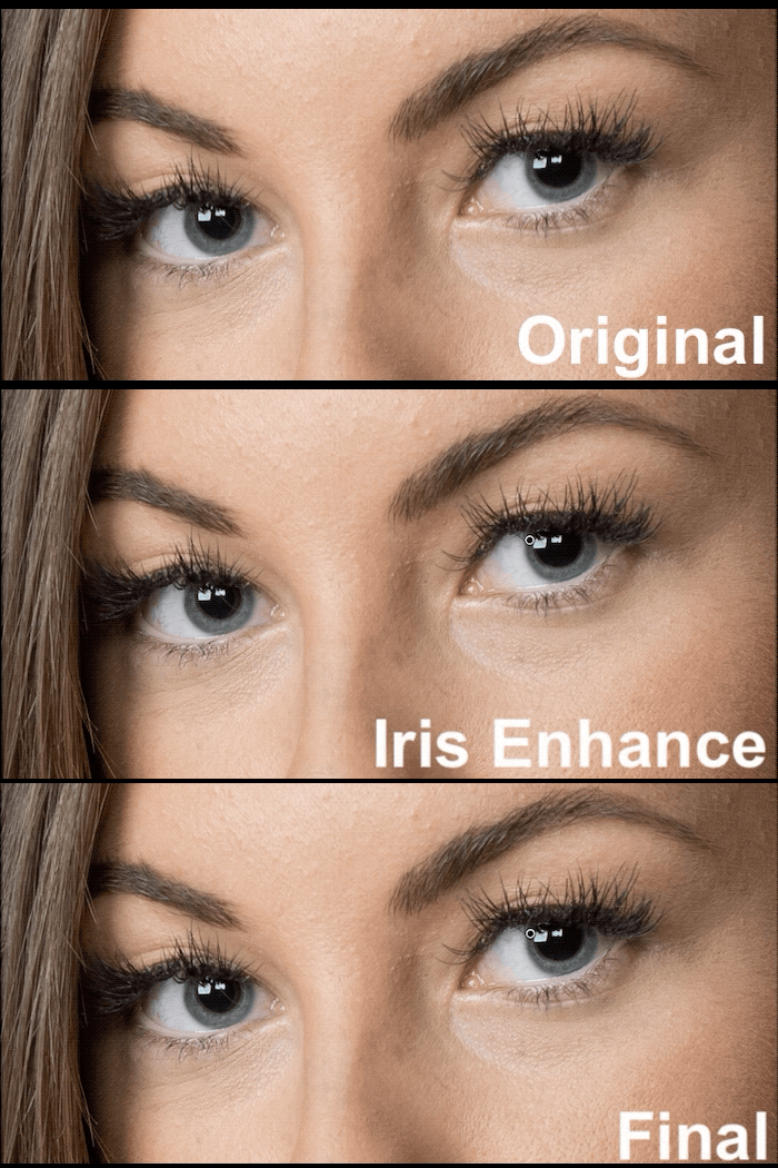
The effect of the texture slider is subtle, but it is a welcome one.
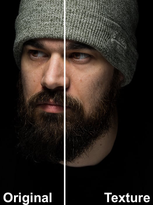
As a side note, you can also use a positive value on the Texture slider to enhance beards in male portraiture.
The Final Portrait
Until now, you only saw 100% crops of my image. That’s so you could better understand and appreciate the effect of the Texture slider on the skin and eyes.
But what is the effect on the full image? This is the original image.
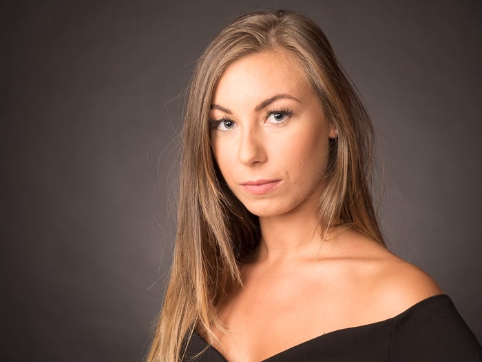
With Clarity -80 to smooth the skin, default sharpening and default Iris Enhance brush, I got this. The skin looks rather plasticky.
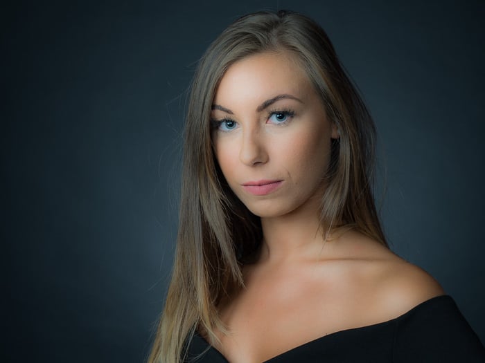
Finally, here is the image edited using the Texture slider to smooth the skin and enhance the eyes.
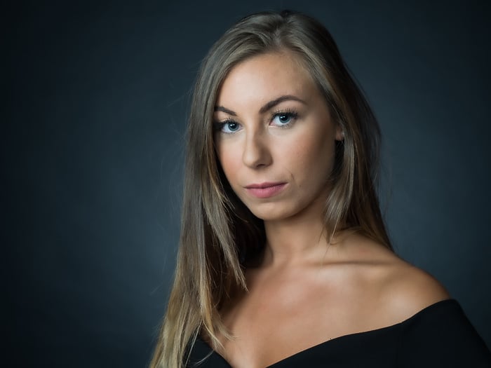
The difference in the edits is evident. The new Texture slider is a great tool to edit your portraits like a pro.
How to Improve the Texture in Your Macro Photography With The Texture Slider
The Texture slider is not specific to portraiture. The new control is useful whenever you want to make textures pop.
A good example is close-ups and macro photography, where texture is very important.
The animated gif below shows the original image compared to two versions. In one version I used clarity to bring out the texture, while in the other I used the Texture slider.
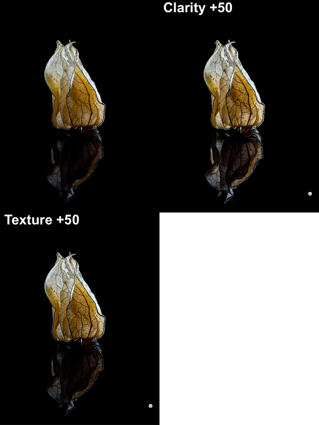
Clarity enhancement of the fruit texture is rather strong and brightens the reflection. On the other hand, with the Texture slider, it is easy to get crispy, but a more natural image.
How To Get Crisp but Natural Looking Landscapes With the Texture Slider
In landscape photography, texture allows you to improve the details in the image, but without bringing up noise as Sharpening would do.
Also, the changes in luminosity and saturation will be not as noticeable as when using clarity.

In this image, a positive texture has been applied to the rocks and the village, while a negative texture has been used to better smooth the sky and the sea while retaining some details. Image Credit: Alessandro Torri.
Negative values on the Texture slider are also great in smoothing out the sky and bodies of water, particularly if you are taking long exposures.
Conclusions
The new Texture slider has brings a more subtle way to smooth or enhance textures. It’s the perfect tool to smooth skin and make eyes pop in portraiture.
When combined with Clarity and Sharpening, it lets you do a basic frequency separation editing.
But its usefulness is not limited to portrait photography. Landscape and macro photography are often strong in texture too, and you can take full advantage of this new slider there.

