Business cards are a crucial part of the networking process if you have a photography business. Photographers know visual material is essential. We make up our minds on whether we like the aesthetic or not in seconds. This is why business cards, and how you present them, are so important.
Today, I will show you a few examples of creative photography business cards to draw inspiration from. The list will be wide and varied, so there is a card type for every photographer.

Do Photographers Need A Photography Business Card?
The primary function of a business card is to give your contact information to someone. As photographers, we can take advantage of these cards to differentiate ourselves from others.
The obvious way of doing this is to use the card to deal out small prints. This is a great way to show your skills quickly and conveniently. Even if you don’t need to pass on your information, keeping a business card on you is a great way to show people your photographic style.
Business cards are almost essential if you are a street photographer or work with models. If you pass someone on the street and take their photo, they may want to see it. You’re able to present your photography business card, and they can contact you easily.
Photography business cards can also help gain access to specific locations! If you have a way with words, business cards can help you access areas that others can’t.
Information to Put on A Photography Business Card
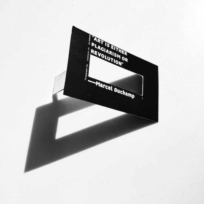
There are a few essentials you need to put on your business card. These are your name, email address, and website.
Other optional bits of information may be crucial to your photo business, like your social media accounts. You can even link these through your own custom QR code you can make online!
Some people like to put their phone numbers on their business cards, which is entirely up to you. I would suggest not overloading the card with information, as it may be too confusing.
Where to Hand Out Your Photography Business Card
The best time to give out your business card is toward the end of a conversation with someone who may be interested in your work. Of course, you will need to judge if they will be a worthy potential client or not.
If you know the recipient you want your card in front of, try meeting them face to face. Handing over your card yourself is a lot more impactful. If you can’t do that, try to get it on their desk or in their work mailbox.

41 Unique Photography Business Card Designs
1. Simple Photography Business Card
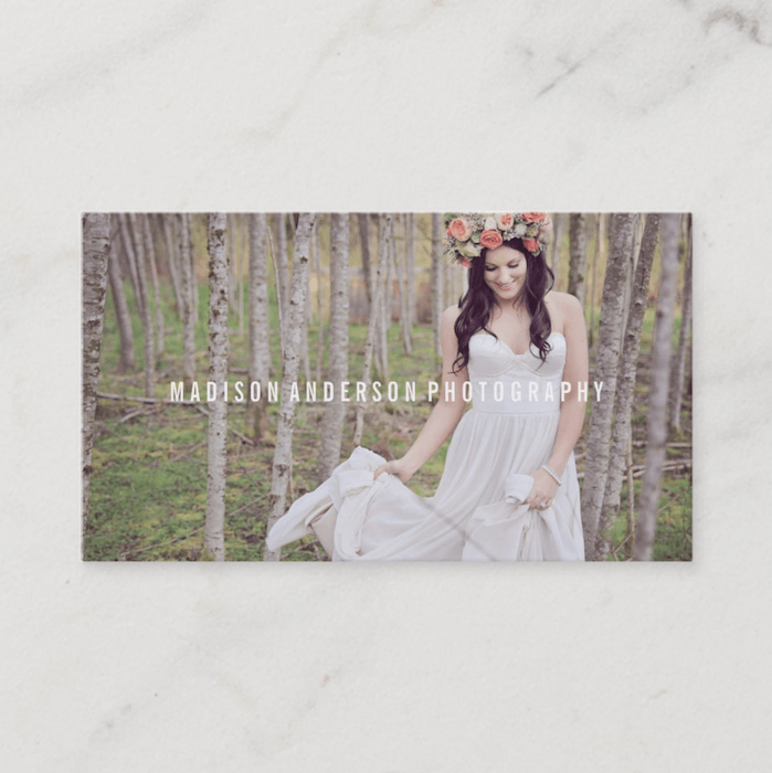
A design like this is ideal as it simply shows your image on the front and your information on the back.
2. Simple Photography Business Card With Logo
If you have a logo for your photography company, try to balance it out on the back of your card like this. Having it on the back means you have an uninterrupted image on the front.
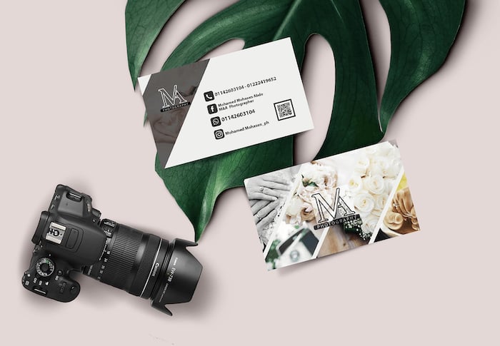
3. Cut Up Collage Photo Business Card
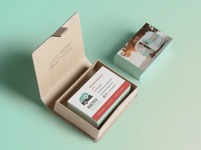
Suppose one image doesn't capture your photography business. Why not try a collage consisting of more than one photo?
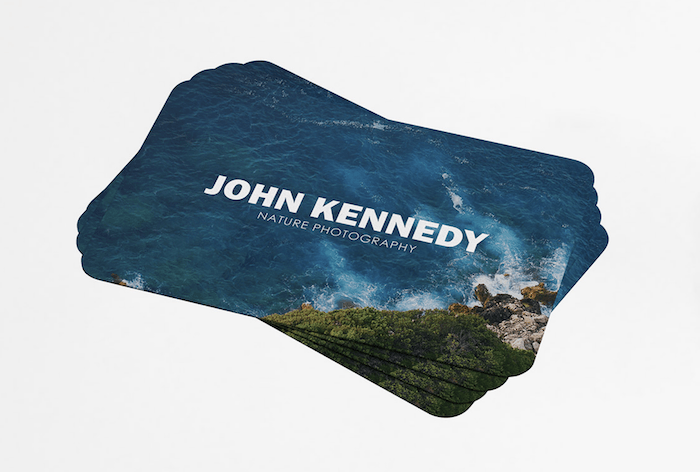
4. Emotional Business Card
Why not evoke emotion through your business card by making the viewer feel like they're on holiday? This can be a calming photo you have taken.
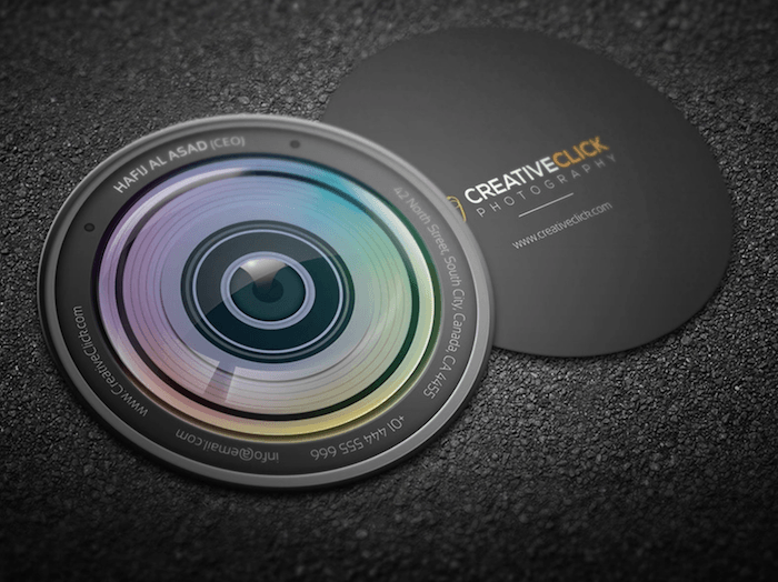
5. Circle Business Card
Trying out different shapes and sizes can set your business card apart from the others. This design embraces photography to the fullest.
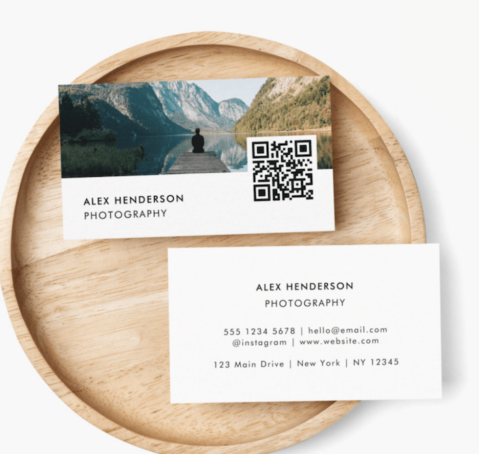
6. Informative Business Card
This photography business card is an excellent example of simply managing a range of information. The QR code has not been squished in with the text. Instead, it takes up some space of the image.
7. Portrait Business Card
Change up from the norm to produce a business card that works well with portrait images.
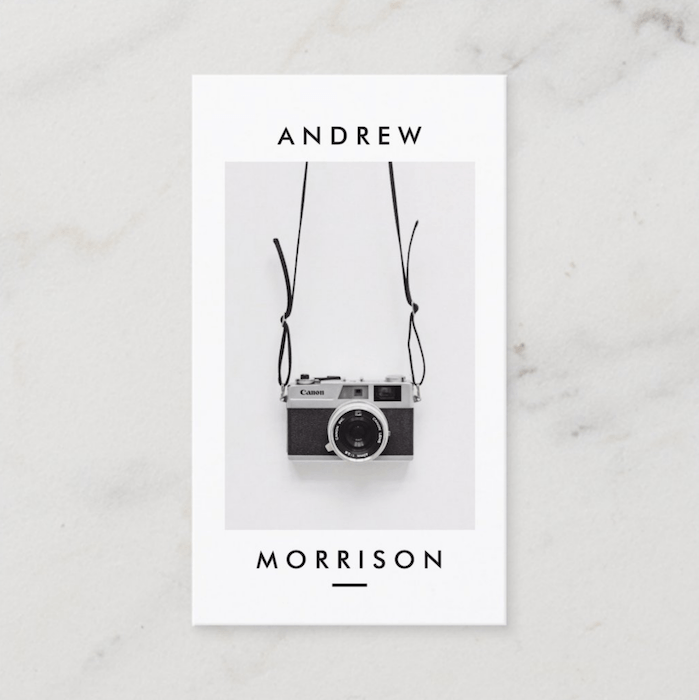
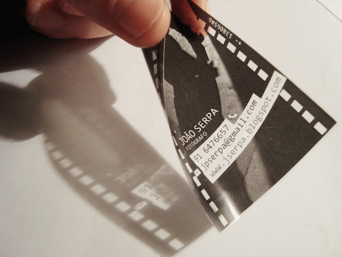
8. Film Business Card
Get creative with your business cards! This excellent idea mimics a ripped, old film slide.
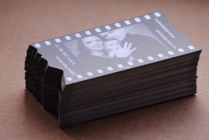
9. Transparent Business Card
A great way to set yourself apart is to use a different material. A transparent business card looks classy and is a great way to promote your photography.
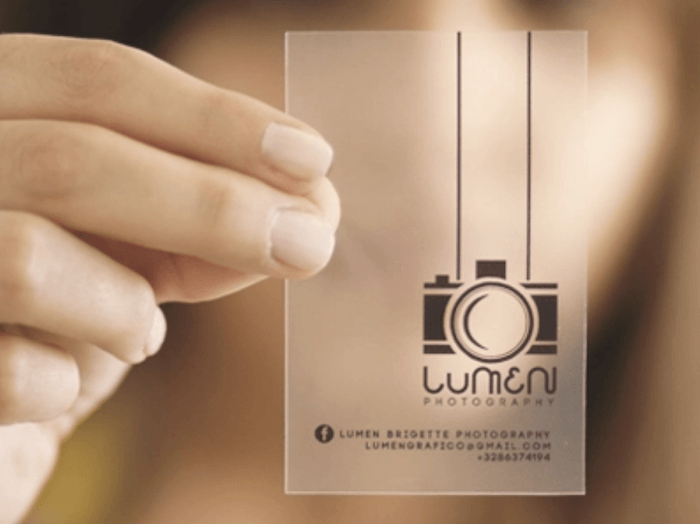
10. Film Negative Business Card
This business card uses a transparent material embedded in the card to look like a film slide. The negative will make your image stand out!
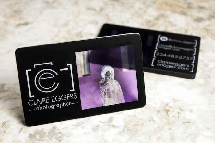
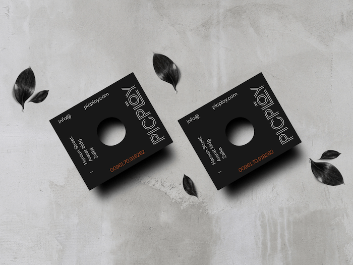
11. Cut Out Business Card
This design features an unusual size and has a hole cut out in the middle. This could be for the viewer to look through to mimic a camera. To me, it looks like a large format lens board!
12. Design Business Card
This design is great if you work with a designer. Use artwork that highlights your style. The recipient can still see your other work on your website.
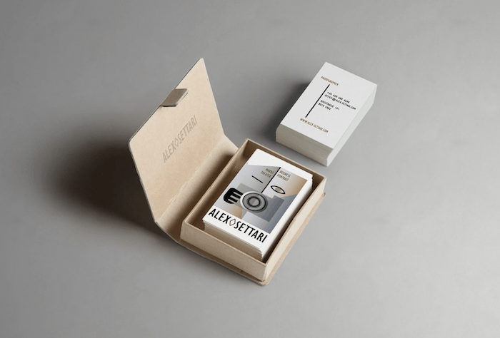
13. Translucent Business Card
If you want to mimic a photographic negative, print your card on translucent paper. This will have a significant impact on both sight and touch.
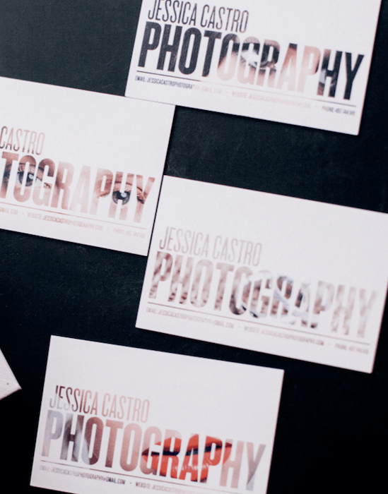
14. Image In Text Business Card
Maybe you don't want to have an image overwhelming the small place. Or perhaps you don't want to show your whole image on a card. This technique allows you to show your photo and text together creatively.
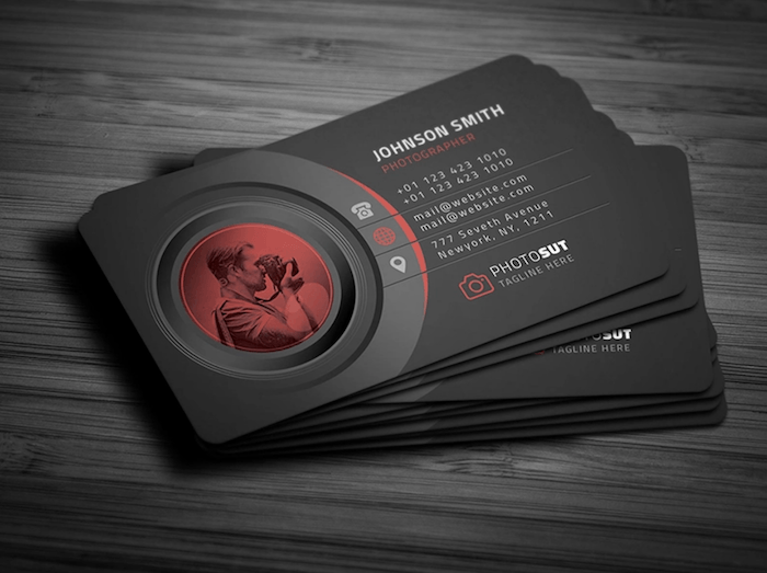
15. In-Lens Business Card
This photography business card idea works great if you have a picture of yourself while working. The design makes it look almost James Bond-esque, with you as the subject down the lens barrel.
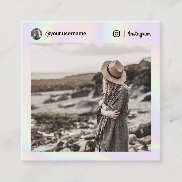
16. Instagram Business Card
You will love this idea if your photography business is big on Instagram. Why not use this business card design to give someone one of your Instagram posts physically?
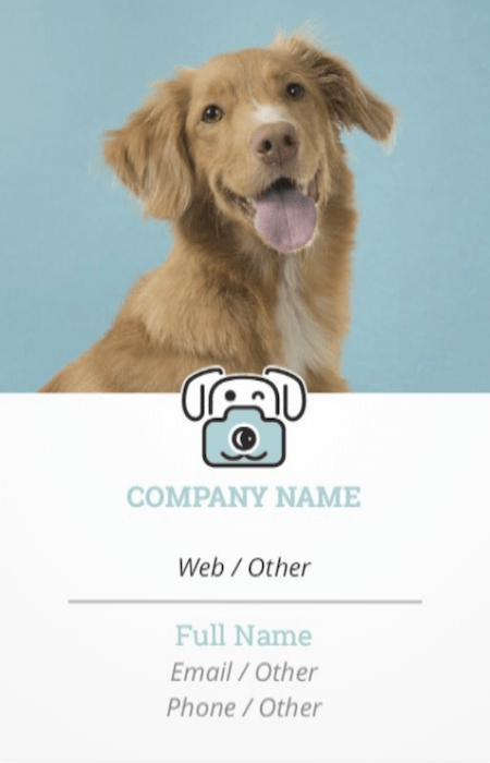
17. Portrait of Pets Business Card
This design only works for pet photographers. What could be better than having a furry friend as a welcome to your company? This design is also nice as it mixes an image and logo well in portrait orientation.
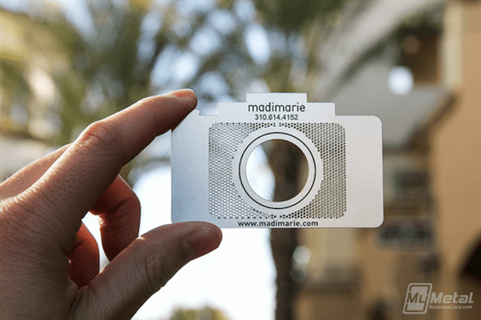
18. Metallic Business Card
As I have mentioned previously, different materials are a great way to stand out. Here we have a stainless steel card that's shaped like a camera with a hole in the middle. It would be hard not to hold this up to your face if you received this!
19. Icon Business Card
If you are not only a photographer and dabble in other similar industries, this could be the technique for you. No one wants to see a long written list on a business card. Instead, give them small icons that represent your work.
![]()
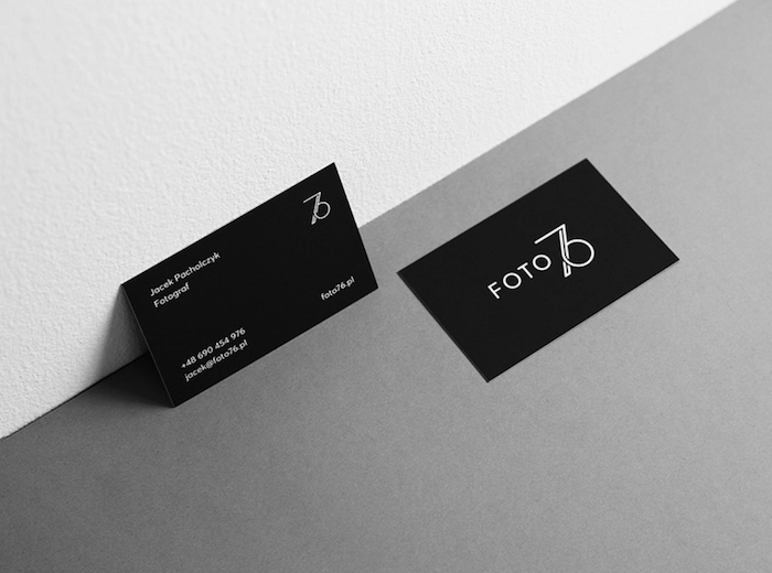
20. Minimalist Design Business Card
If your photographic work is minimalistic and well-curated, have a card that fits your aesthetic. This card is simple, smart, and easy to read, checking off all the boxes on a great business card design.
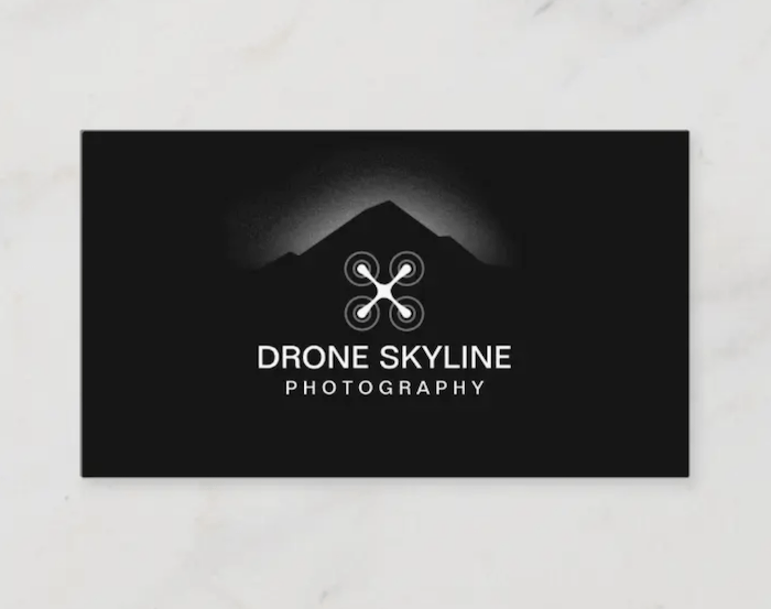
21. Drone Business Card
This is for the drone photographers amongst us. This design clearly shows what you do in a single image.
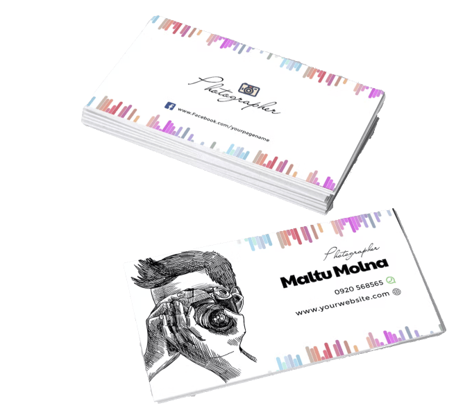
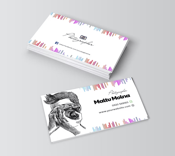
22. Illustrated Business Card
An illustration of yourself or one of your images adds a unique feel to a business card. It makes it seem more soft and personal than rigid and business orientated.
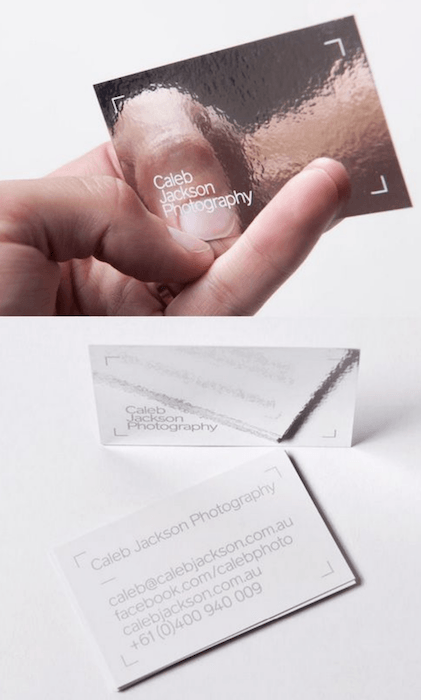
23. Reflective Surface Business Card
A business card design like this works great for product photographers. It’s almost like you are giving a small reflector to your client. Also, if you ever run out of a small light bounce, you’ll have one in your pocket!
24. Rough Material Business Card
Business cards should always reflect your aesthetic. For instance, if you have a rustic aesthetic, a card like this would fit perfectly.
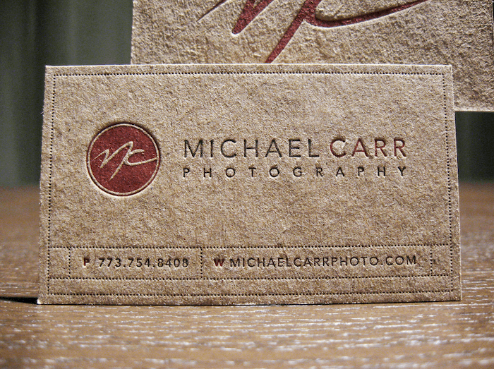
25. Spot Gloss Business Card
If you worked with a designer and they managed to turn your image into a simple vector, you could use spot gloss to enhance your image. This would give your image another dimension that would certainly stand out.
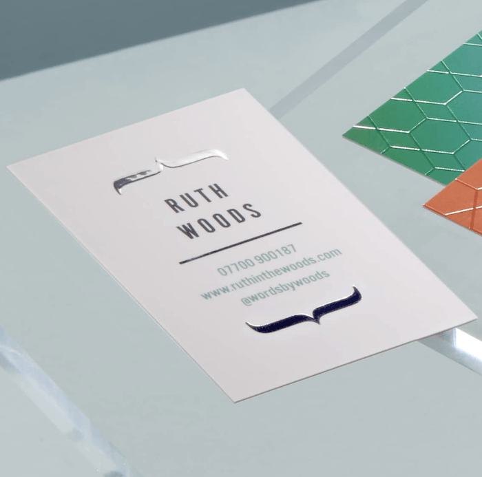
26. Gold Foil Business Card
This is like the last card mentioned, but just a little fancier.
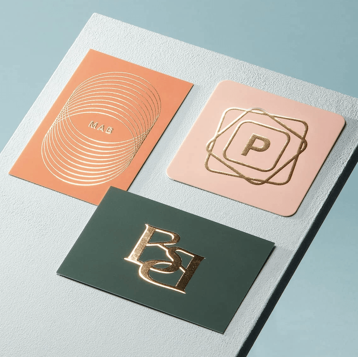
27. Logo and Shape Business Card
Many logos are shaped differently from standard business cards. To stand out from the crowd, have the business card in the same shape as your logo.
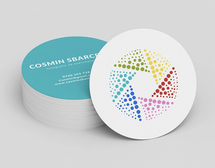
28. Slipcase Business Card
Having a slipcase for your business card adds a great personal touch. It also adds value to your image inside as it is delivered like a fine art print.
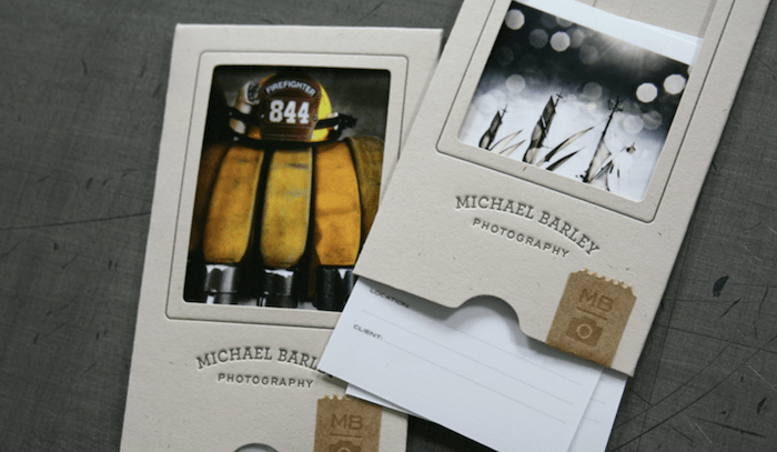
29. Print Business Card
Speaking of prints, why not just gift a print as a business card? A simple print like this lends itself to earning a permanent place on someone’s desk. You could even frame it!
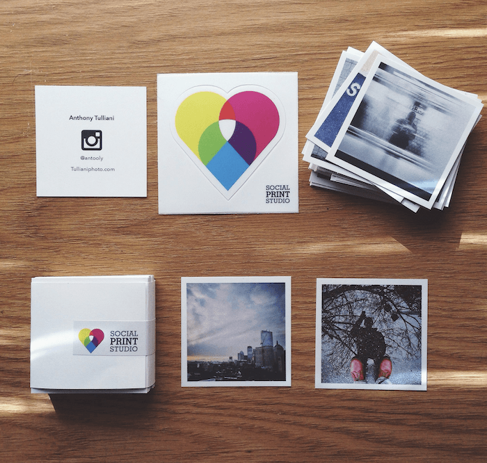
30. Letterpress Business Card
If you have a simple logo or vector of your photographs, consider embossing this onto your card. A letterpress of your design is a simple way of putting a lot on the card without it looking too hectic.
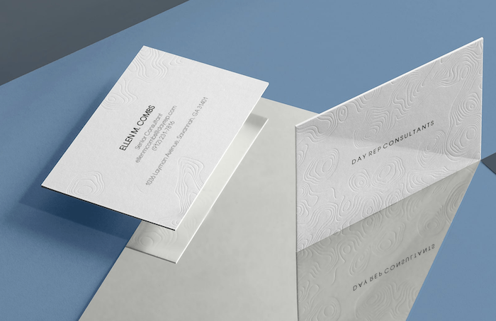
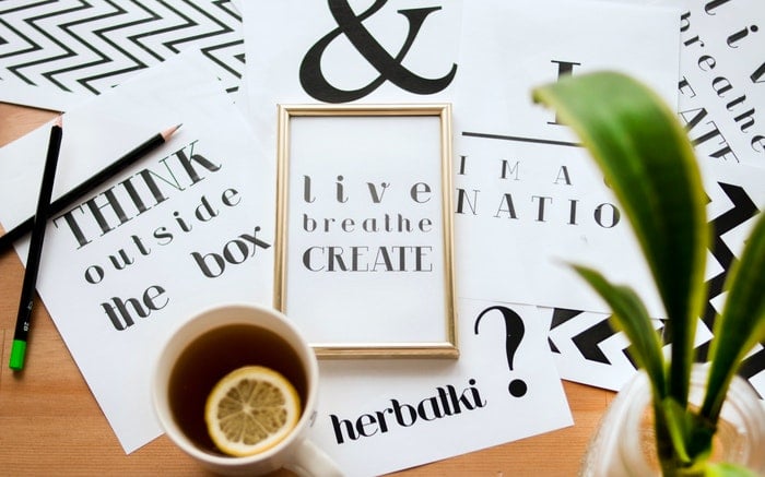
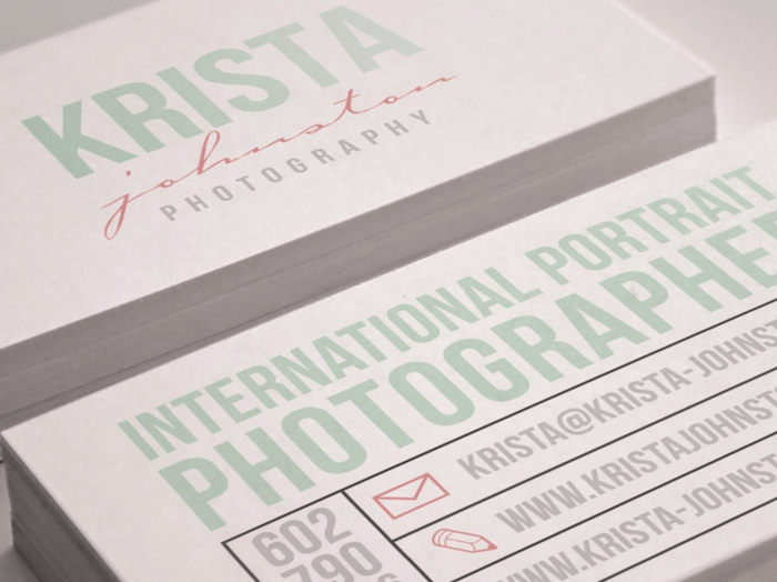
31. Simple Type Business Card
Many people have specific fonts they use for their branding. If you are keen on your font, make this the center of attention.
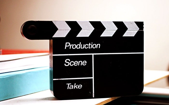
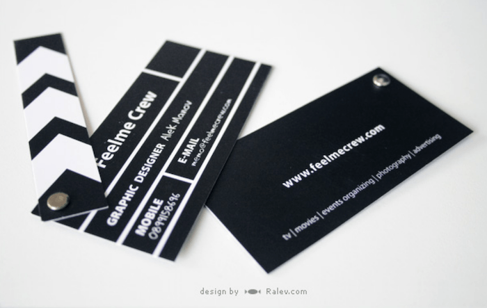
32. Film Business Card
This one is for the videographers out there. Haven't we all wanted to bang one of these pieces of film equipment?
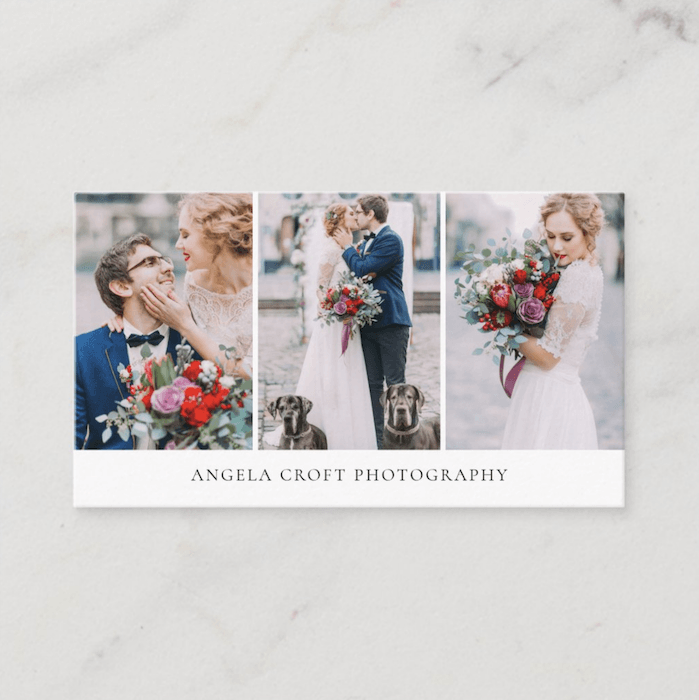
33. Simple Collage Business Card
If one image doesn't get your point across, how about a well-curated sequence?
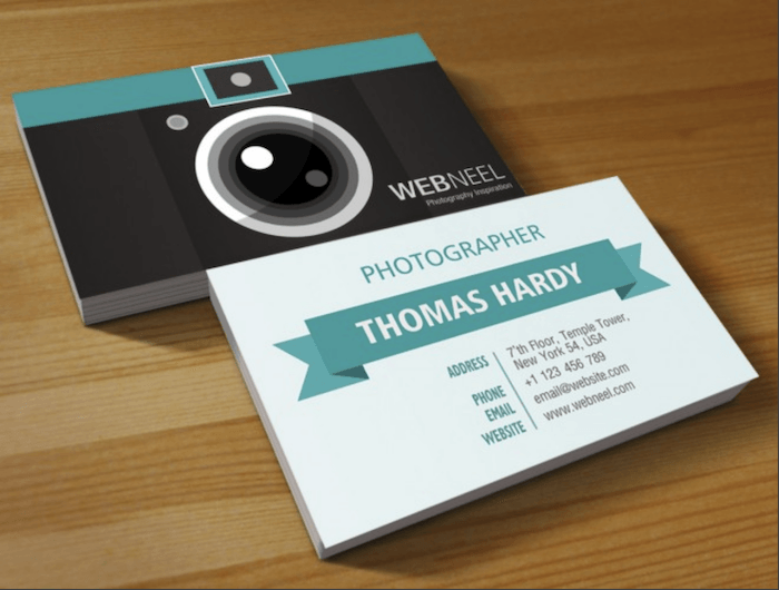
34. Camera Business Card
Use a business card design like this so that there’s no question that you’re a photographer.
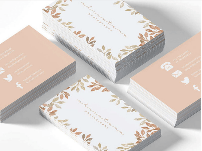
35. Design Around The Edge Business Card
Soften the edge of your photography business card by using a simple repeated image or illustration.
36. Slim Business Card
An unusual shape is excellent, but sometimes going smaller works even better. This way, you can slip your business card in almost anywhere.
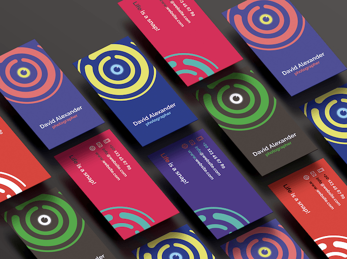
37. Bright Design Business Card
A bright design will stand out from the crowd and bring color into everyday life.
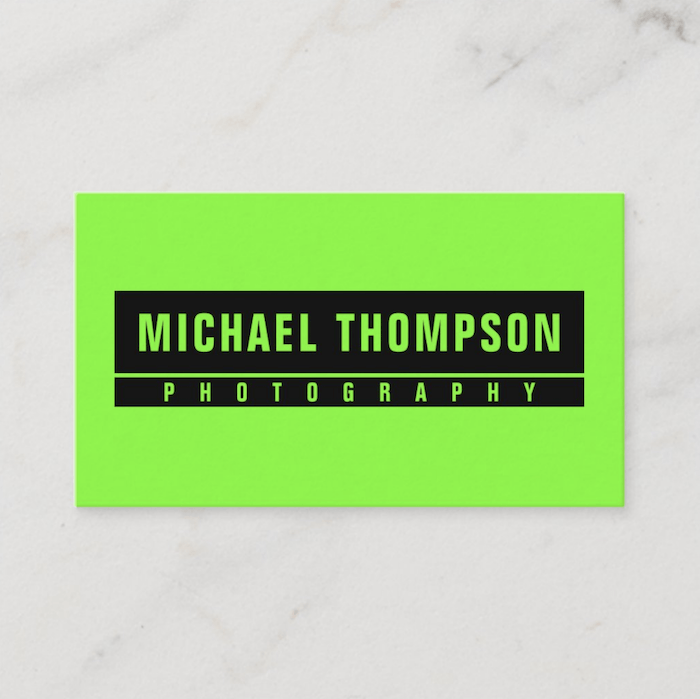
38. Fluorescent Business Card
Usually, photographers don't like being seen. But, when it comes to getting a job, we're more than happy to stand out. There is no way anyone could ignore this!
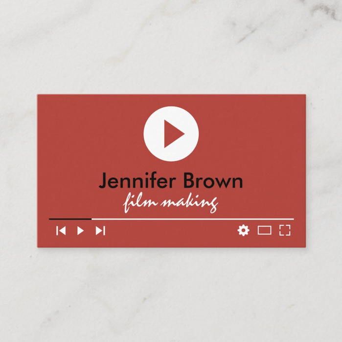
39. Film Editor Business Card
Photographers who use YouTube to promote their work will like this design. But I would suggest removing the red background and using your own image.
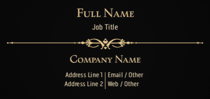
40. Elegant Business Card
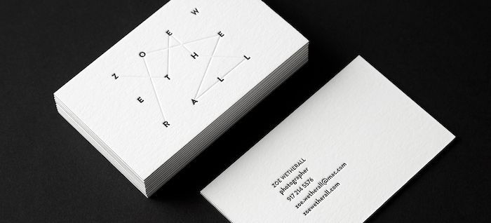
An elegant approach works great in many environments. It may be ambiguous that you are a photographer. But, make it so cryptic the viewer will be forced to look at your website to know more.
41. Stamped Slip Case
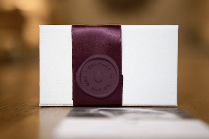
A brilliant extra touch to your business card is sealing it in a slipcase with a wax stamp. This works perfectly for wedding photographers.
Conclusion
After looking at this list, you can see a vast range of approaches to consider when designing your photography business card. It may seem overwhelming, but the trick is to show your photographic aesthetic.
The best way to get a successful business card is to try out many different designs. You can even print out your design on cheap paper and show it to friends and family. So get designing and go bag yourself a job!
Handing out your business cards is a great way to get noticed in person. Check out our Social Success Strategies ebook to get noticed online!
