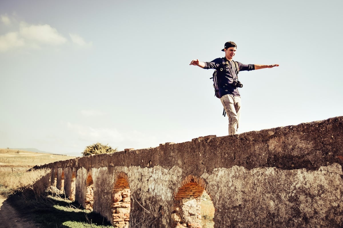
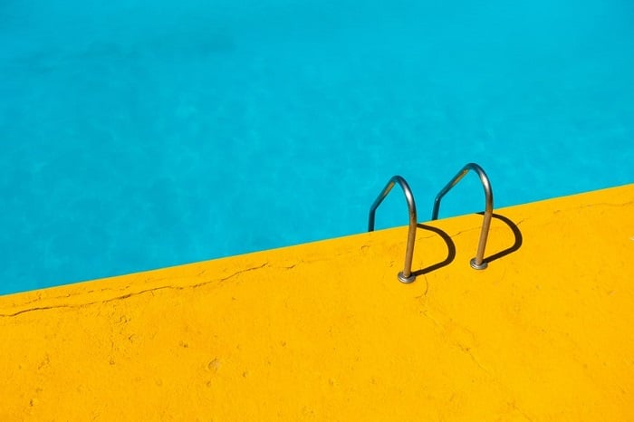
The moment you hold your camera up and press the shutter, you have composed a photo. You have made a conscious or unconscious decision to include somethings, and exclude others.
The key to improving your composition is to understand more about what “works” in a photo, and how. We’ve put together loads of advice to help you master the art of photography composition, so let’s dive in!
What is Photography Composition?
Composition is all about making the best use of the situation before you. It helps you to pull the viewer’s eye to where you want it. It’s about sending the message you want to send. And it’s the ability to make a truly eye-catching image. It’s a subtle art, and there’s lots to learn.
Thankfully, Expert Photography is here to help you get started with photography composition. In this article, we’ll take you through the basic photo composition rules and ratios. We cover all kinds of composition concepts, and we even look at composition techniques for specific genres of photography.
Basic Photo Composition
Learning basic photo composition will improve your photography. The rule of thirds is a simple and effective technique. Divide your frame into thirds and place your subject or points of interest along the lines or at their intersections.
Visual weight is another important concept. Larger objects, bright colors, and high contrast elements have more visual weight. Use these to draw attention to your subject and create balance in your composition.
Leading lines, like roads or fences, guide the viewer’s eye into the scene. Frames, such as windows or arches, focus attention on a specific point. Depth can be created by including foreground interest or using a wide field of view. By understanding and applying these photo composition techniques, you can take your images to the next level.
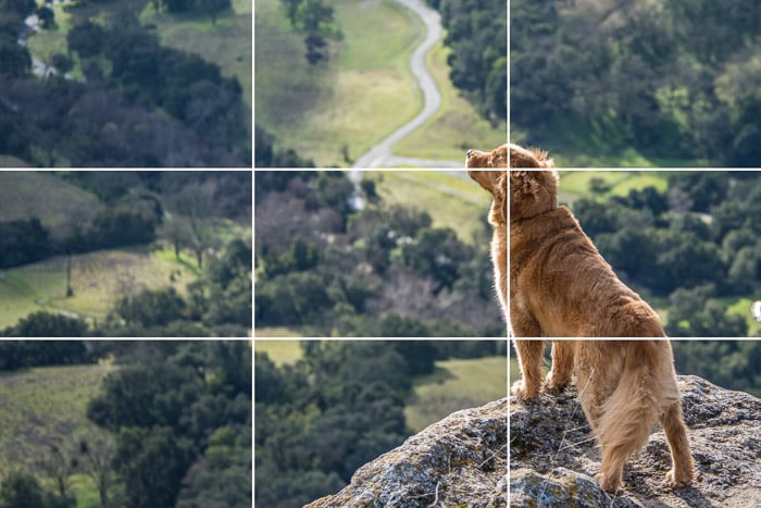
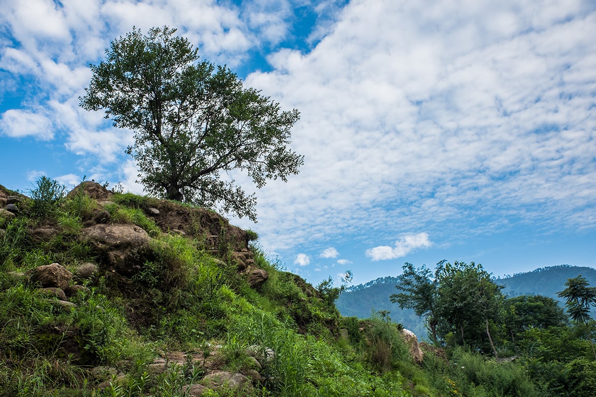
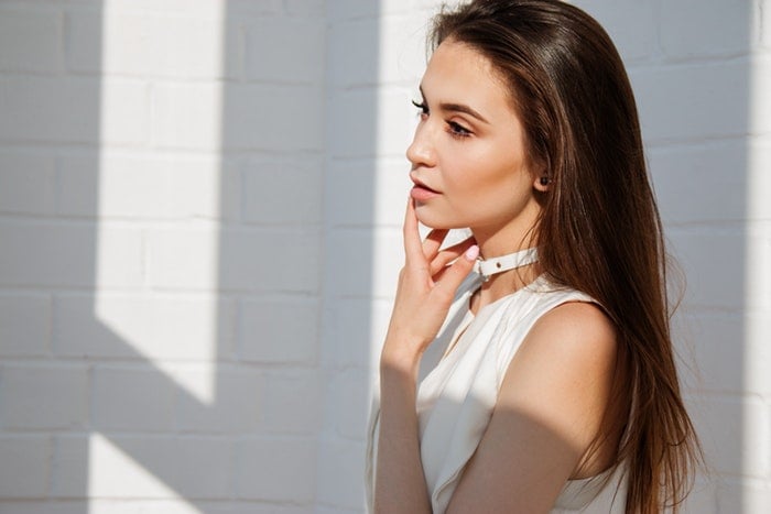
The Rule of Thirds
The rule of thirds is a basic composition technique that can improve the balance and harmony of your photos. To use it, imagine dividing your frame into nine equal rectangles using two vertical and two horizontal lines.
The four points where the lines intersect are where you should place your subject or other points of interest.
For portraits, position the subject’s eyes or face near one of the intersections. In landscapes, place key elements like mountains or boats close to the points.
If your image has two main elements, like a landscape with a sky, use the rule of thirds to make one element take up a third of the frame and the other two-thirds.
You can also use the rule of thirds when cropping images in post-processing software like Lightroom or Photoshop. This can help you remove distracting elements and focus the viewer’s attention on your composition.
With practice, the rule of thirds will become second nature and help you create more engaging images. If you’d like to learn more about the rule of thirds, we have an in-depth article that covers the topic in greater detail.
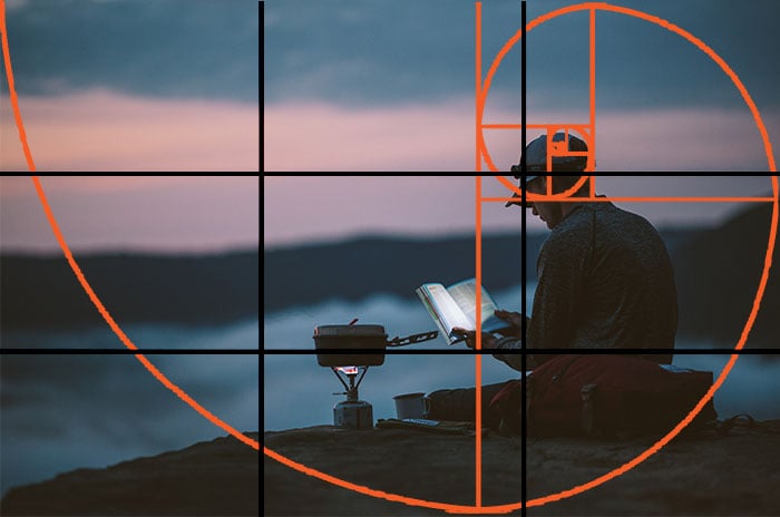
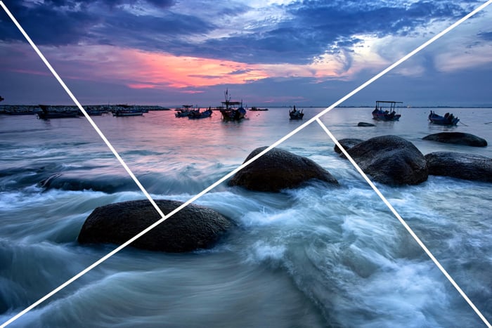
Golden Ratio
The golden ratio and rule of thirds are two popular composition techniques in photography. The golden ratio is a mathematical principle that creates aesthetically pleasing images, while the rule of thirds is a simpler guideline that also produces good results.
The golden spiral, based on the golden ratio, leads the viewer’s eyes around the image in a balanced way. It’s best used for travel images or scenes with movement, as it emphasizes dynamism and guides the eye along the spiral.
In contrast, the rule of thirds is better for minimal scenes with a clear focal point. By placing the subject at one of the intersecting points of a nine-grid, the image becomes more visually appealing. Ultimately, the choice between the golden ratio and rule of thirds depends on the scene you’re capturing.
Check out this in-depth article to learn more about golden ratio composition.
Aspect Ratio
The aspect ratio is the proportional relationship between the width and height of your image. 4:3, 3:2, and 16:9 are all common aspect ratios in photography, and your camera might offer several options as standard. But how do you know which aspect ratio is best for you.
The 3:2 ratio is one of the most popular in photography. Firstly, it’s the aspect ratio of 35mm film, so we’re accustomed to it from the analog days. It’s also the native aspect ratio of modern full frame cameras. But it’s also popular because it gives you visually pleasing and well-balanced images.
4:3 has become popular because it’s a good fit for many digital screens, such as laptops and tablets. The 1:1 ratio has become one of the most common thanks to Instagram and other social media platforms.
Learn more about aspect ratios for photography in our full article on the topic.
Subject Placement
Where you place the subject in your photos has a huge effect on your final composition. Use leading lines to draw attention to your subject or apply the rule of thirds to position them at points of interest. When photographing moving subjects, leave space in the frame for them to move into.
Contrasting colors, lighting, and textures can make your subject stand out. Side lighting adds drama while diffused light conveys calmness.
Experiment with different angles and perspectives to change the feeling of your image. Declutter the scene so every element has a purpose and leads the viewer’s eyes to your subject.
If you want to learn more about subject in your photos, we have a great in-depth article that explores the topic further.
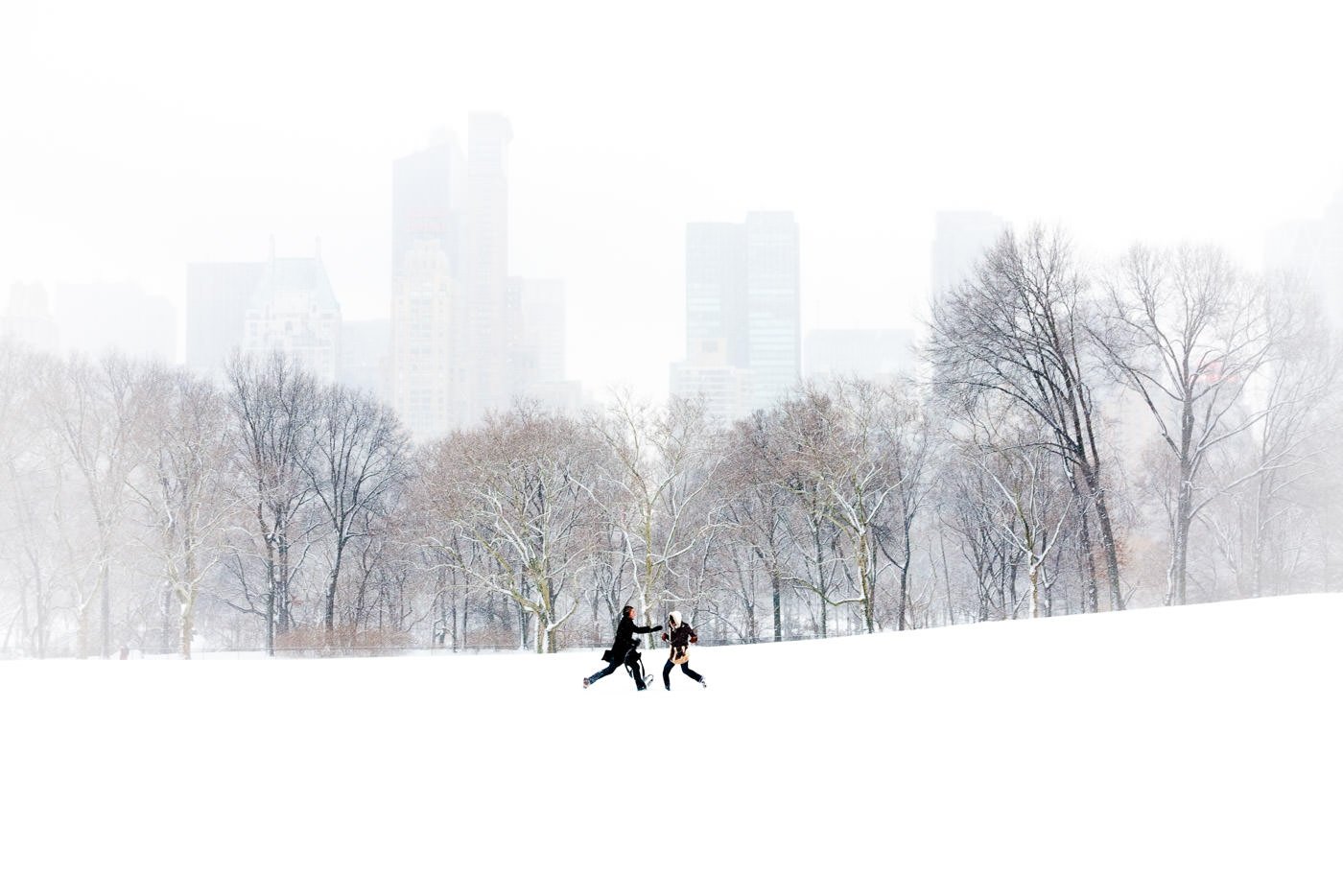
Foreground, Middleground, Background
Foreground, middleground, and background are important elements in photography composition. The foreground is the part of the image closest to the camera, the background is the part furthest away, and the middleground is in between. Using these elements adds depth and dimension to your photos.
Try placing your main subject in the middleground and adding objects in the foreground and background. This makes the image more eye-catching. You can also combine this technique with the rule of thirds, leading lines, and creative framing to strengthen your composition.
Landscape photographers often use narrow apertures like f/8 or higher to keep all elements in focus. But you can also use wide apertures for a blurred background effect. If you want to learn more about foreground, middleground, and background, take a look at our guide.
Visual Weight
Visual weight, also known as balance, is an important composition rule that can improve your photos. The stronger an element’s visual weight, the more it draws in the eye.
To achieve a balanced composition, pay attention to the visual weight of objects in the frame. You can manipulate visual weight using size, color, saturation, tone, contrast, texture, focus, light and dark areas, and by including people or animals.
Experimenting with symmetry, asymmetry, and juxtaposing contrasting concepts can also create interesting compositions with balanced visual weight. Visual weight is a powerful tool for creating compelling images that engage the viewer.
Depth
Adding depth to your photos can make them more interesting and engaging. One effective way to create depth is by using the rule of thirds composition technique.
Place your foreground subject to one side of the frame, leaving space for the background on the other side.
The distance between you and your subject, as well as the focal length of your lens, can also impact depth. A wider field of view and more distance from the subject will include more foreground, leading up to the main focus of the image.
Vertical lines, like trees or buildings of varying heights, can also create depth when placed at different distances from the camera.
To learn more about adding depth to a photo, explore these techniques in greater detail in our full blog post on the subject.

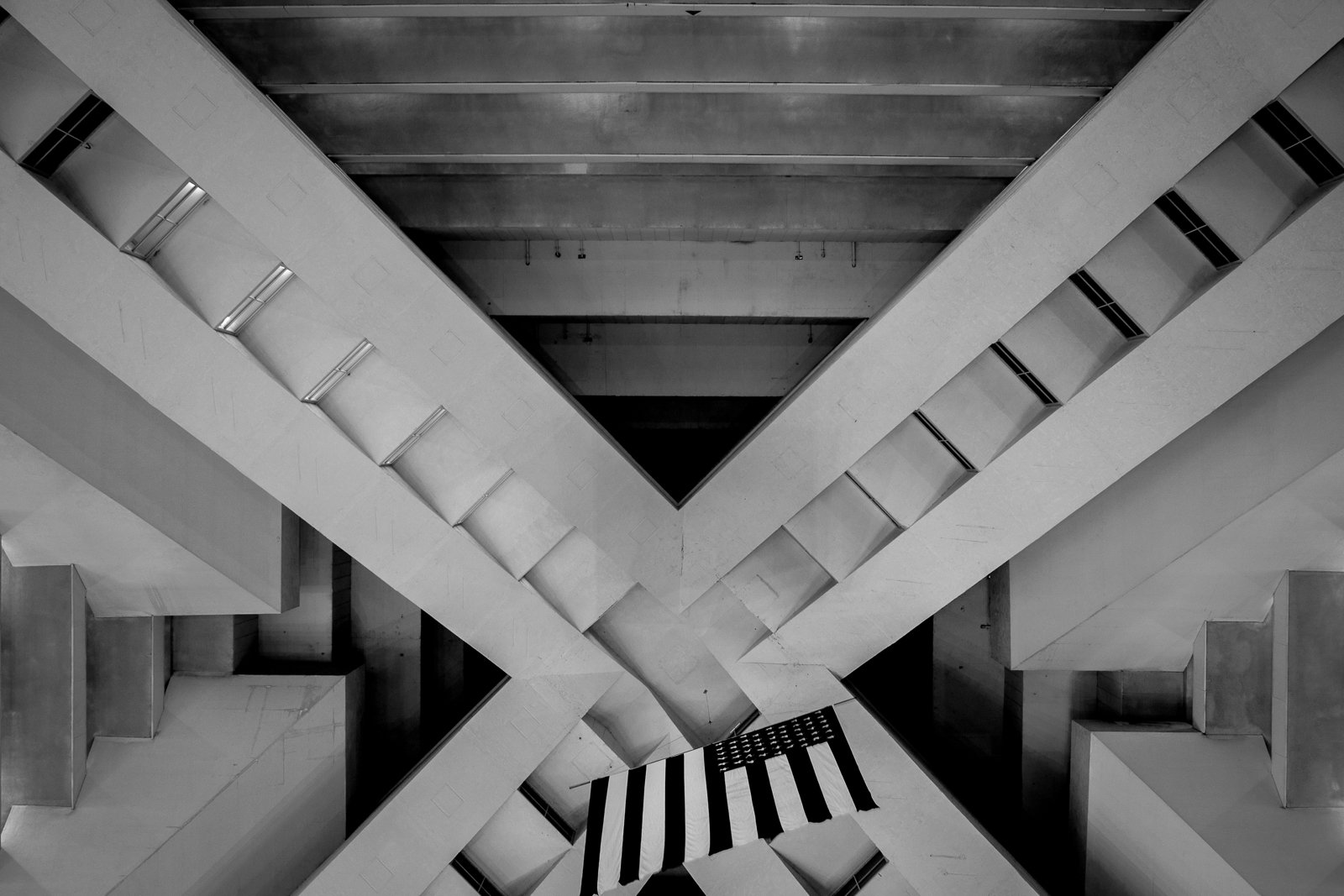
Symmetry
Symmetry in photography is a powerful tool for creating eye-catching images. By using symmetrical compositions, you can turn simple subjects into stunning works of art.
There are several types of symmetry to experiment with, including vertical, horizontal, radial, and reflective symmetry. Vertical symmetry is the most common, where an imaginary line drawn down the center of the frame creates two mirrored halves. Horizontal symmetry is often used in landscape photography, particularly when incorporating reflections in water.
To learn more about symmetry in photography and how to use it creatively in your own work, be sure to explore our in-depth guide.
Using Triangles
Triangles are a powerful tool in photography composition. They guide the viewer’s gaze across the frame, directing attention from one point to another. By grouping three points of interest, you encourage the viewer to explore your image longer.
Triangles can be used to portray stability, aggression, or instability. The inclusion of triangles is inevitable in most photos, but using them properly is key. Implied triangles are the most common, where the shape is suggested without the viewer noticing.
You can also use converging lines to create triangles, either inside or outside the frame. Upside-down or oddly oriented triangles create an unstable feeling. Triangles act like arrows, drawing the eye to a specific point.
Check out this article if you’d like to learn more about triangles in photography.
Contrast
Contrast is a key element in photography that can greatly improve your images. It refers to the difference between the elements that form a picture, such as changes in tones or colors.
There are various types of contrast, including color, tonal, and conceptual. Color contrast involves combining colors that are opposite on the color wheel, like red and green. Tonal contrast is the difference in brightness between the dark and light areas of a photo. Conceptual contrast is more abstract and involves putting together unexpected elements to tell a story.
You can use contrast to convey a particular mood in your images. High contrast photos have an edgy, strong feel, while low contrast images are dreamier. To learn more about contrast in photography, check out our in-depth guide.
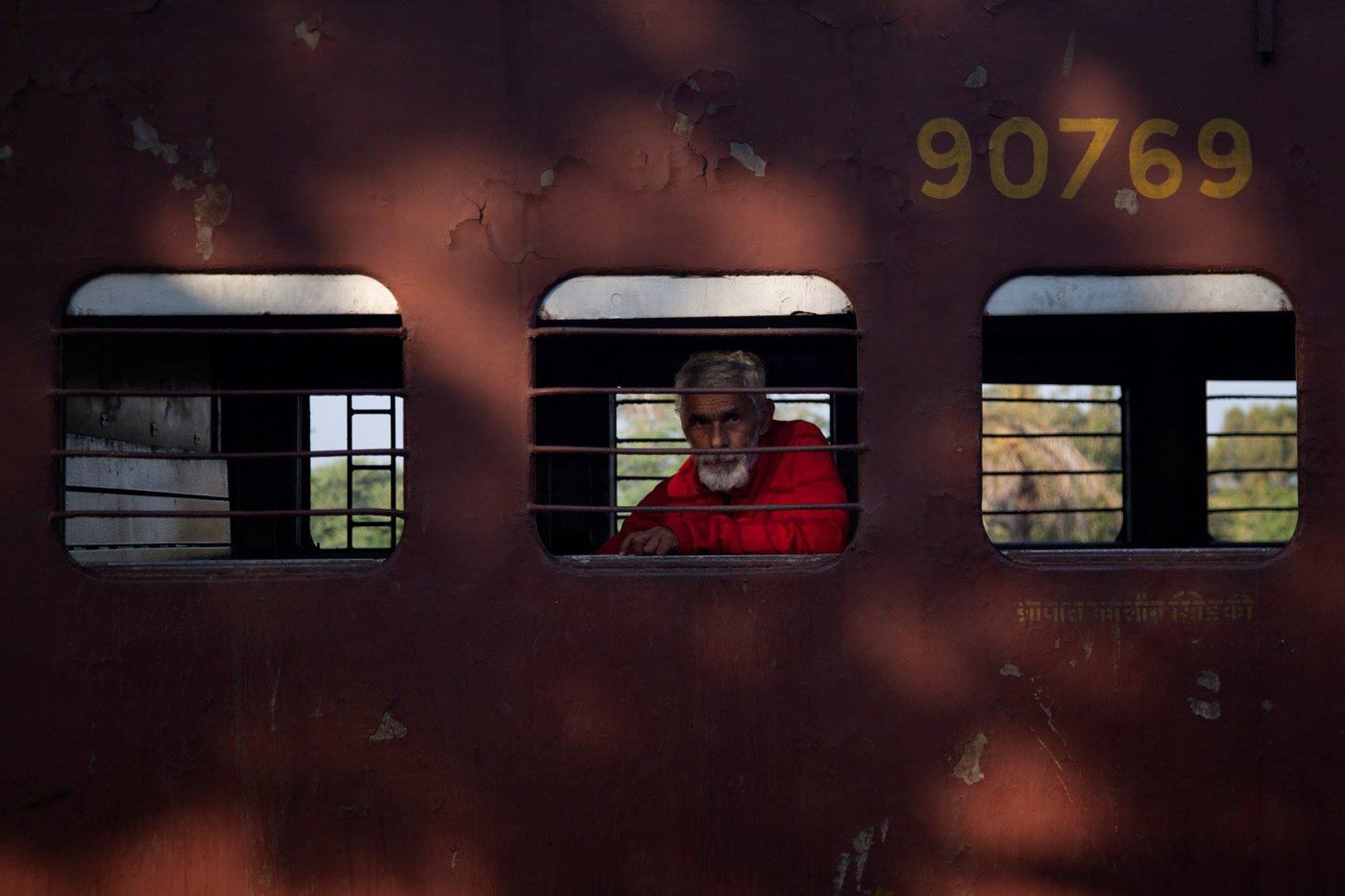
Using Framing
Framing is a powerful technique in photography that can elevate your compositions. It involves using elements within the scene to create a frame around your subject, drawing the viewer’s eye to the focal point.
Light and shadows are great tools for framing. By deliberately using light, you can highlight specific elements in your image while letting darkness hide others.
Doors, windows, and actual frames make excellent framing devices too. They can be used in the foreground, with the subject shot through them, or in the background to emphasize the subject in front.
Foreground elements like branches, bushes, or flowers are also effective for filling negative space and adding visual interest.
To learn more about framing photography, check out this in-depth guide.
Filling the frame
Filling the frame is a simple way to improve your photography composition. It means getting close to your subject so it takes up most of the image. This brings focus to the main subject and removes distracting background elements.
You can fill the frame by using a zoom lens or moving physically closer to your subject. A zoom lens lets you get close even if you can’t move closer. But moving your feet often leads to better angles and perspectives.
Learn how to fill the frame with this handy tutorial and guide.
Creating Balance
Balance in photography is about creating visual harmony through the placement and size of elements in a composition. Symmetrical balance is easily recognizable, with identical objects placed in the same way on both sides of the frame. While pleasing, it can sometimes be boring.
Asymmetrical balance is more interesting, as it involves tipping the balance to one side more than the other. This is achieved by considering the visual weights of subjects and their positioning. Smaller objects can balance larger ones when placed further from the center, creating a dynamic equilibrium.
Our full article on balance in photography is a great resource if you want to learn more.
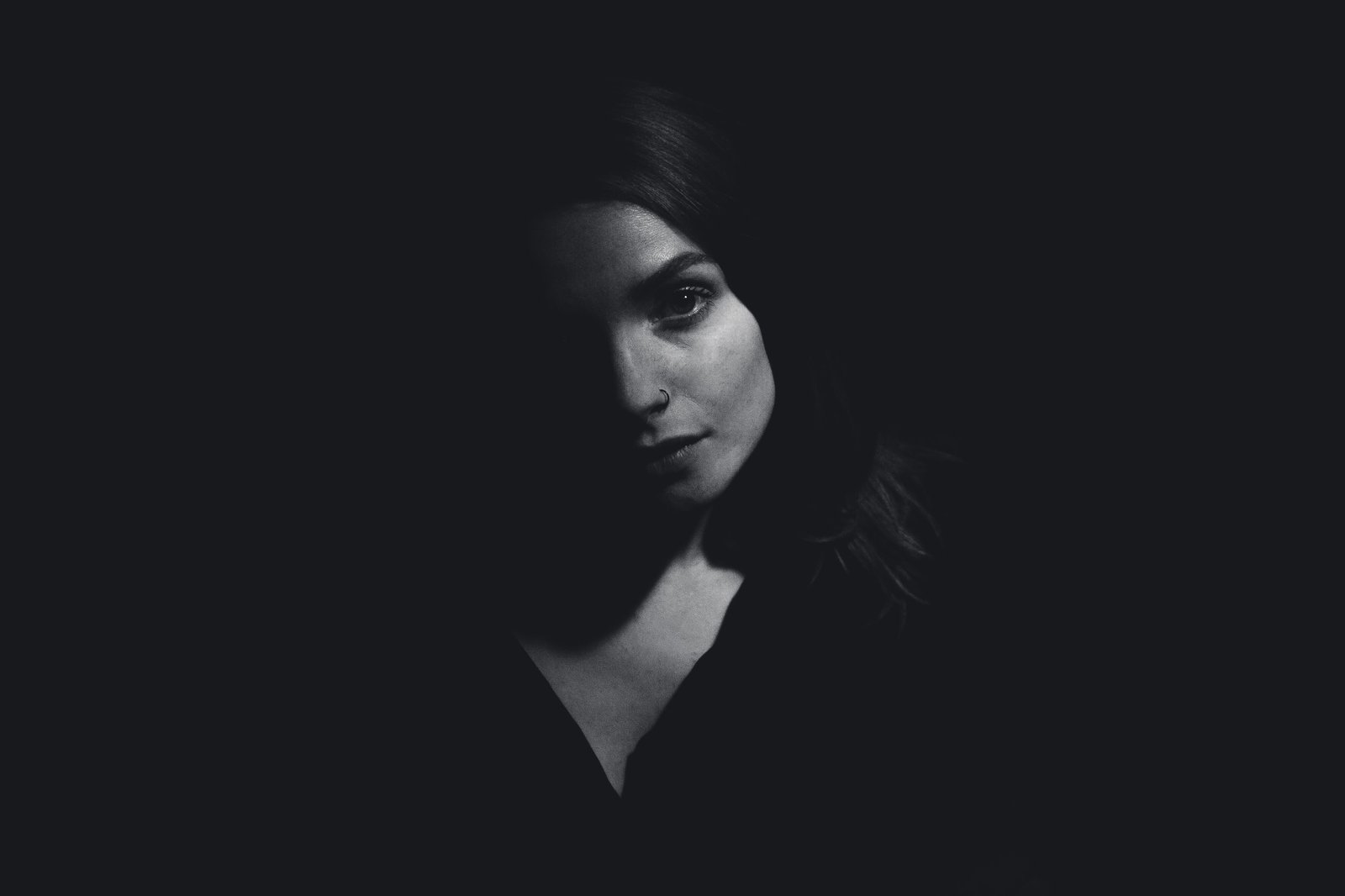
Shadow Photography
Shadow photography can add drama to your images if you know how to use light and shadows effectively. Shoot during the golden hour when the sun is low on the horizon, casting long, prominent shadows.
You can also experiment with harsh sunlight, which creates strong contrasts and sharp shadows that add dimension to architectural and geometric structures.
Artificial light sources like street lights and neon signs are great for shadow photography at night. Look for objects with distinctive silhouettes that cast easily recognizable shadows, such as bicycles, trees, and human figures.
Understanding the concept of chiaroscuro, the contrast between light and dark, can help you create dramatic photos with rich textures.
Master shadow photography using our in-depth article on the subject.
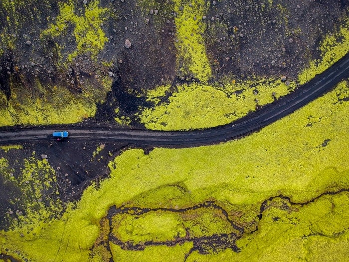
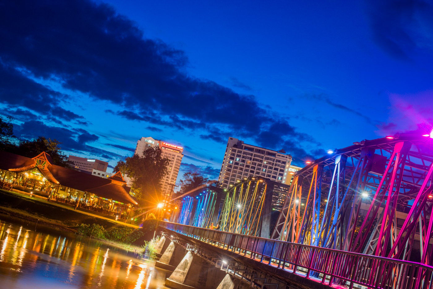
Using Lines in Photography Composition
Lines are a powerful tool for photography composition. Whether they’re road markings or structural lines on a building, you can use them to strengthen your compositions. You can use them to create symmetry or patterns, or you can use them to draw the viewers eye in a particular direction.
This section takes a closer look at how you can use lines in photo composition. You can also see our full, in-depth guide on how to use lines in composition in this link. You can also click on the following links to learn about each sub-topic in more detail.
Horizontal Lines
Horizontal lines are everywhere in photography, even in photos without straight lines. The frame itself is bound by horizontal or vertical lines. Using horizontal lines effectively can greatly improve your compositions.
Horizontal lines group elements together and establish details like direction and location. An unbroken horizon is boring, but intersecting it with a foreground object creates interest. Horizontal lines also give a sense of stability, especially when combined with strong materials.
Horizontal lines in photography are a powerful tool for improving your compositions.
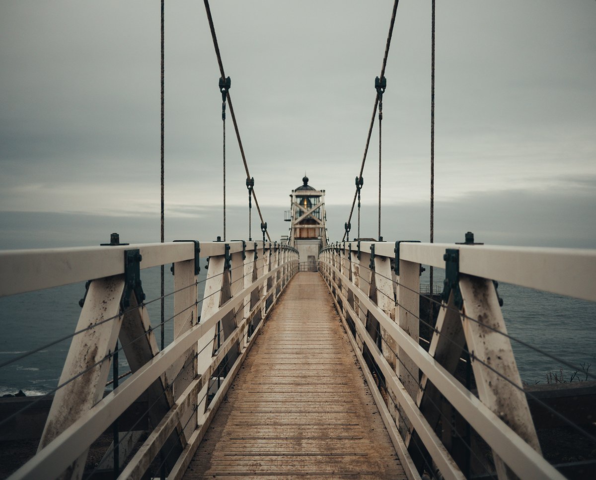
Leading Lines
Leading lines are one of the most effective compositional tools in photography. They guide the viewer’s eye through the image, creating a dynamic feeling. Leading lines can be vertical, parallel, curved, diagonal, or even strong horizontal lines.
To use leading lines effectively, first determine your focal point. Then position yourself so the lines lead the viewer’s eye to that point of interest. Avoid lines that lead out of the frame or don’t lead anywhere, as they can confuse the viewer.
Leading lines are especially useful in landscape and architecture photography, where lines appear in many forms, both in nature and in the surrounding infrastructure. By being mindful when composing the image and using leading lines to your advantage, you can create more coherent and powerful compositions.
Eyeline Photography
Eyeline photography is a powerful compositional technique that allows you to influence your viewers and create more impactful images. By using the implied line created by a person’s sightline, you can direct the viewer’s attention and create dynamic tension or triangles of interest within the frame.
You can also use eyelines as part of your composition, such as following a line in the background to create a triangle that focuses attention back on the subject. When there are multiple eyelines present, it can create a back-and-forth motion between subjects or encourage the viewer to observe the image for longer.
By anticipating your subject’s eyelines and being prepared, you can use eyeline photography to capture natural-looking photos with the visual weight in all the right places.
Perspective in Photo Composition
Perspective is one of the most important elements of photography composition. Every photo is shot from one perspective or another, so you’re using it without knowing it.
But learning about perspective and using it in a more considered way with elevate your photography to new heights. You’ll be able to influence the viewers emotions and show them familiar subjects in a new light.
You might be familiar with bird’s eye view or worm’s eye view, but there are many more perspective techniques you can harness for more impactful compositions.
Our full guide to perspective in photography is the best place to start if you want to master the subject. We do cover some aspects of perspective below, but that article has everything you need.
High Angle Photos
High angle photos offer a unique perspective that can add interest and drama to your images. By shooting from above, you can capture familiar subjects in a new and exciting way.
Even if your photo includes a horizon, you can still create a compelling high angle shot by keeping the horizon at the top of the frame and ensuring the rest of the image is visually engaging.
The orientation of your high angle photo can also impact its overall feel. Portrait orientation can create a sense of height and instability, while landscape orientation provides a more balanced composition. Experiment with both to see which works best for your subject.
You will find loads of high angle photo ideas in our in-depth article on the topic.
Low Angle Photos
Taking low angle pictures is a great way to add drama and interest to your photos. To capture a low angle shot, get down low and shoot upwards towards your subject. This perspective makes your subject look larger and more powerful.
Look for interesting foreground elements to include in your low angle photos. Shooting through grass, flowers, or other objects can add depth and texture to your images.
Experiment with different angles and distances from your subject to find the most compelling composition. Low angle photography is a fun and creative technique that can help you capture unique and eye-catching images.
Dutch Angle Photography
Dutch angle photography is a creative technique that involves tilting your camera to create a sense of unease or dynamism in your photos. It’s a great way to add visual interest to a wide range of subjects, from street scenes to architecture.
To use the Dutch angle effectively, tilt your camera deliberately to create a strong diagonal line from one corner of the frame to the other. This can make vertical or horizontal lines appear more dramatic. You can also use a Dutch tilt to fit more into your frame when shooting in tight spaces.
When photographing common subjects, a Dutch angle can provide a fresh perspective and make the ordinary look more interesting. By experimenting with different degrees of tilt, you can find the most effective angle for each situation.
If you’d like to learn more about dutch angle photography, the best advice is to get out there and try it!
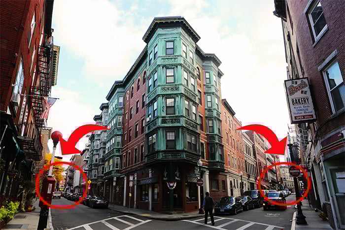
Two Point Perspective
Two point perspective is a powerful technique in photography that creates an illusion of depth. It involves using two vanishing points on the horizon line, with lines leading from these points toward the subject in the center of the frame.
This technique is especially useful in architectural photography, where geometric shapes and lines are abundant.
To create a two point perspective photo, find a suitable location with straight lines leading toward your subject. Stand at a spot where the subject is in the middle and the lines lead outward from the horizon.
Compose the shot with the subject centered and the vanishing points either on the horizon line or in the corners of the frame.
Mastering two point perspective can take your photography to new levels, emphasizing your subject and adding a sense of depth to your images.
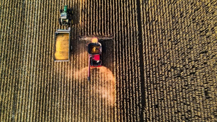
Color in Photography Composition
Colorful photos always attract attention. But if you consider color another part of composition and use it wisely, you can use color to add new meaning to your images.
Even learning the basics of color theory can help you create more powerful photographs. Understanding concepts like complimentary or analogous colors gives you more control over your compositions.
See our full guide to color theory in photography in this article. We have some color-related sections to follow, but that article is the best resource if you’re interested in color for composition.
Complementary Colors
Complementary colors are opposite each other on the color wheel. They create the strongest contrast and a vivid, energizing effect that catches the viewer’s attention in a natural way. The most common complementary color pairs are red and green, yellow and purple, and orange and blue.
Using complementary colors in your photography is a powerful way to make your images pop. The contrast between the colors will draw the viewer’s eye and create an engaging, visually appealing photo. For a more balanced look, you can use different levels of saturation for each color.
Complementary colors are a fundamental tool for creating stunning photographs.
Analogous Colors
Analogous colors are three or more colors that are next to each other on the color wheel. They usually look good together because they share some common hues. Using analogous colors in your photos can create a harmonious and pleasing image.
Analogous colors are easy to find in nature, especially in macro photography of flowers and insects. Landscape photographers often use analogous color schemes without even realizing it. You can also find analogous colors in urban settings, like on city streets.
When using analogous colors, it’s important to keep your images interesting and well-balanced. Pay attention to composition and lighting, not just the colors. Take a look at our article to learn more about analogous colors in photography.

Color Blocking
Color blocking is a bold photography technique that uses two or three colors to create a striking image. The colors are used in large blocks, creating a simple but powerful color scheme that jumps out at the viewer. Color blocking uses color as a key compositional element, sometimes even making it the subject of the photo.
Photographers often mix complementary colors from opposite sides of the color wheel for maximum impact. Street photography, flat lays, food photography, product shots, fashion, minimalism, and portraits can all benefit from color blocking techniques. Look for colorful buildings, use vibrant props and backdrops, or incorporate the natural colors of your subject matter.
If you’d like to learn more about color blocking in photography, we have a detailed guide that dives deeper into this exciting technique.
Advanced Concepts in Photography Composition
We’ve covered all the basics of photography composition, so now it’s time to look at more advanced concepts, theories, and techniques of composition.
Our full article on advanced photo composition ideas is the best resource if you want to take a deep dive into the subject. Or you can use the sections below as an introduction before you get stuck into the dedicated article.
Rhythm in Photography
Rhythm in photography brings structure and stability to your images, like the beat of a drum. Elements repeat or echo throughout the frame, creating patterns that guide the viewer’s eye. These rhythmic elements can be shapes, lines, or even subjects positioned at different points.
Regular rhythm features identical elements repeating at even intervals, while random rhythm has elements that appear irregularly.
Alternating rhythm uses two different rhythms that work together or clash, and progressive rhythm forms patterns that lead the eye in a clear direction. Undulating rhythm is common in landscapes, with soft, rolling shapes creating a gentle harmony.
Rhythm is a powerful tool for rhythm in photography that can strengthen your composition in countless ways, from street photography to portraits and beyond.
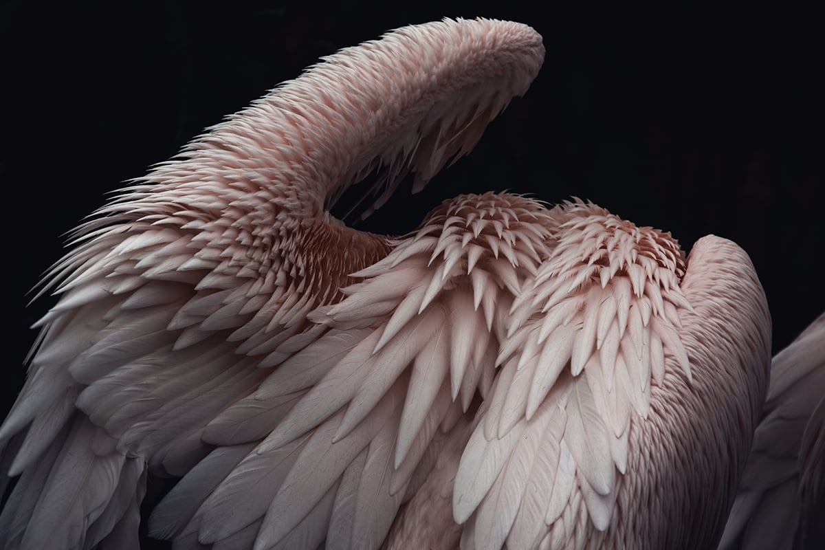
Form
Form photography is all about making subjects stand out as if they’re 3D objects. It creates a line between 2D and 3D by using the right kind of light, angles, colors, and depth.
To take stunning form photos, experiment with side light to emphasize your subject’s shape and textures. Use a large aperture to separate your subject from the background and create depth.
If your results don’t look eye-catching enough, try converting them to black and white to add emotion and put the spotlight on specific tones.
You can read our in-depth article to learn more about form in photography.
Negative Space
Negative space is the area around your main subject in a photo. It creates a relationship between the subject and the background, allowing the subject to stand out. Using negative space well can make your photos feel dramatic and draw the viewer’s eyes to the subject.
The space doesn’t have to be empty. It can contain objects or patterns, but they should blend into the background and not compete for attention. This directs the focus to the main subject.
Paying attention to both the subject and background will help you use negative space in photography to create compelling compositions.
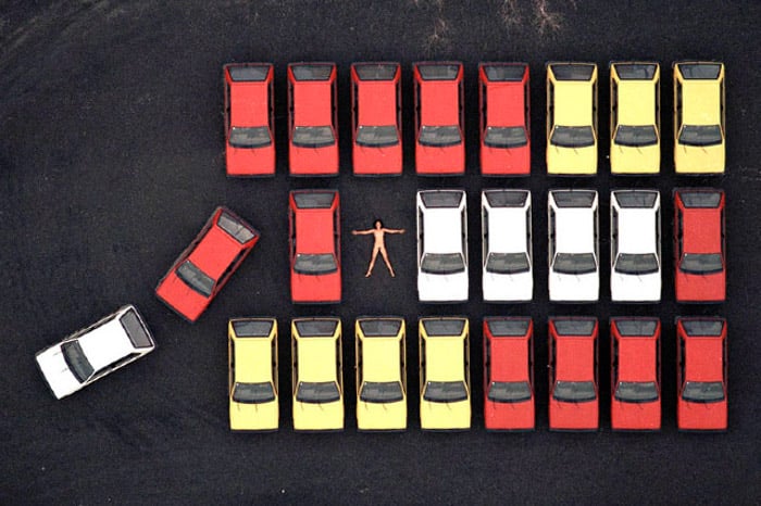
Juxtaposition
Juxtaposition in photography is all about positioning contrasting elements to create a striking image. It can be as simple as showing the difference between big and small objects, or as complex as conveying social commentary through wealth and poverty.
Colors like black and white are great for juxtaposition. Contrasting shapes, lines, and patterns can also make an image pop. Even the subjects themselves can be juxtaposed, like a young child taking on an adult role.
Juxtaposition examples are everywhere, from architecture to technology to people. The key is to find those contrasts and capture them in a way that tells a story. If you want to see more creative juxtaposition examples, there are plenty to inspire your own photography.
Dynamic Tension
Dynamic tension is a powerful tool for creating dramatic photos. It involves using diagonal lines, paths, and body language that move in opposing directions. This creates a sense of tension and pulls the viewer’s eye across the image.
To identify dynamic tension, look for multiple diagonal lines moving away from each other, paths that move in opposite directions, and contrasting body language between subjects. The strongest dynamic tension comes from the widest angles between intersecting diagonals, ideally around 90 degrees.
Framing and rotation also play a role in enhancing dynamic tension. Experiment with different angles and compositions to find the most dramatic effect. However, use dynamic tension sparingly in your portfolio to avoid overuse.

Golden Triangle
The golden triangle is a composition technique that uses diagonal lines to form right-angle triangles. This rule is similar to the rule of thirds, but the frame is divided differently. The main subject should be placed at the intersection of these triangles.
Using the golden triangle can add a dynamic feel to your photos. To compose a shot using this technique, imagine a diagonal line from one corner to the opposite corner. Then, draw perpendicular lines from the other corners to the diagonal line, forming triangles.
Golden triangle in photography is a great way to experiment with composition and create visually striking images.
Composition Tips for Genres of Photography
Most photography niches have particular demands when it comes to equipment, or lighting, or exposure. And composition is no different. We’ve put together some guides to a few of the more common niches where composition has to be mastered.
Food Photography
Food photography composition is all about arranging elements to keep the viewer interested. Use angles and orientation that complement the food, like shooting tall foods straight-on to emphasize their height and layers. Choose one main subject and a few supporting elements to create a focused composition.
Create a focal point to draw attention to the main subject, using light, color, isolation, or contrast. Negative space provides balance and breathing room around the subject. The rule of odds suggests using an odd number of elements, like three or five props, for a sense of harmony.
Place the main elements using the rule of thirds grid or visualize the composition with other cropping guides. The golden ratio creates flow and movement in a curved line, while the golden triangle moves the eye between points in an intentional way.
By applying these food photography composition techniques, you can create enticing images that draw in the viewer.
Architectural Photography
We have a collection of tips for better architecture photography composition.
Use a wide-angle lens to capture the bigger picture and show the building in its environment. Add leading lines to create a point of interest and direct the viewer’s attention. Include a human or other familiar object to give a sense of scale.
Focus on the details for a unique perspective. Look for reflections to add symmetry and contrast. Shoot during blue hour to capture buildings with artificial lights.
Create panoramas to capture large structures. Experiment with different angles for dynamic compositions. Incorporate patterns and repetition to add rhythm. Include people to make the photo more authentic and relatable.
To learn more about architecture photography composition, check out this in-depth guide.
Street Photography
Street photography is all about capturing life and telling a story with your images. It’s a great way to practice your composition skills because you have to shoot what you see without the luxury of staging shots. This forces you to look at the world and people differently, creating opportunities for amazing compositions.
Use the rule of thirds by mentally dividing the image into nine equal parts. Place points of interest on the intersections to create balance and impact. Include negative space to emphasize the subject and add mystery.
Explore depth of field using aperture settings. A shallow depth of field draws attention to details, while a deep depth of field keeps more of the image sharp. Use leading lines like roads, shadows, and gestures to guide the viewer’s eye.
Incorporate street photography composition elements like texture, patterns, framing, perspective, color, and black and white to create compelling images.
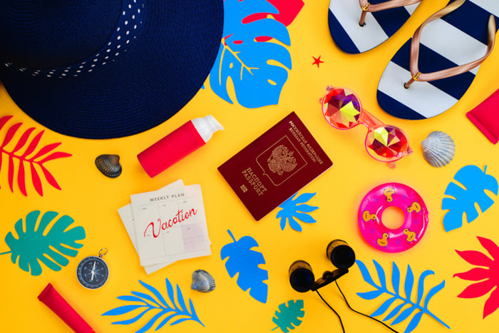
Travel Photography
Improving your travel photography composition is key to capturing the beauty of a destination. The rule of thirds is a basic technique that can add interest to your photos. Place important elements on the intersecting points of a 3×3 grid for a balanced composition.
Symmetry is another useful composition tool. Center the axis of symmetry in one direction, like a reflection, and place it off-center to direct the viewer’s eye. Leading lines, such as paths or fences, can also guide attention to your main subject.
Framing your subject with windows or arches provides context for spectacular views. Color is a powerful element that can lead the eye and balance the composition.
Changing your perspective by moving around or getting closer to your subject can make a big difference in your photos. Including people or familiar objects can help show the scale of large spaces or monuments.
With practice, these travel photography composition techniques will become second nature.

Landscape Photography
Composition is key in landscape photography. The rule of thirds is a great starting point, but don’t be afraid to explore other techniques like the golden ratio and golden triangle.
Symmetry can create striking images, especially when combining natural and manmade elements. Including an interesting foreground helps guide the viewer’s eye through the scene.
Framing your shot through natural elements like trees or windows adds depth. Simplify busy scenes by removing distracting elements or improving your landscape composition in post-processing.

Fashion Photography
Fashion photography requires great composition techniques while showcasing the subject’s clothing. The rule of thirds is a popular composition technique that involves dividing the frame into nine equal squares and placing the subject on one of the intersecting points.
Centering the subject can also work well for fashion portraits, but it’s important to consider the background and use elements to balance the composition.
Counterbalance involves using another component in the frame to create harmony when the subject is placed in an unusual position.
Telling a story through the images is also important in fashion photography, as it grabs attention and compels viewers to look at the image longer. Props can be used to create context and add dimension to the composition.
To learn more about fashion photography, check out this in-depth guide.
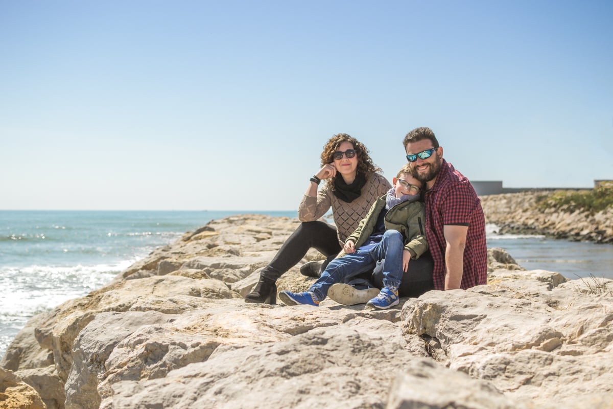
Family Portraits
Composing family portraits can be one of the trickiest assignments, and we have some tips to help you.
Use the rule of thirds to place your subjects along imaginary lines that divide the frame into thirds. This creates a balanced, natural-looking composition. You can also look for symmetry in the environment, like stairs or bridges, and position your subjects there.
Framing the family with elements like doors, trees, or windows draws attention to them. Be mindful of the horizon line so it doesn’t cut through people’s necks. Leaving negative space around the family keeps the image simple and distraction-free.
Change your perspective by shooting from different angles and heights. Cropping is a useful tool, but avoid cropping at joints or cutting off heads at the neck. Capture movement by giving the family space to move into the frame.
Most importantly, don’t be afraid to break the rules to get the perfect family portrait!
Some Masters of Composition to Inspire You
If you feel in need of inspiration, then take a look at some of the photographic greats. There is something to learn about composition from any great photographer.
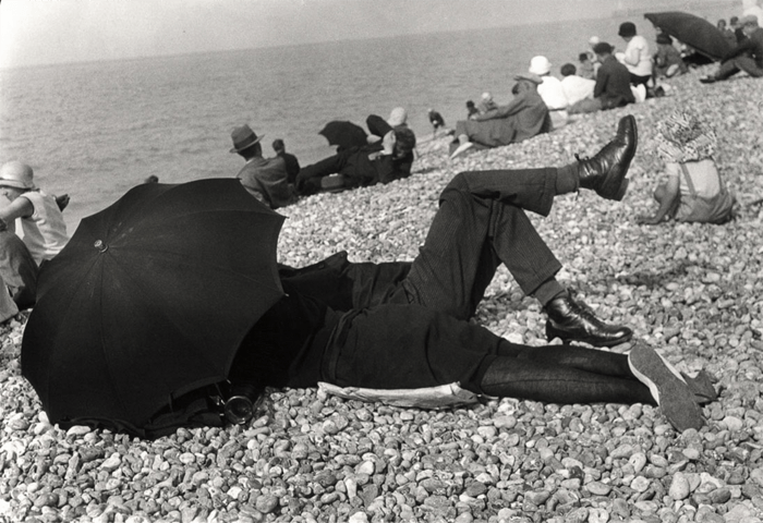
Henri Cartier-Bresson
Henri Cartier-Bresson was a master of composition. He used figure-to-ground composition to make his subjects stand out by creating contrast between the subject and background.
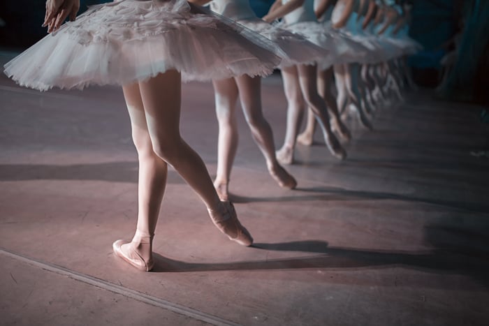
Repetition was another technique he used to strengthen his compositions, like in his photo of the Bolshoi Ballet School where the repeated ballerinas and ballet barre lead the viewer’s eye through the frame.
Cartier-Bresson also used shadows to add interest and meaning to his photos. Diagonals and the golden triangle were other tools he used to draw attention to the most important parts of the image.
The Fibonacci spiral helped him create balanced, harmonious compositions.
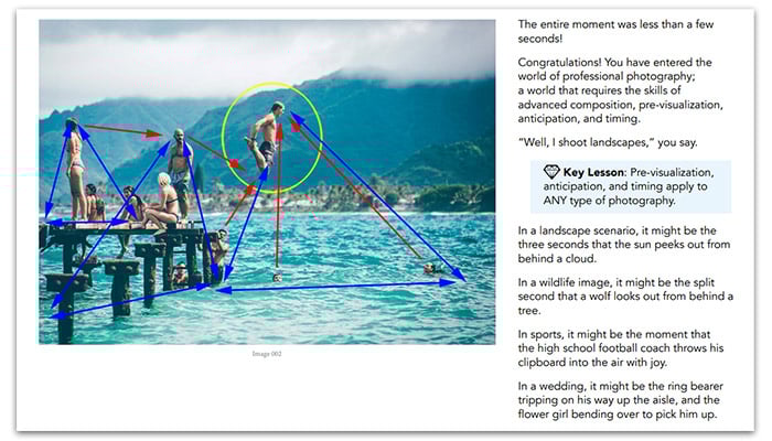
Perhaps most importantly, Cartier-Bresson had a knack for capturing the decisive moment. His photo of a man jumping over a puddle is a perfect example of how he could capture a fleeting moment that tells a story.
To learn more about Henri Cartier-Bresson’s composition techniques, check out this in-depth article.
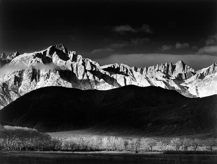
Ansel Adams
Ansel Adams was a master of landscape photography. He spent hours finding the perfect location and time to capture stunning images. Adams knew his camera so well that photography became instinctive for him.
Adams often placed the horizon high in the frame to emphasize the landscape’s scale compared to the sky. He also used post-processing techniques like dodging and burning to perfect his prints, sometimes spending an entire day in the darkroom to produce a single image.
To dive deeper into the lessons we can learn from this iconic photographer, Ansel Adams provides valuable insights.
Photzy Composition eBook Review
Improving your photography composition skills is important. Photzy’s Advanced Composition ebook can help you learn these skills quickly.
The ebook focuses on three key areas: pre-visualization, anticipation, and timing. It also covers 12 advanced composition tools like balance, lines, and depth of field.
Each chapter ends with a shooting assignment and quiz to help you practice. If you want to learn more about advanced composition, Photzy’s Advanced Composition ebook is a good option.