In this article, we will explore Color Grading in Lightroom and Adobe Camera Raw. With just a few colored circles and sliders, it doesn’t look like much. But this Lightroom technique is deceptively powerful.
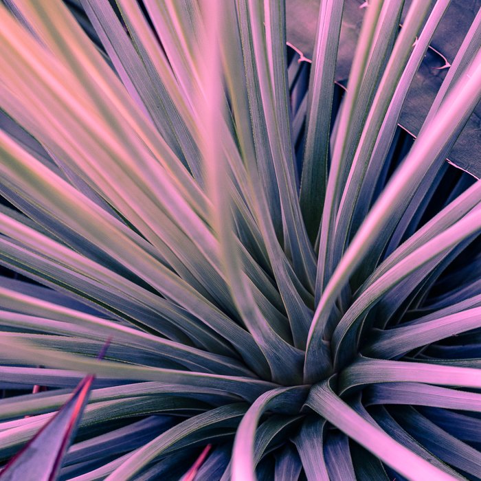
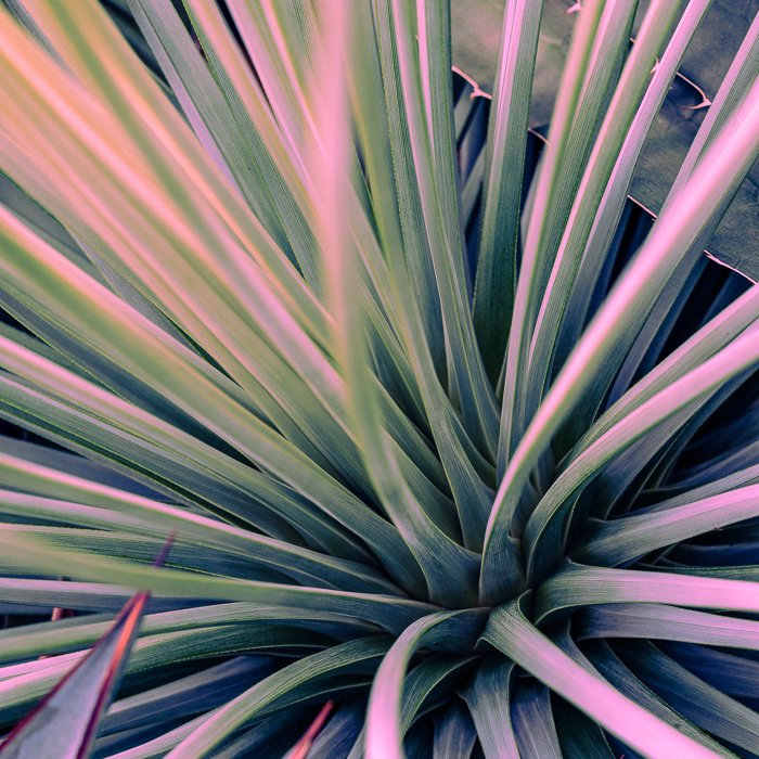
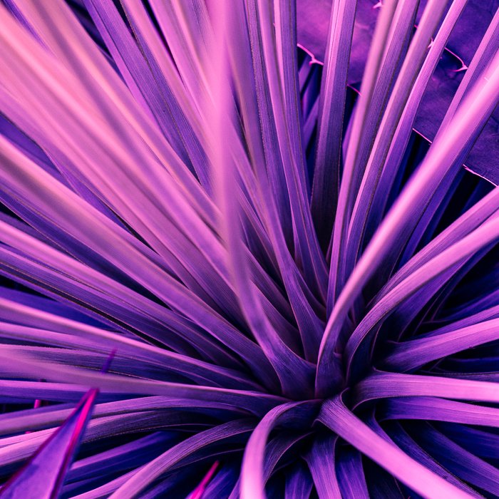
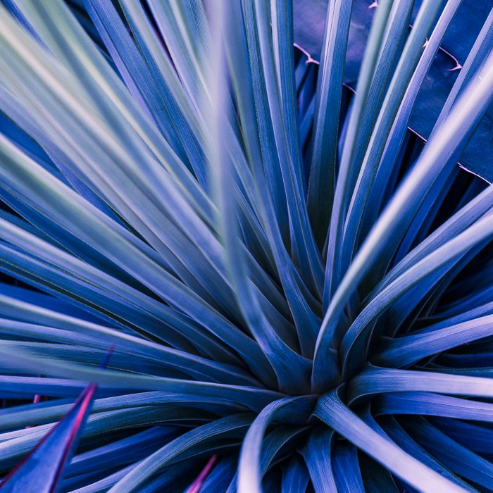
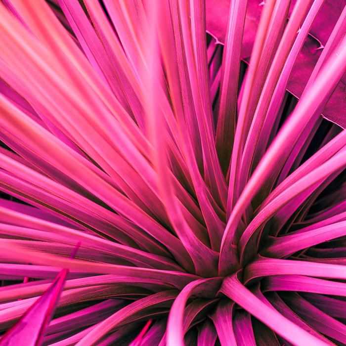
Once you know how to use the Color Grading tool in Lightroom, your post-processing creativity will expand to whole new levels. Consider these images before and after color grading.
What is Color Grading in Lightroom?
There are a lot of ways to change the colors in your image. Lightroom’s Color Correction tool fixes optical halos. White balance makes your image warmer or cooler. Or you can use the HSL/Color panel and re-tint individual colors. Blues are more purple or reds more orange. All these Lightroom color correction tools change the colors across your image.
In color grading photography or color toning, you individually add color to a range of light. Highlights can hint at one color while shadows are tinted a different color. Many color grading Lightroom presets set a particular mood.
Adding yellow to highlights and blue to shadows is a popular combination. Blue and yellow are complementary colors, found opposite on the color wheel. These colors go together well.
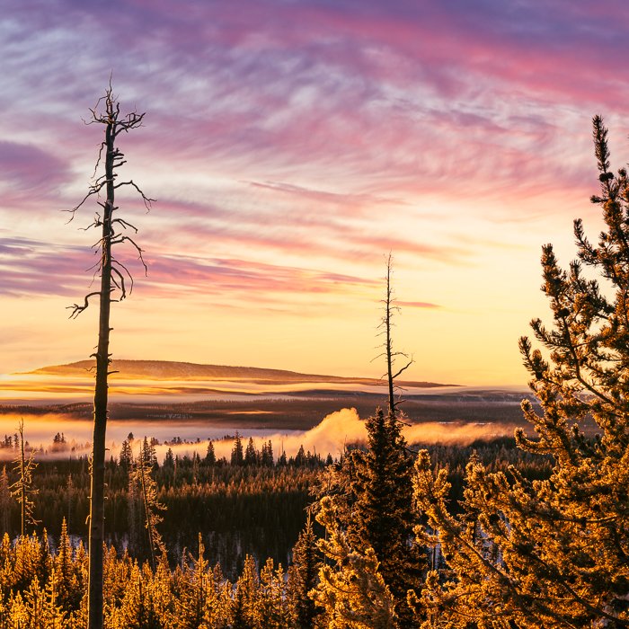
Sunrises and sunsets often have yellows, oranges, and reds in the light. The colors next to each other are analogous. They also go well together. You can use Color Grading to emphasize these tones. You can make the highlights more yellow, emphasize oranges in the midtones, and add a bit of red to the shadows. You do not need to add much for the colors to stand out.
If you want to adjust a specific color in your image, use the HSL/Color panel. If you wish to change the color of light, use Color Grading.
Color Grading vs Split Toning
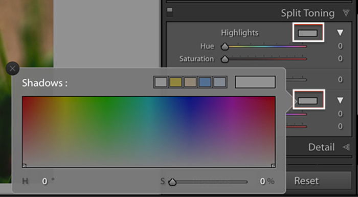
In 2020, Adobe replaced the Split Toning tool with the Lightroom Color Grading tool. The tools are similar in what they do. Split toning divides light two ways into highlights and shadows. Color grading separates light three ways, adding midtones.
The Split Toning panel was organized differently, with the colors along a spectrum. In theory, the linear color graph wraps around like a circle. Notice that red tones appear on both ends of the spectrum. The colors in the Color Grading tools are on a color wheel. This helps you choose colors that go well together.
How to Use Color Grading in Lightroom
Let’s start with a tour of the Color Grading tool in Lightroom. Then we can use it to add color to an image.
Step 1. Open the Color Grading Panel
The Color Grading tool is the same in Lightroom Classic, Lightroom CC, and Adobe Camera Raw (ACR):
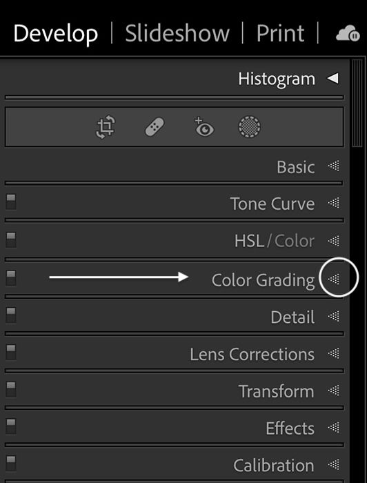
- In Lightroom Classic, Color Grading is in the Develop module, under the HSL/Color panel.
- In Lightroom CC, the tool is in the Color panel.
- In ACR, Color Grading is under the Color Mixer.
If you still see the Split Toning panel in your menu, upgrade to the newest version of Lightroom.
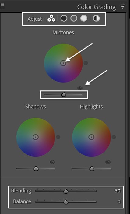
Color Grading Panel
In the Color Grading panel, you have five circular icons across the top and three main color wheels with a few sliders below.
The icons across the top let you edit one color wheel at a time. From left to right, the icons are three-way, shadows, midtones, and highlights. There is also a global color wheel option. This larger tool lets you choose your colors more precisely.
The separate color wheels below change the tint of your shadows, midtones, and highlights. Sliders under the color wheels control luminance. The eye icon toggles color grading on and off. This lets you see the change in your image. The Blending and Balance sliders control how the three light ranges interact.
Step 2. Choose a Color Grade
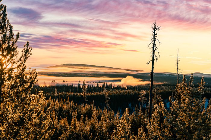
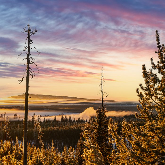
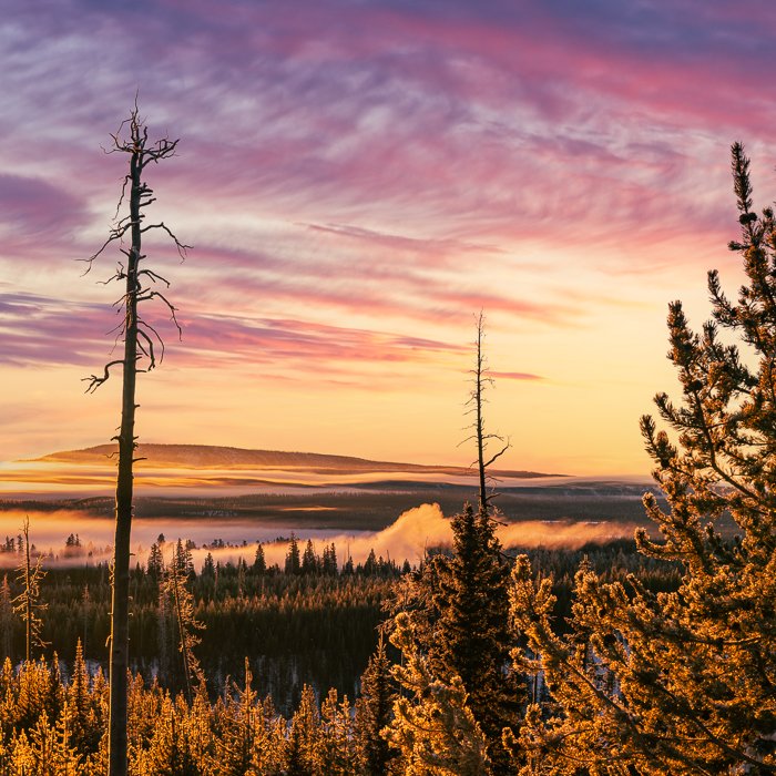
You can choose any colors you want to tone your image. For this sunrise, I used color grading to emphasize the tones already in the scene. I made the sun rays warmer by adding yellow and cooled down the forest shadows with a little blue. I added a little more pink to the clouds and brought the color into the foreground by adding it to the midtones. The subtle changes make the tones pop.
Setting Colors
To set a color, grab the circular target from the center of the color wheel. Drag it towards the edge. The further out you go, the more saturated the color.
As you move the target around the wheel, the colors in your image change. A dot appears outside the wheel to show you exactly what color you select. Double-click in the center of the wheel to reset the tint.
The target is very sensitive and moves quickly. Hold the Option key (Alt key on a PC) to slow it down. You can also use sliders to choose your colors. Click on an icon across the top of the panel to isolate the color wheel you want to use. Click the triangle icon to reveal the Hue and Saturation sliders.
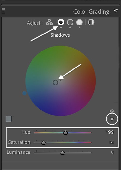
Hold the Shift key to change only the saturation. The Command key (Ctrl on a PC) locks onto saturation to let you change only the hue.
Try moving the target to the outside edge of the wheel so you can see the color clearly. Once you decide on a tint, pull the target towards the center to reduce the intensity. A little color grading goes a long way.
You can be very precise and use color theory to choose the colors in your image. Or you can let your eye guide you.
Step 3. Adjust Luminance Sliders
Once you make a color selection, move to the Luminance sliders under each wheel. Luminance sliders are new to Color Grading.
The Luminance slider brightens or dims the tones in the selected light range. For instance, moving the slider under the Highlights wheel to the right lightens the brightest highlights. Moving the slider to the left darkens the lightest areas. The Luminance under the Highlights wheel does not affect midtones or shadows. Lightening reduces the intensity of the color.
These two images have the same color grading. In the right-hand photo, I brightened the highlights and midtones and darkened the shadows. But we are not done. There are more tools that help fine-tune the look…
Step 4. Adjust the Blending Slider
Blending lets you control how gradual or abrupt the color transitions are. By default, the slider is in the middle at 50. There is some overlap between highlights and midtones, midtones, and shadows.
To blend the colors more, move the slider to the right. This pulls colors into a broader range of light. To reduce the amount of blend, move the slider to the left.
Here’s an exaggerated example so you can see the change. The image on the left is the original. I color graded the right photo with blue shadows and yellow highlights at 100% saturation. I left Blending at 50 and Balance at 0.
Now, let’s change the Blending slider. The color grading stays the same. In the first image, I changed the Blending slider to 0 to isolate the colors. In the second, I set the slider to 100 to increase color overlap. Notice that the blues and reds combine to create purple.
Step 5. Adjust the Balance Slider
The Balance slider changes the division of luminance across your image. Move the slider to the right if you want to focus on highlights. More pixels take on the tint you have set in the Highlights wheel. Move the slider to the left if you wish to treat more pixels as shadows.
In the first image, I changed the Balance slider to -100. More tones take on the blue of the shadows. In the second, I set the slider to +100 making more pixel highlights.
Step 6. Adjust Global Color Grading
The icons across the top of the Color Grading panel isolate the color wheels. But there is one extra. The icon on the far right is for Global color grading. Use this tool to add a color tint to your entire image. For instance, if you want to add a sepia tone to a black-and-white image.
Color Grading—Lightroom vs Photoshop
Lightroom is one of the best tools for Color Grading. But you can also color grade in Photoshop by adding a Color Balance adjustment layer. You can use the ACR filter if you primarily photo edit in Photoshop. Color Grading in ACR works just like the Lightroom tool. But for many photographers, the process is not as intuitive as the Lightroom color wheels.
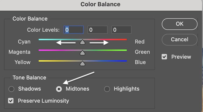
How to Color Grade in Photoshop
Go to the Image drop-down menu and select Image > Adjustments > Color Balance. You can choose Shadows, Midtones, or Highlights in the Color Balance window. Use the three sliders to add a unique color profile to the light. The three sliders in the Color Balance adjustment panel replace the color wheels used in Lightroom and ACR.
Conclusion
Color Grading in Lightroom is a powerful photo editing tool. It sets the mood of your image. The Lightroom tool is easy to use and packs a lot of creative punch. With a few spins of the color wheels, your photos take on a whole different look. Ideally, you want the toning to be subtle. But if you like extreme toning, go for it! Color Grading gives images personality.
Try out the Creative Photography Cookbook e-book to create technically perfect and beautiful images!