Are you looking to improve your product photography skills? If so, you need to check out Lightroom. This powerful editing software can help you achieve amazing results with just a few simple tweaks.
In this article, we’ll walk you through the best product photography editing tips for Lightroom. We’ll show you how to adjust your photos to make them look their best, and we’ll provide some helpful tutorials that will take your skills to the next level. So what are you waiting for? Start learning today!
Product Photography Editing with Adobe Lightroom: Why Choose It?
In no way is Lightroom inferior to Photoshop. It’s just different.
Photoshop is a pixel editor. The adjustments you make affect the individual pixels of the digital file.
Lightroom is a global editor. It makes adjustments globally, that is to the whole image. It’s limited in what it can do to correct specific areas of the image.
You cannot do composites in Lightroom, as you can do in Photoshop.
This is the case for jewellery photography. The jewellery has been photographed with various adjustments to the lighting.
Several images are then layered together in Photoshop to create one perfect image.
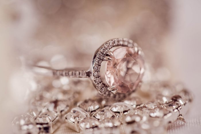
Lightroom cannot do this, but you can still get great results. It has many features to help enhance and color correct your product photography.
Another wonderful thing about using Lightroom is that you can “sync” your edits. You can copy the settings you have applied to one image to a whole series of images. This saves you a lot of time in editing your pictures.
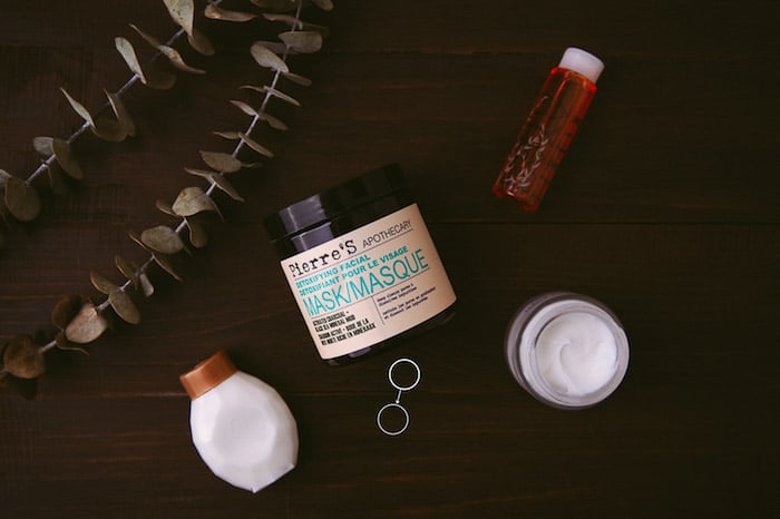
For this post, I will walk you through an edit of the image below in Lightroom’s Develop Module.
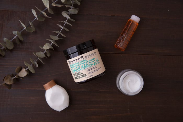
Straight out of camera image.
The Histogram
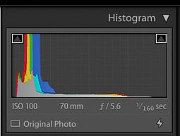
It's important to have a basic understanding of the histogram. That way, you can make adjustments to the exposure and tones in your image.
A histogram maps out the tonal range of an image. Brightness is graphed on a grayscale. Every pixel in the image is assigned to a value.
Black is on the left, while white is on the right. You can find the shades of grey in between.
The distribution of the tones in the histogram will tell you about the overall exposure of the image.
A big peak in any of these regions means that the image has a lot of pixels at that particular density. An open gap in the histogram means that there are no pixels at that density.
Check if you have a strong peak at the black or white end of the histogram. If you do, your image could be underexposed or overexposed.
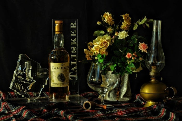
It depends on the individual image and the look you’re after. A dark and moody style shot such as the one shown here, will have a lot of pixel density at the dark end of the spectrum.
Generally, most images look best if they contain both dark and light values. Otherwise, they may lack contrast and look flat.
Cropping
It’s a good idea to crop and straighten your image before you start making global adjustments.
First, make sure that your image looks straight.
I shot my product image on a rustic background meant to mimic a picnic table.
This can be a challenging type of background to shoot straight on. And it usually needs an adjustment in Lightroom.
As you can see from my straight-out-of-camera image below, the lines appear crooked.
I used a tripod with an overhead extension arm, and took care to get my camera as level as possible. But it wasn’t enough.
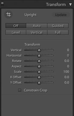
To straighten an image, start in the Transform panel and click on Auto.
If this doesn’t work, you can try one of the other settings, or do it manually under the Crop Tool.
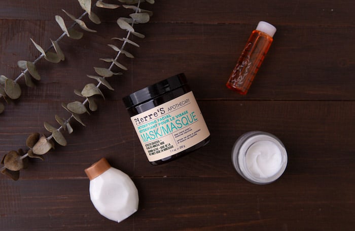
Straightened SOOC Image
To access the Crop Tool in Lightroom, click on the grid symbol under the Histogram in the top panel. Or hit R for the keyboard shortcut.
This will allow you to crop your image by bringing in the corners with your cursor.
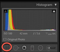
Note that when the lock is closed on the lock symbol, the tool will crop each side of the image evenly.
If you would like to freeform crop, simply click on it to unlock it.
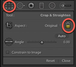
With the crop tool activated, you can click O for the shortcut to bring up several compositional overlays. These include the Phi Grid or Golden Spiral.
One tip is to shoot a bit wider than what you want for your end result. That way you can tweak your composition in post-production.
You also may decide to crop your image to a certain aspect ratio, like 4×5 or square for Instagram.
Spot Removal
The spot removal tool will help you create a clean product image. You might use it at the end or at the beginning of your workflow.
It will remove any dust that appeared on your sensor or any other small flaws from your image.
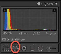
Click on the spot removal tool and move it to the area where you want to remove the flaw and click again.
It will sample pixels from a nearby area and replace them.
White Balance
I recommend setting your white balance in-camera. Or you can shoot with a grey card and adjust it in post-processing.
This removes incorrect color casts. And it ensures that your whites and colors render accurately.
You can also correct your white balance in Lightroom. Take the eyedropper tool and click on an area in the image which appears neutral.
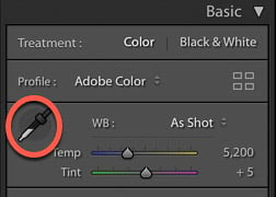
This will adjust the color temperature in the whole image. You can tweak it afterwards if it's not quite as you desire.
It's not as precise as the other options. It can work well for images that don’t have a lot of white in them, or are not shot on a white background.
Exposure and Contrast
Exposure affects the brightness of the range of tones in your image.
I often make this adjustment initially. I may scale it back once I have made some other adjustments.
For dark and moody images, I usually underexpose in camera a bit, so I don’t end up losing shadow detail when editing.
You can boost contrast in the Basic Panel or in the Tone Curve panel. I will get to this in a moment. You always want to add at least a bit of contrast, as RAW digital files are flat by nature.
Highlights and Shadows, Whites and Blacks
This panel is where you may end up doing a lot of tweaking before you settle on a final look. It will give you a more precise balancing of tones than simply relying on the Exposure slider.
Check if the bright areas look muddy, or the shadows still need more light. Move the sliders to points where the image looks good overall.
You will likely need to go back a readjust your exposure slider once you have made edits in this area.
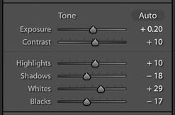
In my product photo, the highlights needed a bit of a boost. The shadows were also too light for the look I was aiming for, which was a dark and rustic look.
I brought the highlights down and boosted the whites. I also brought down the blacks to create the ideal balance for the aesthetic I was after.

Clarity, Vibrance and Saturation
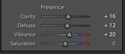
Clarity is an important slider in Lightroom when editing product photography. It gives your image contrast in the mid-tones and adds edge detail.
For product and still life photography, you can push your clarity further, again. It depends on the desired result.
I set mine at +16 for the image below.
Vibrance is also an important slider in food and product photography post-processing.
It's a better editing tool than saturation because it's more subtle. It adjusts the less saturated colors. Without intensifying the already saturated ones.
Vibrance will first boost the saturation of the muted colors and then the other colors. It adjusts the less saturated tones without over-saturating the ones that are already saturated.
Whether you actually use the saturation slider depends on the image. In general, a conservative approach is what works best when editing product photography. It's easy to overdo the saturation.
If you decide to use this slider, nudge it up a tad, to about +5 or +6.
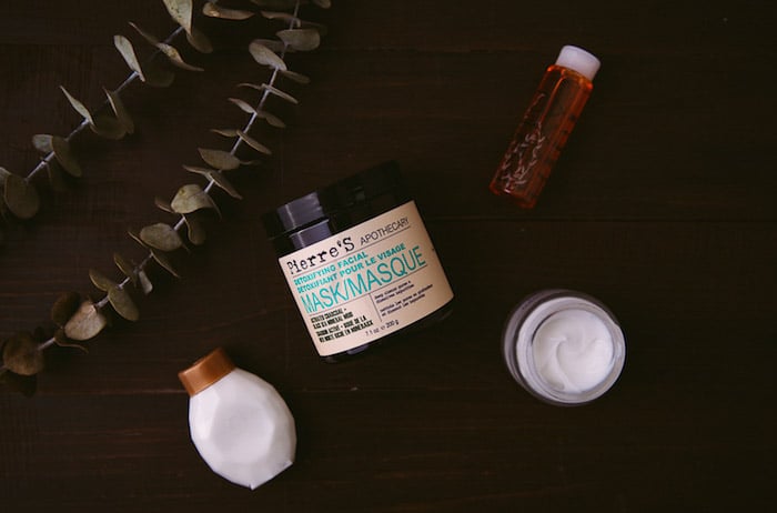
New users often find the Tone Curve challenging, but it's one of the most powerful tools found in Lightroom.
The Tone Curve is a graph that maps out where the tones in your images lie.
The bottom axis of the Tone Curve starts with Shadows at the far left side. It ends with Highlights on the far right end.
The mid-tones fall in the middle, in a range from darker to lighter. They get darker as you move lower, and brighter as you move up the axis.
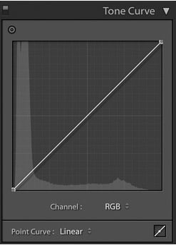
You can control the lightness and darkness of your tones. Adjust the Point Curve itself or the Region Curve.
The Region has sliders for each part of the tonal range. As you drag each slider, the curve and the image both change.
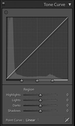
To make adjustments with the Point Curve, click on the area you want to affect. This will create an anchor point at which to control the tone.
Dragging the point up lightens that tone; dragging it down darkens it.
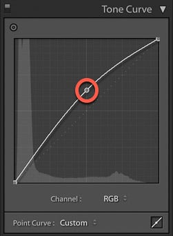
Assess the mid-tones in your image to see if they are already bright. If not, click on the middle of the tone curve and bring the point up.
If they are too bright, bring the curve down. Check the other parts of your image.
Typically you may find that your curve looks like a soft S.
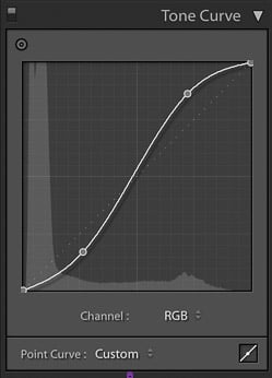
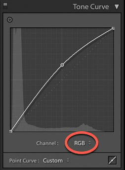
You will also notice that there is an RGB option in the lower-right portion of the point curve.
This helps you to individually edit the Red, Green, and Blue channels. It performs the same types of adjustments to brightness and darkness. But it does so on each separate color.
This can be useful if you want to edit a color individually, or give your image a certain color overall.
You can also choose tones directly from the image. Use the Targeted Adjustment Tool.
This is located in the top left of the Tone Curve.
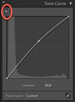
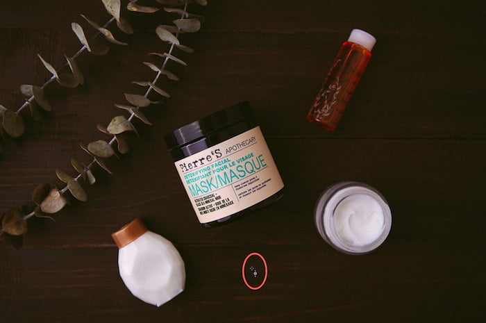
Click on it and move the cursor over the image. The tool shows you the tones under the crosshairs. If you click and drag it up and down the image, you will affect the tones like those under the crosshairs.
For example, if you drag vertically on an area with light pixels, all of your image's highlights will be adjusted.
If you're just getting started with learning the Tone Curve, play around with the Region sliders. Take note of how the various sliders affect the curve.
Whichever approach you choose, be sure to watch the histogram as you make changes. This way you’ll make sure that you are not losing important detail.
HSL Adjustments
HSL stands for Hue, Saturation, and Luminance. This is where you balance the colors in Lightroom.
Color adjustments are usually more subjective than tonal adjustments. This is because color gives a photograph a sense of mood.
There are two ways to make color adjustments in this panel. You can adjust them all at once under HSL/All.
Or each color individually under the Color tab at the top of the panel.
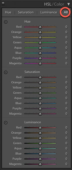
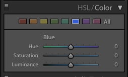
The Hue tab or section at the top of the panel is where you choose how warm or cool you want each color in your image to be.
For example, I find that greens almost always look off. I slide the greens slightly more towards the left or right to get them looking more realistic.
To add more warmth meaning more yellow to your greens, slide it to the left. For a cooler hue, sliding it to the right will add more blue.
The Saturation slider in the basic panel adjusts the color of the whole image. But the saturation sliders here adjust each color individually.
If you adjust a color to be more saturated, this will affect the saturation of that particular color throughout the whole photo.
Whether you're working in the basic panel or the HSL panel, saturation requires a light hand.
Lastly, Luminance affects the brightness of the color. These sliders more valuable than the saturation sliders, so work with these first.
Editing in Lightroom is all about balance. The same goes when working with the Hue, Saturation, and Luminance adjustments.
Noise
Noise is the grain that can appear throughout an image.
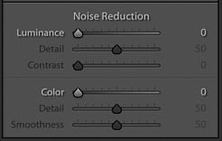
It's not a problem when you are shooting with artificial lights.
When working with natural light, grain can appear in your images. Either you’re shooting at a higher ISO, or you didn't get enough light onto your sensor.
Working with the Noise slider in Lightroom will minimize grain. And it will give your image a smoother look.
But, be careful not to push the slider too high, as it can result in a plastic look.
Post-Crop Vignetting and Dehaze
If you are editing a darker, moodier image, post-crop vignette is a must!
You’ll darken the outer corners of the frame. This will draw the viewer's eye towards the center of the image and your subject.
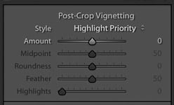
To darken, move your slider to the left. If you slide it to the right you will get a light-white frame.
The midpoint slider controls how far in the dark edges get to the center of your photo.
Feather controls how soft or hard your vignette will look.
A softer vignette looks more appealing than a hard, "spotlight" effect.
Sharpening
Sharpening should be the last editing step. It adds contrast between pixels and edges. This, in turn, adds definition and creates a more refined look.
But don’t apply sharpening to the whole image.
In product photography, there is not much point in sharpening the props and the background.
The focus is on the product. So that is what you sharpen.
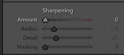
To do this in Lightroom, mask out the image to select the areas of the image you want to sharpen. Hold down the Alt/Option key while clicking on Masking in the Sharpening panel.
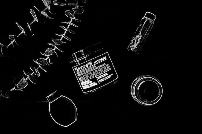
Lightroom will show you where the sharpening is being applied in white. Your image will look like an x-ray.
Slide it to the right. The farther right you go, the less the image will be sharpened.
Here is a screenshot with the sharpening mask applied to +70. I didn’t want to sharpen the background. Just the details of my product, particularly the lettering on my product jar.
You will find that you will be in the +70-80 range for sharpening this type of photography.
Exporting and Saving
Once you are satisfied with your edit, it’s time to export and save your image.
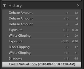
Lightroom has kept track of all of the changes you’ve made. You can always undo these changes by stepping back in the history panel.
You can see that I worked on a virtual copy. This means I duplicated my file so I would have the original in my Lightroom filmstrip in case I needed it.
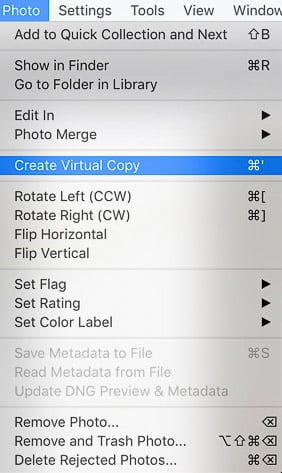
 To create a virtual copy, go up to the Photo tab and choose ‘Create Virtual Copy’. You will see a duplicate of your image in the filmstrip.
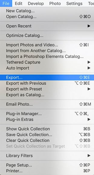
To save the file onto your computer, click on the File tab in the top left-hand of your screen and choose Export.
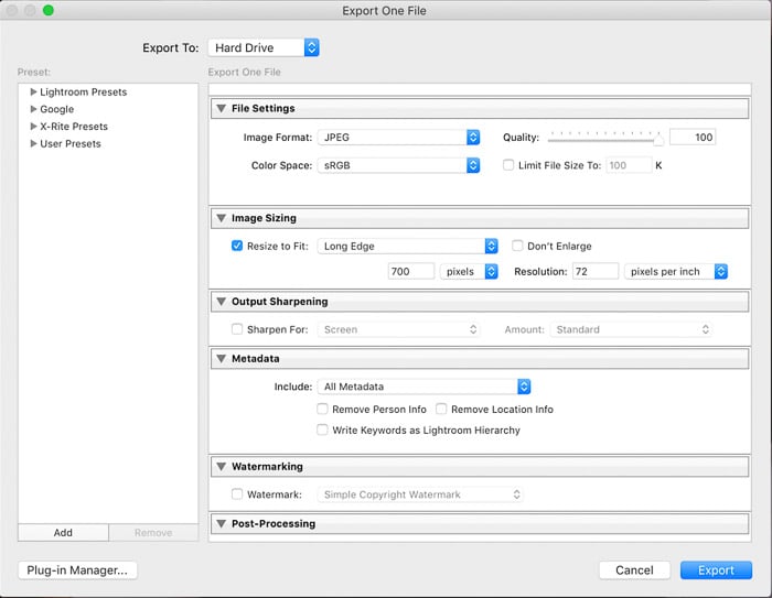
A box will pop up where you input the information about how you want to save the file. Decide which folder you want to save it in under the Export Location tab.
For example, I saved all of the images I used for this post in a folder called “Expert Photography”.
Decide which file settings you will use. If you are using your images for the web, you will choose JPEG with sRGB as your color space. For sRGB, the typical resolution needs only be 72 pixels per inch.
If you need your image file to be a certain dimension, you can check ‘Resize to fit’ and specify the inches or pixels etc.
Hit Export and Lightroom will save your image with the settings you have applied to your destination folder.
And here is the final image!
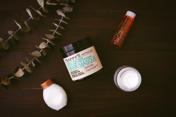
Not drastically different than what I began with. Overall a more balanced and refined looking photo and one that is consistent with my style of photography.
You can use the same steps and approach white light and airy images as well.
The end goal of product photography are clean images with beautiful light and a subtle hand when it comes to editing.
For this, Lightroom is all you need.

