Creating a website for your photography business used to mean hiring a designer and spending thousands of dollars. That’s no longer the case.
Nowadays, many DIY website builders like Wix, Elementor, and Squarespace exist. Building your photography website is as easy as choosing a template and uploading your photographs.
Some of these websites, like Photoshelter, cater to photographers. This means that they have dedicated site options with their needs in mind.

8 Most Important Tips for Making a Photography Website
Here is a rundown of the important things to remember when making your photography website.
1. Pick the Right Web Hosting Platform
So, what’s the right web hosting platform for your photography website? When choosing a web hosting platform, it’s important to select a company with fast performance and good security. You also want accessible customer service.
WordPress is an extremely popular self-hosted web platform. It’s customizable and boasts great SEO. However, many companies now offer one package of web hosting, portfolio and resume templates, email, and other tools.
Be sure to research all your options and the pros and cons of each to make the right choice for your photography website.
If you choose WordPress, know that there are thousands of templates. Once you settle on one you really like, you can customize it to your exact specifications. However, you may choose to take a less techy route.
2. Use a Template to Highlight Your Work
Your site must clearly convey what kind of photography you specialize in and the essence of your style.
As great as drag-and-drop template websites are, they have their limitations in terms of design. And they are not as customizable as a website built from the ground up.
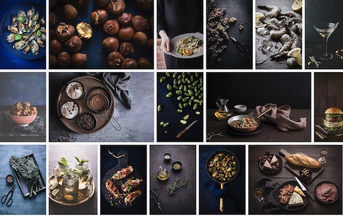
For example, I am a Photoshelter user. When I started with them, I used their East template. This is a mosaic-style template.
Mosaic-style templates are great for showcasing photographers’ work. They have been very popular lately. A potential client can instantly get a feel for your style by glancing at the landing page. They don’t have to scroll tediously through each gallery.
However, I found that with this template, I couldn’t organize my images exactly how I wanted them to appear on my front page. The template was set up to pull random images from my galleries to feature there.
I had no control over the appearance of my landing page. I also didn’t control the first impression I gave to people coming to my site for the first time.
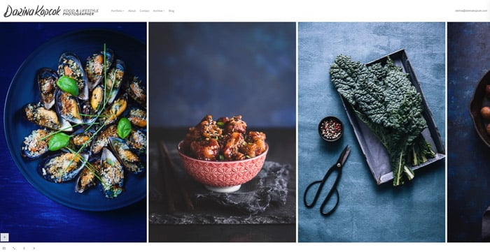
I decided to change it to a scroll-style template. This allows visitors to see a large, attractive rendition of my images.
They can also easily click on an icon in the bottom left-hand corner of the site. This way, they can view each gallery in a mosaic tile format.
One handy feature of many of these web builders is that you can test out how your images will display in the template before hitting publish. It’s easy to go back and forth before making your final decision.
3. Write a Blog to Reach Out to Followers
This is one tip that is often met with objection by photographers. After all, we are visual people. For many of us, writing is a weakness and a chore.
Having a photography blog connected to your website can be extremely beneficial. For example, having a WordPress-powered blog connected to your website can increase your SEO and ranking. By writing blog posts, you’ll continually update your content and earn the favour of Google.
Blogging is a powerful marketing tool that helps you connect to your ideal audience. It reminds your followers that you are a working photographer.
And by appearing busy, you attract others’ attention. They assume you are good and want in on the action.
So many photographers focus a lot of their marketing efforts on social media. But blogging actually helps you create an asset that drives more and more people to your work over time.
4. Stick to a Focused Theme for a Cohesive Look
A photographer’s website is considered their primary selling tool and the summary of their brand identity. Your photography website is your online portfolio.
Your photography website will define how potential clients see you. A poorly designed website will call your professionalism into question. And it will discourage potential clients from contacting you for an estimate.
The key to a successful photography portfolio is to have a theme or themes. And to keep them tightly focused.
For example, I am primarily a food photography shooter. I shoot editorials and advertising for clients in the food space, as well as product packaging and lifestyle connected to food.
I have also shot sports photography, corporate and personal branding, and events. Those genres are not my primary interest. So, I don’t have images from those shoots on my website.
I will take those kinds of gigs if I get them through referral, but I am not actively promoting myself as a photographer who specializes in those areas. My focus is food photography, and this is what you see when you visit my website.
5. Limit Images and Galleries to Not Overwhelm Clients
In the case of your photography portfolio site, less is more.
You want to demonstrate to clients what you’re good at quickly. Having too many galleries and images dilutes your message.
You may shoot in a few photography genres. But stick to the ones that meet your business and career goals. If you want to do more sports photography, make sure your portfolio lines up with that.
Create galleries around a single specialty. If you mostly shoot in one particular niche, find a way to organize your work into special themes.
I have a gallery called “Food Dark” and another “Food Light.” I have basically organized my images by mood and key.
The interesting feedback I have had is that many potential clients are drawn to my dark and moody work and hire me for that. Even if this is not their desired style, they are drawn emotionally to it as a body of work and its uniqueness.
When it comes to the number of images you should include in your gallery, I recommend no more than 20. This is enough to give clients the gist of your previous work and style without overwhelming them.

6. Show Only Your Best Work to Catch Visitor Attention
It goes without saying that within your themes and galleries, you should only show your best work.
It can be a difficult process to determine what this is! Sometimes, your favorite shots are less commercially viable than others in your portfolio. Or they don’t look cohesive with your other images.
A great portfolio doesn’t mean continually updating your new work. It means presenting a concise collection of your images that speaks to your intended audience. It tells them about the kind of work you want to do and what they can expect from you.
Surprisingly, photographers can be bad at deciding their best images. This is often because of the emotional connection we have with them.
If you’re unsure what to include in your photography portfolio, ask trusted professionals in your network.
Or pay for a portfolio consulting service. You can find a suitable coach or a consulting company specializing in working with photographers in this way. One such company is the US-based Wonderful Machine.

7. Keep Potential Clients in Mind When Creating a Website
All these tips help you keep your potential clients in mind. Hopefully, you know the clients and brands you’d most likely work with.
If you’ve done lots of portrait photography but prefer doing weddings, focus on that. A client shouldn’t have to guess what you’re good at.
Even in your chosen niche, ensure your portfolio is tight and signals what you do best and want to keep doing.
I do a lot of food packaging work. But I prefer doing editorial. The bulk of my online photography website demonstrates that.
Don’t try to be all things to all people.

8. Choose Commercially Viable Images That Tell a Story
Now that you know the top tips to help you build an outstanding photography website, we’ll cover how to choose images for your new website. These will be images that will be a part of your online portfolio.
Always start with your most commercially viable images and lead with them.
Focus on telling a story with your photos. Your galleries can have a narrative feel with images connected by theme. Or they can hang together with common elements in composition, mood, or color.
The overall feeling should be cohesive but not repetitive. Show what you need to and no more than that.

I recommend an exercise for those putting together their first photography website or portfolio. It is first to narrow down the images they are considering. Then, have them printed into 4 x 6 photos.
Spread the images out on the floor or pin them to a wall and start to cull them more ruthlessly. Look for the ones that hang together based on the criteria you have determined until you have chosen your final edits.
Seeing your images in tangible form makes the task easier to process. It’s worth the extra time and effort.
Conclusion: Making a Photography Website
Are you ready to build your first photography website? Many great resources are out there to help you create a stunning online portfolio. You’ll build a web presence to help you get your name out there. By following these best practices, you’ll get your first clients quickly.
