When it comes to Instagram, the bio is one of the most important elements of your profile. It's one of the first things people see when they click on your name, and it's what they read when they want to learn more about you. So it's important to make sure your bio is both interesting and well-written.
But what makes a good photography bio? And how can you make sure yours stands out from the rest? Here are five tips to help you create an awesome photography bio for Instagram.
Creating a Photography Bio for Instagram: What Makes a Good One?
An Instagram bio is where you put a small blurb about yourself or your photography business. It is a short section of text to introduce your photographs.
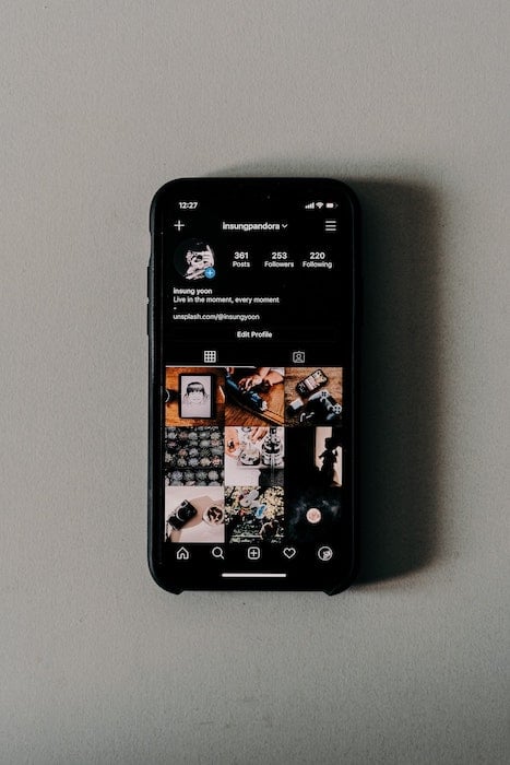
Instagram gives you six different boxes to put in set information:
- Name
- Username
- Pronouns
- Website
- Bio
Your name and pronouns are first, your photography bio is in the middle, and your website is at the bottom.
This write-up is entirely different from your personal or artist biography. Your standard biography on your website should be roughly a paragraph or two long.
On your Instagram page, complete sentences aren't a good idea. There's not enough space!
Why is an Instagram Bio Important for a Photographer?
A successful Instagram bio sets the tone for a photographer's Instagram feed. It shouldn't overburden the viewer with information. A photography bio should provide key slices of knowledge to help inform your target audience about your work.
A bio has two main functions for your photography Instagram account:
- It introduces people to you
- It gives them context for your work.
Most importantly, it gives viewers a way to engage with your work. But don't get too worked up to make it stand out from the others.
The most important feature on your Instagram page is still your photographs! So if you can't think of anything flashy, keep it as simple as possible.
Top Tips for a Perfect Photographer Instagram Bio
1. Show Your Style with a Profile Picture
Your Instagram bio should reflect the same style parameters as your photographs. People notice this most through the choice of your profile picture.
Your profile photo should sum up your feed in one photograph. A well-taken, high-resolution shot of yourself is the perfect way to introduce yourself. A good portrait can put a friendly face on the Instagram account.
A successful picture shows your photography style. For instance, if you are a travel photographer, maybe upload an image of yourself shooting in your favorite location.
Example for a Travel Photographer
Let's take a look at Chris Burkard's photography bio example. Burkard's picture shows he is shooting on location. He's photographing in a picturesque setting, even though we can't see that much of it.

The distant hills and beautiful lighting are small signifiers. They tell the viewer that he's a travel photographer who is comfortable finding and photographing stunning locations. This approach works with all types of photography.
Example for a Portrait Photographer
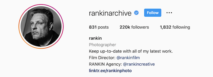
Let's now look at another genre of photography. Here is a well-known studio portrait photographer, Rankin.
His profile picture is a simple portrait. But it is taken in the same style he would use in his photoshoots. It clearly shows himself and his portrait skills.
Example Photography Style Photo
You don't always have to add a picture of yourself to your profile. It can sometimes be better not to have an image of yourself.
Many photographers often use their branding, style, or logo as a picture. Artists will often use one photo that speaks of their work.
A great example of this is Todd Hido's Instagram. His profile photo is of a house at night with lights on. It is a photograph that captures his artistic style perfectly.

The most important aspect to remember—it is all about setting your tone as a photographer. So, if your style is serious, black and white photography, it is best not to include an image of you with a colorful wig on your head!
2. Keep the Information Short and Sweet
The most effective Instagram bios feature no more than a couple of sentences. As I mentioned before, your Instagram biography is not your artist statement.
People have a short attention span when it comes to social media. You have to be quick and to the point.
It is better to use keywords rather than whole sentences. Bullet points are preferred. They take a fraction of time to read than a complete sentence.
Even emojis are commonly used as a visual signifier. They quickly translate an idea, bypassing language barriers!
When looking at my favorite photographers on Instagram, I notice there aren't many with more than seven to ten words per line. More often, there will be one or two phrases per line.
How to Reduce Words
Try not to add any text if it is not crucial information. Don't add something people can learn from looking at your photographs. For instance, if you are a landscape photographer and the only pictures on your feed are landscapes, you don't need to specify.
If you have a lot to say, try to break up the text using special characters like a spacer. Make the bulk of words more digestible. This is done well on Tanya Habjouqa's Instagram page.

If your Instagram account name already has your name in it, you don't have to repeat it. You can use the ‘Name’ section to improve your SEO (Search Engine Optimization).
For example, if you put ‘wedding photographer’ there, you can appear higher on the search result list than those who do not. This technique will favor niche keywords as the more specific you are, the fewer people that will come up when typing the keywords.

Using the name section to show being a wedding photographer
3. Include Location and Photography Style
Instagram bios will often have two critical pieces of information:
- Where the photographer is from
- The kind of photographs they take
You can describe both points with two words each.
The location is pretty straightforward. It lets your target audience and potential clients know your stomping grounds. It is something that you can communicate through emojis and flags.
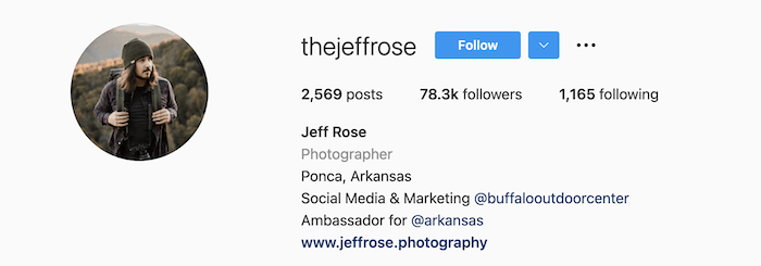
You can be as broad or narrow as you like when talking about your photographic niche. This can take form in something as direct a ‘Portrait photographer.’ Or, you could use it to show off other services such as ‘Photographer and Musician’ on Donjay's Instagram.

Again, the images on your feed speak for themselves. If you have an Instagram filled with portraits, it doesn't need to be said.
4. Use Links to Show Off Your Work
Instagram is an excellent stepping-stone for viewers to engage with your work further. Make sure you use the Instagram bio to link to your website or other Instagram accounts.
If you enter your website in the right section, you can have a noticeable hyperlink underneath your bio. This is the main link for your Instagram page.
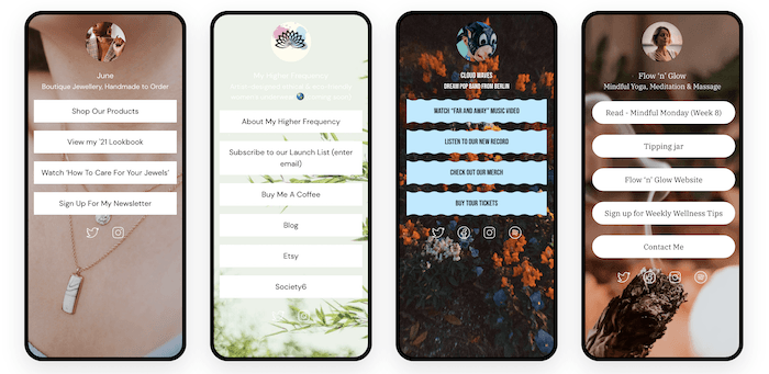
But having too many links for your Instagram page can cause a lot of confusion. This is why many photographers are now using a web service called Linktree.
How Linktree Helps Organize Mulitple Links
Linktree is a single link that takes you to a page. There you can direct people to multiple locations.
Using Linktree is an excellent way to provide more than one link, as it will provide a single button for each connection. You can have four to seven links up that are easy to navigate and look fantastic.
5. Add a Call to Action
Adding a call to action in your bio is the best way to get the viewer to engage with your work. The more viewers engage with your work, the more likely they will remember your photography in the future.
A call to action can be as simple as telling people to look at your website. Or, it can be as direct as providing a link to a product you currently have for sale.
You are streamlining your viewer's effort to find this information by doing this. It makes your photography business or art more accessible.
For example, our Instagram bio takes you directly to buy our new e-book release. We consistently change this, giving new options for fans of our work. And people come back repeatedly to our Instagram page.

6. Have Fun With It and Don't Force It
Unless your work features serious topics, have some fun with the Instagram bio! The critical information should still be front and center. But you still have a lot of space to get creative without overwhelming your viewer.
You can do this with an inspirational quote. Or, use a curated selection of emojis that match your photographic style.
If there aren't any extra elements that you want to put in your bio, don't worry about it! We are photographers, so we usually are better with our images than with our words.
There are many photographers out there who have minimal information. Patrick Zachmann's photography bio only states that he works for Magnum Photos!

Examples of Successful Photographer Instagram Bios
Let's look at a couple of examples of different Instagram bio ideas. There are many ways to approach this. But they all stick to the key points listed above.
Morgen Maassen keeps it short and sweet. He uses monochromatic emojis to match his picture. It is a perfect example of how to think of your whole bio as one.

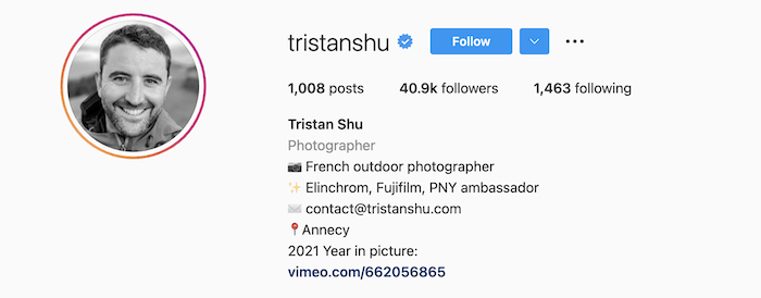
Traistan Shu uses emojis as bullet points. That way, you know what each line of information is telling you.
Lillie Giger uses special characters in her Instagram bio to set herself apart. This unique font reflects the same cool aesthetic as her photographs.

Conclusion
All our examples will help you to create a successful biography. Look at it as a recipe. There isn't a right way to do it, but there are various flavors. And different people prefer different flavors!
The best way to create a successful bio is to experiment. I suggest giving multiple options a try and screenshot what your bio looks like.
You will then be able to flick through various approaches quickly. There will be one bio that reflects your photographic style the best.
After looking at a range of examples, we see no perfect Instagram bio. Instead, there are many ways to show who we are as photographers.
Try out our Social Success Strategies e-book for creative ways to attract followers!


