Wedding photos are one of the most important memories a couple will ever have. They’ll want to be able to look back on them for years and remember the day perfectly. That’s why it’s so important to make sure they’re edited correctly. Here are 10 fabulous wedding photo editing tips.
11 Wedding Photo Editing Tips for Lightroom Processing
Lightroom is one of the most popular photo editing tools for wedding photographers. Because it both organizes and edits photos, Lightroom speeds up the editing process.
This is a must when looking at a few hundred images. But Lightroom won’t speed up the editing process if you don’t understand all the tools. So here are 11 Lightroom tips for wedding photo editing.
Note that these tips work for both Lightroom Classic and Lightroom CC (Creative Cloud). But the controls may be located in different spots for Lightroom mobile.
1. Use Flags and Stars for Easy Culling
The first step to editing wedding photos is determining which photos to edit. One of Lightroom’s biggest advantages is that it can organize and edit photos. So several tools help determine which photos make the cut.
Inside the Library module, use the Import button on the bottom left. And select the folder destination on the hard drive on the right. Check the Add to Collection option and create a new Collection for the wedding.
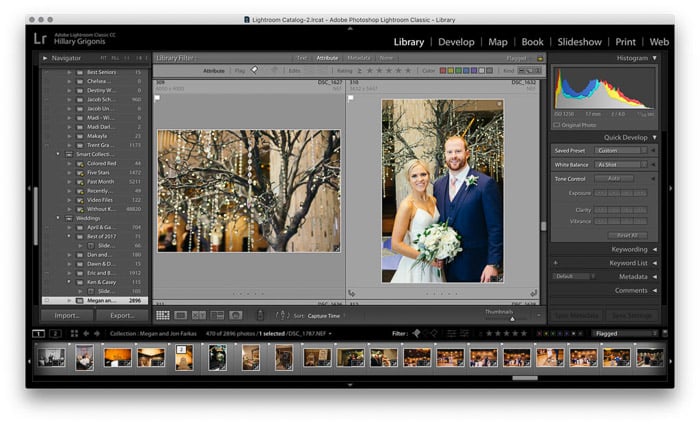
After importing the photos and adding them to a collection, cull the photos to find the keepers. Lightroom has two main tools for the culling process—flags and stars. I use the flags for simplicity.
I hit “P “on the keyboard to add a flag when I see a photo I want to edit. Or I tap the little flag in the upper-left corner of the thumbnail photo in the Library module. The flag is also on the filmstrip in the Develop module. (Need an easy way to remember the keyboard shortcut? It’s “P” for Pick).
Another option is to rate each photo. Tapping one to five on the keyboard gives the highlighted photo that amount of stars. You can then go back and edit the photos with four and five stars. And you can keep the three stars as an option to add if the final number of photos is a bit low.
2. Use Customized Presets to Hone the Editing Process
Some photographers swear by presets for fast editing. But others say that your photos look like everyone else’s if you use Lightroom presets. So what’s the right answer?
Lightroom presets are great for quick edits. And they’re also easy to customize. Tweaking a preset or creating your own helps in a couple of ways. It mixes faster edits with a characteristic look that’s more your style.
For example, I love some film-inspired presets. But some have odd skin tones with too much orange or artificially increase the contrast. When I tweak the preset to my style, I can edit it so that those same changes are applied the next time I use the preset.
Editing an existing preset is easy. First, apply the preset to a photo. Then make the adjustments you’d like. And finally, right-click on the preset and choose “update with current settings.” We have a helpful article on installing presets you can check out.
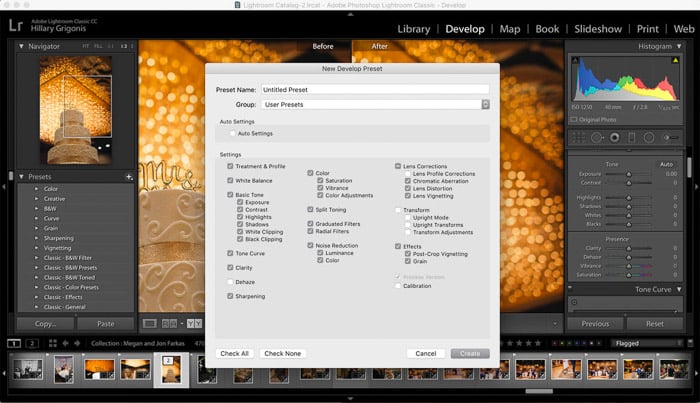
You can also make your own presets. And if you’ve been manually adjusting all this time, you already have the material to do so. With the edited photo selected, click the plus (+) icon at the top of the Presets menu on the left. And then click the option to create a new preset.
In the pop-up window, name the preset. And then, put a check next to any edits in the selected photo you’d like to include in the preset. Now, when you want to apply a similar edit, you can apply the preset to speed up the process.
Presets are great starting points. But most of the time, a photo isn’t done after that preset. The remaining controls can help fix errors with the photo. Or they can fine-tune the color adjustments the preset provided. (We have an article on the best wedding presets you can check out.)
3. Edit in Stages to Speed Up the Process and Catch Errors
Most wedding photographers have a specific workflow for the post-processing too. I divide my editing into stages.
First, I upload and cull. Next, I apply a preset and make color and exposure edits. Then I go back through and apply any local adjustments, healing brush fixes, or crops.
I save the few photos that I need to open up in Adobe Photoshop for last. Focusing on one set of tools at a time makes the process move faster for me. Editing in stages, I may also notice something I didn’t catch the first time and correct it.
4. Perfect Exposure With Lightrom Sliders and Tools
After applying any presets, one of the first edits is adjusting the exposure. First, make any changes to the overall exposure. Then, use the Highlights and Whites sliders to adjust the lightest areas of the image. Use the Blacks and Shadows sliders to adjust the darkest areas of the image.
Use the curves-based exposure adjustment tools before using the contrast slider. These include shadows and highlights. (The actual tone curve is also available for those familiar with working with curves).
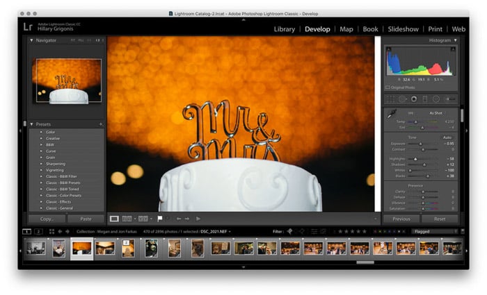
Creating brighter highlights and darker shadows creates more contrast… without the exaggerated look that the Contrast slider tends to produce. For a matte look, do the opposite and lighten the darks and darken the lights.
I use the Presence controls less frequently. But I will use the Clarity slider to add detail to a ring shot. The Dehaze tool is also helpful for fog and haze.
5. Color Correct With White Balance and HSL Tools
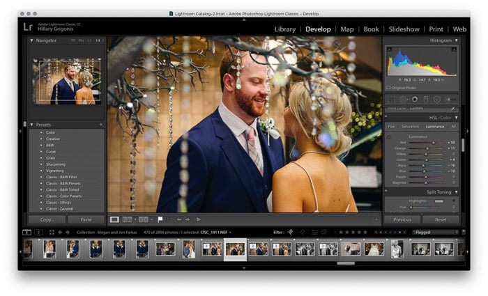 Lightroom Classic’s color controls sit in two main panels. White balance is located at the top. Use the dropper tool to select something white in the image. This can be the groom’s shirt or the bride’s dress. Then fine-tune it using the temperature and tint sliders.
The HSL, or hue, saturation, luminance panel, allows you to individually fine-tune the image’s colors. Luminance is how light or dark a color is. Saturation is how bright or dull a color is, and hue changes the shade of that color.
Lightroom gives each color a slider inside the HSL panel, allowing you to adjust each color without affecting the others. These color tools help create a specific look. Adjusting the greens and blues, for example, can create the look of a specific film.
This main panel also includes vibrance and saturation. But these sliders are easy to overdo. Avoid them. Or make the HSL edits first. Then see if those other two adjustments are still necessary.
Along with creating a specific look, you can use the HSL panel for some corrections. Pulling up the orange luminance slider will brighten skin tones while pulling the red luminance slider will make red skin less obvious.
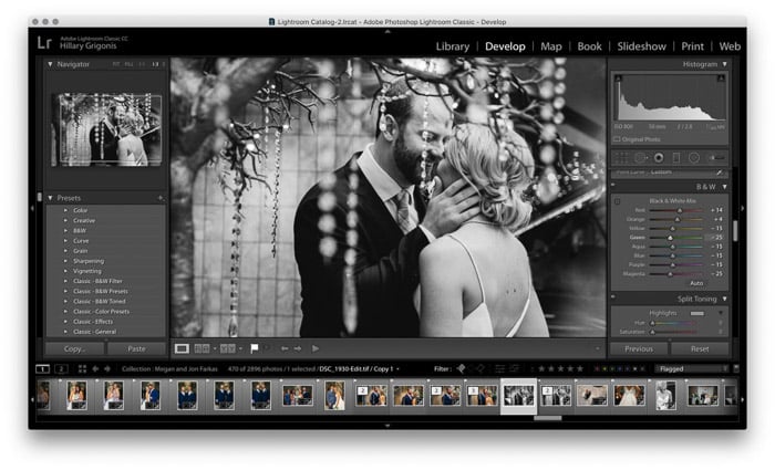 The HSL is also essential for getting great black and whites. After converting the image to black and white (use the Treatment option at the top of the Develop panels), the HSL becomes the B&W panel and will control the shade of gray each color converts to.
If you have a photo where two different colors look similar in black and white, you can adjust one to get more contrast in the black-and-white version.
One more HSL trick. If you’re unsure exactly where a specific color falls in that HSL panel or black-and-white conversion, click on the small circle icon in the corner of the HSL panel.
With the target tool selected, the slider for that color lights up when you hover the cursor over a specific color. Clicking with the tool and dragging it up or down adjusts the slider value for whichever panel you have open.
This applies to the luminance, saturation, or black-and-white panel.
6. Don’t Forget to Sharpen and Reduce Noise
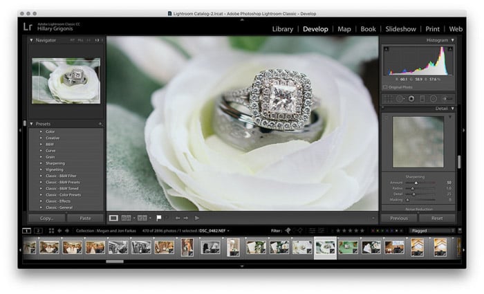 Unlike a JPEG, the camera doesn’t automatically apply any sharpening algorithms to a RAW photo. Under the detail panel, use the sharpening slider to bring out the details. Zoom in before you make this adjustment, and be careful not to overdo it.
Underneath the sharpening slider, noise reduction tools will keep grain from high ISOs in check. The luminance and color sliders will reduce noise, while the detail, contrast, and smoothness control how that noise reduction is applied.
7. The Crop Tool Is for More Than Just Crops
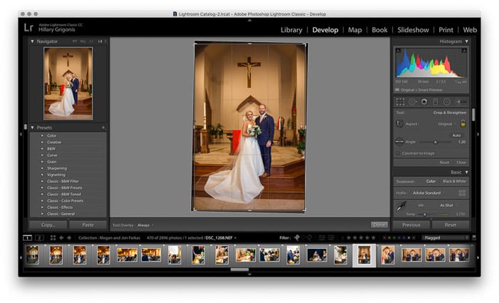 A Crop tool is a simple tool, correct? Not exactly. Along with cropping the photo, Lightroom’s crop photo straightens crooked lines and adjusts the aspect ratio from a printable 8 x 10 to a 1:1 Instagram.
Tilt the corners of the crop box to straighten, drag the angle slider or tap the auto to help straighten the shot. Or, use the drop-down box to select a new aspect ratio if the couple has ordered a print of that particular shot.
8. Use the Gradient Tool to Fix Mixed White Balances
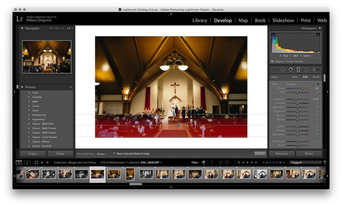 Lightroom includes several local editing tools that don’t require going into Photoshop for more detailed work. The gradient tool is one of them.
The gradient tool can help darken a sky like a digital graduated neutral density filter. Just draw the gradient line down to the horizon.
Choose the color range mask from the drop-down to keep that gradient only on the sky. Then use the dropper tool to select the colors in the sky. (Use shift if there’s more than one color).
Once applied, the gradient tool allows you to adjust the exposure and colors of just that area without affecting the others.
Adjusting the sky is a popular way to use the gradient tool. Mixed white balances are another. I recently shot a wedding that had large windows at the back of the ceremony.
While gorgeous and bright, my wide-angle shots had one white balance where overhead lights lit the front and another at the back of the church.
Using the gradient tool to cover one side of that skewed balance with a fade in between, I could correct the imbalance in just a few minutes.
9. Use the Healing Brush for Minor Imperfections
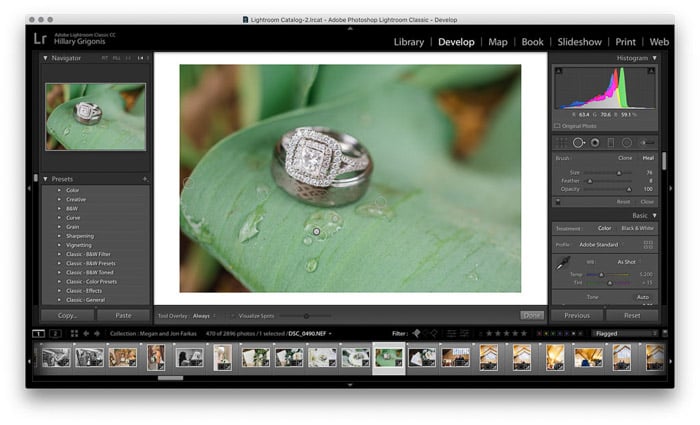 Photoshop may be more detailed. But Lightroom has a healing brush tool that still works for many retouching scenarios. It’s the one that looks like a circle with an arrow on the right in the toolbox underneath the histogram.
The healing tool works well for minor acne and even getting a street sign out of the background. This tool has both clone and healing modes. While large retouching projects still require Photoshop, I tackle a majority of retouches with Lightroom alone.
10. The Brush Tool Also Helps Retouch
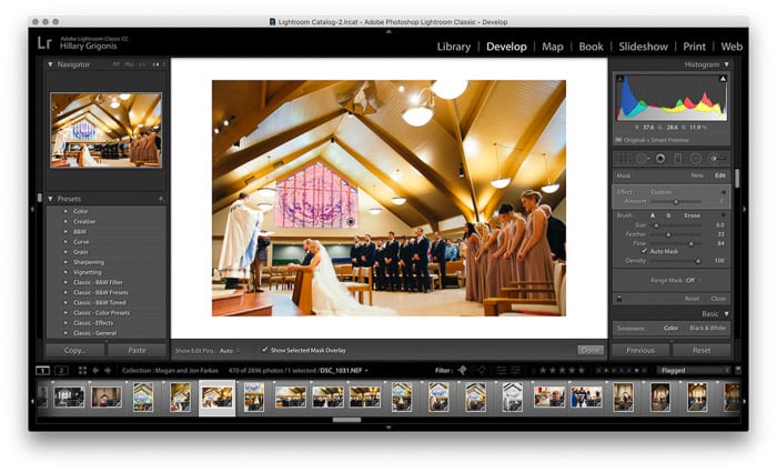 The brush tool brings Lightroom’s powerful non-destructive edits to just one part of the image. It’s commonly used for dodging and burning. Wedding photographers can also use the brush for retouching without Photoshop.
Lightroom has a built-in brush preset to whiten teeth and soften skin. You can find them in the effects menu in the drop-down. You can use a single slider to control the intensity or tap the arrow for more fine-tuning on each setting.
For even faster retouching, check the auto mask tool. Lightroom will then try to automatically detect the edges. This means that the teeth whitening tool, for example, is only brushed over actual teeth.
The Auto mask doesn’t work every time. I turn it off for tasks where the area I want to edit contains multiple colors, like darkening a stained glass window. But for most edits, the auto mask makes the brush tool even faster.
Like full presets, making a new brush preset is also easy. Use the sliders on a custom brush to choose the settings. In the effects drop-down, choose “save current settings as a new preset.”
For example, I like the Lightroom default teeth whitening. But it’s usually way too white and looks a bit unnatural. So I pulled the slider down and saved the adjustment as a new preset.
If you adjust a brush every time you use it, that’s a good sign you could save time by creating a custom preset.
11. Don’t Forget Lightroom’s Export Tools
Lightroom’s tools don’t stop with the edits, either. Wedding photographers can use the program to create a slideshow video of the day. They can even add a watermark when exporting for the web.
The slideshow is a panel all its own (not yet available in Lightroom Creative Cloud (CC) and is only a Lightroom Classic only feature). And inside the edit panel, if you scroll down to the watermark, you can choose “edit watermarks” to upload an image to deter image theft.

Conclusion
Adobe Lightroom is a popular tool for editing wedding photos. Whether you use Lightroom Classic with the most tools or CC with cloud backups, we have a guide for simple Lightroom backup and troubleshooting you can check.
Because of Lightroom’s built-in organization tools, presets, and shortcuts like auto masking and range masks, the software helps make all those edits move quickly. With a few wedding photo editing tips, Lightroom can make quick work of all those photos to edit.
Now you have the tips for perfect wedding photo editing, make sure you have your workflow covered with a checklist, and don’t forget to read our guide on setting your wedding photography prices.
