

To create a vintage photography look, start with a reference image, match its lighting and styling, then shape the color, contrast and grain. You can shoot on film or use a digital camera or phone. An old camera is optional; a clear idea of the look you want is essential.
Vintage photography can mean photographs made in the past or new pictures inspired by them. This guide focuses on creating new images. A formal studio portrait, a crisp black-and-white street scene and a faded family snapshot need different treatments. There is no single filter that represents them all.
These ten tips take you from choosing a style to shooting and editing a consistent set.
1. Study a Reference Before Choosing Your Camera
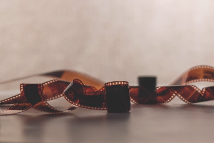
Study a few photographs that share the look you want. Notice the light, pose, framing, color and texture. Separate the choices made during the shoot from the appearance of the finished print or scan.
Avoid assuming that all old photographs were blurry, grainy or low in contrast. The George Eastman Museum's process guide describes daguerreotypes as sharply defined. Kodak's TRI-X technical data also describes high sharpness and fine grain. The medium and process matter.
Choose your route:
- Film: Use a working film camera, suitable film and a lab that can process it. For black-and-white film, following a home developing guide is another option. Check which film you can buy and have processed before committing to a camera.
- Digital: Use the camera or phone you already have. Capture a well-exposed original and create the treatment in editing. A camera's retro exterior does not determine the image's look.
A square crop may suit your reference, but it is a framing choice, not a measure of resolution. Do not crop every image square simply because you want it to feel old.
2. Choose a Theme to Keep Your Vintage Photos Consistent
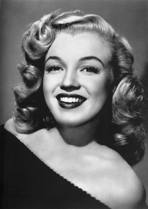
Photography's history contains many distinct styles. Pick one direction for your photoshoot rather than mixing unrelated cues.
For example, plan a formal portrait with restrained posing and a simple backdrop, a glamorous portrait with carefully shaped light, or a casual family-album scene with relaxed gestures. These are starting ideas, not rules for an entire era.
Make a small reference board. Choose a few recurring elements: a lighting style, a color palette, clothing and one or two props. Keep that theme consistent across the shoot. If historical accuracy matters, check the details against dated museum or archive photographs.
3. Use Composition to Support the Vintage Feel
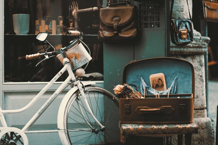
Composition is the arrangement of elements in the frame. Use your reference to decide whether the picture should feel formal, casual or dramatic.
For a formal portrait, try a centered subject and an uncluttered background. For a still life, arrange a few objects with space around them. For a casual scene, leave room for the person's surroundings and gesture.
Keep horizons level when the reference calls for it. Use the Rule of Thirds when it helps, but do not treat any composition rule as proof that an image is vintage. Check the frame edges for modern signs, packaging or equipment that distract from the scene.
4. Match the Pose to the Style
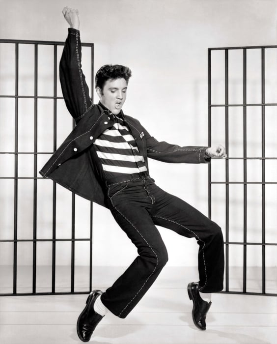
A vintage portrait can be formal or candid. Choose the approach that fits your reference instead of forcing every subject into a stiff pose.
For a formal look, give the person a stable position, arrange their hands and ask for a calm expression. A chair or table can give them something natural to do. Keep the pose comfortable; a serious expression is an option, not a requirement.
For a relaxed photograph, give your subject a simple action: turn toward a friend, adjust a jacket or walk through the scene. Photograph the transitions as well as the finished pose. Use a shutter speed that keeps the movement sharp unless you deliberately want motion blur.
Do not infer the camera, exposure time or capture method used for an old picture from its pose alone.
5. Choose the Depth of Field for Your Scene
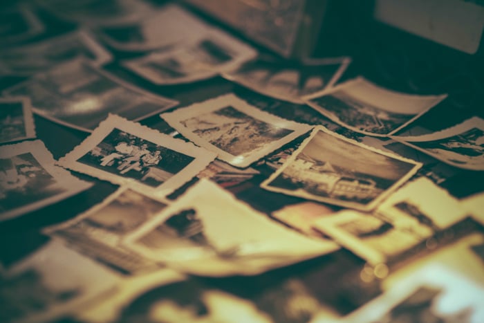
Depth of field is the range of distances that appears acceptably sharp. It is an outcome of your camera setup, not a separate vintage setting.
With the same lens and focus distance, a wider aperture such as f/2.8 gives less depth of field than a narrower aperture such as f/8. These are practice starting points if your lens supports them, not settings used for the photographs in this article. Nikon's aperture guide explains the relationship.
Try a wide aperture to separate a portrait subject from the background. Use a narrower aperture when the setting or several objects need to remain clear. Review the eyes, hands and important props, then adjust. Neither shallow nor deep focus is inherently more vintage.
6. Add Imperfections with Restraint
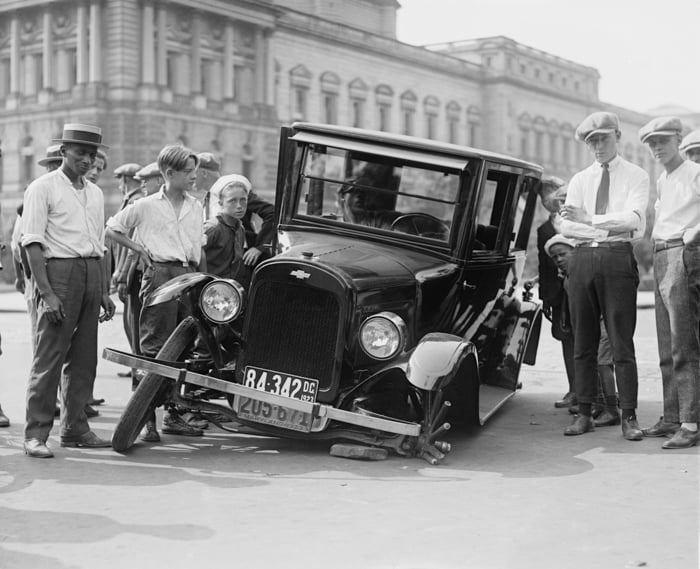
Grain, a worn border or a subtle light leak can suggest an old print or snapshot. They are optional creative effects, not requirements for film photography.
Start with a clean, well-exposed original. Do not dirty a lens, damage film or deliberately open a loaded film camera to create an effect. Keep a clean version so you can change your mind later.
In photo editing, add one effect at a time. Keep an overlay away from a face or an important object, and reduce its opacity if it dominates the picture. Check added grain at both close view and the size at which the photograph will be displayed. Texture should support the image rather than hide it.
7. Create Softness Without Losing the Subject
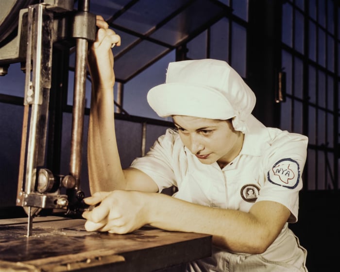
A soft-focus look can work for a dreamy portrait, but it is one choice among many. Sharp detail and strong contrast can also suit an older photographic style.
For a gentle portrait, start with light from a large window or an overcast sky. Turn the subject until the shadows suit their face and check that the eyes are in focus. This is a suggested setup for your own shoot; it does not describe how the example photograph was made.
If the digital result feels too crisp, reduce local contrast slightly in editing. Compare the skin, hair and clothing before and after. Stop before important detail disappears. A faded tonal treatment changes brightness and contrast; it is different from a blurred or missed-focus image.
8. Edit a Vintage Look in a Clear Order
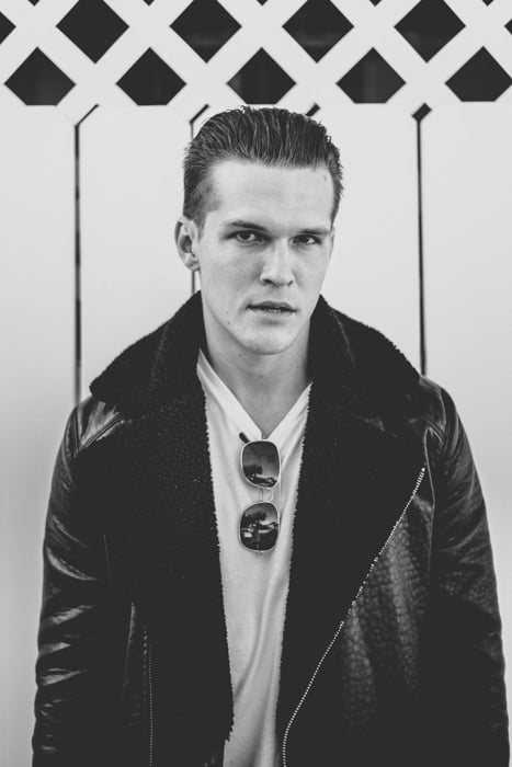
You can shape a digital image in Photoshop, Lightroom or another editor with suitable tone and color controls. The same approach can help you refine a film scan.
For a gently faded color look, try this sequence:
- Set the crop and exposure. Remove distractions and make the subject easy to read before adding a style.
- Shape the contrast. In a point-curve editor, lift the bottom-left endpoint slightly to turn pure black into dark gray. Keep some separation in the shadows; stop if the image looks washed out.
- Adjust the color. Try a small warm shift and lower saturation only where it suits your reference. Keep skin believable. A warmer image is not automatically more historically accurate.
- Add grain. In Lightroom Classic, use the Grain controls in the Effects panel. Amount controls its strength; Size and Roughness shape its appearance. Check the result at different zoom levels and after export.
- Compare the set. Place several finished images together and adjust any photograph whose color or contrast breaks the intended style.
Adobe documents the tone and color controls and film-grain effect. The recipe above is a creative starting point, not an exact simulation of a named film stock.
Presets and actions can speed up the process. Treat them as a first pass, then correct each image's exposure and color. For a more detailed editing exercise, try our guide to a vintage photography look.
9. Choose Black and White, Sepia or Color Deliberately
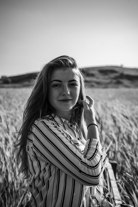
Choose the palette that fits your reference. Black and white can emphasize shape, expression and light; a warm brown treatment can suggest a sepia print. A color photograph can look vintage too.
Traditional black-and-white photographic prints were not simply made with cheap black ink. For example, gelatin-silver paper uses light-sensitive silver salts. Color photography also has a longer history than a blanket "all old photos were hand-colored" claim suggests: the V&A's process guide describes Autochrome color photographs from a process patented in 1904.
To make a digital black-and-white image, use a conversion that lets you adjust how colors become gray. Check that the subject still stands out from the background. For a sepia effect, add a restrained brown tone after conversion. The digital effect changes appearance; it does not reproduce the chemistry of print toning or improve a print's permanence.
For a color look, compare the palette with your chosen reference. Reduce distracting colors selectively rather than desaturating everything by default.
10. Make the Most of Vintage Clothing and Locations
How you stage a scene tells the story before you add a filter. Look for a location, clothing and a few props that fit your chosen theme.
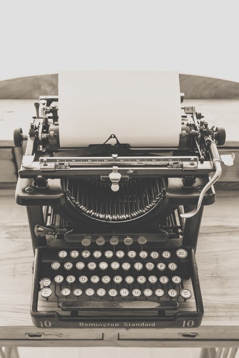
A quiet doorway, an old desk or a plain wall may be enough. Match the details that will actually appear in the frame: collars, hair, furniture, packaging and signs. Check for phones, smartwatches, contemporary cars and other objects that conflict with your intended setting.
Use styling and textures with purpose. Worn wood, fabric or paper can add interest without covering the scene in antiques. Try a wide view to establish the setting, then a portrait and a close-up of one detail. Carry the same lighting and editing choices through the set.
Conclusion
Choose a reference, build the scene and capture a strong original. Then use tone, color and texture to bring the result closer to the look you want. Film and digital are different routes; neither guarantees a vintage style on its own.
For your next shoot, keep one theme across a portrait, a wider scene and a detail photograph. Compare them together before adding more effects. If you want to work with existing family pictures, our guide to digitizing photos is a useful next step.